


Bmac
-
Posts
4,304 -
Joined
-
Last visited
Posts posted by Bmac
-
-
3 hours ago, spartacat_12 said:
It seems strange that they're being so vague about this whole thing. They unveil a centennial crest that will I guess be the primary logo for the upcoming season, but make no mention of if there will be new uniforms or if the new crest will even be used on the uniforms. Then they announce the Era Nights with a video that highlights various uniforms from their history, but don't explicitly state whether or not they'll actually wear those uniforms during those games. It's all very confusing.
I believe it's what we in the biz call "a teaser." They'll make an actual announcement and unveil everything, don't worry.
-
13 minutes ago, Ridleylash said:
I know this is probably sacrilege to some people, but honestly I kinda want Boston to switch to brown full-time, specifically the shade they used for the 2019 Winter Classic. They can pull the look off well, and nobody else in the league uses brown anyways.
Honestly, I'm kinda surprised their first RR wasn't a brown-and-gold 80's jersey, seems like that would've been incredibly obvious and an easy seller.
I STRONGLY want the Bruins to use dark brown instead of black. A Bruin is literally a brown bear. A deep chocolate shade would be amazing alongside the rich yellow and vintage white (I know, go ahead and hate me). I'd also prefer they wear yellow as the primary home jersey.
In other words, I probably have the most unpopular opinions regarding the Bruins.
-
 5
5
-
-
This is officially out of hand.
What kills me most is that many of these are just so poorly designed. Minor League Baseball is supposed to be fun and goofy to an extent, but at least have some integrity when it comes to design quality. It's very obvious that most teams are turning to their in-house designers, who are not putting out very good work.
-
4
-
-
I predict the A's will keep much of their current identity intact, modify the colors, and add a Las Vegas script as everyone else has mentioned.
But I also predict they'll add a black and gold alternate uniform (City Connect?) as soon as possible.
-
1
-
-
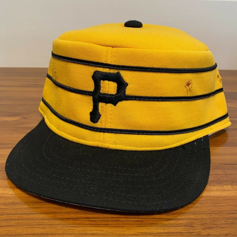
I think I spy horizontal stripes on the caps a la the famous pillbox caps...

-
 1
1
-
-
The inclusion of the bridge in the B is fantastic.
-
1
-
-
47 minutes ago, adsarebad said:
No pirates city connect leaks yet?
strange... we saw that Baltimore jersey leak long before they unleashed the horror on us.
There was something for Pittsburgh posted several weeks ago somewhere in this thread.
-
7 hours ago, Michael Bolton said:
It seems the Marlins fathers' day cap is...just the regular Marlins logo. I understand why, but it's funny to me.
I almost wonder if that's why they added the random patch to the side of these caps. The Marlins cap needed to look different than their regular cap, so they added a patch, and of course had to add that onto all of them.
-
Holy :censored: can we PLEASE not have the Canucks discussion again?
-
5
-
2
-
-
I randomly found (and bought) a Tampa Bay Devil Rays hat at a little mom-and-pop sporting goods shop in southern New Hampshire in like 2005. The only other team merchandise there was for the Red Sox.
-
The Texans have some of the best uniforms in the NFL. The logo is great for what it is. The custom number font is perfect. The shoulder design is perfect - modern yet timeless. The color balance is solid, especially when the red socks are worn with the white jerseys and navy pants. The ONLY gripe I have is with the pants, which should just mimic the shoulder design of the jerseys (red tapered stripe on navy, navy tapered stripe on white).
-
10
-
-
26 minutes ago, BJ Sands said:
I live in Chicago, I am not from Baltimore and have only visited twice, never been to a game at Camden Yards and I am not an O’s fan, but my 39Thirty home cap is one of my go-to hats to wear. Better yet, I’ve seen other people in Chicago wearing it and it always starts a conversation. Just a beautiful and whimsical design in a world that sometimes is too serious.
Bingo. That cap has enough whimsy and kitsch to capture the vibe of baseball as many folks know it. It just feels right. Like eating a hot dog at the ballpark.
-
4
-
 1
1
-
 1
1
-
-
4 hours ago, ManillaToad said:
A team from Kansas City calling themselves the Blues would be great for the rivalry with St. Louis if any of them cared about soccer
Kansas City had several baseball teams named the Blues long before the St Louis hockey team came around. Nevertheless...
-
2
-
-
1 hour ago, who do you think said:
Dailyregularly-scheduled reminder that:-The NBA's Vancouver Grizzlies, aka the Hardwood Coyotes, were airlifted over to Memphis after just six awful seasons, GrOwTh PoTeNtIaL in untapped Western Canada be damned. The league hasn't gone back, probably won't go back for a long time, and is absolutely no worse off for not being there.
-The original Charlotte Hornets, after a failed arena pursuit and after the fans turned on George Shinn for whatever the hell he did, got shuttled down to New Orleans; half the size, much less corporate presence. (Charlotte's replacement expansion team has been a train wreck and would probably be the one moved if you put a gun to the BoG's collective head and forced them to relocate one existing franchise by tomorrow).
-The Sonics, after their failed arena pursuit, were moved to Oklahoma :censored:ing City (less than third the size of Seattle going by raw CSA numbers). OKC has a great fanbase, is pretty much a model small-market franchise, and from 2011-2016 were as hot of a national TV property as any other team in the league.
-The NBA bent over backwards to preserve a quality small market with a rabid fanbase (Sacramento) that they pretty much have all to themselves, over chasing the population numbers and muh corporate presence in Seattle just for the sake of being in Seattle.
But you see, these moves were Actually BadTM, because Business Cosmo said so, on their annual numbers-we-pulled-out-of-our-colon list. The NHL needs these crappy, disinterested GrOwTh PoTeNtIaL markets if they're ever going to catch up with the NBA! You don't understand, there are [number] people in the [giant southern ballsweatville populated by northern ex-pats] area!
AND LET US NOT FORGET that once things got truly comical with the Expos, MLB went banging on doors all over the U.S. looking for a place to drop them, and they spent parts of their two lame-duck seasons in Baseball Saskatoon, aka Puerto Rico. (The NHL found a similar arrangement with the Coyotes, back when their situation was merely comical, unacceptable because oof that would be a bad look, my dude.)
YES.
I said this here a while back, but I'll say it again: the NHL should be focusing on niche markets that will actually support hockey. Bettman's approach has been the equivalent of "get a list of the top 32 biggest cities and put teams there."
The NBA and MLS have both proven that placing franchises in deliberate niche markets that will actually support the sport can work extremely well. Portland, Sacramento, Orlando, SLC, even Austin!
The NHL should've been very deliberate with their expansion strategy in the 90's, and it shouldn't have been about plopping down franchises in every major city in the Sun Belt. Yes, Tampa has been a monumental success. Dallas and Nashville ended up pulling it off. Vegas seems to be working. But I'd argue the success of those franchises has very little to do with the size of the market. In fact, larger markets such as Atlanta, Phoenix, and Miami (despite their current on-ice success, the Panthers are a mess of a franchise) have failed.
Stop focusing on big markets. Start focusing on solid hockey markets. Where would the sport actually be appreciated, rather than become a burden to sell to the locals?
Quebec City is the obvious answer. I think Kansas City would be a huge success. Are folks in Houston really that crazy about hockey, or do they just want a new team because honestly, what city doesn't want a new team?
-
3
-
-
I love the Mariners CC uniforms, but I really can't stand that they're now wearing blue and yellow for two out of three games during a weekend homestand. The Sunday cream uniforms should have been replaced, not the road grays.
-
14
-
-
Lots of sports-related data systems (digital scorebooks, scoreboards, stats tracking, etc ) are programmed to have three letter inputs for each team. The thinking being that two letters is often not enough to identify most teams within a data system, and most programming requires the same amount of characters for each team entry, necessitating abbreviations like "VGK" instead of just "LV."
-
2
-
-
The Sens could definitely pursue something closer to an old time hockey club aesthetic with hints of the current identity. According to Icethetics, this idea was at last explored:
-
14
-
-
17 hours ago, IceCap said:
My apologies.
My personal opinion is that we're kind of at the limit for viable NHL markets regardless of where we're talking about. Arizona is a failure and should be replaced by Quebec City. Hartford's probably always going to be there and could be viable with a new arena, and Florida and Carolina are both on shaky ground, and Houston's a dream some people are insistent upon. But it's not like there's an six new markets the league could expand into tomorrow or anything.
I'll always advocate for Kansas City. They should be next in line behind Quebec City. They have an arena and a sports-obsessed market (one that would stretch into Kansas, Iowa, and Nebraska as well). I know there are some hold-ups currently, but if they wanted to, they could be a perfect landing spot.
-
2
-
-
5 hours ago, Blast_Brothers said:
If you set aside the expectations of what a MLB uniform should look like, I think the design is pretty strong. The black pants, while odd, seem like an integral part of this set, tying together the other black elements of the uniform, and the black undershirt.
Given that the City Connect designs have been untethered to the 'rules' of baseball uniforms from Day 1, I find it hard to really complain about this set.
Exactly. From purely a design standpoint, the black pants fit the overall design very well. I'm glad this program is attempting to expand the visual language of the baseball uniform as we know it. White over white and gray over gray all the time is boring. Not to mention the tie-in to early baseball uniforms that used colored pants with colored jerseys. It should be way more common. As a graphic designer myself, I love seeing them utilizing the entire canvas and trying to operate beyond the conventional uniform design structure.
All that being said, the cream Sunday pants would be a great alternative option with the CC uniform.
-
5
-
-
No way are they going to move the minor league team and then have an empty brand new minor league ballpark. And teams want their affiliates as close as possible. Aviators are definitely staying put.
-
2
-
-
I've always thought Giants and Titans worked for New York teams. The names just seemed to fit with an enormous, larger than life city with huge skyscrapers and the like. Not super location-specific, but just enough to feel right.
-
3
-
-
I SO BADLY wish the Broncos had kept the brown and yellow color scheme from day one. It fits so much better than blue and orange.
-
1
-
 1
1
-
 1
1
-
-
7 hours ago, IceCap said:
As good a run as the Broncos had with the Cyber Horse 1) everything old is new again and 2) you can't stave that off with incompetence.
Denver won back to back Super Bowls in 1998 and 1999. Then they set the record for worst record for a defending champ in 2000 that stood until the Rams prolapsed in 2022. They won another when an all-time great defence carried the burnt out husk of Peyton Manning to a second title, but that was in 2015. It's been eight years and a parade of failed coaches and QBs, the last of which is on a team crippling contract if he can't turn his game around.
Sixteen years of nothing between 1999 and 2015. Eight more years of nothing since, and becoming the joke of the NFL thanks to Russell Wilson's LETS RIDE mantra and bad sandwich commercials. Sooner or later the ratio of bad football to good tips in the bad's favour. And then the classic brand, which is the opposite of the slick Cyber Horse/Nike panelled look, becomes appealing.
Nothing you've said here is wrong, but I'm not sure most people see it that way. Fans of teams that haven't won multiple Super Bowls in their lifetime see a uniform worn by the Broncos for 3 Super Bowl victories and associate that with success. 3 Super Bowl victories during the 25 year lifespan of a uniform is pretty damn good, especially when the previous uniforms were worn for 30 years without any Super Bowl championships.
It's valid to say the uniforms have become stale and should be replaced, especially if the franchise is facing a downturn. But to say the uniforms should be replaced because the poor Broncos haven't won the Super Bowl in 8 years and it had been 15 years before that? No.
-
Perhaps we can utilize "redesign" vs "rebrand" to clarify the different changes.
Patriots redesigned their uniforms. Same branding, different execution.
Broncos and Buccaneers rebranded in the late 90's. New everything.
-
12
-


MLB 2023 Uniform/Logo Changes
in Sports Logo News
Posted
Exactly. Obviously the marathon is an iconic element of Boston. But it's an odd thing for a Major League Baseball team to base a uniform on.