Frenchie
-
Posts
4,433 -
Joined
-
Last visited
Recent Profile Visitors
9,959 profile views


Frenchie's Achievements
183
Reputation
-
Henderson's name on a Vegas shirt is absolutely sacrilegious... Yet, I would like to see some sort of "LV" cap... And of course, we would need some sort of Vegas Gold somewhere in the uniform.
-
Sorry for the delay in sending you my vote for the new MHL owner, they both looked like quality owners.
-
I'm assuming "FrozenFaceoff.net" was the source of that template. But that looks a lot like the old EA Sports NHLXX" community templatle formerly known as Breakaway.net. Then, I think they went to NHLDepot, and I think they are now wasserlasser.com
-
Looks like they also have an alternate:
-
You mean like Stefan Dukaczewski did? https://dribbble.com/mstrpln https://www.instagram.com/mstrpln/

-
The one detail I question on this one is the "horn" on the hat. I think it's supposed to be the "roll/fold" of the rim of the hat.
- 2,113 replies
-
- 1
-

-
- concepts
- sports logos
- (and 8 more)
-
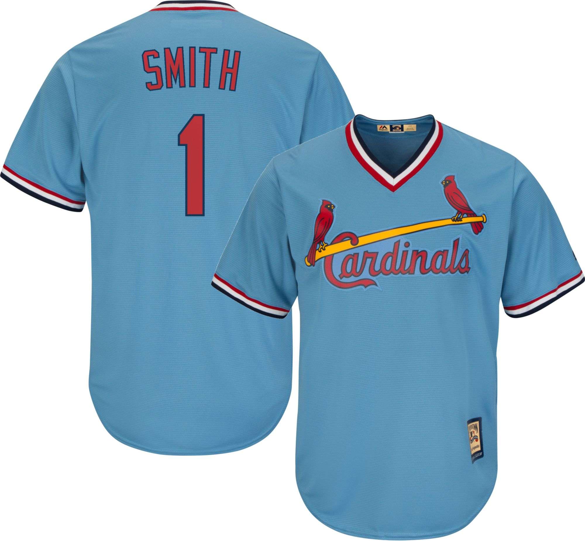
That would be sweet. I'm not sure what type of source material you use, but I went online and googled a few of the big names of the 80s, and asked for large files (George Brett, Ozzie Smith, Nolan Ryan) I also looked at manufacturers' websites, but those weren't really good (Rawlings, Majestic)
-
I have recently gotten into making some Baseball Jerseys and have really been enjoying the PSD Majestic template from John Benson. Does anyone know about a similar "foolproof" layered template for "over the head" jerseys (like the 80s, BP and Players' Weekend's)?
-
 Frenchie changed their profile photo
 -
forum questions Ask A Moderator
Frenchie replied to Nick 1733's topic in Forum Policies and Announcements
but it's so temping !!!! -
forum questions Ask A Moderator
Frenchie replied to Nick 1733's topic in Forum Policies and Announcements
Looks like I will have to refrain from accessing this board on my free time at work, I sit on same floor as HR... Could be embarrassing... -
Not to mention it technically sits in NJ's waters. From the National Park Service: You didnt contradict anything I said above. It still sits in NJ's waters even though NY has jurisdiction over the Island. Jurisdiction trumps territory. The US embassy in London's in the UK's territory but it's still American land. It's more or less an easement granted to the given country. And I didnt say anything trumped anything. Stop devolving this further into semantic stupidity. Don't stop! Where most people hate "Semantic Stupidity" I find it highly entertaining
-
Players in the "wrong" uniforms
Frenchie replied to larrypep's topic in Sports Logo General Discussion
How about this fun one: Subban at ASG in Canes' (Skinner) shirt: -
Players in the "wrong" uniforms
Frenchie replied to larrypep's topic in Sports Logo General Discussion
Somebody needs to make sure he never steps foot in Montreal...