

Morgan33
-
Posts
7,627 -
Joined
-
Last visited
-
Days Won
14
Posts posted by Morgan33
-
-
I'd rather they suit up in the Mooterus...
Seriously, that is far and away the worst uniform in their entire history. -
Anything would be better than "Utah HC"
-
 4
4
-
-
I would argue that we have more than enough classic looking teams. With Arizona having one of the most distinct designs in league history (talking about their Kachina look) I would like to see something similarly unique. Unique but not overtly cartoony. Seattle nailed this balance with their logo... Not so much with their striping.
-
2
-
-
9 hours ago, bowld said:
I wouldn't mind them wearing colors like this. In fact, Utah Phoenix has a nice ring to it
 -
-

Maybe a dark forest green instead of Navy?
Too similar to Calgary. They need something more unique than that.
-
1
-
-
I'm one of those people who thinks the Yotes got it perfect the first time... That being said, I could definitely get behind this. The sleeve striping looks fantastic.
-
1
-
-
Without the (non-sublimated) storm flag striping and silver accents, they look just like any other Red, Black and White team... The inaugural set is miles better than the red Adidas version and its conceptual white counterpart.
-
 1
1
-
-
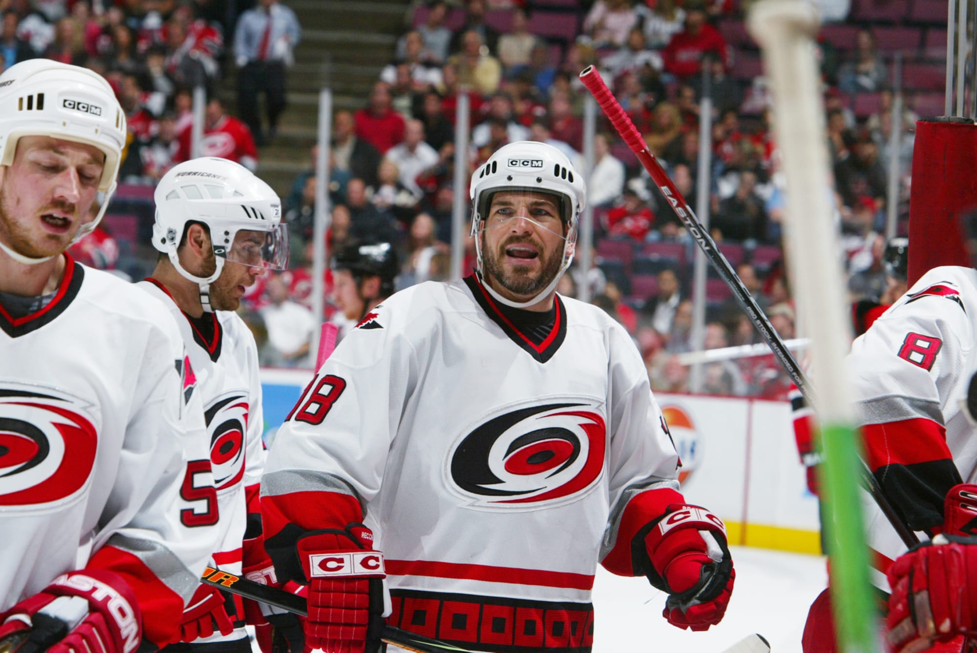
4 hours ago, Kevin W. said:
If the Hurricanes had gone with that instead of the wordmark they'd have one of the
bestmost mediocre sets in the league.-
3
-
 1
1
-
 1
1
-
 1
1
-
 1
1
-
-
The Edge uniforms were originally supposed to be tucked in as this early prototype suggests. I remember hearing that Karmanos fought RBK on this so they could keep their distinctive hem stripes intact.
-
2
-
 1
1
-
 1
1
-
-
1 hour ago, ruttep said:
Modern classic. This should have never been changed.
-
7
-
2
-
1
-
-
Of course it's offensive it's the current year... Everything's offensive so lets all act offended on the behalf of the people we've decided are offended by a logo they've likely never seen.
-
2
-
1
-
 1
1
-
1
-
1
-
2
-
1
-
-
8 hours ago, M4One said:
Carolina Hurricanes are polling season ticket members about possible new logos. I know some people don't like their current primary, but none of these would be an upgrade.
These are laughably bad but fitting considering the trajectory their identity has been on these past 10 years.
-
3
-
-
Another boneheaded decision they made was getting rid of the Glacier Twill... Them and Pittsburgh.
-
7
-
 2
2
-
-
Bought 8 Reverse Retro 2.0's and not a single one belongs to the Canucks... Don't regret a single purchase, especially now that the league is switching to Fanatics. RR 2.0 was the final gasp for collectors.
-
2
-
-
It looks like it has a straight hem-line. That would be a welcome return for the first time since 2007...
-
On 3/11/2024 at 4:12 PM, GFB said:
What an absolutely bone-headed decision it was to get rid of the Yeti Footprint... While the logo's nothing special in a flat application, embroidered it looks nothing short of beautiful. The way the silver sparkled always reminded me of snow and ice. It was so much more creative and fitting than the recoloured state-flag insignia.
-
7
-
1
-
1
-
-
6 hours ago, GFB said:
I understand this probably isn't close to the actual original shade of blue, but in my memory and nostalgia (trading cards from the 90s and Wings/Avs rivalry tributes) this is how I remember the Avs:
By pushing the blue into more of a "blue-green," it both warms and darkens the look considerably... So when I see images like this, with the blue lighter and closer to royal, it immediately feels colder and more jarring (which may be a good thing for the Avalanche, depending on your view):
The difference in these two blues is likely attributed to a change in the jerseys material. Their original authentics were done by Starter and featured a significantly looser knit mesh. To my knowledge the shade of blue didn't change when the Burgundy was darkened.
I wholeheartedly agree that it looked much better when it was more "blue-green." Much warmer look.
-
2
-
-
12 minutes ago, CreamSoda said:
The Avs look a million times better in blue equipment and have a cup in them. They aren’t going back to those ugly mismatched uniforms.
Their recent cup happened in the most mismatched uniform in team history. Blue equipment, blue numbers, blue nowhere to be found on the striping or shoulder patches and multiple instances of the two colours bleeding into each-other and competing for prominence.
There's nothing mismatched about the uniform they won the cup in 1996 in. You just personally don't like it.
-
2
-
3
-
2
-
-
Or they could just go back to something that was unique, worked in spite of its unconventional construction, saw immediate success, clothed some of the greatest players to ever partake in the sport and spawned one of the greatest rivalries of all time...
-
7
-
1
-
4
-
-
On 3/5/2024 at 4:34 AM, maz said:
Uniform have more than two color. Uniform doesn't look like from 1975. Uniform make me mad.
Depth? Contrast? Pssh. ALL THE BRIGHT COLORS! If you can't find it in the default MS Paint color palette, don't use it. Change your TV's settings and cope if you don't like it, b*tch.

Sums up the last 10 years of this place to a tee.
-
3
-
1
-
-
4 hours ago, chcarlson23 said:
If your striping doesn’t have the colors that you included into the numbers, there’s something off about the design.
You mean like this? I see blue on the numbers but not on the striping.
5 hours ago, spartacat_12 said:Where do you see any black on this jersey? The black names & numbers never made sense on the white jersey, and were basically thrown on there to justify the black equipment. And about a third of the teams in the league have a colour in their logo that doesn't appear anywhere else in their uniforms, so wearing black pants because of a tiny black puck covered in snow seems like a stretch.
4 hours ago, chcarlson23 said:Why does it have to be arbitrarily shoehorned into the numbers and gear then?
I've explained ad-nauseam on this thread why they went with black equipment and why it was necessary. To eliminate any instances of burgundy and blue touching on the uniform. Look at how awful these colours look side by side. No contrast or definition what so ever.
-
1 hour ago, Ridleylash said:
Black is completely and utterly unnecessary as an Avs uniform color when they already have a pretty dark color in their palette (burgundy) to contrast the blue and silver with. It's one of the purest examples of BFBS in the NHL, especially since they barely used it for anything anyways.
It's not Black for Black's sake if Black is a part of their scheme and has been for all 28 years of the franchise's existence. This comment perfectly illustrates why this cringe term has lost all meaning in 2024.
QuoteThe dark jersey only has it as an accent color for a single stripe on the hem and sleeves, and they didn't even bother putting black on anything but the NoB and numbers on their white jerseys; making the black equipment feel even less cohesive on what was their home jersey at the time.
It doesn't need to be anywhere else. It's on the primary logo, numbers and equipment. It can be seen no matter what angle you're looking at the uniform from. Why must it arbitrarily be shoehorned onto the striping?QuoteI'd rather they bring out burgundy pants if there must be a different pants color for the road jersey, because at least it keeps within the color hierarchy of the jersey.
You know you've got a cohesive and well thought out uniform set when it requires two sets of breezers to not look like a dogs dinner...
-
3
-
1
-
1
-
-
3 hours ago, spartacat_12 said:
Wearing black equipment with a uniform that doesn't have any black in it looks amateur.
Both Avalanche original home and roads contain black so this point holds no water. Primary logo does too.
QuoteIt's like seeing a minor hockey team where every kid just has basic black pants regardless of what colour their jersey is. If the Red Wings or Canadiens started wearing black pants would that not clash with their uniforms?
Who's advocating the Red Wings or Canadiens start wearing black pants? Neither of them use it on their uniforms or logos so of course it would clash.
QuoteIf they were going to keep the black equipment, it would have worked better if they eliminated silver altogether, like they did with this alternate.
Notice how this alternate doesn't have a single instance of burgundy and blue touching directly? There was a very good reason for the use of black equipment with their original uniforms. Which is something the team has forgotten since 2007...
-
2
-
-
44 minutes ago, chcarlson23 said:
This doesn’t make any sense. Black and white are not neutral colors or neutral shades. Unless planned, they can really stick out. White breezers and gloves have a tendency to do that. But black would too if paired with a team that doesn’t have that in their color scheme. The Habs aren’t out there rocking black breezers, because they’ve never had black in their color scheme. And you absolutely have to include them into the color scheme, because it does add to the visual weight and/or effect of the look.
You are right that black and white can stick out on a uniform. I don't think I ever made the argument that they didn't. But from a technical standpoint, they are still not colours. They are shades that augment colours. Black and White are nowhere visible on a colour spectrum and are therefore neutral. That doesn't mean they don't effect the visual weight of the uniform. The Avalanche made the creative decision, from day one, to use 3 neutral shades.
QuoteI also don’t know how you can say that 90’s look is perfectly balanced. You’ll have to explain that more, because what I see, (and obviously this could all just be a difference in opinion) is a set that has a lot of burgundy and white up top, and then really random black gear in the middle, and then socks that emphasize more blue than anywhere else in the set. (I know there is both blue and black across the set, but at a distance, such as watching the game from the stands, all I can see of black is the gear, and of blue is the socks.) It feels a little bottom heavy, and that two colors that are featured below the waist aren’t really present on the jersey.
There's black on the numbers and black on the front crest so I don't see the issue with black breezers. The jersey striping is Burgundy > Silver > Blue and that's repeated on the sock striping. I see no issue with balance on that road jersey. The only balance issue I see on the entire set is the discrepancy between the home striping and home socks.QuoteThe Avs probably used black gear, because burgundy or steel blue breezers and gloves were probably too hard to come by in the 90’s. So they chose black, and then shoehorned it into the rest of the sweaters, forever making their color scheme ridiculous complicated.
If the Ducks could get Eggplant gear in 1994, there is no reason to think the Avalanche couldn't get Burgundy gear in 1996. It was a creative decision on the part of the team, likely because they didn't want any instance of Burgundy and Blue to touch directly (because it looks terrible). Burgundy breezers would have broken this rule at home and blue breezers would have broken it on both uniforms.
Why would they go out of their way to wear black helmets on the road, their first year, if this wasn't a intentional decision? It wasn't until the completely closed-minded and cringe inducing term; "Black for Black's Sake" was coined that anybody started taking issue with it.-
1
-
3
-
-
The Flames logo is a symbol to represent the team, not a literal illustration of a C on fire. And this comment isn't directed at people who prefer either version, just that argument itself.
"The white C represents white-hot fire"
"The Black C looks burned out like the state of the franchise, lulz"
It's a sports logo. Either version is perfectly acceptable to represent a fire based team.-
3
-


/cdn.vox-cdn.com/uploads/chorus_image/image/65574061/161022317.jpg.0.jpg)


2023-24 NHL Jersey Changes
in Sports Logo News
Posted
The whole Stars website is decked out in "Skyline Green." They are most definitely using those atrocities in the playoffs