-
Posts
1,097 -
Joined
-
Last visited
-
Days Won
1
Posts posted by _RH_
-
-
Usa white/blue photos look great! The collar is great as focal point. On the other hand, the blue/red look is about as garish as it gets! Yuck.
-
What's worse, the kit matchup or the free kick?
-
 1
1
-
-
I've posted a few times through the years on the Avs removing black, and generally agree with my past-self:
For me, the shades of red and blue cannot touch, so the current look is poor. I will say, looking back at the black breezers they do look weird now. I'm surprised they havent tried the trend of "colored helmet on the road".
Those 6 versions I doodled still feel more consistent than anything they've worn... white breezers feel intriguing since they'd balance the "very dark" color scheme.
-
 1
1
-
-
I think Carolina's primary is mostly good, but the puck has always looked upside down to me. Maybe that could be tweaked to form a "c" without being quite as blatant as upper right. The logo is jagged, the "c" should follow suit.
I don't care much for the script logos (the white third is a sharp template but nickname scripts feel weak to me)
-
7 hours ago, Carolingian Steamroller said:
I loved those 90's Chargers uniforms. ... The fact that we get (Chiefs vs Chargers) every year now is an absolute gift.


Looks good to me!
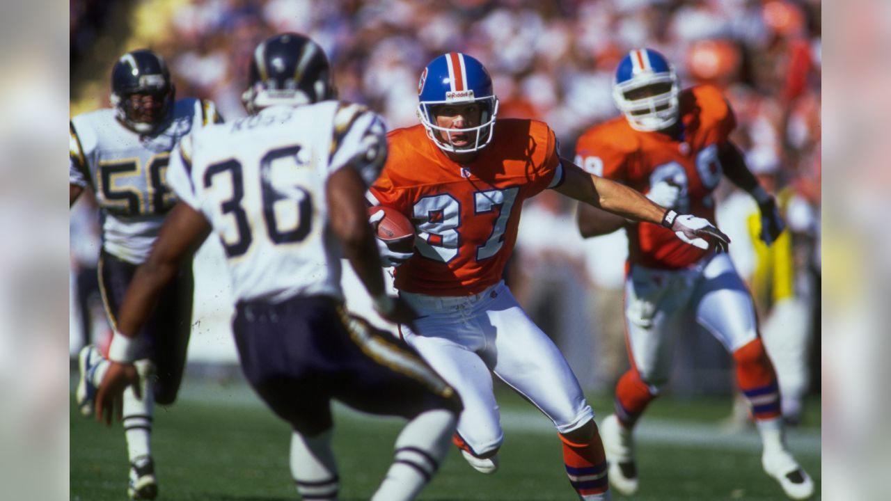
And since we're talking Denver's shade of blue:

-
 1
1
-
 1
1
-
-

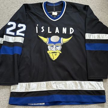
Iceland is looking very nice tonight
-
 5
5
-
-
(Jets) I presume this is unpopular, but I didn't at all mind the "wedge" jerseys. To me that was a unique element that wasn't too over the top. If that set deleted all black it'd be very good, IMO.
-
 2
2
-
-
Weird matchup today:


For some reason this was hard for me to quickly identify; not very pleasant on the eyes!
-
 1
1
-
-
22 hours ago, Sport said:
Take the Seahawks as a hypothetical. If they were to go back to the 80's/90's unis there's some things that would have to change. The 2002 logo update is such an improvement over the old one that it'd be a crime to throw out.
Interesting. To me the original is clearly inspired by the local native art, and therefore vastly superior.

-
 2
2
-
 1
1
-
-
29 minutes ago, DCarp1231 said:
The Cowboys, Eagles, and Giants all have throwback uniforms… and then there’s the Commanders

-
 2
2
-
 4
4
-
-
Eagles:
1. Likely unpopular, but I think the darker shade and black trim (not black jersey or pants) is superior to the throwbacks . I'll draw a parallel to the Calgary Flames where adding black and toning down the main color makes it more aesthetically pleasing.
2. How many times do teams totally disregard their opponent's colors color scheme when planning alt colors. If youre Philly, why wear your brighter green against another team with a brighter green shade!? Anyone in their division would've been preferable
-
 2
2
-
 2
2
-
-
I may not be a smart man, but I know when jerseys aren't the same color as helmets

It's 2023, how is this still so imperfect?
-
 6
6
-
 1
1
-
-
Blue Jackets going b/w/r/w in training game. I assume this is just temp thing to minimize equipment but it looks nice to me.
https://twitter.com/BlueJacketsNHL/status/1703143275010371704?t=QZAVV5Uc-6U8Zackk6DH_w&s=19
-
some thoughts I haven't seen mentioned:
1. Kansas always looks bad with inclusion of the Jayhawk. Perhaps as a Mizzou fan I'm biased, but if they insist on having that stupid looking bird on their helmet (with so much yellow) they really need yellow elsewhere. IMO they looked great in the "NY Giants" phase - just don't mix red/blue jerseys/pants. Also unpopular I guess: I thought Trajan looked good. Looking at the history of their "circus" font that seems even more superior; I would never have them in block since they have two superior alternatives that feel much more unique to them. I don't even need to say how dumb the BFBS is - damn they're only 20 years late to the trend.
2.NAU mountain range pant stripe is really cool. That's the sort of unique element that teams need without going over the top on cheesy gimmicks.
3. UCLA always looks good but it's funny that they now emphasize metallic helmets and cleats BUT STILL HAVE THE KHAKI PANTS. IT IS THE YEAR OF OUR LORD 2023 AND WE STILL CAN'T GET TEAMS TO WEAR GOLD PANTS? I am once again asking that the pendulum swing from "flat pants" to "metallic pants" - God bless the Raiders and Cowboys. Florida State is obviously a huge offender too.
-
1. On the previous page someone posted Oregon's B/Y/Y (thanks for sharing) and the post got more "thumbs up" than "vomit" responses. I'm very ashamed of this reaction; maybe this board has lost its way
 . Apart from lack of green, I'm bothered by the shoulder patches looking backward.
2. While I appreciate UH "Oilers", I can't look at that without seeing the atrociously mismatched stripes. If you're not going to match the originals, at least ensure your elements match each other.
3. Keep those "one team dressed up as another" examples coming... I'm not sure how I feel about the concept, but it's unique!
-
It's a shame we can't throwback to the pants that better match the finish on the helmet:


Ahh - "progress"!
-
 3
3
-
-
14 hours ago, ramsjetsthunder said:
(Den bww vs Ari wrr)
This may go down as the worst looking game in NFL History
*cue people sending photos of Jags v Rams from 2018*
I don't think the Den Ari matchup is so bad, but your other example is pretty rough:

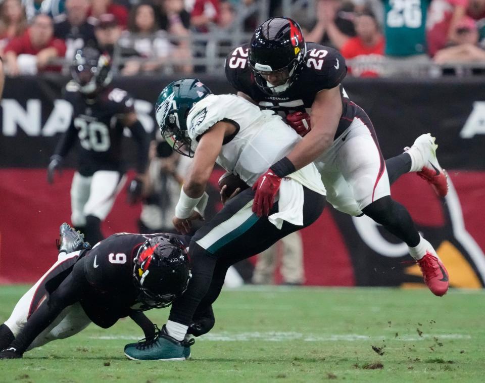
So many folks have listed other examples that are in the (especially awfully) mono vs mono category ...I'll nominate this mess of Ari vs Phi (with min red or green) from 2022:

-
 3
3
-
-

Well I guess I'm in the minority ... I see 12 likes for Anaheim's tiny logo being worse than VGK. I'll respectfully fully disagree. Sure that logo needed to be bigger and it was boring and BFBS (and even worse when you consider they should've been in their eggplant/jade) but man...these gold jerseys are way worse! Something about that white next to gold ... blech! I'll put Washington's into the same "meh" category as Ana. Pitt's khakis are bad, agreed. The other set they won it isn't much better IMO:
 the colors are better but man the striping is just all over the place!
-
 2
2
-
 1
1
-
 6
6
-
-
Will Vegas' gold jerseys be the ugliest to ever hoist the cup? Off the top of my head, yes!
-
Do we think / know Vegas will ELIMINATE black in future, or just focus on grey / gold? To me grey / gold is a cool unique combo but the issue with the current gold jersey (apart from gold just not being a great primary color) is too much (or any?) white. I don't know why the current white jersey looks good to me with "70% white and 10% gold" while the current gold jersey looks abysmal to me with "70% gold and 10% white". To my eyes getting rid of white would make the gold work better:

And to me the other big improvements that could be done would be (1) send the chrome helmets to needy children in a developing nation and (2) eliminate gold (khaki) from the gloves.
-
 5
5
-
 2
2
-
-
12 hours ago, tBBP said:
If you want the 24-minute behind-the-
scenesseams version of this rebranding process, here you go.Pay particular attention to the remark made at the 2:25 timestamp regarding the alternates...
so she's saying they had to either release the alts now or wait a few years? Wonder if the rule is same for helmet, jerseys, and/or pants.
At 1:45 it's interesting that she says "Michael was really emphatic about the ...stripe". Sounds to me like they originally wanted the whites to be blank too!
SLEEK. MODERN. CLASSIC. lol - BLANK. EMPTY. BORING. UNIMAGINATIVE. BLACK 20 YEARS LATE.
-
 6
6
-
-
Unpopular thought alert: setting aside the black jerseys/pants (which should be deleted forever) and monochrome red, the only thing really bad about the previous set was the white jersey. They just needed to eliminate the red shoulders (similar to Bengals old set). Piping isn't my favorite look but totally blank jerseys are just about as bad.
I loved the concept that swapped black to navy and gave yellow a bigger role.
-
For a franchise that's been in Chicago, St Louis, and now Arizona I think it'd be cool to add some flag/local elements. Trading black for blue would be nice, but do we really see them doing that after the new black helmet? And do we know that the white helmet will be basically unchanged? Feels strange to me to have such a minimal helmet and modern uniforms.
I think we can all agree those grey face masks have to go!

-
On 2/22/2023 at 3:59 PM, FinsUp1214 said:
If ad patches HAVE to be a thing...
(They do not)
-
 4
4
-


/cdn.vox-cdn.com/uploads/chorus_image/image/69507032/695982536.0.jpg) the colors are better but man the striping is just all over the place!
the colors are better but man the striping is just all over the place!


2024 NFL Changes
in Sports Logo News
Posted
If the Lions really did want the metallic sheen on pants but "although they will lack the sheen of some of the franchise's earlier looks because of limitations with the fabric Nike utilizes " how is this acceptable? A huge comapny is unable to fulfill the request of one of the biggest businesses in the world? A request for a product that existed 40 years ago?! Unacceptable.
Im not terribly impressed by the striping: the helmet centerline ratio seems different than the pants. And the shoulder silver/white will look poor from any distance.
Now for an unpopular opinion: going from their unique font to block is a step backward.