


_RH_
-
Posts
1,097 -
Joined
-
Last visited
-
Days Won
1
Posts posted by _RH_
-
-
I actually like a lot about the Caps look, but something is bothering me. It's like with the logo they're saying "look how clean this is when blue never touches red" but then they allow them to touch at the hem and on the socks. Here's a pic of Ovi on ice, and the middle box is apparently the real look (note the yuck helmet and all red gloves)

So to me if they want to keep the colors separate (which reminds me of Avs winter classic) I'd do away with the red hem stripe, make the socks match the sleeves, and add more red via helmet and rear numbers... I drew this on the right. I'm split - the single color weagle is cool but seems really tough to balance color if you want to simultaneously separate blue and red with white.
-
Again I'd prefer the full color palette (sans black) but just think they could do better with the striping pattern. I'm guessing from TV distance it'll barely look like anything (just solid burgundy). Here's a look at the original and new (top row) and a couple quick doodles (bottom two rows). Right column "fills" neither area, middle column "fills" middle, and left column "fills" outside.
-
I guess the two-color scheme isn't terrible but IMO inferior to the green/orange. Interesting that after the revival of the popular Kachina logo theyd go with text - anything to make a buck, I suppose. IMO worst downgrade is the hem pattern- the original is just worlds better than this.
-
 1
1
-
-
On 1/8/2023 at 6:59 PM, Ninoners said:
I'm going to pistol whip the next person that says "Natty". Lol. But seriously, it's awful.
Hey Farva, has this guy edited the audio of his drum playing or is it natural?
I'd like to think TCU getting caved in tonight is karma for wearing black.
-
As much as I love the Oilers set aesthetically, it doesn't sound like Tennessee will let that happen for Houston.
I must be in the minority, but think the Texans look good. Good colors, good logo, good font. I'd hate for them to blow that up for the newest trend that fans ask for. They just need to always separate the blue from red with white (shoulder shape, pant stripes). I'm not a fan of mono looks, and the red jersey next to blue pants look off to me. It's funny though, the blue pants next to red socks are ok to me
-
9
-
-
Looks like the Bruins forgot which nights they planned to wear their reverse retro:
(This wasn't planned as a "wear them only in warmups" as they wouldn't wear the white socks too) surely this is the biggest gaffe the Bruins organization will make this year

-
 2
2
-
-
Van: something is off with the striping, maybe the difference between the sleeves and hem. Green pants might have been better too.
Pitt: I like the jersey but pants and sock stripings are off
Buf: I assume unpopular, but I like the look of colored helmets with white jerseys. Like Detroits RR last year, I think it adds to the overall look. I think blue and yellow on jerseys and socks should swap. Also would've liked the diagonal line on side of jerseys to carry onto pants.
-
Rather than tell you what I like or dislike about each jersey, I thought it may be fun to tweak each one. The intent is to keep the general jersey the same but make a small change or two.
-
1
-
-
Haven't seen this posted yet ... the Avs one just makes me even more mad they haven't added blue to the current road template! Clearly you can have two trim colors adjacent!
-
 1
1
-
 1
1
-
-
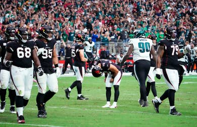
So we have a game between a red team and a green team. A matchup where no team typically wears black helmets, jerseys, pants, or socks. And what happens?
Black hemets, jerseys, pants, and socks. We end up with what, to me, is on top 10 list of all-time awful uni matchups. The cardinals are dumb for doing a blackout (and they're about 20 years late to that trend) but they're at least the home team. There is no reason Philly should be allowed to wear black in this game (or ever, but that's beside the point).
-
17
-
-
If it were up to me Cincinnati would ALWAYS have black stripes on orange, like they did from '81 to '03. I will not be taking questions at this time - thank you.
-
8
-
-
Question about K-State helmets: are they a "true silver" or is there some blue in there ala Dallas Cowboys? For their pants, it seems like they kept the shiny material longer than most schools, but does it seems toned down now?
-
2
-
-
3 hours ago, RayFinkle said:
Missouri looks great.
Yeah that was a pretty "classic" looking matchup. To me each school has minor issues; I'd make Auburn "orange on blue on white" and I'd make Mizzou "yellow on black on white" (real on left, tweak on right - changes Auburn's helmets and Mizzou's jerseys)
-
2
-
-
23 hours ago, Brave-Bird 08 said:
I'm a broken record, but the new uniforms -- while not the greatest -- are a huge improvement over what they were in.
VS
Seems like about "6 vs half a dozen" to me: to me the helmet finish is better but the silver, "ATL", and font are all worse. The old piping is no more objectionable than the new stripe to me...I'd guess they'll both age similarly.
-
3
-
-
FSU wore white helmets last time ... first time ever?
Previous road looks:
So to recap:
-helmet color is clear downgrade over gold
-facemask color is clear downgrade over red
-helmet logo is not improved, IMO a downgrade since it changed a classic
-jersey design (patterns around collar and sleeves) is clear downgrade over previous set
-font is a tossup (both unique enough but not too wild)
-pant color is clear downgrade over either gold or red
-logo on hip is smaller now
If anyone responds in emojis or says something about ice ... I'll smite thee!
-
1
-
-
Carolina's throwbacks are fine; they have such a weird history of changes. They're like Minnesota to me - started out strong and probably regressed with almost every change since. Based on their constant changes I'm sure they'll switch again soon, but I'm hoping they eventually get to the "two flag" pattern on hems and sleeves:
-
It's certainly not a BAD look, but IMO the use of grey is superior and sets them apart. From TV distance the black and teal melt together and they're going to look like Toronto/Tampa with wonky color settings . IMO the home jersey is better, I think the away is awkward at hem as you lose the appearance of a single white line .... I guess the way my eyes are seeing it is "teal stripe on teal jersey" and "white stripe on white jersey" which feels strange
left is real, middle adds teal to road hem, right adds teal to road hem and sleeves
-
If I were forced to have a jersey ad I'd allow it on the vaunted "hanger effect" inside collar
") in honesty the few I've seen haven't been the end of the world where colors match - I think those will be about as noticeable as SJ waves: not at all. I think some of the contrasting helmet ones from last year were worse. Also keep in mind from tV angle we'll probably rarely see the collarbone area
in honesty the few I've seen haven't been the end of the world where colors match - I think those will be about as noticeable as SJ waves: not at all. I think some of the contrasting helmet ones from last year were worse. Also keep in mind from tV angle we'll probably rarely see the collarbone area
-
 1
1
-
-
I think @CreamSoda's take on the sleeves makes sense... IMO that's a BETTER way to do it, but having grey AND black just looks better. Maybe @PlayGloria is right that having those 3 colors would reduce sales of the original. So a couple thoughts: 1. lose the orange for the shark eye / hockey stick (below middle) 2. if you insist on being a 2-color team would it make more sense to be a darker grey rather than black? It gives more contrast with the teal (below right)
-
1
-
-
As I look at Ottawa, I wonder why they didn't complete the "black on red" motif via a red stripe at the bottom of their breezers:
(left is real, right results in 3 "black on red" bands for both the home and road set)
-
3
-
-
Thanks for the thoughts ... the "pinstripes" at the edges were just a photoshop leftover that I didn't edit out. @CLEstones how would you change the scale and placement? I think @-Akronite- is right about the horizontal use not being as good, but I'm not sure how much wider it could be as pant / helmet stripes.
-
I was thinking again about Mizzou's recent traditional football uniforms, and how they're using a "northwestern" stripe pattern. It was originally discussed in THIS and THIS post (based on @GFB conversation). I was wondering how to make a "6 stripe" pattern work, and here's an idea:
Think that would be an interesting pattern for helmet / shoulders / pants without being too bizarre?
-
3
-
-
To me SJ should lose the orange and go back to the original teal and grey, so that's a plus. I fear that teal breezers will be too much (not enough grey), maybe they could do something like one of these two to feel like "teal+grey" team whether they're at home or on road: (trying to keep the "grey on black on white on teal" pattern - with extra teal in middle of grey for bottom set)
-
1
-
-
20 hours ago, KG_grfx said:
This is sick!!! Its cool to see a concept that uses a powder blue with this set, I'm surprised by how much I like it. I love what you did with the flag design on the knee pads, something I didn't think of and a really good solution to not using the stripes down the pants.
Thanks, yeah I'm not sure if the knee area would look "over the top". How much effort would it be for you to put that on your 3d template?


/cdn.vox-cdn.com/uploads/chorus_asset/file/24052071/usa_today_19112800.jpg)


/cdn.vox-cdn.com/uploads/chorus_asset/file/22186209/1292279167.jpg)

/cdn.vox-cdn.com/uploads/chorus_image/image/71379838/_CIM0378.0.jpg)
/cdn.vox-cdn.com/uploads/chorus_image/image/71378949/_CIM0448.5.jpg)


2022-2023 NHL Jersey Changes
in Sports Logo News
Posted
Carolina going rwrw tonight. I don't think I'd seen it before, but I must be out of the loop because a google search shows them using this combo previously:
IMO it's a fine look, but not great against a team like the Caps with so much red in their color scheme. What are the rules about both teams wearing colored helmets? The other times I can remember white jerseys with colored helmets in NHL are Buffalo and Detroit reverse retro.
Carolina has also recently gone brbr:
Have we seen bwbw, bwrw, or rwbw?