


thebigeh
-
Posts
181 -
Joined
-
Last visited
Posts posted by thebigeh
-
-
I just want to say, it's been a while since I surfed the forums here. But, catching up, the stuff produced here by ren and others is still loads of awesome.
")
-
 1
1
-
-


I can tell you that ren did the leaping leprechaun.
http://boards.sportslogos.net/topic/95922-updating-vintage-logos/?p=2170110
-
ren's BYU cougar IS better imo, because it stays true to the original art work as it's being updated. hettinger_rl had it right when he said Torch's cougar looks shaved.
ren's multitoned cougar looks the best because it pops out more.
-
1
-
-
ren would have done a better job of recreating that logo, imo.
-
1
-
-
not bad not bad
Appreciate the comments techhornet. Thanks for taking the time & going through the whole thread, not many will. That bee logo you asked about is the Hamilton Kilty B's logo, my restored version can be found in the link below.
http://boards.sportslogos.net/topic/95922-updating-vintage-logos/?p=2244038
yeah I just came across this thread and I got addicted
I didn't mean to go though the whole thread but once I got hooked I didn't stop looking till page 76.
I loove the uncc and wake forest and baltimore bullets and baltimore orioles logos and the hamilton bee logo you did
and some people were asking for a charlotte hornets logo are you still doing it?
and the charlotte hornets baseball and wfl football teams are 2 vintage hornets teams, but they have good quality logos via sportslogos.net already
and chicago hornets is different
can anyone maybe see if there is any other vintage hornets or bee logo teams out there?
thanks
the only vintage bee teams I can name
charlotte hornets baseball
charlotte hornets wfl football
chicago hornets football
hamilton kilty bees hockey
maybe georgia tech (if they have a need updating logo or not I don't know)
How about this one. The American Hockey League's Pittsburgh Hornets from 1950-51:

-
Oh great and mighty Ren.
First, let me just say, even though I don't visit this page on a regular basis, I never ever get tired of seeing you take old sports logos that you get from old photos and refurbish them make them look modern and contemporary. Every time I see a new work of art from you, I'm left with my chin dropped to the ground in awe. You even took the time to do a request of mine from awhile ago; the leaping Boston Celtic leprechaun with the crown on its head from the 1960s. You're like a master car mechanic that takes old clunkers and remakes them to look and run like brand new.
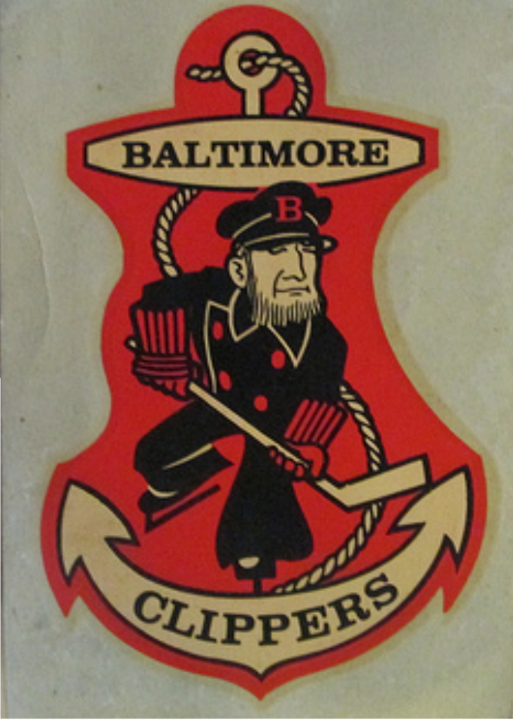
And second, and most importantly, on page 57 of this thread, you posted, on April 13, 2014, that you made an attempt to update a vintage American Hockey League logo, the Baltimore Clippers, but you gave up on it because you couldn't find a clear, decent sized photo to use.
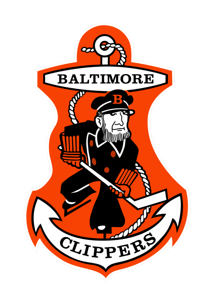
Well, as luck would have it, I recently recreated the logo you attempted using Inkscape and GIMP. I did it first by taking the second logo, with the orange outline, enlarging it on my screen, using the Snipping Tool to capture an upper and lower half of the enlarged photo, saving them, then carefully putting them together on GIMP and saving it as one.
This was the result:
With that, I used Inkscape to carefully draw around the image. I even had to research the right font for the lettering and came across one I thought was the closest. URWClarendonTMedWid, which I was able to find at a free site and download. It took me a couple of days, but this was the final result:
I even did a second one where I replaced the orange with light blue, to give it a more nautical feel. This is what it looked liked:
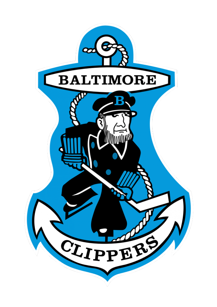
I don't know what you think of them, but I did the best I could. If you're still interested, feel free to use any of the images above to recreate the logo with your own personal touch. They're Photobucket images, so you'll probably have to click on the images to get larger ones. Whenever you can, as I assume you have a mountain of requests to go through.
Good luck, Ren.
-
1
-
-
Ren, idk what your profession is, but I sincerely hope you're making some money off of this talent you have.
I've seen dozens of logos in this thread worthy of schools/teams calling you up and begging to use.
It brings in a few bucks here & there once in a while but not that often.
Oh great and mighty Ren! I have given you a logo to update.
The Boston Celtics' leaping crown wearing Irishman:

Pretty simple. The only color needed is on the vest. All green, including the cloverleaves. Looking just like that.
Here's a larger, clearer one to help you out better:

Couldn't get it to rotate properly like the first image above.
Whenever you can, it would be much appreciated.


ren69. You... are da MAN!!!

And condolences for the recent loss in your family.
-
1
-
-
Oh great and mighty Ren! I have given you a logo to update.
The Boston Celtics' leaping crown wearing Irishman:
Pretty simple. The only color needed is on the vest. All green, including the cloverleaves. Looking just like that.
Here's a larger, clearer one to help you out better:
Couldn't get it to rotate properly like the first image above.
Whenever you can, it would be much appreciated.
-
If I could sum up one word/gesture/picture to describe your work ren69, it would be this:
Seriously dude, your work is awesome. I love that you've upgraded vintage sports logos without lessening the charm in them. Your work with U of Michigan are amongst your best. It's like you've restored the Sistine Chapel. You should be getting paid a ton of money for the work you do.
I'd give you some requests, but you seem to have your hands full as it is. Keep up the great work.
EDIT: Your latest Detroit Lions logo is a real beauty.
-
3
-


Detroit Lions Uniforms
in Concepts
Posted
NO WCF MONOGRAMS, ANYWHERE!!!