


andrewharrington
-
Posts
7,409 -
Joined
-
Last visited
-
Days Won
14
Posts posted by andrewharrington
-
-
49 minutes ago, TBGKon said:
So how do the Classic series jerseys work? Are they worn in game, pregame, or just for sale to fans?
Team Classics are just a line of retail throwbacks on the traditional CCM-style cut.-
 3
3
-
-
6 hours ago, -kj said:
Do go on...

-
11 hours ago, Brian in Boston said:
My problem with this logo...
... is the complete lack of detail on the entirety of the hawk's lower jaw. No mouth line... no lower mandible... no detail whatsoever. Minimalism taken to the extreme.
In the photo of the hawk at rest which you shared...
... one can still discern details such as the mouth line, the separation of the upper and lower mandibles, and the feather-covered rear portion of the lower mandible. They're all plainly visible here...
While the artist who designed the Winterhawks' alternate logo had every right to design a more minimalist mark, I feel the choice - and its execution - leave something to be desired aesthetically. It strikes me as a bit too stylized. There's something "robotic" about the hawk. Certainly attractive, but not what I'd choose for a team dubbed the Winterhawks.
In my opinion, small anatomical details that you have to zoom in to see are precisely the ones you want to simplify, especially in an era where a logo’s use as a social media avatar is so critical to the team’s engagement with fans. I’m not sold on the scalability of the new one after seeing the Twitter avatar, as you lose most of the detail at that size.In the old one, I read the black area under the beak as the lower beak itself (in shadow, obviously, which is why I’m not expecting to see more detail there). Honestly, I think the separation of the midtone and shadow acting as the mouth line is a little stroke of genius, giving dimension and drama to the form without adding a shred of unnecessary detail. I’m realizing the perspective of the old one—from slightly below—was one of my favorite features. You’re always looking up at a hawk, never at eye-level, and the subtlety of that made the previous one look very proud and regal to me. There’s also something really nice about the compact, ovular shape and the smooth, gestural flow from beak to feather. Is it flying overhead? Is it looking at Portland from the top of its perch on Mt. Hood? Could be either, and I really enjoyed that dynamism. I also think the four feathers and the northwest gaze in the old one are a better and clearer homage to the Chicago hand-me-down.
I can understand perceiving it as a robo-hawk, too. I don’t perceive it that way, but it wouldn’t bother me, either. I like the idea of “inventing” a unique Winterhawk since it’s not a term that’s tethered to a specific animal. The silver bird worked well enough to make the bird look snowy/icy, and I think it was a good choice knowing the logo had to work on red, white, and black backgrounds. It’s tough to make a primarily white logo look good on a white jersey (and also tough to avoid bald eagle comparisons).
Regardless, fans overwhelmingly love the new mark, and that’s ultimately what counts… even if I personally think they left something better on the table and am extremely disappointed they chose to commission a local apparel company who has a reputation for stealing art (including mine) to run the process.
This would have been baaad if he didn’t bring in Brian to save him.

-
4
-
-
On 7/9/2021 at 7:41 AM, WSU151 said:
Again, I disagree, especially when you said the barrel was dry on the “first go-around”, when it clearly isn’t. There are still quite a few ideas for every team available…even for the Leafs and Red Wings…and if your biggest concern is “Well that’d just be an alternate jersey” then I’m ok with that. The program is literally taking old jerseys and changing the colors or vice versa, or sometimes a mix. Thinking that it has to break some “new ground” every time in the alternate jersey space is just wishful thinking.
Just because you wouldn’t like a yellow 80s jersey or a black 90s pedestal or a red 2000s Blasty jersey or a white or black 2010s “Calgary” jersey doesn’t mean no one will. The Panthers could have a red version of the double blue jersey, or a navy version of the current jersey with old colors and people would still buy it.
Do I think teams like the Devils, Golden Knights, and the Islanders have a tough road ahead? Sure, but by no means was adidas “scraping the bottom of the barrel already during the first go-around.”
And to argue that “the worst possible things” does not mean (or has nothing to do with) low quality is just a really odd take. Bottom of the barrel is low quality oil…the crud
The reality, though, is that every team saw (at minimum) three distinct options, so while only one made it to the ice, every team has already said no to at least two ideas.-
9
-
-
5 hours ago, O.C.D said:
This reminds me of something I noticed in 2K21; When you see two teams that use red in a match-up and you notice the variations of red used in the NBA. From afar a lot of the reds look the same, but when compared they're slightly different. In the game the Pistons red looks almost rose compared to the Hawks.
They’re probably using the actual team colors across the board in the game, but in reality, all the reds likely get consolidated down to one or two so more garments can be made using the same fabric lots.-
5
-
-
2 hours ago, CreamSoda said:
that uniform is too dark for me. I personally think it looks better with the slate blue.
Sure, but flipping the balance so the burgundy is dominant brightens it up a whole lot, as @GFB demonstrated on the home uni up there. -
7 hours ago, GFB said:
The problem with the Avs elimination of black is that the shades of blue and red have very similar levels of brightness; there's almost no contrast between the two.
To illustrate this, I'll use these desaturated photos. When you had black in the color scheme, the white and silver were the light-tones, the red and blue acted as mid-tones, and the black acted as your dark tones. While unconventional, black equipment balanced the uniforms out because there's almost no dark tones on the sweater outside of the hockey pucks in the logos.
Once you remove black from the color scheme, the entire uniform is solely midtones and highlights. Other teams pull off "no dark colors" looks well enough, so that isn't entirely the problem, but because there's almost zero contrast between the brightness levels of the blue and the red, there's something jarring and a bit off about it.
I'll be honest that the black equipment never bothered me and I much prefer it to the current blue equipment, but if the team was going to eliminate black, the better course of action would have been meeting in the middle of the black and current blue by using the navy the team had been using as an alternate...
The contrast is much easier on the eyes here in my opinion, others might disagree. Personally, I'd hate to lose the Avs current shade of blue for another generic navy team, but I do think it's a better solution to accomplish what the Avs were attempting to do.
I came to a similar conclusion once their alternate uniform came out; pairing it down to burgundy, navy, and white is my favorite path. There’s something so fresh, crisp, and cold about this color scheme, and I totally think it would translate well to the home/road and logos. It evokes the concept of high altitude and snow much better than the medium blue and silver, in my opinion.-
5
-
-
6 hours ago, WideRight said:
Not a fan of the idea of the Jets joining the Giants by putting an "NY" monogram on the helmets. Biggest city in the country and the best their two teams can do is a "NY"? Pretty lame. NFL helmet logos tend to represent the team name rather than the city, and the Jets, if they ditch the "JETS" logo should embrace that. Unlike a giant, which is hard to depict in a logo, the Jets have an easy to depict, exciting, in-motion, aggressive team name and could maximize that rather than being just another NY team to rely on the NY monogram.
I grew up on Long Island, and I will openly admit that one of the reasons I am a diehard Bills fan is that when I was a kid I thought the green helmet "JETS" and white on blue helmet"GIANTS" logos on the helmets were boring and lame, so I found the only other NY team and they had a cool charging Buffalo, which was so much cooler. (Add to this Joe Ferguson's hail mary vs the Pats in 1980 and then his playoff game v. San Diego when he played with a broken ankle and I was hooked on the Bills).
So, NFL helmet logos should represent the team name and not the city, and your argument in favor is that a team from Buffalo with a buffalo on its helmet is the gold standard?
-
13
-
-
1 hour ago, TheRealPepman said:
Yes they did. The Climate jerseys had the adidas logo tag in front (bottom right specifically).
The Aeroready jerseys didn't have that tag.
Clima is essentially just legacy tech marketing, not a specific fabric or anything. I don’t think the materials changed when the dots were scrapped. Climalite became Aeroready, Climacool became Heatready, Climaheat became Coldready, Climaproof became Windready/Rainready, etc. Many different fabrics can all qualify to be labeled with the same tech by meeting certain testing measures is all.-
1
-
-
3 hours ago, gosioux76 said:
What a nightmare and, simultaneously, a perfect metaphor for the current state of NBA aesthetics. Not only will we make your team schizophrenic, we'll now combine all of its personalities onto one uniform! Good lord.
Didnt we already do “Time Warp Mash-Up” with the Cavs ten years ago?
-
4
-
-
13 hours ago, Old School Fool said:
Watching the Thunder doesn't make you want to get a crappy hot dog from a convenience store?
Design Brief“Gas station/NASCAR fire suit, but make it drip. Thx.”
-
9
-
-
On 5/20/2021 at 12:43 PM, BBTV said:
Who else used the rounded nameplates like that? I'm sure someone did.
The only other team I distinctly remember is the University of Miami, but I think it was somewhat of a Nike signature for a very specific and limited time period. -
23 minutes ago, DNAsports said:
Even pre-Nike is a bit wonky to me. I’ve never been able to differentiate what is it isn’t a sleeve/shoulder stripe on those. Or even if there is a sleeve/shoulder stripe. Is it supposed to be a reverse UCLA type thing? I legitimately have no clue.
Gotta go back to the original.It was actually an oversized NW stripe with the TV number in the center. The bottom part of the design eventually got chopped away, and now it’s more like contrast sleeves with a UCLA stripe at the edge.
-
2
-
-
18 hours ago, WSU151 said:
I liked the double outline on the Bruins' 95-97 white jerseys (black/yellow/black), but a single outline always looked best on the black jerseys.
If they can reverse the colors of the current spoked B (a la the 80s/90s logo) that would be fine with me. I always kind of liked how the circle and the B were yellow on the old black jersey.
Exactly. You can see on that tweet/photoshop they used the current logo and just flipped the colors to the way they were applied on the old mark. Looks fantastic. Would do wonders for the Bruins’ look, in my opinion.-
4
-
-
4 hours ago, CaliforniaGlowin said:
Btw, that is not the final jersey, that was a placeholder when the branding launched.
Source?-
4
-
-
On 5/6/2021 at 2:40 PM, oldschoolvikings said:
Why not just build in the compression sleeves, tights and what have you, into the material, and not market uniforms so thin you tell the player's religion?
Because then you can’t sell compression sleeves, tights, and what have you. Duh.
In all seriousness, there’s too much personal preference at play to build baselayers into a uniform piece. It honestly wouldn’t surprise me if there was something in the CBA protecting players’ baselayer choices.
-
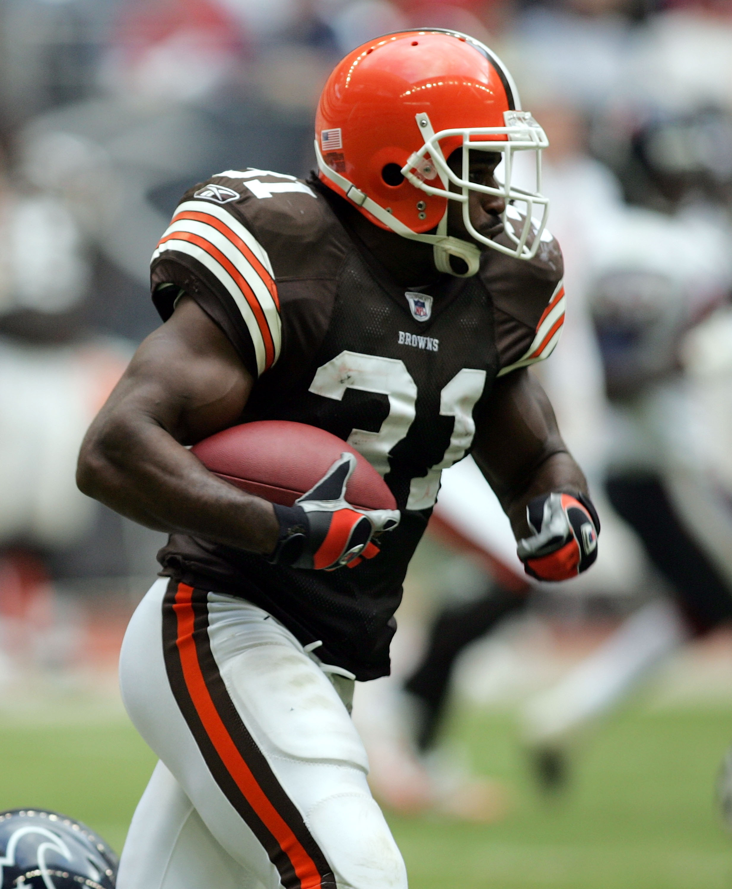
1 hour ago, PERRIN said:
As traditional as it is, I've got to disagree. I feel like I've mentioned this several times already, but it should really be Brown/Orange/Brown. on the all white combo, it makes the pants clash with the jerseys, which are B/O/B/O/B, dark surrounding light. would it look much better? Not really, but it would definitely be more consistent and stick out less.
48 minutes ago, Lights Out said:I don't like white pants on the Browns at all
(the orange pants are the only ones they really need) - but if they have to have them, brown-orange-brown stripes are definitely better than the alternative, which just looks off.
Theoretically, they could also do Florida Gators-style "floating stripes" (orange-brown-white-brown-orange) to match the helmet and that would look better too.
This uni (is that William Green?) looks too brown-heavy to me. Orange trimmed in brown on the pants makes the helmet look out of place, at least with the brown jersey. You need the extra orange on the pants to balance the helmet and hold up against jersey and socks. An orange-dominant pant stripe or orange socks are the best way to do it, and I don’t see the Browns going for orange socks with Cincinnati in the div.-
8
-
-
On 5/3/2021 at 7:39 AM, Gothamite said:
I don't believe that. Not that I doubt the facts, but it seems inconceivable that the best brand in lower-level American soccer came from the same firm that gave us this mess.
Seems like the teams may share ownership, but they sure as hell don't share staff.
Now that I believe.
Looking at all their work (Planet Propaganda), I think Forward may have been the exception rather than the rule. Even that one, the art style is a bit simplistic for me. They’re an older agency, looks like they’re really entrenched in that mid-2000s Minneapolis look as far as design goes.The fact that Forward is tossed into their catch-all “Hits, Rarities, & B-sides” section tells me sports identity is not their passion or focus, so it’s also possible they contract outside the agency for projects that are beyond their specialties.
-
1
-
-
24 minutes ago, DiePerske said:
Miscounted ha.
Also, the duplicate numbers would probably get pretty confusing.
-
6
-
-
8 hours ago, LA Fakers+ LA Snippers said:
But the current commissioner was the deputy back then.
In other words, he spent decades waiting for his boss to retire so he could “unleash his innovative brand of creativity” and “free the league from the draconian identity restrictions of the 1990s.”-
9
-
-
14 minutes ago, WSU151 said:
Looks like they have one name per list that's better than the rest of the list. Notice how Redtails, Redwolves, and Warriors aren't on the same list.
I’m no information expert, but it seems like giving different people different lists would skew the data, no?Or does each person go through all the lists? In that case, it does seem like they’re trying to capture data that reinforces their preferences.
-
1
-
-
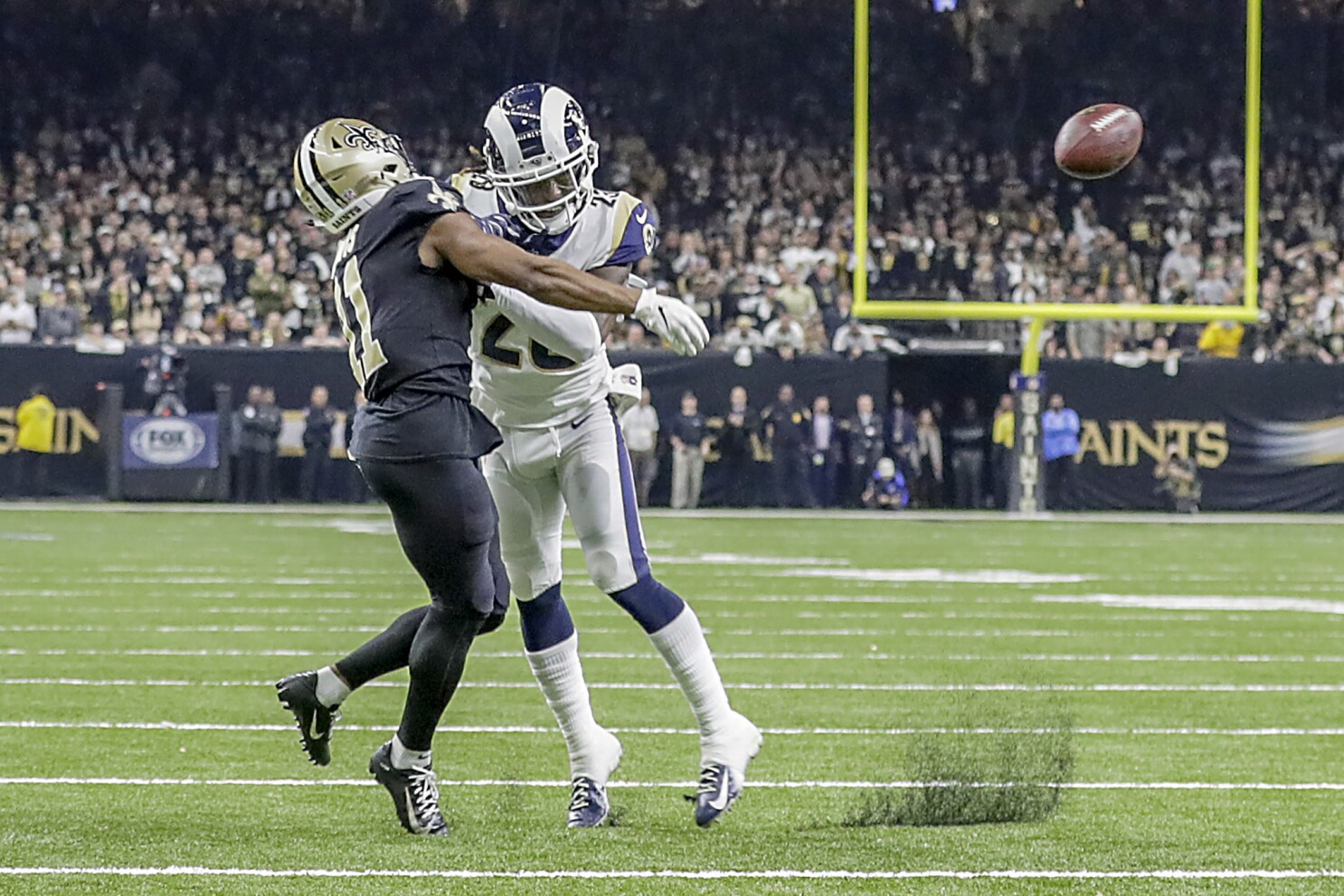
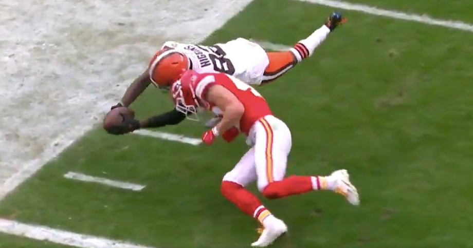
35 minutes ago, MJWalker45 said:
That Kansas City Cleveland call alone should have been the impetus to fix plays like that. College can go back and fix it, the XFL could go back and fix it, the AAF could have gone back and fixed it but god forbid the NFL referees fix an obvious call.
these should never stand simply because the foul wasn't called on the field. Even when the teams could challenge pass interference they were rarely called, if I remember correctly.
Sorenson wasn’t even fined for that hit on Higgins. No discipline whatsoever for the most dangerous play of the playoffs. This is why the NFL isn’t taken seriously when it purports to be genuine about player safety.The team also posted it as a highlight and even called their own guy “Dirty Dan” in the tweet.
-
13
-
-
12 minutes ago, BBTV said:
Zach Ertz has been one of the most popular players on the team and biggest sellers for around 7 years give or take. I'd expect they'd have plenty of stock of 86 (though he's likely to get traded by the draft).
It’s irrelevant. Think about the amount of time and money/expertise required to set up a green-screen photo studio, get the position right, get the camera settings right, get the lighting right, capture the photos, cut out the background, and color correct the image...Versus opening up the blank Eagles jersey, typing the correct name and number, and exporting it. No one is going to take individual photos of every SKU given the alternative.
Heck, some of this stuff isn’t even done with photos anymore. Almost 100% of the photos in the IKEA catalog are composited 3D models now. Same with car commercials. Nike’s signature graphic tee and jersey thumbnails have a very smooth, idyllic look to them, which makes me think those are 3D models.
-
2
-
-
1 hour ago, Lights Out said:
By that logic, wouldn't a white facemask be better? It doesn't get more "neutral" and "invisible" than being the same color as the rest of the helmet.
White and black aren’t neutral in terms of brightness/value. They’re actually the least neutral examples of achromatic shades.52 minutes ago, henburg said:I just don't see grey as a neutral color at all, regardless of the unique, old-fashioned traditions within baseball. I mean, this board coined terms like GFGS for a reason, right? Otherwise, I think that uniforms like these might wouldn't get so much hate.
Aside from that, you can't look at modern helmets like the Jags or expressive helmets like Bengals and tell me that a grey mask looks good for them. Any "one size fits all" mentality toward aesthetics is a bad idea.
It’s just context. Grey isn’t intended to be neutral in any of these. It’s the star of the show, which is why it doesn’t communicate the same way.21 minutes ago, BBTV said:Not sure if this is something or not, but the Eagles black jerseys are shown on their site without TV numbers. The green and white have them. https://store.philadelphiaeagles.com/mens-philadelphia-eagles-zach-ertz-nike-black-alternate-game-jersey/p-23326864913882+z-883-856968152?_ref=p-DLP:m-GRID:i-r10c1:po-31
EDIT: It's inconsistent - some black jerseys have them, others don't. Still, they don't need to photoshop these so I'm not sure how an error would be made.
Many of these are photoshopped. The number of photos that need to be continually created and edited, year after year, players who switch teams, new designs, number changes, et cetera, is enormous. There are also sometimes minor differences between jerseys that come in finished with the player’s name and number already (typically the biggest stars) and jerseys that come in blank and are printed domestically with the player’s name and number (which are usually overflow orders and players with more niche followings).


NFL Changes 2021
in Sports Logo News
Posted
Love these. I hope they keep them around and add a fauxback white helmet with the pants stripe on it.