


andrewharrington
-
Posts
7,409 -
Joined
-
Last visited
-
Days Won
14
Posts posted by andrewharrington
-
-
10 hours ago, MJWalker45 said:
So they're using Army camo for a Navy battleship that deployed Marines.

What makes it “Army camo” as opposed to “the camo from the actual ship?” -
I think that USF uni is the first look at adi’s woven option. At last, a high-caliber alternative to Primeknit.
-
5 hours ago, Buc said:
Sooo...is that to imply that the original white jerseys weren't NCAA compliant? And if not...you mean to tell me no one thought to check with the NCAA to see if the (re)design was compliant before unveiling them in the first place? And did they not learn from Florida State's blunder five years ago? (Speaking of blunders...yeah. I still don't know how that one got past the NCAA compliance people.)
Honestly, I don’t know if the NCAA requires pre-screening uniforms for compliance. I know we do so as a courtesy to the schools (definitely cuts down on headaches and is one less thing for a busy staff to worry about), but I think some tend to treat it as a “it’s better to ask for forgiveness, not permission” situation.
-
 1
1
-
-
Someone at Temple must be a great negotiator. Despite being a small school with little mainstream success or nationwide brand clout, they’ve been able to get their outfitters to give them a high level of customization for several years now. I’m not sure I love these uniforms, but good on them for standing up for what they think they deserve.
-
5
-
-
2 hours ago, aawagner011 said:
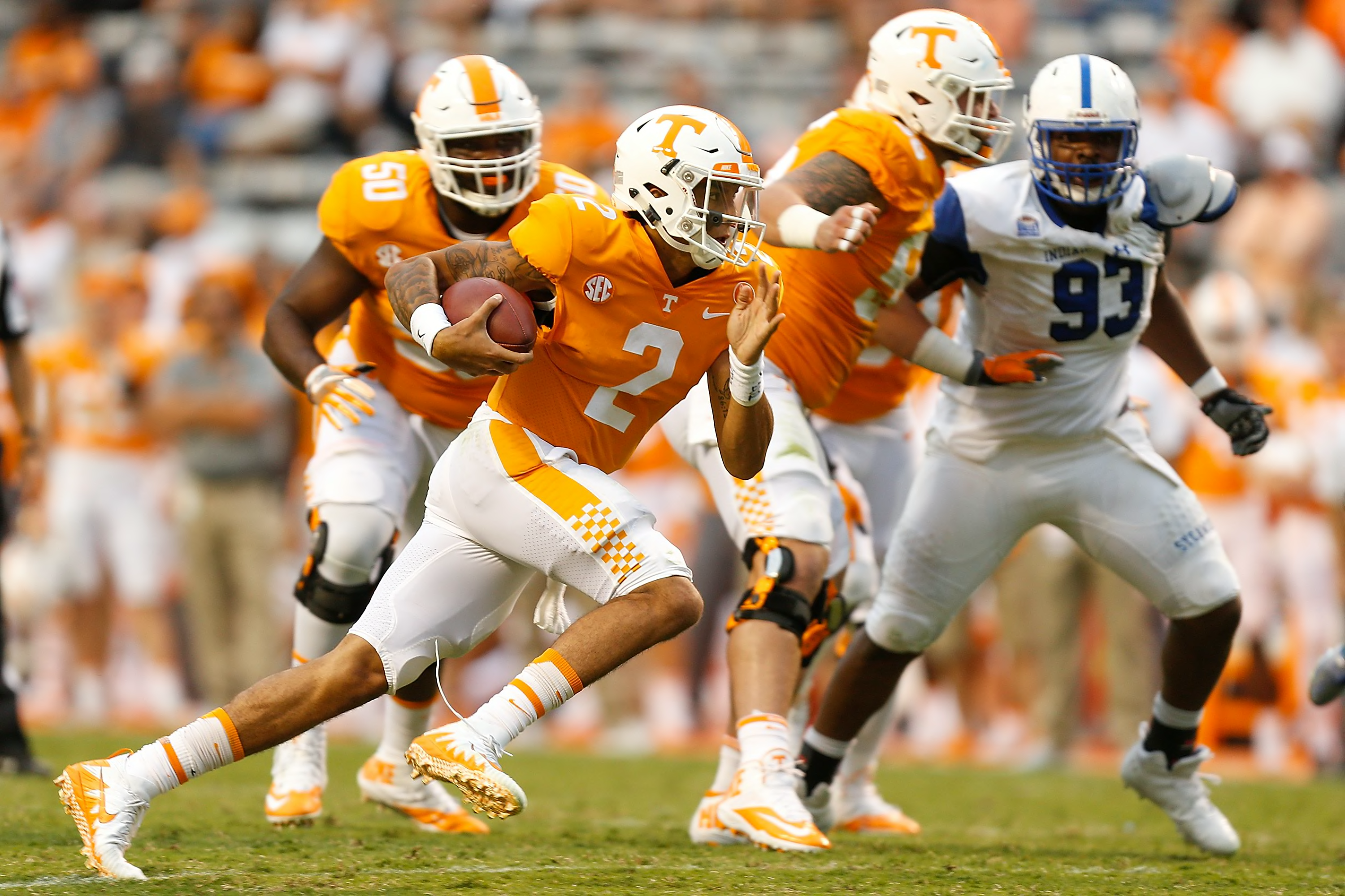
I prefer the double stripe over the plain white pants. But I also really liked the previous single stripe with the checkers. It was a subtle and clever way to integrate another part of their identity into the uniforms. It did not drastically change their design and was still a traditional look. I also liked how it matched the helmet. From the front, it was the same Tennessee we all knew but had a little extra flair on the back of the helmet.
Man, that was the pinnacle of aesthetics for UT. Classic with just a hint of distinction (the wide stripes, checks, and subtle “moonshiner block” numbers). Loved it.-
4
-
-
On 7/16/2020 at 3:50 PM, the admiral said:
Maybe I should get used to the fact that it's going to be nothing but performative gestures everywhere we turn while everyone's actual lives just keep getting worse!
It was a direct request from the student athletes, so I don’t really see it as an empty, performative gesture from the school.-
5
-
-
5 hours ago, CaliforniaGlowin said:
The eyesore to me is another damn animal logo, especially when your team is not named after an animal.
I think it’s cool that several UC campuses share the bear as a mascot given its association with California iconography, and I think this one is quite creative. It would have been significantly less exciting if it was just tartan, and significantly less creative if it was a literal highlander. I think the approach they took merging California and Scottish traditions is a benchmark for creating a unique identity.As far as the monogram goes, I don’t mind that the R is the isolated character since that’s the distinguishing feature of this particular campus compared to the other UCs, but there’s something nice about the symmetry of bringing the C to the front.
Is there an explanation anywhere for why the monogram is oriented with the C dropped below? My first thought upon seeeing it was to make the leg of the R vertical and adjust the spacing between the ends of the C so that there’s a defined H hidden in the negative space of the C and R.
-
4
-
-
On 4/29/2020 at 12:25 PM, hawk36 said:
This is a great uniform but just needs a slight refinement... With so much going on the outlined numerals unnecessarily clutter. Look at the flag, no outlines, keep that in mind and use sold black or solid red numerals and it all comes together nicely.
Absolutely. A simple lack of cohesion and balance/hierarchy has long been a weakness in so much football design.You’ve got enormous flag graphics on the two most prominent parts of the uniform. You don’t need more of that pattern shrunk down and printed on the numbers. It’s redundant clutter. The aforementioned graphics are full color, and huge. You don’t need little slivers of those colors on the digits. Solid color numbers would complement those big graphic blocks spectacularly. Gimme a solid black number with red team and player name, or vice versa.
-
4
-
-
On 4/24/2020 at 10:26 AM, WSU151 said:
New uniforms are on the way for all sports, which kinda sucks for football, as I thought they looked great the past two years. Hopefully they keep the same essential look.
The Nikespeak on pretty much all these new marks is pretty nauseating. They mention "fierce" seemingly 89 times, and the font was based on circles and lines found on the Rotunda blueprints...because circles and lines are never found anywhere else. And there's some other nauseating lines...but MOD EDIT.
Man, I thought I was being overly facetious with the compass and ruler joke...
You’ve got to ask yourself if people can understand the ideas you’re trying to communicate. Do people know about these blueprints? Do they have access to them? Are you presenting the work in a way that connects the two for your audience? If the answer is no, or even maybe, then the value of the idea is questionable, in my opinion. That’s not an inherently bad thing, but here, they’re relying on that idea to essentially excuse the type for looking overly geometric and lacking polish, and that’s trouble; if people can’t understand the why, all the context is gone and you’re left with a bad piece of type.
I didn’t even make the connection that the new numbers look much more like Tech’s at first glance, either. Puzzling move, all around.
-
3
-
-
On 4/24/2020 at 8:52 AM, MJWalker45 said:
Numbers and wordmarks form the school's site.
https://logos.virginiasports.com/#marks
https://twitter.com/VirginiaSports/status/1253707882136252418/photo/4
That type is... rough. It looks like the brief said, “We want a new wordmark that’s clean, sharp, and looks toward the future, but it’s very important that you only use a compass and ruler to create it.” This needs major optical corrections before it looks polished.Also a great example of what happens when your verticals and horizontals are the same thickness; the verticals look thinner than the horizontals in some cases.
-
4
-
-
12 minutes ago, stumpygremlin said:
The "Walking Deacon" instantly reminded me of Washburn University's Ichabod logo. They're close enough, I think, that Washburn could ask to have it changed. I say that based on Iowa vs. Southern Miss.
I honestly wouldn’t be surprised if they get a letter from Johnnie Walker, either.-
1
-
-
7 hours ago, CaliforniaGlowin said:
I just saw on ESPN a women's soccer team called Sky Blue FC. I looked them up to see what they look like. Their colors? NAVY AND ORANGE. YOU HAVE A LITERAL COLOR AS YOUR TEAM NAME AND DON'T USE IT?????? Are the Crimson Tide not crimson? Are the Purple Aces not purple? It shouldn't bother me so much, but use your freakin heads, people!!!

They’re obviously referring to night sky, not day sky.

-
6
-
-
On 8/10/2019 at 5:17 PM, pepis21 said:
There is a lot of similar fonts, but they need to be redone in few places. Of course you don't have that font and you can't share it with other people, right?
")
I do have it, but I can’t share it.
In general, if you’re looking for really nice sport-inspired typefaces, I highly recommend CJ’s Varsity Type Foundry. If what you’re looking for isn’t available, odds are he’s got something in the works, so keep an eye on the Varsity Type Instagram as well.
-
3 hours ago, MattMill said:
So they had thousands of caps made, also for the typo? I don't believe you.
They also added a pug logo to the already wrong IRON PUGS wordmarked shirt?
That's laying on the lies thick to correct one mistake And 3,000 shirts is nothing.
This is all a ploy.
Was this also a spell check issue too?
INOM PIGS
No. That’s just an issue that could easily be fixed by not having open fronts on baseball jerseys. Sew that placket shut and it’s fine.
-
1
-
-
On 7/9/2019 at 7:15 PM, pepis21 said:
That’s one of adidas’ brand fonts (though it shouldn’t be horizontally squashed like that). I bet there’s something with a similar look out there, but I’m not sure what.
-
1 hour ago, BrandMooreArt said:this roo definitely lifts! solid, iconic silhouette here and some interesting line work that divides light and shadow. i don't love it, but its a detail you dont see very often; cant think of another mascot logo like that. they probably spent a good amount of time fine tuning the yellow and light blue areas to make sure the lighting and form was right. the right (viewer left) arm might be a bit short? im not a fan of these kinds of illustrated animal-human logos, but for what it is, this one is alright.odd choices on type all around. the angles and cuts on the letters are all over the place. theres not a single attractive letterform in "Kansas City" and that particular "C" is just gross. the thin, white outline against yellow is blasphemy, strokes should never be that thin and i dont believe in putting white against yellow like this. whats the point? KC is widely tracked and never kerned. look at the space between T-Y or K-A. The University line is as much of an afterthought. Leading all around too tight as well. It truly feels like they worked the whole time on the mascot and phoned in the typography on the last day. The monogram on mascot chest has nothing in common with the other type either.
"Evoking the past while creating a new future was a major goal of the project." — thats from the linked article. is everyone taking Nike's tagline as their ethos now? even Adidas is saying the same kind of thing.For what it’s worth, every single time a team briefs a project (in any sport), some variation of “inspired by the past/built for the future” is in the brief somewhere. It’s a natural byproduct of internet comments becoming a primary means of critiquing design, and it’s resulted in a “follow the formula or risk stoking the ire of Twitter” mindset throughout the industry. No one wants to take a risk when there’s so many dollars and reputation points on the line.
-
2
-
-
On 6/20/2019 at 6:28 AM, WSU151 said:
I see a possible lawsuit coming from the Gators about that F.
It’s notoriously difficult to protect the design of plain letterforms and typefaces. They’d have to show the court that their F is so unique or so associated with the school that the end result would inevitably cause confusion, and both color and proximity factor into that. UF would have a good proximity argument, but I think they’d lose on color, because FT would argue that there’s no way in heck anyone would ever mistake a garnet-colored logo as belonging to UF.
-
2
-
-
5 hours ago, dont care said:
Which is why I said I don’t want it in the mlb, or did you miss that part?
I missed it... because it’s not mentioned in the post I quoted... which was a post pertaining to its purpose in MiLB, not MLB.
-
52 minutes ago, dont care said:
Because both are completely changing their entire identities for a day. Either way they are taking away from their primary brand and making their actual fans not expirience their best looks they’ve come to know and love.
But how many people care about an MiLB team’s dilution of their own brand when the act of dilution is often what makes the kids laugh and gets the parents to take the family out to the park for the “one night only” swag in the first place? The brand audience for an MiLB team compared to an MLB team is like a lemon compared to a bowling ball.
-
4
-
-
On 1/16/2019 at 3:45 PM, B-Rich said:
While "Baby Cakes" is certainly less 'clunky' than "King Cake Babies" (and there is no doubt, THAT is the prime focus of the imagery, a king cake baby), 'Baby Cakes' is just as 'clunky' as 'King Cakes'.
You're basically agreeing to my point-- that the owners and Brandiose came up with this monstrosity to market not to the locals, but nationwide. There is nothing 'authentic' about the name whatsoever, no matter how much Mardi Gras imagery you stick on it; and the name is a slap in the face to locals. And while I agree that it is easy to draw the line from Baby Cakes to "Oh, they're talking about a king cake baby", you miss that the immediate extension of that line, from locals young and old is "what the f...? Why would they even DO that?"
Oh, and re: crawfish and 'mudbugs', sure. That's a common nickname. Long time name of a Shreveport's hockey team. But 'swamp lobsters' would be seen as what it is, a completely made-up and original contrivance (though a better fit than Brandiose's "Red Eyes')
Well, your impressions are wrong, and a little lackadaisical. "You get the crown and you're 'king for the day' or whatever". What's this crown crap?... Ain't no crowns involved in king cake, and no 'king of the day'. And while we Southerners (and particularly South Louisianans) ARE great hosts, the king cake routine is nothing like that-- cakes are typically brought into office break rooms for workers to nosh on all day, or kids bring them to school to share, etc. And whoever gets the piece with the baby gets the next one.... if a king cake is at any party, or on a folding table on the parade route, they have about as much attention as the cheese dip, Popeye's chicken or mini-muffaletta trays.
And you are right about there being commemorative 'cake figurines', but those are different and separate from the king cake babies. King cake babies are cheap plastic things that are stuffed into (or under) a warm cake:
The commemorative figurines, however, are porcelain, not plastic; are made by ONE bakery in town (Haydel's); come in their own separate Ziploc package OUTSIDE OF THE CAKE in addition to the baby inside the cake; always represent some aspect of Mardi Gras and New Orleans; and a different one is produced every year. And yeah, my family does have a collection of those commemorative figurines which display and add to every year.

Whenever you can come on down to New Orleans, give me a holler-- I'll show you what it's ALL about.

Thanks for the rundown. Very informative. I think I heard about the crown and “king for the day” custom from a college friend. Maybe it was his family tradition or something. Most of the documentation I can find on the subject of finding the baby, however, does paint it in a positive light, the only negative aspect, as you said, is having to bring the next one.
Additionally, I totally understand not being on board with the concept of national marketing for a regional team, but given that’s obviously the goal for teams that are branding themselves in this manner, I still contend that Baby Cakes works better in the pursuit of that goal. It piques the curiosity of outsiders who aren’t familiar with the king cake tradition, which is a good move when trying to increase the reach of your brand. For better or worse, it engages (some) people to think, “What a silly name. I gotta check this out.” Then, before you know it, it’s, “OMG their logo is an angry king baby breaking out of a pastry! How outrageous! Take my money.”
-
6 hours ago, B-Rich said:
Now you're just reaching.
"There's a lot of background research into the names". As I posted back in 2016 when the name was announced, from a local newspaper article that quoted directly from the Brandiose guys, they were here barely 2 DAYS doing on-the-ground research. And to say, "specifically Baby Cakes would only work in New Orleans" is flat out wrong. It doesn't even work IN New Orleans. Brandiose and the out-of-town owners stated that they DERIVED the name; it is NOT even a real thing (the local term is and has always been "king cake baby"). They stated in their finalist name descriptions that a king cake baby "was sought after", while New Orleanians know the exact OPPOSITE is true-- you don't want the piece with the baby, because by tradition then you have to buy the next cake. Swallowing the baby or not owning up to getting the piece with the baby is even a long-running joke around here.
Not knowing these things is the kind of "lot of background research" these guys do. That's why 91% of respondents in an online poll after the name was announced HATED the name.
These guys were so clueless that another one of their finalist names was "Red Eyes" for crawfish, despite the fact that (a) Crawfish do not have red eyes, and (b) NO ONE HERE HAS EVER CALLED THEM THAT.
It's relevant because this was the point of the name change all along. Nothing to do with building local interest, or picking a name that locals would go for, it was a short-term cash grab, which the owners essentially even admitted to.
Minor league merch-- just like MLB, NBA, NFL and NHL merch-- is now sold all over the country, so they came up with the most 'whimsical' "cute' 'silly' (stupid) name that would sell the most merch nationwide-- not to locals in New Orleans, 91% of whom disapprove of it and who see the name as a joke-- but to the many more people in places like Atlanta, Tampa Bay, New York, Boise, etc. who want to wear something cute and recent and 'out there'.
4 hours ago, Brian in Boston said:Well, then the quality of the background research being done isn't up to snuff. If it were, someone would have realized that "Baby Cakes" doesn't truly "work" in New Orleans, as the cultural icon being referenced is actually a King Cake, not a Baby Cake.
Either that, or - as is more likely - someone decided that King Cakes wasn't a goofy enough name to lend itself to an over-the-top logo package. So, it was then decided that in order to justify the creation of a goofy logo with attitude, the idea of a king cake would be mashed-up with the idea of the baby figurine baked into said confection and the bastardized "Baby Cakes" identity was reverse-engineered.
In short, there's a reason the name New Orleans Baby Cakes hasn't been "around since 1930": it doesn't mean anything within the culture of the New Orleans marketplace.There are some good discussion topics here:
Being able to travel to do research is a luxury, and you often pay for that out of your own pocket. If you’re taking research trips, it means you’re taking your job seriously, literally spending your own money in order to do a better job. And yes, you can learn a lot in two days.
If you’re committed to naming your team after a religious pastry, why does the team need to be exactly the name of the actual thing? Why not use some creative license to make the name a little catchier? I’d argue that Baby Cakes is a better sounding name than King Cakes (which is a bit clunky), and debate the nationwide marketing approach if you’d like, but given that approach, I’d say Baby Cakes is the better name. It’s simply more recognizable and familiar to people as a fringe-level term of endearment, meaning it’s inclusively marketing those who don’t know what a king cake is (which is probably a lot of people outside the Gulf Coast region). If you do know what a king cake is, I think it’s pretty easy to draw the line from Baby Cakes to, “Oh! They’re talking about a king cake.” I mean they’re called crawfish, but you could probably figure out what I was talking about if I said mud bug or swamp lobster.
Lastly, I’ve always gotten the impression that it’s good luck to find the baby. You get the crown and you’re “king for the day” or whatever. Sure, you’re chosen to supply the next cake, but I’ve never met someone from the south who *didn’t* want to cook for you or host a party.
Ive even seen people with collections of various cake figurines, so I’d say “sought after” accurately describes the cake babies in some circles.
-
On 12/30/2018 at 8:32 AM, SFGiants58 said:
I'd love to know if there's a font that closely resembles this one (curved lead-in to slab serifs, that spot on the end of the "R," and the right-heavy "A"):


That particular style of slab serif typeface is commonly referred to as Clarendon, of which there are many different examples out there (of varying quality). A condensed option will likely get you close.
-
1
-
-
12 minutes ago, umlegend1980 said:
So there's kind of a connection with the Bills logo being a Buffalo or Bison I guess?
Precisely. The Bills are named for Buffalo Bill Cody, and Cody was famous for being the best bison hunter in the country; that’s how he got the nickname “Buffalo” Bill.
-
2 hours ago, umlegend1980 said:
I think of the Buffalo teams using a Buffalo when I see this. The Sabers at least have Sabers in their logo. The Bills have nothing reflecting Bills and this has nothing reflecting a Warrior. Cool logo, but can't be primary.
Buffalo Bill Cody lived in western New York immediately following the Civil War (three of his children are buried in Rochester, I believe). Not long after that, he was contracted by the Kansas Pacific Railroad to supply bison meat for its workers. Essentially, he was a professional bison hunter during that time.
-
1
-


College Football 2020
in Sports Logo News
Posted
The pattern that matches what’s on the ship and not what the Army wears?