


andrewharrington
-
Posts
7,409 -
Joined
-
Last visited
-
Days Won
14
Posts posted by andrewharrington
-
-
8 minutes ago, CS85 said:
All those uneven serifs...I dunno, something about that logo feels poorly done.
That’s why they fixed it.

-
That is subtle AF, but they did a good job.
-
 34
34
-
-
On 6/24/2018 at 3:48 PM, Lights Out said:
The color balance absolutely was not better in the past. There was no pewter at all on the jerseys in the '90s set. Pewter was and is their unique color, yet they managed to leave it off the jerseys entirely in favor of generic red and black. Their current uniforms are a big improvement in that regard.
Just because it’s their unique color doesn’t necessarily mean it’s best applied everywhere; it’s never appeared in any of their logos or typography, either.
I do like it on the shoulders, but I thought they were good without it as well. The full red/pewter combo is on the borderline of too much dark color for me, though.
On 6/26/2018 at 3:02 PM, KRZYBDGRZ said:Yes please explain.The weagle is sleek, makes the capitol building, and is unique. If the capitols got rid of the edge template, and turned back to copper, they’d be set.
On 6/27/2018 at 9:45 PM, Jamikel said:Every time I look at it, all I can see it how anatomically FUBAR that eagle is. The forced W shape makes it look like its wings are coming out of its butt.
This is my biggest issue with it. The silhouette is so stylized that it looks almost butterfly-like. I really think it’s just trying too hard to do too many things. A more anatomically sound shape to the wings would do wonders (the Capitol already tells you it’s Washington, so the W is redundant), and I don’t like the contrasting head of the eagle in conjunction with the Capitol cutout. I know it’s supposed to be a bald eagle, but especially on a dark background with a keyline, it creates a strange composition, with one focal point stacked on top of another. The golden eagle on the seal posted above is a good example of the head not needing to be white to get the point across. I also think, in general, the style of it is a bit similar to D.C. United, and both those changes would help differentiate it.
-
1
-
-
On 5/21/2018 at 6:33 PM, B-Rich said:
If it's "Greenbow" Alabama, why couldn't they use green in the color scheme?
They could. They chose not to.

-
2
-
-
On 4/12/2018 at 10:18 AM, rjrrzube said:
You know, that's not really that bad. Although I would say have a LITTLE orange, just to tie it to their history. But brown and white ain't awful.
I’m a Browns fan, and I love their classic look, but I’m okay with them adopting a new look as long as it’s well done. I’ve gotta say, I’ve long been intrigued by this idea (among others). Throw some orange stripes on either side of the brown stripe (and add matching pant stripes), and I think you’ve got a nice, clean look that has historical roots.
-
On 1/23/2018 at 11:09 AM, raysox said:
Here’s a big reveal from the Broncos logo designer with a ton of sketches of potential logos
https://www.behance.net/gallery/61221339/The-Denver-Broncos-Identity
Safe to say they ended up in a pretty nice spot, much better than the early proposals.
These niche, tangential stories (uncontrollable forces of nature!?) are the kind of thing that carry too much potential to be lost on fans and have made professional sports design a punchline in the years since.
-
On 2/13/2018 at 9:40 AM, DustDevil61 said:
The majority of Vegas Golden Knights jerseys on eBay are fake, but the one posted below looks pretty close to a proper replica. The screened-on tag and the numbers are what makes me wonder the most, though.
The nameplate lettering is a dead giveaway. It also looks like the numbers may not have the proper glittery trim, but most importantly, they’re not perforated.
-
The logo's drawn quite capably. I like how the small X follows the keyline of the large one, but the verticals of the F and L feel a little light as a result of the X being so fat. I see they wanted the upper right point of the L to perfectly meet the X, but I think they need to slim down the X in the wordmark a little to make it work. I would have even connected the F right into the L (maybe with an angled terminal on both letters), just like the X bleeds right into the F. I would have also stripped it down to a single keyline.
As for the marketing so far (give football back to the fans/red, white, and blue), I fear the main focus of this league is going to be an anti-NFL, "where players respect the flag and our heroes" brand.
-
2
-
-
7 hours ago, the admiral said:

Brush it off. This person didn’t know that the Steelers’ logo was pertinent to the steel industry, for cryin’ out loud. Much to learn.

-
That's really closer to Futura than Avant Garde, but it's kind of a mashup of both really
It's based on Avant Garde.
-
I wouldn't mind if ALL facemasks were gray, as long as all uniforms were somewhat traditional-looking. I love the Broncos in yellow. I love the Buccaneers in orange. I love the Browns' look through and through, especially the logo-less helmet and even the brown pants. Hate numerals that have any sort of extra embellishment on them. Block styles and plain round styles (Bears, Bengals) are it for me. I don't mind monochrome in football. I love different colored jerseys and shorts in basketball. I also love big design elements like horizontal stripes, or big singe chest stripes, diagonal sashes, etc. I like bringing the 'soccer look' or the 'rugby look' to other sports. Using stripes creatively is much more difficult and yields a much better result than 'creatively' blocking in colored panels and tapered stripes like all these modern uniform designers do.
-
Really? Nobody has posted this yet?

Perhaps it wasn't posted because after 6 or 7 championships, LeBron will be best remembered as a Miami Heat.
No, he will be best remembered as a douchebag.
Not only will Lebron be remembered as a douche, but he will also be remembered for not being able to win the big one.
But mainly for being a douche.
Correct. He will win the big one, but he'll be best remembered for not doing it in Cleveland. I mean, not that anyone else can win the big one in Cleveland either (because it's basically impossible), but the last time we had the best player in their given sport for 7 years was hen Jim Brown was playing, and even he only led the browns to one ring. The championships in 1950, 1954 and 1955 were before his time.
-
I have a printer asking me to put a 1/8" bleed all around on a poster I did for an organization that they are getting printed. The poster size is 11x17. Would it suffice to just to make the image size 11.125x17.125? I'm working in Illustrator by the way.
The odd thing is they want it as a PDF so it's not like they can see the bleed marks or anything since it isn't a AI or EPS file they are getting.
It seems in this case that increasing the image size proportionally by 1/8" of an inch on each side would make the most sense?
No, no. If your print is 11.125 x 17.125, that only gives you a 1/16 inch bleed all around. Your print (pre-trim) needs to be 11.25 x 17.25 so you have your 1/8 inch on each side of the edge. And you will set up the .pdf to show the crop marks and bleed, otherwise they will trim into your artwork. Here is a pretty standard prep:
Make your artboard (document size) in Illustrator 11 x 17. Drag 4 guidelines outside the artboard, 1/8 inch from each edge. When you compose your layout, make sure the edges of all bleed images are placed at or beyond these guidelines. Now, while you are saving the .pdf, click the 'Marks & Bleeds' tab on the left. In the 'Marks' section at the top, I usually check 'Trim Marks' (also called crop marks) and 'Registration Marks.' In the 'Bleeds' section underneath, specify 0.125" on each side. Click 'Save.'
Illustrator will automatically expand the artboard to show the extra 1/8 inch and it will add your trim marks and registration marks. I should also add that the trim and registration marks are not completely necessary, as some of printers prefer to set those things up themselves, but make sure you have that 1/8 inch extra all around, meaning you have to increase your page size by 1/4 inch in each direction.
-
How about this font here?

What is the name of it?
That looks like a Michael Schwab illustration. If it is, I can tell you that he does all his own lettering by hand, which is why you see all those little imperfections in the letters and spacing and whatnot. So, while there's nothing exact, the closest matches I've ever found are: Telegrafico (The S is definitely different, but it's free). Gotham (Looks like they were looking at the same set of letters for inspiration, but this is more precise with less quirkiness). Proxima Nova (This one's got the same sty;e of G that Schwab uses). Neutraface No. 2 (Pound for pound, the character of this font [the Display Titling weight] is probably most like Michael Schwab's lettering).
-
Does anybody knows what the font used for "RED POP!" is? It would be prefect for a project I'm working on.
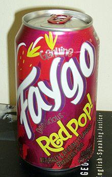
In my professional opinion, that font is not perfect for any project. Ever.
-

Does anyone know what font this is?
-

The Levitra logotype.
-
Nailed it. Thanks.
-

From the L.L.Bean holiday catalog. This is actually the typeface used in the current L.L.Bean logotype as well. It's beautiful, and there are some big, clear examples of it in the catalog. Something like the capital G might be a dead giveaway, but I just can't pinpoint it for the life of me. Great set of italics to boot.
-
I have a Illustrator question. How do I make text arc? I'm trying to a get the text to look similar to this.
Thanks.
Make a path in the shape you want the text to follow, then click on the T for Text Tool and hold it down.
This will open up other text tools.
Click on the one called Path Type Tool, which is a T on a downhill angle.
Click on the shape, then typoe the texy.
You can move the shape around once you've got the text on it to get it exactly right.
When you're happy with it, convert the text to Paths and you're done.
A method that works better for me is to type whatever you want, right click-click on create outlines, then go to effect->warp->arc
This method distorts the letters, though.
-
don't use a stroke. go to OBJECT > PATH > OFFSET PATH. it looks like a stroke, but it's not limited to be a single width all the way around, and you can add as many outlines as you like in this fashion with ease.
-
Thanks everyone. I did do that, but it was still a mess.
http://www.hotpotatographics.com/concepts/riemen/logo-v5.gif
See how the blue is just...gross?

Thanks.
honestly dude, just draw the blue shape by hand. trace over the one you have with some well-placed anchor points and good use of the curve handles. 5 minute job tops. none of this 6 hour b.s.
-
that's serpentine.
-
Okay, I need to know what ALL the fonts in all four images are.
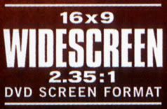


WIDESCREEN: Compacta Regular
16x9 & 2.35:1: Berthold Akzidenz Grotesk Bold Extended
You were correct on those two.
DVD SCREEN FORMAT: Trade Gothic (News Gothic or Franklin Gothic are close as well.)
I wouldn't trust a Pixymbols font, even if it is close.
LIONSGATE: Montreal
I'm 100% sure it's NOT Bernhard Gothic. You could also try Futura Bold or Limerick. Thing is, the letters in LIONSGATE are modified, and I don't think that S necessarily goes with the same font as the other letters.
LIONSGATE AND LAKESHORE ENTERTAINMENT: Bee
Also 100% sure it's NOT Movie Title Gothic; the Rs are different. Bee is very close, and it's what I've always used on movie posters.
2006. COLOR. FEATURE RUN TIME: Helvetica Condensed Bold
(Bucco_b nailed it. Make sure it's NOT Helvetica Neue, that's slightly different.


College athletics identity changes
in Sports Logo News
Posted
I knew it! Because I did the same thing at first.