


andrewharrington
-
Posts
7,409 -
Joined
-
Last visited
-
Days Won
14
Posts posted by andrewharrington
-
-
Make sure your shape doesn't have any unjoined points. I've had that happen trying to align the stroke to the inside, and it was because there were two points on top of one another that the align stroke was disabled, and they weren't joined. (Select the points and Apple-J/Ctrl-J to join)
-
odd question here but this problem is becoming a huge pain in my @$$. I use Illustrator 10, and last night I was typing headers and labels for a color palette im working on for a friends fantasy football league. anyways, before bed, i could totally and legibly read the text i had typed. today, i open the file and all the letters are big grey blocks. I have to zoom in to 950% or make teh font size 75pts or higher to read the writing. WHAT HAPPENED AND HOW DO I FIX IT!?!?!?!?
~UJ
Sounds like the greeking got out of whack. Go to Illustrator > Preferences, and toy around in there until you find the greeking setting and turn it way down. If that's not it, you have a more serious problem.
-
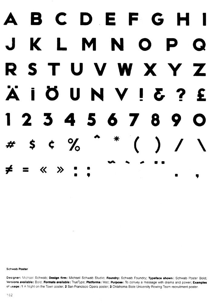
If you're familiar with the work of Michael Schwab, whom I consider to be among the best graphic artists of the modern era, then you're familiar with this lettering; he uses it on 80% of his work. Before it was practical to make custom digital fonts, Schwab lettered all his work by hand. After scrutinizing and comparing the lettering in many of his most recent pieces, I have come to the conclusion that some of his lettering is now done digitally.
I'm wondering if his signature lettering is available commercially or not. The closest font I've been able to locate thus far is called NEUTRAFACE TITLING, by House Industries (www.houseind.com). That font is based on work by the architect Richard Neutra. The styles of the letterforms are very similar, with Schwab's letterforms obviously being less rigid and geometric because of their hand-drawn heritage, but they are not exact, just very close.
Here is Schwab's lettering, for reference. I see that it has a name and platform information at the bottom, but I have no idea where to find that, if it's even available to the public. I've exhausted my search options.
-
Using the mouse is the best way. It offers the most manual control. Use this tutorial and thank pcgd for it.
 patrickcummings.net tutorials
 -
It's always better to trace over images in illustrator rather than use a tracing tool to do the work for you if you want a really crisp, accurate image. You can see where Streamline messes up. The eyes aren't quite round, the lines aren't as smooth, etc. It takes an extra hour, but it's worth it.
-
Anyone know what this font is and where i can get it?
Thanks in advance and really appreciate it.

It may be custom, but the only way to find out is to look. It will take an hour or two, but go to myfonts.com, type "Tanqueray" for the sample text and look through all the scripts and see if you find a match. I've done it before, and I found my match, but it did take a while.
-
come i need help plz... does anyone know what the font is called they used on south africa for the world baseball clasic ?? ( page 9 for info )
See the last post on page 9. It's probably custom.
-
Actually, for free fonts resembling Interstate, Clearview, and DIN 1451, the RoadGeek versions are difficult to beat, and they have all the weight and style variations as well.
-
If you have InDesign CS2, you can package a file into web format for GoLive CS2, but that's all I know of the science.
-
Only the "R" is really custom, and the joined letters would have to be done manually, of course, but yes, pretty much anything having to do with the U of A will be Friz Quadrata, and no, it's not free.
-
There will also be a full set of playing field diagrams, by the way.
-
The 3D Templates have gotten out of hand. I apologize for being instrumental in creating the monster that is the 3D Football Template, and I will now do my best to slay the monster.
I am in the process of creating the best flat templates ever to see the light of day. I am starting with football, and I am making all major jersey cuts for sports that have more than one or two primary cuts, like football, soccer, or hockey, for example. I will be making the following templates over the next few months.
Football (Many Cuts)
Baseball
Basketball (Many Cuts)
Hockey (Many Cuts)
Soccer (Many Cuts)
Volleyball
Softball
Field Hockey
Cheerleading
Lacrosse
Ultimate (Of Course
 )
)Rugby
Swimming
Track & Field
Wrestling
Band
Gymnastics
Cross Country
Aussie Rules
Bowling
Polo Shirt
T-Shirt
-
I am looking for the name of the typeface used for the following:
Cincinnati Bengals' numerals and nameplates
The University of Arizona Mens' Basketball numerals
Kohl's "15% Savings for using Kohl's Card" campaign
The closest I have found using all the search technology know of is the Noga family.

As you can see, it's not exactly the same as the typeface shown in the images below. The tell-tale character will be the "1" as it has that unique serif. I need to buy this typeface, but I first need to know the name of it.
Bengals (names and numerals)

Arizona (numerals)

Kohl's (the green headline text)

-
Also, does live trace really work?! I've never bothered to use it... I honestly don't think I could trust the computer to duplicate something as well as I could just with the pen tool. If so though... man that could come in handy!
Live trace works. It's not great for line art unless you have a good hi-res image, and even then a manual trace is still better, but if you want a sweet vector image of a photo or drawing or something, it's a pretty good tool.
-
It's called Adobe Streamline. Live Trace is wonderful if you have a hi-res reference picture. It's pretty good if you have a lo-res but large size reference, and its all-right if you have a small, lo-res reference. That's all it depends on.
To layout text like the Rangers' jerseys, make the text paths by using Text > Create Outlines, then just select ANGERS, then move the letters down and to the right with the arrow keys until they are where you want them, then select NGERS and move them the same number of times with the arrow keys, then select GERS, and repeat, and so on. Illustrator won't do everything for you with text and whatnot. You have to get creative and find a solution sometimes.
-
It doesn't, because it's a new feature with Illustrator CS2.
-
This may be a stupid question but here we go: If I created a logo in Illustartor and want to make it smaller to say put it on a uniform, the image gets smaller, but the stroke sizes stay the same so it end up looking all jumbled up. Is there anyway you can adjust the size of an image and have the stroke size increase or decrease with it??
Here's some advice, though: Use offset path instead of stroke. It's easier to use and reproduce, it's more customizable, and it looks a lot nicer, plus you don't have to worry about scaling strokes and effects.
-
If you use "Add" in the pathfinder, then click "Expand," your objects will fuse into one without you having to trace the common outline. I don't know if that quite explains it; I may have misunderstood the question.
-
Thank you Joel. Do you know if there is a way to get the Font Folio without a multi-computer license? All Adobe has on its website are 10 and 20 computer licenses and they are like, $5000 and $9000, respectively, and that is too rich for me for fonts. I really only need a one computer license, which I would imagine to be much less expensive. I'm going to look around and see what I can find. Again, thanks for the help.
-
Would any of you font gurus reccommend the "MacFonts" or "MacFonts2" software? They are quite inexpensive for having so many fonts, but are there enough good, usable fonts in them to necessitate buying them?
-
This is not really a font question so much as it is a hardware question regarding fonts.
I just got a new Apple notebook, and I am in the process of trashing apps I will never use, and organizing folders and such before I install Adobe CS2, Office:Mac, and my corps of applications I do use. Basically, I want to move all my non-system fonts to one folder. Is it best to place them in Library > Fonts on the hard disk, or in Library > Fonts in the User home folder, or some different place?
-
Hobogrish, to arc the baseline of text, follow these steps.
Type it.
Select it.
Go to [Type > Create Outlines].
Go to [Effect > Warp > Arc Lower].
Check [Preview] box.
Adjust your values until it looks how you want it.
Click [OK].
Go to [Object > Expand Appearance].
Enjoy.
-
This is what I would like to do, and I bet it's kind of advanced, so work with me a bit.

In the above picture, I want to remove Tony Allen so that I can make myself a wallpaper. That is, take him completely out of there and away from the court and a player who looks a lot like Darius Songaila, etc.
Then, when I put him onto another background, I want it to be just him and have no white box around him or anything of the sort.
Can someone show me how to do this? It would be greatly appreciated!
Post this in Photoshop help next time, since, after all, it is a photo. Anyway, in Photoshop, you want to select the Polygonal Lasso tool, make sure "Anti-Alias" is checked, zoom in, and painstakingly follow Tony's outline as best and as closely as you can. Then, you can copy him and paste him onto anything you want without having a silly white box.
Oh, and Hennisch, if you convert your text to outlines with [ text > create outlines ], select your text, and go to [ Effect > Warp ], I believe there is a choice to arch just the bottom. To finish it off nice and neat, go to [ Object > Expand Appearance ].
-
I have had it happen before as well, and I concluded that it is a "glitch" of sorts in the preview mode. The rule of thumb is if you made it straight/lined up/perfect, then it will always stay that way until you modify it, regardless of how it looks in preview.
Instead of printing it to make sure everthing is crisp and smooth, though, it is more economical to preview the "save for web" option. It gives you a raster preview, but it shows how things line up very well, especially if you use the handy "image size" tab on the right to make it bigger.
Name That Font!
in General Design
Posted
well, it's all over the preseason, playoffs, and pro bowl graphics, as well as the NFL's advertising banners, the non-condensed version is used on the nflshop.com graphics, and it's definitely not a match for thesis.