

Billy B
-
Posts
7,481 -
Joined
-
Last visited
-
Days Won
1
Posts posted by Billy B
-
-
Nowhere near as bad? You could have done what the Clippers did for ANY sports team, gave it the usual marketing spin, and it'd have the exact same lack of brand personality. Sometimes, bad design is just that.
That could be said for the Packers "G", Bears "C", Cubs, Indians "C", Yankees "NY", Dodgers "LA", and many others. All of those logos I just mentioned can be drawn by a child. None are special in any way. They are just generic scripts. Again, IMO the response has been an overreaction. There isn't much you can do with Clippers anyways. I don't see any lakes in the Lakers logo. That's a basic logo as well. Now is the new Clippers logo a great logo? Absolutely not! It's very plain and simple. But it is also nowhere near as bad as the cries have it to be.
I'd argue that the Yankees and Dodgers (maybe Bears too, but the Reds logo is pretty much the same) have great logos regardless of the tradition behind them. You can have a great logo that can be drawn by a child.
And the name Clippers gives you plenty to work with. You could, I don't know, put a clipper ship in the logo. Saying a couple curved lines represent the ocean isn't enough when designing a logo representative of the team name is so simple.
-
Speaking of Sixers-Hawks, here's 1999-2000. First year of Hawks' final red-and-yellow jerseys vs. final year of home-jerseyed Sixers in gold letters.
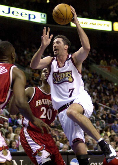
And a good one for players in the wrong uniforms. Never knew that Toni Kukoc played for the Sixers.
-
 1
1
-
-
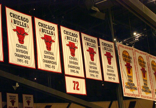
This may already be in this thread, but I stumbled upon it today and thought it couldn't hurt to add it on here. Thought it was kinda cool how they made the ribbon for the 116 wins come off the sides of the '01 banner.
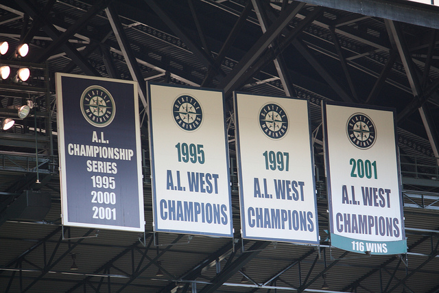
I think it's pretty cool. The Bulls have the same thing except they put it on their division champ banner.
-
As much as an inconvenience this will be to European leagues, it'll be even worse for MLS since this chews right into the playoffs. I am not looking forward to this.
MLS will be fine. They'll probably just push the start date a month earlier and play in warm weather cities early. The 2022 World Cup being in the winter is the least of its problems.
-
Haha that's true. I actually really like that helmet. It could work well with a team using a winter/cold weather-based nickname .Washington vs. Houston, 1971. Only time this matchup happened:

I don't know what it is, but I love those Oilers uniforms.
I guess the Cowboys aren't the only team in Texas to have worn a fustercluck of differently-shaded silvers.
That's the first thing I noticed too. I think the Cowboys would look really good with a helmet similar in color to this that matched their pants.
-
Classic Perds
-
The jerseys may be garish, but the Buccaneers' combination game is something I really like. White on white is especially sharp.
The only change they need to make is the number font. And they would have a nice, modern uniforms
The helmet could use some simplification too, but I agree with this. I really like how their uniform looks when the socks match the bottom part of the pants stripe. The number font is just awful though.
-
A post in the biggest upgrade/downgrade thread reminded me of this one. I really liked the Suns previous set of uniforms. The Barkley era set is still my favorite, but I liked these and they don't get much love around here.

-
I think those look good in a vacuum, but I generally dislike throwbacks that look nothing like the current set. I think at least some of the hate those get is because people don't think the Jets should look like that.
I agree with this.This throwback doesn't get near the love that it deserves.
Edit: The Eagles' blue and yellow jerseys are another example. I normally like bright colors like that, but it doesn't look like the Eagles to me.
Same here. Those are great looking uniforms, but I don't like throwbacks with a totally different color scheme. It just looks weird seeing the team in blue and gold when everything else (field, TV graphics, most fans) are in green. It's fine for a one-time uniform for an anniversary or something, but I think the Jets wore those for a few years.
I really like that shade of gold, though. I wish the Saints wore something closer to that.
-
There probably aren't many because they've all been updated to not look like they were designed 60 years ago.
It was first used in 1951, for that reason alone it is wonderfully designed.Chief Wahoo is a terribly designed logo, regardless of whether or not it's a racist caricature:
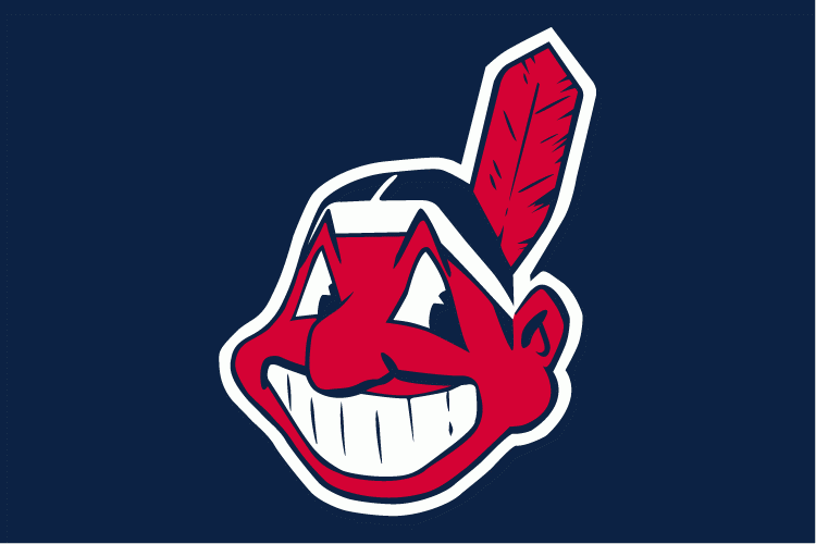
Just look at it. The terrible line weights in the teeth (which don't even connect fully) and the other really bad attempts at detailing in the feather and the eyes make for a horrendous logo. It may be that some details didn't translate well when the logo was originally digitized in the 90's, but come on. If they had to keep him (which I hope they don't), at least modernize him.
Find another character logo that old that looks as good.
-
I watched extra time against Belgium on the sidewalk looking through the window of a bar with about 40 other people since regulation ended right at the end of the work day. Never would have expected the bar would be full, let alone have a huge crowd watching outside through the windows.The level of interest in NYC was amazing. Walk down any street in Manhattan during a match, and cheers ring out from every bar and restaurant you pass. Offices shut down during matches, as conference rooms got repurposed into viewing parties. Doubly so when the US was playing. During that last match, I was walking through Midtown and there were several impromptu sidewalk gatherings as dozens of New Yorkers gathered around to peer in windows or watch on temporary projection screens at sidewalk cafés. It was marvelous.
I hope NYCFC can tap into just a little of that spirit. Gods know that we love the sport in this city; good we'll finally have a team in MLS.
-
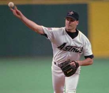
Those are boring. 1990s blandness at its finest.I think these are really, really underrated Astros uniforms

2 words I never thought I'd see used together in a uniform discussion context
I actually agree with that. Another uniform that fits into that small category:

-
1
-
-
What is Kendall Gill's right uniform?
-
My favorite part about the banners at the United Center are the Bulls NBA Finals banners that have the players' names around the outside.Which arena/stadium has the best championship and retired number banners?
Personally, I think it's a toss up between TD Garden and United Center...all of the banners, for the most part, are clean and simple enough. The Bucks and Marquette re-did their banners at Bradley Center a few years ago, and look better than they did before.
-
I kinda like basketball uniforms with different colored jerseys and shorts. The Wizards gold and black alts were one of my favorite basketball uniforms. And while I don't like the look for Syracuse (a team named the Orange should wear all orange) the uniforms they wore tonight weren't bad at all. I wouldn't mind seeing more full-time alternates like this in college/NBA or maybe even one team wear it full-time and make it their thing.
Oh, and those Warriors uniforms were amazing. The blue was my favorite, but that set was great.
-
Illinois QB Wes Lunt wearing a jersey that he'll never wear in a game. He sat out last year after his transfer from Oklahoma State and we'll have new uniforms when he takes his first snap next season.

-
That doesn't make it right.
maybe not right, but ignorant to the real thing, and finding a "deal" of what they think is a real jersey. the people who are doing the wrong thing are the companies making them, and the people selling them with the false identity as an authentic.
Yeah, I'd bet the people that knowingly buy a fake and don't care are equal to or less than the number of people that just think they found a deal on a website that other people don't know about.
-
You realize Duke was basically a glorified mid major until the 90s, right?
And Ohio State is hardly a historic basketball power... unless you mean Oklahoma State.
I'm not sure what your definition of glorified mid-major is, but I definitely wouldn't classify Duke as one. They made it to three final fours in the 80s and four more before Coach K got there. They might not have been the Duke we know today, but they've always been a very good program.
Plenty of schools that aren't thought of as major powers now have stretches of similar dominance in their history... peep the titles won by Loyola-Chicago and UTEP (Texas Western). At most, you could compare Duke of the 80s to Gonzaga of the late 90s and early 2000s.
I'd call the Loyola and UTEP title seasons flukes, not dominance. Neither of those teams have even been to the Elite 8 besides their championship season. Gonzaga has never made a Final Four. Duke has four Final Fours pre-Coach K (seven pre-90s). They weren't UK, KU, UCLA back in the day, but they have always been a power. They were the 8th school to get to 1000 wins and that was in 1974. I've heard other people (not on here) say similar things about Duke before and it's simply not true. But maybe you assumed I wouldn't know this since Duke plays in a different conference than that of my precious, fart-sniffing institution.
-
I like it when the same teams enjoy success, I also hate all mid-majors in college basketball(examples: Butler, VCU, FGCU, George Mason).
Jesus. Do you also root for the villains in movies, and enjoy watching people from Walmart run small family-owned businesses out of existence too?
Meh, I don't think there's anything wrong with that. I have nothing against mid-majors and underdogs in general, but I do feel like something is wrong whenever the Dukes and UCLAs of basketball are not relevant during the season. Same goes for the Yankees in baseball, Celtics and Lakers for NBA, and USC and Texas in college football.
Exactly, I like the fact that the best teams stay on top. I enjoy Texas, Alabama, USC, Ohio State, LSU, and other well known teams to be ranked in NCAAF. In NCAAB I like it when MSU, OSU, Syracuse, Duke, Kansas, Kentucky, UCLA, Arizona, and other well knowns do good. I dislike the "cinderella stories" in the tournament because they destroy what I like to see, old prestigious universities battling it out in March.
You realize Duke was basically a glorified mid major until the 90s, right?
And Ohio State is hardly a historic basketball power... unless you mean Oklahoma State.
I'm not sure what your definition of glorified mid-major is, but I definitely wouldn't classify Duke as one. They made it to three final fours in the 80s and four more before Coach K got there. They might not have been the Duke we know today, but they've always been a very good program.
-
Don't they get a separate ring from the Orange Bowl?
I know alot of teams will just combine rings. Badgers have done this with almost all their rings. Saves money
Doesn't the bowl game give out those rings though, not the the school?
-
That 49ers ring is really nice. Probably one of my favorite sports rings.
-
Northern Illinois gets an Orange Bowl ring even though they got spanked in it? Seems kinda lame. That's like a participation trophy. They should have gotten a MAC champs ring and that's it.
I think getting rings for making the bowl game is pretty standard practice. And I agree that it's pretty lame.
-
Ohio State went undefeated and won their division, I don't see why they shouldn't get rings for that. I mean .500 teams get rings for losing bowl games, it's really not bad that tOSU is getting rings for their undefeated season.
-
Big Ten 2014 alignment has been decided.
Big Ten East: Maryland, Rutgers, Penn State, Ohio State, Michigan, Michigan State, Indiana
Big Ten West: Nebraska, Iowa, Wisconsin, Minnesota, Illinois, Northwestern, Purdue
2 Indiana centric thoughts.
1) If Indiana doesn't pull off Bowl eligibility next year, it's going to be awhile before it happens
2) Indiana is separated from all its rivals. The Big Ten might as well add Virginia and UNC now. This bites.
Hey, we'll finally get to play Iowa in my grad year here. Two teams in the same conference shouldn't go four years in a row without playing each other. Kinda nice that we'll be in the "easy" division too. But this really screws over IU.
Indiana would have been hosed regardless. Don't tell me that they would expect to win a West division against Wisconsin, Northwestern and Nebraska.
Probably not, but they'd at least have a shot. I'm thrilled that we're in the West because we'll actually be able to make it to the conference championship game a decent amount. Nebraska and Wisconsin (but that's even dependent on how they do with Bielema leaving) should win more often than not, but everybody else should be able to win that division once in a while.

Unpopular Opinions
in Sports Logo General Discussion
Posted
I think this is the best the Rockets have ever looked and don't want them to rebrand anytime soon.