

JQK
-
Posts
11,065 -
Joined
-
Last visited
-
Days Won
2
Posts posted by JQK
-
-
46 minutes ago, bowld said:
LOVE this helmet

HAIL SATAN!
-
 2
2
-
 6
6
-
 2
2
-
-
-
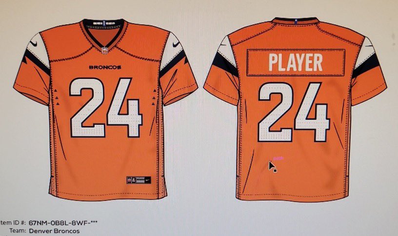
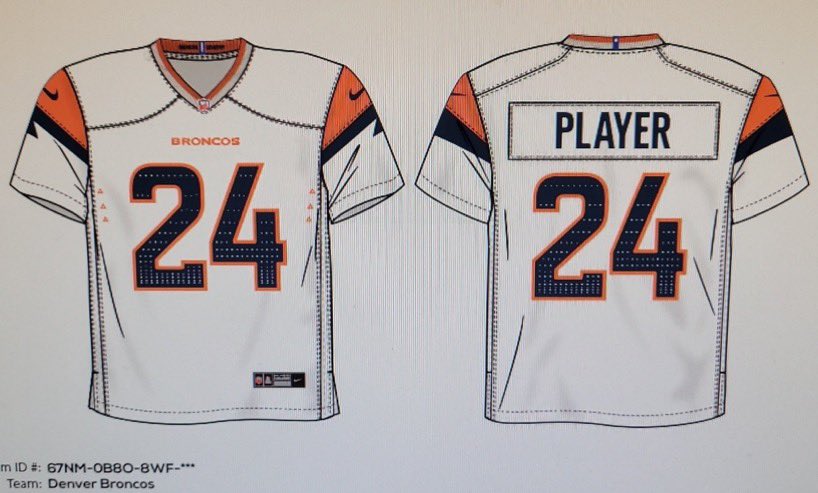
Nice ode to the Chargers on these new Broncos sleeves
-
4
-
 1
1
-
9
-
 1
1
-
-
Oof
-
I want these Giants 1930's throwbacks so damned bad...
-
2
-
-
1 hour ago, Cujo said:
Denver Broncos leak ??
LOVE this Denver look if real
-
5
-
 1
1
-
 1
1
-
-
39 minutes ago, mvk said:
I think this is a really good concept, though I’d like to see it in an orange/yellow/red, maybe a hint of brown.
And while it is a really good concept, I think the branding looks too close to the Milwaukee Bucks that it could be mistaken at quick glance.
otherwise, I think it would be great to try to incorporate a “U” somehow as well.
I got the Mount Nebo/Wasatch Range in there, and the hockey sticks as well... I was thinking of a U or the state outline, and maybe abstractly you can say the neck (although was going more for a shield feel to that)
-
Lions away pants are a big negative. The alt is ok. The homes are a home run. Pair the silver pants with the white away jersey and you have an absolute winner...
-
4
-
-
-
Damn... so they're really going with red font in red endzone?
Oof-ahh...
-
1 hour ago, Cujo said:
Not necessarily true.
Minnesota's numbers are turf. Sewn in. All they did was paint the point serifs off the numbers and round them off.
-
1
-
-
21 hours ago, ruttep said:
Think they'd try to match it up with this year's playoff endzones
What teams have in their end zones at home and what teams have in the endzone for the super bowl are very often two different.things...
-
On 1/23/2024 at 12:51 AM, ruttep said:
49ers would likely use the red version of the saloon font that they've put in their end zones for the playoffs this year
What makes you think that?
-
8 hours ago, monkeypower said:
Nice highlight notwithstanding, it's going to take some time to get used to seeing the logo at midfield.
It's such an improvement but it just looks weird to me right now.
It's been 48 seasons since the Giants moved to the Meadowlands and I think 40 or 41 since the Jets moved there... that's about two full generations that haven't seen a midfield logo for either team (and probably longer, don't know if the Giants had one at the Yale Bowl or Shea or Yankee Stadium before that or if the Jets had one at Shea, and my inclination is that, no, they didn't)
-
1
-
1
-
-
8 hours ago, GeauxColonels said:
I like the texture, and stacking the text would cover up too much of the orange IMO. I would like to see the text slightly small.
-
1 hour ago, Ted Cunningham said:
But why do the helmet and pants stripes not match?

They don't have to to look good.
These look good.
-
1
-
-
-
That's basically the Bradley font...
-
7 hours ago, monkeypower said:
There's a difference between what they were before and this logo created by an Indigenous artist for Indigenous Celebration night.
The Rĕð§ƙïŋ§ logo was made by an indigenous artist as well... and they decided to throw that baby out with the bathwater...
-
1
-
 1
1
-
1
-
 4
4
-
-
Just now, DCarp1231 said:
I remember these from the mid to late 90's. They had these sort of impromptu letter logos for all the teams based on their main logo
-
5
-
-
I suck at logos but.... eh... whatever..
-
6
-
-
-
7 hours ago, DCarp1231 said:
I remember when the name change discourse first started, someone came up with Redwolves and a :censored:ing icy white concept art because “that
 sounds/looks tough bruh” and people ran with it.
When in fact, it sucks, is a horrendous option, and absolutely needs to stay as far away from this team as possible.
The Icy White nonsense or the Red Wolves moniker?
Because i agree with the icy white nonsense, but the name should have been the Red Wolves, never the Commanders.-
 1
1
-
-
.
-
1
-


 sounds/looks tough bruh” and people ran with it.

2024-25 NHL Changes
in Sports Logo News
Posted
Someone will call it racist and it won't get approved for use.