


totc
-
Posts
969 -
Joined
-
Last visited
Posts posted by totc
-
-
On 5/2/2021 at 4:57 PM, CaliforniaGlowin said:
I call ripoff

I really, really hope that a north Jersey minor-league team doesn't rename itself "Disco Fries" for a promotion!
-
 1
1
-
-
On 5/2/2021 at 10:19 PM, Eastport76 said:
idk but the mallard look like more a Richard Scarry Character. Remember his Busytown series?
+100 for the Richard Scarry reference. His illustrations were "Where's Waldo" years before that series began!
-
On 4/8/2021 at 1:47 AM, packerfan21396 said:
There was also these grayscale rainbow guts in 2015:
.
These are spectacular! Kind of reminds me of when Hudson Jeans Co. came out with these. -
On 9/10/2019 at 10:45 PM, johnnysama said:
^ To be fair, however, there weren't too many "real" jerseys being sold at retail to the public in that era.
In New York, you could have gone to Gerry Cosby's. But I also do wonder if these maaaaaaay have been a prototype for when the Rangers went to the crest in 1976?
-
On 7/16/2020 at 12:45 PM, Big Yellow Flag said:
Has anybody compiled all these new temporary baseball names and/or identities? Seems like some of them could make for a good inspiration folder (and a very valid new section under baseball on the mothership?).
Agreed. I like the K-Town Bobbers (the intersquad nickname of the Kenosha Kingfish) which has a cool red and powder blue scheme and I like the caps.
-
On 2/26/2020 at 11:45 AM, rjrrzube said:
I'll be so happy when we get past this phase.
Can we call it FFFS - Food For Food's Sake??
Or how about a new trend -- the 10 or so teams who broke out some version of the Tequila Sunrise jersey last year?
In 2019, we had: Fayetteville Woodpeckers, Tulsa Drillers, New Hampshire Fisher Cats, Hartford Yard Goats, Everett AquaSox, Reno Aces, Pensacola Blue Wahoos, Mobile BayBears, the Kenosha Kingfish, and two from the Round Rock Express. We also saw the Albuquerque Isotopes give away a purple Rainbow Guts jersey but on a day the team wore their Sunday reds.
Adding to the Tequila Sunrise for Tequila Sunrise's sake in 2020 are the Savannah Bananas (a wooden-bat summer league team). -
On 12/10/2019 at 8:36 PM, Brian in Boston said:
That said, so have the Savannah Bananas... a team that, in addition to being no slouch in the "whimsy" department itself, has averaged 4,083 fans per game, put together an 88-game sell-out streak over three consecutive seasons, and captured the Coastal Plain League's Petit Cup Championship in its inaugural year. And the Bananas have done it in a city and metro area much smaller than that which the Pickles can draw from.
FYI: I got a phone call from the Bananas organization saying that my order from their team store is coming in a few days.
To wit: their Rainbow Guts jersey: https://thesavannahbananas.com/product/fandesignjersey/Wonder what would happen if Savannah and Peninsula wear their 'Bows in the same game (yeah, I know. It's been a minute since Peninsula wore them).
-
In FIFA Road to World Cup '98, Argentina's road uniforms are purple instead of navy. I never understood how EA could have made such a fundamental error.
-
FC Barcelona has had ridiculously-colored "change" strip for years -- yellow, green, pink, light blue, even salmon.
Check this Google gallery: https://www.google.com/search?rlz=1C1GCEA_enUS817US817&biw=1258&bih=783&tbm=isch&sa=1&ei=c3BpXZnbB-i9ggfJh4rQCQ&q=barcelona+third+jersey&oq=barcelona+third+jersey&gs_l=img.3..0i30l2j0i5i30j0i8i30l3.33120.34672..34928...0.0..0.90.687.12......0....1..gws-wiz-img.......0j0i24.8rUO8ZEIKJs&ved=0ahUKEwjZ4OKAoqvkAhXonuAKHcmDApoQ4dUDCAY&uact=5 -
The Peninsula Pilots (Coastal Plain League) appear to have a new alternate navy jersey with an outline of the Commonwealth of Virginia and a large P coming out if it: They had the Tequila Sunrise a few years back, but it seems to have disappeared, even though staff last year wore an interesting cap with the outline of an F-14 filled in with gaudy stripes like that jersey.
https://twitter.com/PeninsulaPilots/status/1002775155284824064 -
...or hopefully this one:
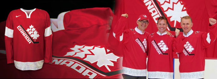
I'd like my neighbors to the north to go to that uniform design. It is incredibly nice.
I can't really complain about American national team designs. The Team USA soccer team kits since about 2003 are nice (though the crest could use some work). The Team USA baseball team has an awesome design.
USA Hockey and USA Basketball both have crappy logos, but at least those logos have ceased appearing on the uniforms. I personally think that all Team USA teams should use a touched-up and modernized version of this logo:

but that's just my (probably unpopular) opinion.
Actually, I think you're going to see something like that this time around ...

After what's happened with the soccer and ice hockey teams not being allowed to use their federation wordmarks, I think you're going to see these on a lot more jerseys this time around.
-
I want to upload, not download.
I know.
www.dafont.com/submit.php
Oh, duh. Thanks!
-
I haven't had the stomach to bust through 39 pages of questions and answers, so forgive me if this has been covered already.
After looking through a fistful of floppy disks (remember those?) last night, I have re-installed Fontagrapher on my old Quadra and have done a smattering of retouching/shaping to create a sans-serif font which will mimic the writing on some of the infamous Rainbow Guts jerseys -- i.e., Houston Astros from 1975-1992, Tuscon Toros from roughly 1983-1992, and the Asheville Tourists from about the same era.
In addition, I had created two fonts about 10 years ago, one called Polo Grounds and one called Fenway, which uses typefaces from old Gold Medal Sporting Goods catalogs. These fonts mimic the New York/San Francisco Giants (and the Pirates, kind of) as well as the Boston Red Sox. I know that there are some fonts out there that do the trick already (Bosox, TGI-Friday, Saloon), but these use the shape of actual sporting-goods catalogue letters.
Now, aside from RapidTrak, where can I do some uploading?
Uploading fonts? Dafont.com?
(sorry, I don't know what RapidTrak is; all I got on Google was some linear accelerator.
But Dafont.com is the best place for (free) fonts, if that's what you're asking.
I want to upload, not download.
-
I haven't had the stomach to bust through 39 pages of questions and answers, so forgive me if this has been covered already.
After looking through a fistful of floppy disks (remember those?) last night, I have re-installed Fontagrapher on my old Quadra and have done a smattering of retouching/shaping to create a sans-serif font which will mimic the writing on some of the infamous Rainbow Guts jerseys -- i.e., Houston Astros from 1975-1992, Tuscon Toros from roughly 1983-1992, and the Asheville Tourists from about the same era.
In addition, I had created two fonts about 10 years ago, one called Polo Grounds and one called Fenway, which uses typefaces from old Gold Medal Sporting Goods catalogs. These fonts mimic the New York/San Francisco Giants (and the Pirates, kind of) as well as the Boston Red Sox. I know that there are some fonts out there that do the trick already (Bosox, TGI-Friday, Saloon), but these use the shape of actual sporting-goods catalogue letters.
Now, aside from RapidTrak, where can I do some uploading?
-
Pele in a USA jersey:

This was the 1976 Bicentennial Cup; the "US" team was instead a group of NASL All-Stars.


Minor/Independent/Collegiate League Baseball Logo/Uniform Changes
in Sports Logo News
Posted
Remember the Lousville Adidas "Rainbow Guts" uniforms? They're baaack. They were worn in a win over Vanderbilt on Tuesday.
https://www.cardchronicle.com/2021/5/5/22421714/capacity-upgrade-approved-for-home-louisville-baseball-games