


burgundy
-
Posts
3,431 -
Joined
-
Last visited
-
Days Won
1
Posts posted by burgundy
-
-
8 minutes ago, BBTV said:
Also, Nike design is free, but teams can still hire anyone they want to design uniforms. It’s just that since Nike’s work is already paid for, they just use them (from the neck down).
The owner's wife can design the uniforms for free too!
-
 1
1
-
 5
5
-
 1
1
-
-
9 hours ago, udubfan19 said:
they stopped talking about the titans and texans (they didn't even talk about the uniforms, it was something about reddit.) only when i said "texan-titan jacked.
 " then they started to actually talk about uniforms. who pissed in your cheerio's?
I think you misunderstand what "threadjacking" is. Threadjacking is when a thread about a specific team/topic is derailed into discussion of a completely different team/topic. For example, if the thread were specifically about the Broncos new uniforms, and people start discussing the Browns, it's been CLEVE-JACKEDTM. But a thread about all NFL changes can't be jacked by any NFL team because they're all already included in the discussion.
However, this thread can get jacked by flags.
33 minutes ago, CaliforniaGlowin said:Sounds like this thread has been flag jacked.

-
3
-
 1
1
-
-
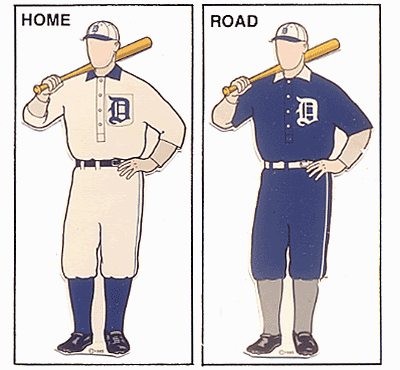
10 minutes ago, coco1997 said:
If Detroit's City Connect jersey is navy, I actually hope they pair it with matching pants. After all, there's a precedent for it:
I expect it to be an all-navy uniform mixed with elements of away uniforms from three World Series winning seasons.
Gray hats from 1935
Sleeve numbers from 1968
Arched script style from 1984, but probably "Motor City" instead of Detroit
-
5
-
-
5 hours ago, floydnimrod said:
More of an overall question: not considering the new template, are there any teams whose road grays are better, or at least on par with the home whites? I can't think of a single team where the road gray isn't just a worse uniform design than the home uniform
Not sure if they qualify as road grays, but...
-
17
-
 1
1
-
-
14 minutes ago, GDAWG said:
A football league with competent referees? What the hell is this?
Everybody can hear what they discuss, so they're held accountable. They can't just stubbornly stick to a bad call out of spite like NFL refs like to do.
-
3
-
-
24 minutes ago, shaydre1019 said:
Chargers have 2 different blue alternate sets that aren't on the primary uniform or primary logo.
Also I would guess like someone mentioned its a shade of light blue but not the same shade as the oilers.16 minutes ago, DCarp1231 said:I think with the Chargers, they’re hugging a fine line between “yeah this is definitely a ‘throwback’” & “Shut up and take the money in jersey sales”
Royal blue and navy are historical colors for the chargers. Ever since Color Rush, historical colors aren't contained to just throwbacks.
The exact shade of the light blue isn't the issue for the Texans, it's that the color would not be present on the home and away, and is not part of franchise history. But also, the
OilersTitans can't claim exclusive rights to a single shade of blue, no matter how much they want to. They can own the name that they call it, but the Texans could use the same shade and just call it something else. -
11 hours ago, tBBP said:
Since we're back to Texanjacking it seems, here's this. Not a leak of any kind, just some guy's concept on Instagram. But I will say the red version is kinda...interesting:
https://www.instagram.com/p/C5JfO9pR-bC/?igsh=M2RvcW96b3FkZTJo
Giving me serious Delaware State vibes, but I...think I...really...like it??? (!). And now that I'm looking at this far more intensely than I should probably be legally allowed, IF the Texans were to use the light blue in this way—as a secondary to their red—I could completely see this being a potential future colorway for them. (Of course, naturally a light blue alt would pop up down the line somewhere, but still.) Funnily enough, it'd also be among the more unique looks in the league despite the individual colors themselves being quite common in pro sports.
Would the Texans even be allowed to use light blue on an alternate? Isn't the rule that alternate colors have to be present on the primary home or road, or be a historical color? And the league has been very clear that the Oilers are NOT part of the Texans' history. So unless they sneak a bit of light blue onto the home jersey, I don't think we'll see a red and light blue alt, as good as those colors would look.
-
1
-
-
The new logo is very slightly different. The arc is the most obvious change, being solid white and tapered instead of using the gradient. More subtly, the "+" is a bit thicker, and it's now properly aligned. In the original version, the top of the vertical stroke is slightly further left than the bottom of the stroke. It always annoyed the hell out of me, so I'm glad they fixed it.
I'm not a fan of the teal gradient they've gone with. I understand why they went with teal, but it just looks weird.
-
2
-
-
1 hour ago, BBTV said:
Question though - since the touchback is now the 30, does the kicker need to pooch it to fall in the "zone", rather than use his full leg? I do like that part - kickers have become way too much a part of the game, so anything to reduce their impact - whether it's pushing the kickoff back to the 30 (or even 25 based on today's kickers) or narrowing the goal posts is a-ok with me.
Yes, the kicker needs to get the ball somewhere between the 20 and the goal line. If it lands in the endzone and stays inbounds, the returner has to either down it for a touchback to the 30, or they can choose to return it. If the ball hits inside the landing zone and bounces into the endzone, then downing it would be a touchback to the 20. If it lands short of the landing zone, regardless of bounce, the ball is placed at the 40.
I wonder if we'll see some attempts at low-angle, line-drive kicks to try and bounce them into the endzone. They don't need the hangtime anymore for players to get downfield, and the coverage can't even move until the ball is caught or touches the ground.
-
42 minutes ago, Pharos04 said:
Players giving them "rave reviews" means absolutely nothing. Players just like anything new. Most of them have zero sense of uniform aesthetics. The Lions' insistence last year on wearing Monolulu Blue and those plain white pants does not make me optimistic for what these players like.
-
9
-
2
-
-
2 hours ago, infrared41 said:
The old "looking forward while respecting the past" bit. The next time that approach results in a great looking uniform will also be the first time. On the bright side, the Nike-speak will be glorious. "The horse stomping across a snow covered mountain sleeves signify that Broncos Country has never lost the pioneer spirit of the 1850s. We ride in all weather. The icy blue stitching you can barely see represents the battle tested craftsmanship of the frontier. The arrow stuck in the horse's neck honors the brave wagon trains that were attacked by the Commanche. "
I hope I'm wrong, but I think this is going to be a disaster.
You have our sincere condolences in advance, Broncos fans.
Signed,
Browns fans in 2015.
"The orange remains unchanged."
-
2
-
6
-
-
9 minutes ago, BBTV said:
Nice work... except didn't the Browns have Bernie?According to Uni-Watch Bernie was in Tecmo Bowl, but not Tecmo Super Bowl.
-
2
-
-
7 minutes ago, MNtwins3 said:
Zach Wilson is a zero
Not when it comes to MILFS.
-
6
-
-
Some notable bits from the FAQ page:
QuoteWould Bluffton University’s name change because of a merger?
University of Findlay and Bluffton University will continue to operate as independent institutions, until legal approval is granted. No decision regarding Bluffton University’s name has been made at this time.
Interesting that there's no question about Findlay changing its name. So Findlay will stay "University of Findlay", but Bluffton could change.
QuoteI’ve seen the “Strong Roots. Brighter Future.” artwork. Is this the new logo?
This artwork and its variations will appear in official communications during the second and third phases of the merger process. The artwork gives a visual presence to our Strong Roots and even Brighter Future as Findlay and Bluffton come together to achieve something greater. It is not intended for external use or in merchandising. This artwork would be replaced with our new joint brand, which would be revealed during Phase 4, when we launch and celebrate.
QuoteHow will a merger affect student-athletes?
Until legal approval is granted, student-athletes will continue to compete in their current athletic program as NCAA Division II University of Findlay Oilers and NCAA Division III Bluffton University Beavers. The intention, pending NCAA approval, is that the athletics programs at each institution will continue to operate under two divisions with University of Findlay competing in the Great Midwest Athletic Conference and Bluffton University competing in the Heartland Collegiate Athletic Conference. This is a model that other schools who have merged are following successfully.
QuoteWill University of Findlay and Bluffton University keep their team names and mascots?
The intention is that University of Findlay will remain the Oilers, with Derrick the Oiler as the team mascot, while Bluffton University will remain the Beavers, with J. Denny Beaver and Jenny Beaver as the team mascots.
-
2
-
 1
1
-
-
12 minutes ago, HOOVER said:
I have a theory that custom number fonts are one way that the manufacturers tried to deter bootleg jersey sales.
Easy to get China jersey online for $25 with accurate numbers when it’s full block; harder when those bootleggers don’t have a custom number font file to copy.
That may have been the original intent, but it doesn't really work. Sure, bootleggers may not have the number font when the jerseys are first revealed, but once those jerseys are out in the world it's pretty damn easy to make a copycat font. It also doesn't work because people that buy counterfeit jerseys don't care if the number font is accurate, or even if the color and striping are accurate. I have seen some absolute abominations in Detroit, and the people wearing them don't care.
The main reason for CNFCNS(Custom Numbers For Custom Numbers Sake TM) is that it's just another way for the designer/manufacturer to experiment and put their stamp on teams. The Texans didn't need a new number font. Their outgoing numbers were already a clean, modern font with tasteful design elements that evoked the bull horns of the logo. It would have worked well with the new horn stripes. But they were a Reebok design, and Nike didn't want them on their jersey. So they designed a new font that looks like the old font is glitching out. It's still using the same ideas as the old font, but they shuffled elements around just to make it different.
-
9
-
-
On 3/18/2024 at 11:24 PM, The_Admiral said:
Could they get away with yellow as a base color if the blue outlines, say the blue above the navy in that picture, were thick enough on the numbers and scripts? Yellow hats, yellow socks, something like that? Rays of sunshine, the sun is yellow (as drawn by a child), and every Tampa team would be built around a different primary color.
They could go the Bad News Bears style with blue single color number and letters, with yellow piping and undershirts.
And the perfect sleeve sponsor:
Spoiler
But in all seriousness, it would be interesting to see an MLB team try yellow as a primary again.
-
1
-
-
3 minutes ago, CaliforniaGlowin said:
But they said the uniforms won't be the same design with different colors. They are all supposed to be unique.
As a disgruntled Washington fan, I can confirm that this is a horrendous idea.
-
10
-
-
2 hours ago, MDGP said:
Took me a bit to find it at first too. The stripe being horizontal due to the player squatting threw me off.
So is the stripe truncated, as Nike has been known to do, or is he wearing an untucked navy undershirt? I don't think this phrase has ever been said before, but... I'm hoping his shirt is untucked.
10 minutes ago, Sec19Row53 said:I don't think there's been a clear view that shows this. The 'game action' is an estimate of what they look like. I see red in the sleeve horn, and that would fit Nike's MO for how they handle the swoosh.
It is most definitely a stripe. If that were the swoosh then it would be backwards, too far down the sleeve, and too far forward. The blue spot above the horn is the swoosh. You can see it in the reflection.
-
2
-
-
8 hours ago, Silver_Star said:
That looks like a minor league uniform or an XFL uniform.
It looks............................. don't know. I just do not know anymore.
8 hours ago, Silver_Star said:Oh dear god! No pants stripe? Oh god! I am done with this crap!
8 hours ago, Silver_Star said:WAIT A MINUTE! THE TEXANS WAS USING MIDNIGHT BLUE SINCE 2002 AND NEVER CHANGED THAT AT ALL. THEY STILL WORE MIDNIGHT BLUE ALL THROUGH 2002-2023!!!! GEEZUS!
If you click the [+] next to "Quote" you can quote multiple posts at the same time.
-
2
-
-
8 minutes ago, JustABallCoach said:
Can any of our color experts speak to this?
They've been using the same exact shade of dark navy blue their whole existence. The same shade that the Bears have also used since 2002.
-
6
-
-
1 hour ago, GFB said:
Did the bottom of the 3 fall off? Woooooooof.
It looks like a 9 with a bite taken out of it. Just terrible.
The horns on the sleeves are... fine. It's basically a variation on what the jets are now getting rid of. The lack of red is very disappointing. If the rest of the uniforms were to be color swaps of this design, it would be passable (minus the numbers). But we know Nike is too enamored with their own farts to allow such a cohesive set.
-
26 minutes ago, BBTV said:
I've said it before, but kickers and punters shouldn't have to wear numbers.
Just put the team logo on the front, or an advertisement.
"Delay of game on the kicking team, number... eight-hundred, five-eight-eight, two-three-hundred, Empiiire."
-
12
-
-
31 minutes ago, CitizenTino said:
Is updating the small wordmark below the NFL shield on the collar enough of a change that the Eagles are now locked into these uniforms for another 5 years?
The only other example I can think of is the Patriots, and they wore the updated uniforms for 5 years before changing to their current set. Although it's unclear if that was by rule, or by choice.
When the 49ers finally updated their uniforms with the classic wordmark they also went back to 3 stripes. They wore the 2 stripe sleeves for 5 years as well.
-
1
-
-
54 minutes ago, leopard88 said:
Washington College used Pantone 187C as its maroon until 2016.
I think we can all agree that calling 187C "maroon" is absolutely ridiculous.
-
7
-


MLB 2024 Uniform/Logo Changes
in Sports Logo News
Posted
They should reconsider apologizing for these.