


burgundy
-
Posts
3,431 -
Joined
-
Last visited
-
Days Won
1
Posts posted by burgundy
-
-
7 minutes ago, ruttep said:
I think the burgundy jersey could be salvaged into a decent look. The other two are simply horrible.
The burgundy jersey itself is passable, but marred by an oversized wordmark and gimmicky numbers. That they chose to pair it with plain pants brings the whole uniform down considerably.
-
 4
4
-
-
10 minutes ago, oldschoolvikings said:
I've gone back and forth in my head as to who has the worst current uniforms, top to bottom, in the NFL... Washington or Tennessee.
Sitting here watching these horrific Commie outfits, and I think seeing Chase Young's giant head with that silly little "W" stuck on his forehead... my goodness.
OK, Washington, you win. What a nightmare.
Tennessee's uniforms may be a pile of crap, but they're a cohesive pile of crap. Washington's uniforms are a collection of turds by three completely different animals.
-
13
-
 1
1
-
-
1 hour ago, ManillaToad said:
They should black out the screen so that we don't have to see these hideous uniforms on this lifeless shell of a team
They deserve to get humiliated by the Bears for wearing those abominations.
-
4
-
1
-
-
40 minutes ago, WJMorris3 said:
Drop Notre Dame out of the top 25 already. They struggled against freaking Duke.

-
3 hours ago, Discrim said:
Ugh...sometimes it felt like the Irish did everything right on defense, and then that Ohio State QB would luck out somehow.
They did almost everything right. Morrison had Harrison locked down all day, so all the attention went to Egbuka, and Harper just couldn't cover him. Why they didn't put Cam Hart on Egbuka, I don't know. That matchup decided the game.
And of course having only 10 guys on the field was quite a blunder.
-
33 minutes ago, WJMorris3 said:
Absolutely DOMINANT performance by the Scarlet and Gray over those frauds from South Bend. How were they even ranked in the top 25?!
What the
 are you even talking about? Go back under your troll bridge.
26 minutes ago, oldschoolvikings said:
are you even talking about? Go back under your troll bridge.
26 minutes ago, oldschoolvikings said:For that matter, is Holtz still alive?
Physically? It's debatable. Mentally? He's been dead for years.
-
1 hour ago, Cujo said:
Now we're talking!
Teddy Bridgewater in #50
A QB wearing the number of an ineligible receiver.
-
5 hours ago, colinturner95 said:
This might be better served for the Unpopular Opinions thread, but am I the only one that doesn't like when teams (this goes across all sports) go to a throwback design as is for their regular home and away uniforms?
To me it feels like a cop out, like "we can't think of anything better so here's our old uniforms again"
I don't mind teams going back to an old look, but it is annoying when they don't update or fix any of the flaws of the look. If it's your regular look, it doesn't need to be a 100% faithful throwback, warts and all. Purdue's same-color number outline looked bad then, and looks bad now. A gold outline or plain numbers would have looked better, and the pants could have used stripes to match the helmet. And then of course, there's Miami and their mismatched pants stripe that they didn't fix.
-
11
-
 1
1
-
-
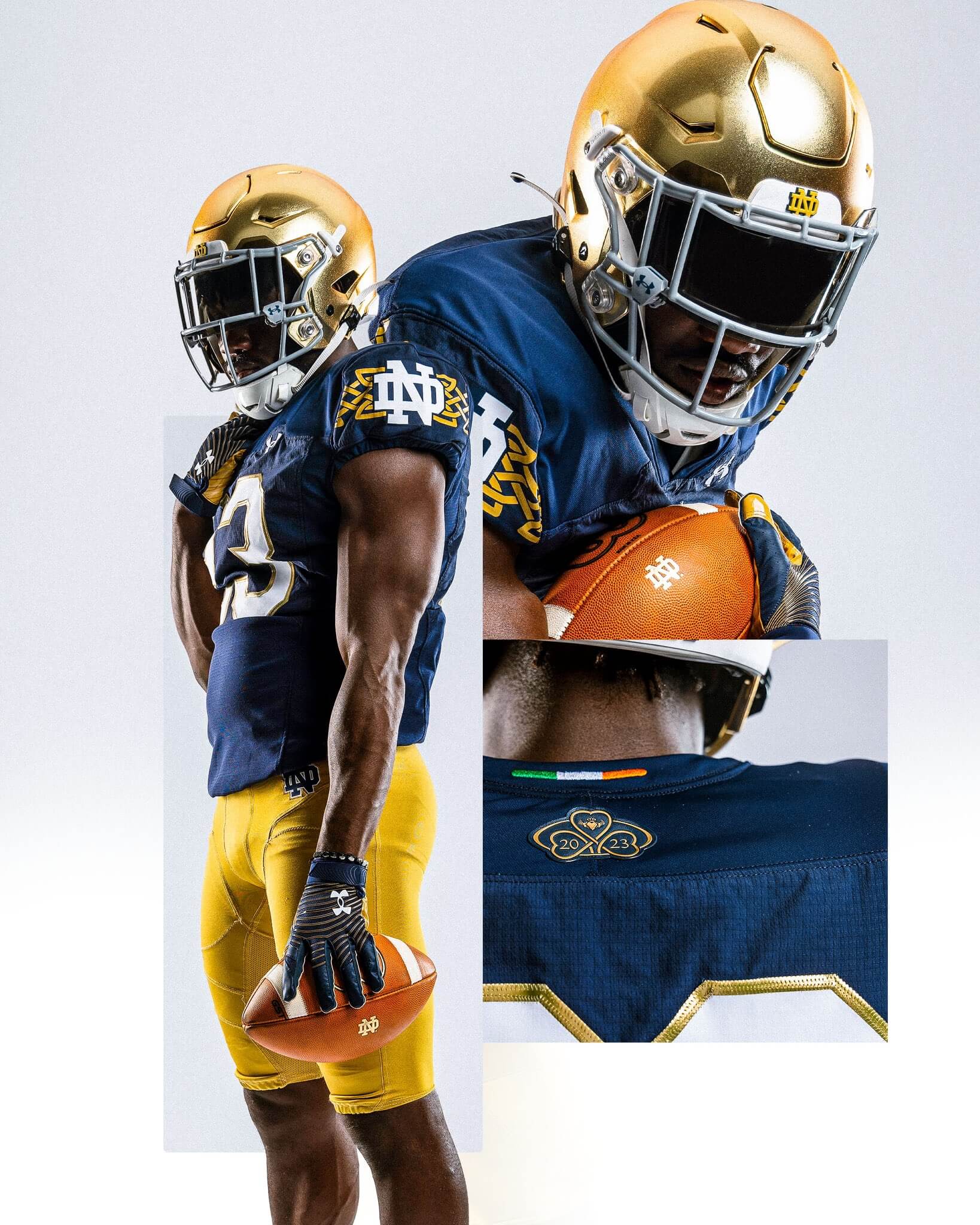
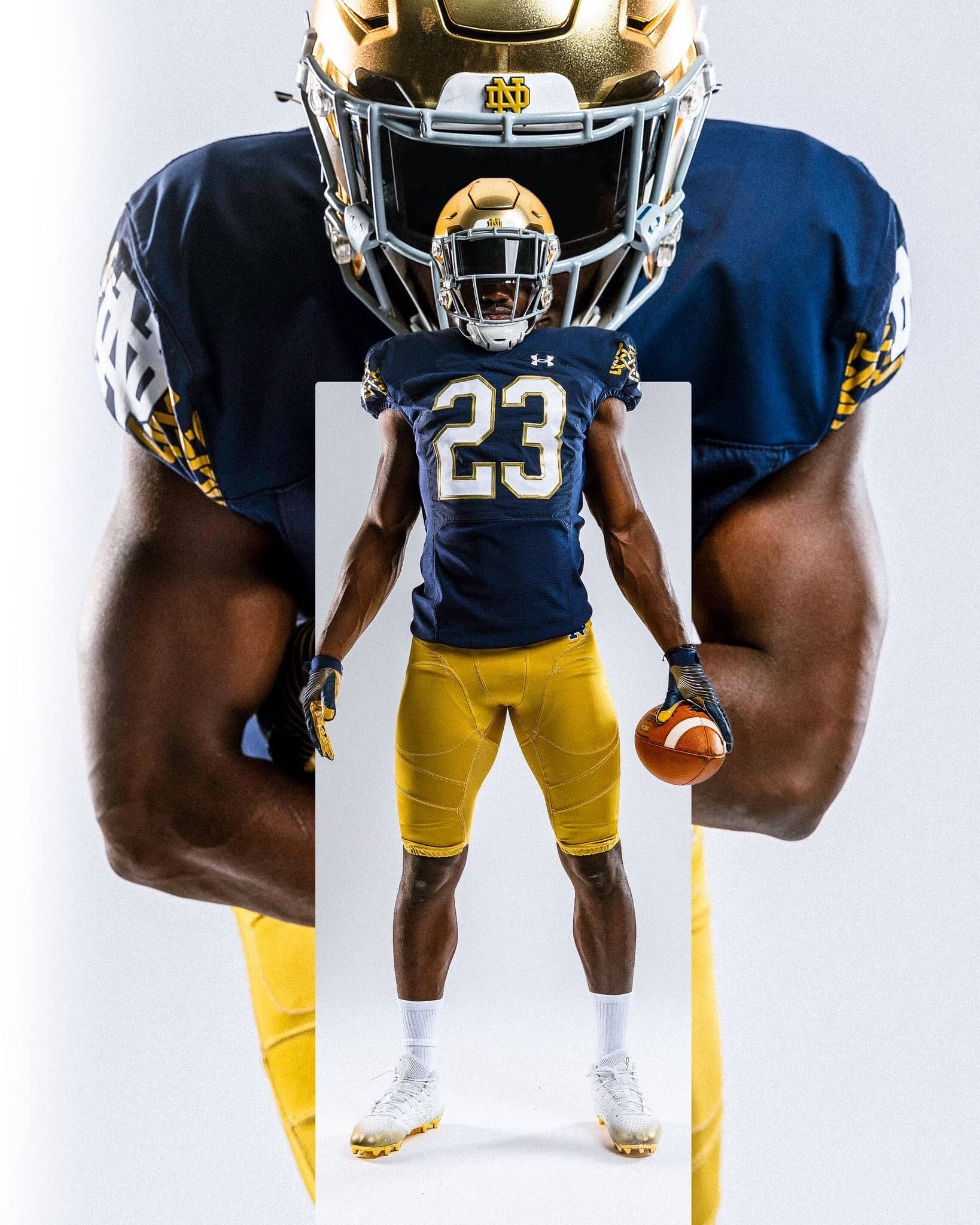
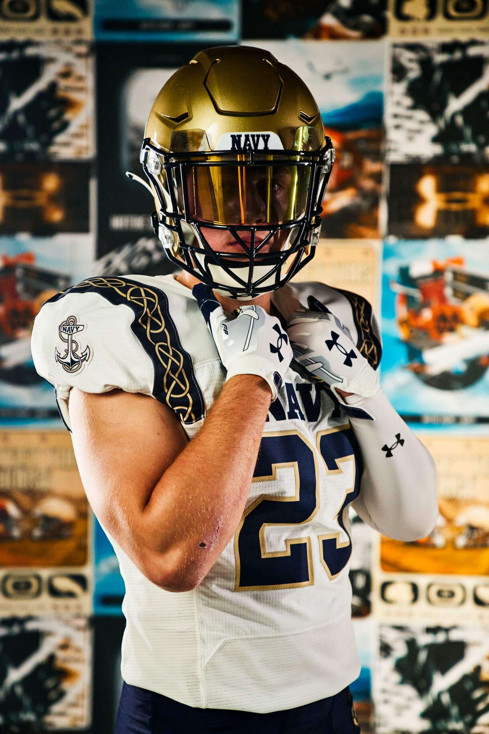
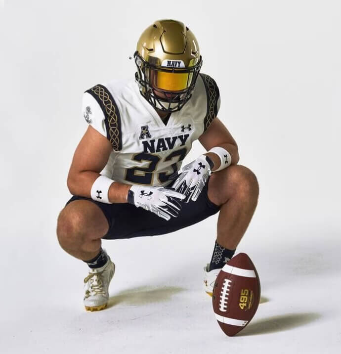
1 hour ago, MJWalker45 said:
Navy looks pretty good as well. I was hoping to see the back of the jersey to see if they have any additional game specific designs like Notre Dame has with the year of the game.
Navy looks good, but with both teams using Celtic knots it looks like an intrasquad scrimmage (again). @CaliforniaGlowin was right, ND should have gone green. Or Under Armour could have tried harder to make them look different.
-
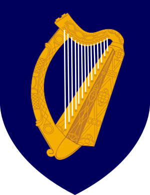
2 hours ago, CaliforniaGlowin said:
not wearing green in Ireland is a choice
While green would be nice, blue was the color of Ireland before green, and is still used in places, such as the Coat of Arms of Ireland. So blue and gold works just fine.
-
10
-
-
Notre Dame's uniforms for the Navy game in Ireland. Not bad for a one off, but the gold for the sleeve design looks a little too yellow.
-
8
-
-
48 minutes ago, DCarp1231 said:
In terms of right now, I think 30/32 teams could successfully put out throwback H/A sets. The two teams that would have the most trouble are Carolina and Houston.
Carolina- They could just use the OG set featuring silver numbers blue jersey used for the franchise’s unveiling.
Houston- much like Carolina, the uniform has remained relatively unchanged since its inception. Toss on the white helmet from the unveiling.
Nothing is inherently wrong with either team’s uniform history, but if the league was to undergo such a widespread “promotion”, the Panthers and Texans would feel like non participants. They’d almost have to come up with fauxbacks.
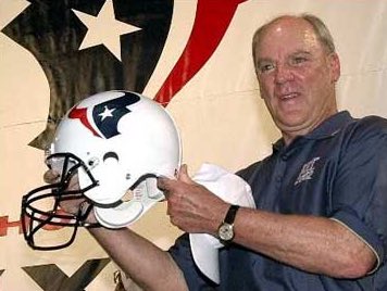
Houston's current uniform will be their throwback option by next year.
And then there's the Ravens, who can't legally wear their original logo. So unless they put the current logo with the original uniforms for a fauxback, their only option seems to be the 99 uniforms, which most people wouldn't even notice the difference.
-
5 hours ago, aawagner011 said:
Notre Dame has fixed the navy numbers while creating a new, unwanted problem: green pants.
It's about time they fixed the numbers, and I'm glad they went with white numbers instead of gold, as those shades of gold and green could also be a legibility problem.
But then of course they had to go with green pants. They look like the Leprechaun. Of course they could always pair it with gold pants later, although historically, they have separate gold pants with green logos, so the blue logos might look off if they use the current pants.
-
3
-
-
30 minutes ago, oldschoolvikings said:
It's nice. A good looking shade of green regardless.
Personally, I would've preferred the Harold Carmichael uniform. It was in a Superbowl, and is chocked full of disco-70's goofiness.
Modern uniform cuts would do such a disservice to those gloriously oversized stripes.
-
7
-
-
14 minutes ago, Germanshepherd said:
New Nevada set
I'm disappointed they went back to regular silver helmets. That Notre Dame style finish looked great on them. What are we calling that finish anyway? Metallic leaf?
The rest of the set is meh, but it would be better if the pants and helmet matched. Either both have stripes or both are stripeless. As it is, they look disjointed.
-
1
-
-
6 minutes ago, Sec19Row53 said:
Can they have two alts? No, I think.
Dolphins have 2 throwbacks. Chargers have two throwback-inspired color rush alts. The Patriots don't have a color rush anymore, so it's possible they could have a 90s throwback. I doubt they will, but they could do it if they wanted.
-
4
-
-
8 hours ago, Cujo said:
*clicks article*
Ya. We know. The current Titans own the rights to the Oilers name and logo. But they don't own colors. Lmk when someone buys or owns a color and can restrict the use of it.
Anish Kapoor would like a word with you.
-
3
-
 2
2
-
-
9 hours ago, TruColor said:
I wish they could have used the proper wordmark however (check out the 'U' in 'Buccaneers" for example):
I also wish they had used the proper colors, and also provided the version of the logo that was used for marketing. (Different than was used on the helmets.)
The 'S' also appears to have been rotated 180o, making the top bigger than the bottom. What a weird little quirk.
-
4
-
 1
1
-
-
About time. Calibri was always such a weird choice for a default font.
-
4
-
1
-
-
1 hour ago, wentvoltage123 said:
NC State with new uniforms
Why is number 11 wearing a child's uniform?
-
1
-
-
The Pro Bowl definitely went through a Factory Pomo phase.
-
2
-
-
2 hours ago, Brave-Bird 08 said:
EDIT: wow, for a 33 year old, I feel so old re-reading what I just typed.
Don't worry; as a fellow 33 year old, I totally agree. We're not old, we're just the last generation to have any sense of proper aesthetics.
(Please ignore whatever we wore in the 90s. We didn't know any better.)
-
4
-
8
-
-
2 hours ago, BBTV said:
here's an example of the slight difference in NOB font that only one of us would notice. Also the color difference. I don't doubt that the color formula is the same, but the materials/lighting will make the new version look more "kelly", whereas the jersey it's modeled after appeared a little darker. I have a (rare) authentic from that era (Russel) and it definitely is darker.
I wouldn't be surprised if the number font on the throwbacks won't have the angled serifs on the 6 and 9. Although that font is still used by the Tigers and Yankees, so maybe Nike is aware enough to use it.
-
12 hours ago, BBTV said:
I don't think dynamic logos should be inhibited by stripes. If it's charging forward,, the stripe acts like a wall it'll bang in to. That might sound silly, but it's a guideline I follow. It's also one of the reasons why the only way the Broncos can have a stripe is if it tapers in the front so the cyberhorses can charge through it. It's not a rule because there's exceptions. Most white helmets need stripes, and I kinda look at the Bills charging buffalo as a static logo rather than a dynamic one, but that's admittedly totally arbitrary. The Ravens should drop their stripes ,but they're purple and hardly noticeable so the bird heard can fly over it.
The Bills helmet stripe mimics the streak on the logo, so it's like the player and logo are moving in unison, as a heard of buffalo.
... or something like that, I don't know . Sounds like Nike-speak, lol. But the design just works.
-
4
-


NFL 2023 Changes
in Sports Logo News
Posted
The first league-wide contract was with Reebok in 2002. Before that, each team chose their own uniform supplier, so you'll also see uniforms with marks of Puma, Wilson, Champion, Russel, Starter, Apex, Logo Athletic, and possibly others that I'm forgetting. They also only started putting brand logos on the sleeves in the late 80s.
I think you were looking for the unpopular opinions thread. The vast majority of people would say that the Campbell/Moon era is the best that franchise has ever looked, and is in the conversation for best football uniform of all time. The silver helmet uniforms are nowhere near that level.