


pepis21
-
Posts
2,741 -
Joined
-
Last visited
-
Days Won
1
Posts posted by pepis21
-
-
If Grizzlies wanted to imitate a concrete court they should make it form a real concrete. It would be innovative to NBA standards. Of course few knees would blow up in a game process, but it would give a real atmosphere of street courts.
-
 1
1
-
 3
3
-
-
Racing Bulls:
-
 2
2
-
1
-
-
2 hours ago, Berlin Wall said:
And Ferrari be like:

 Enzo Ferrari would throw a thunders on Maranello if that ever happen.
Racing Bulls suit and sneak peak of car:
Sauber suit:
-
1
-
-
Instead of giving refs ad patch they should send them to some training camp, because they are terrible.
Edit:
Not only a patch, but also a sponsorship for IST.
-
5
-
-
FIA just need to increase weight of the car, which compensate weight of the paint. Thankfully Ferrari would be red on most parts (at least I hope so).
-
1
-
-
Like in previous season they'll have BWT livery and regular one:
I love two colors on rims.
-
1
-
-
It was predictable that NBA will follow FIBA and try to LED court by themselves. I could imagine if court pass test on events, they would like to check it in a game like next season IST Final or ASG. Then is only small step to introduce it by teams to use on regular bias.
-
7 hours ago, ATLJ said:
New Atlanta United away kit leaked by local basketball team:
It seems like NBA is now a platform to leak/unveiling NHL and MLS jerseys
-
1
-
-
I don't know about Sauber. That green look so garish at these pictures, but on real track it might look less saturate (remember 2021 Aston Martin?), so I will wait to judge until Bahrain pre-season testing.
-
1
-
-
20 hours ago, VampyrRabbit said:
That script still has the same problems as the Clippers one with the white outline filling most of the counters.
And this is what in my opinion make these wordmark great, because they are unusual and unique compare to standard outline.
-
Williams:
-
1
-
-
On 2/1/2024 at 3:46 PM, DCarp1231 said:
I kind of wish the pattern was used as trim along the bottom to imitate Dale Sr’s Goodwrench scheme
I understand they wanted to emulate AJ 4 Black Cement which would be release one day before Daytona 500, but they don't have any splatter pattern. Air Flight 89 Black Cement have it.
-
17 hours ago, BBTV said:
Those are awful. The blue inside the C is a surly out of place.
If you don't like Clippers wordmark, there are also two less known versions with Los Angeles wordmark. One with blue numbers:
and second with white numbers:
8 hours ago, MCM0313 said:it would’ve been fun to see a yellow alt (which is kind of what the Siakam photo is).
Like this?:
-
6
-
-
4 hours ago, tscuzzy said:
Specifically they were discussing how they don’t wear red uniforms anymore and he said “something in store next season. I can probably drop that. They fire too… it’s gonna be the favorite”
Red - V
Retro Eligibility - V
Fire - V
But I don't mind a regular red alternate too.
On the other hand current Clippers uniforms aren't bad. Logos are more problematic
-
2
-
-
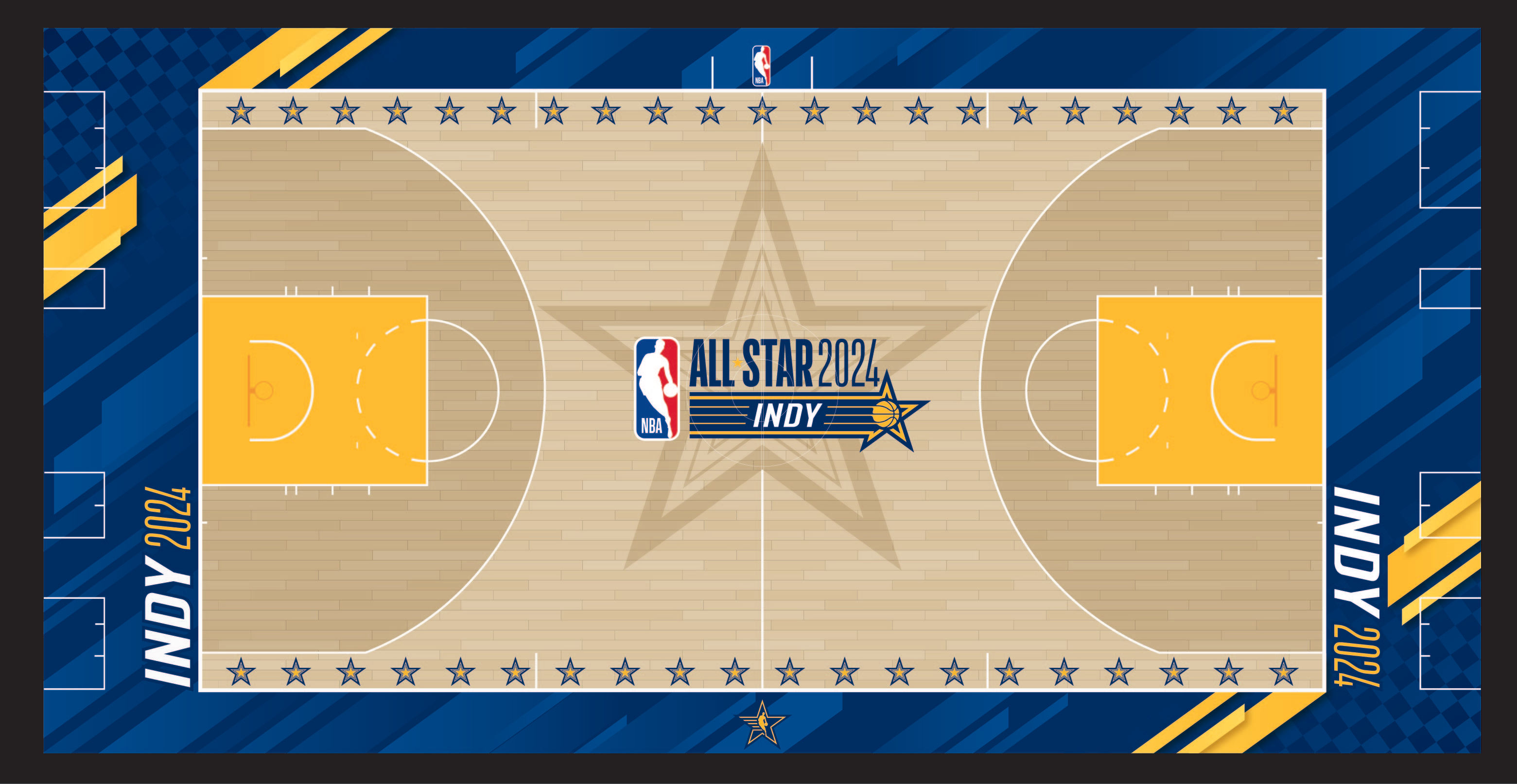
23 hours ago, truepg said:
Another year that the All-Star court doesn't match the uniforms.
It match with 2021 uniforms and wouldn't be surprise at all if that court design was originally meant for 2021 ASW, because they never unveiled it, so they could reuse it with small tweaks.
Still don't understand why nike didn't use teamwear for 2021 ASG and move those Pacers inspired unis to this year
-
1
-
-
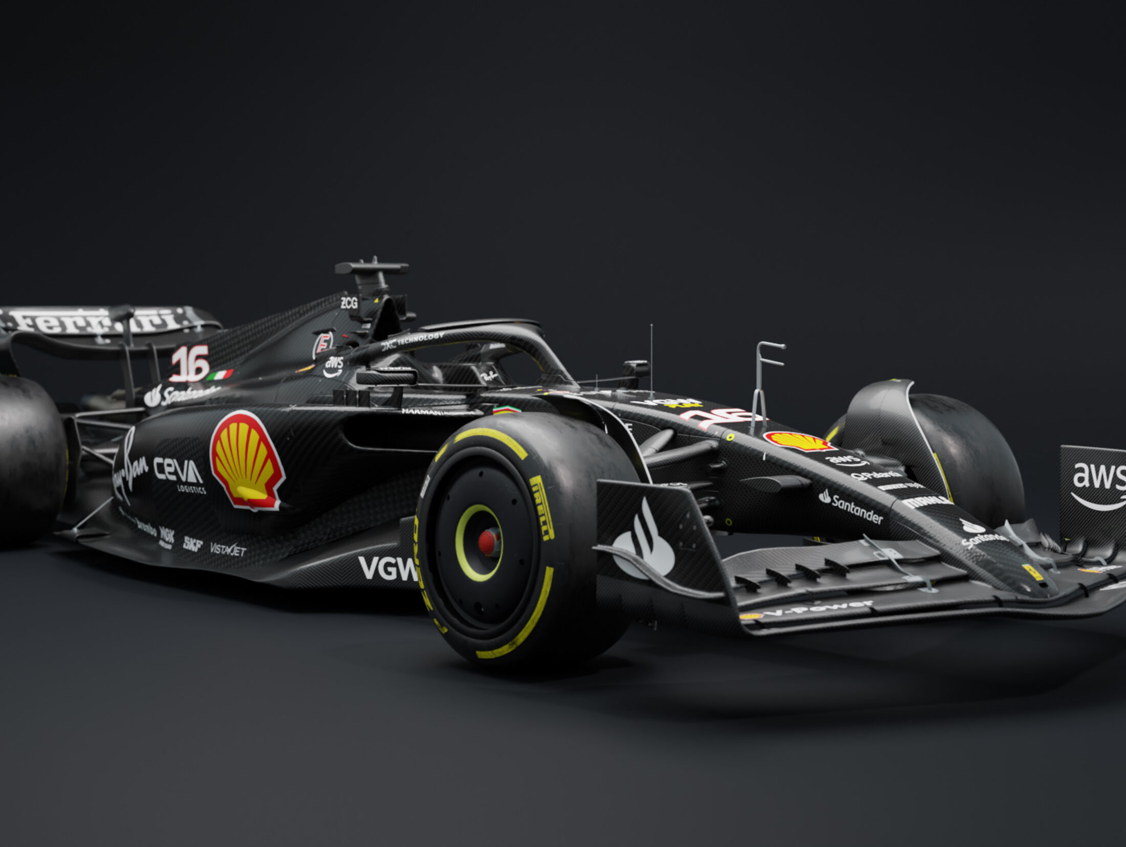
Almost same as in last season. They remove white and red between engine cover and sidepots.
-
1
-
-
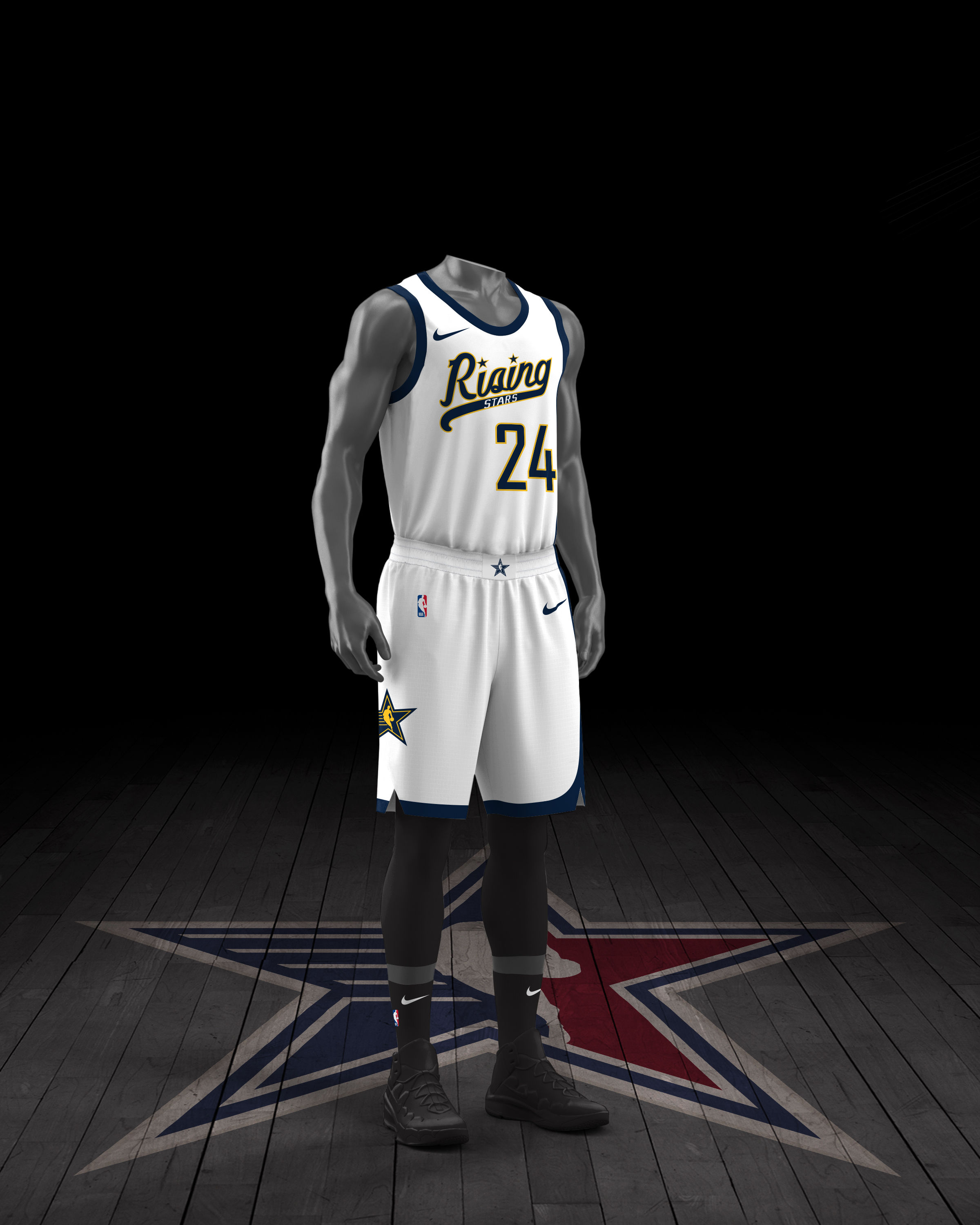
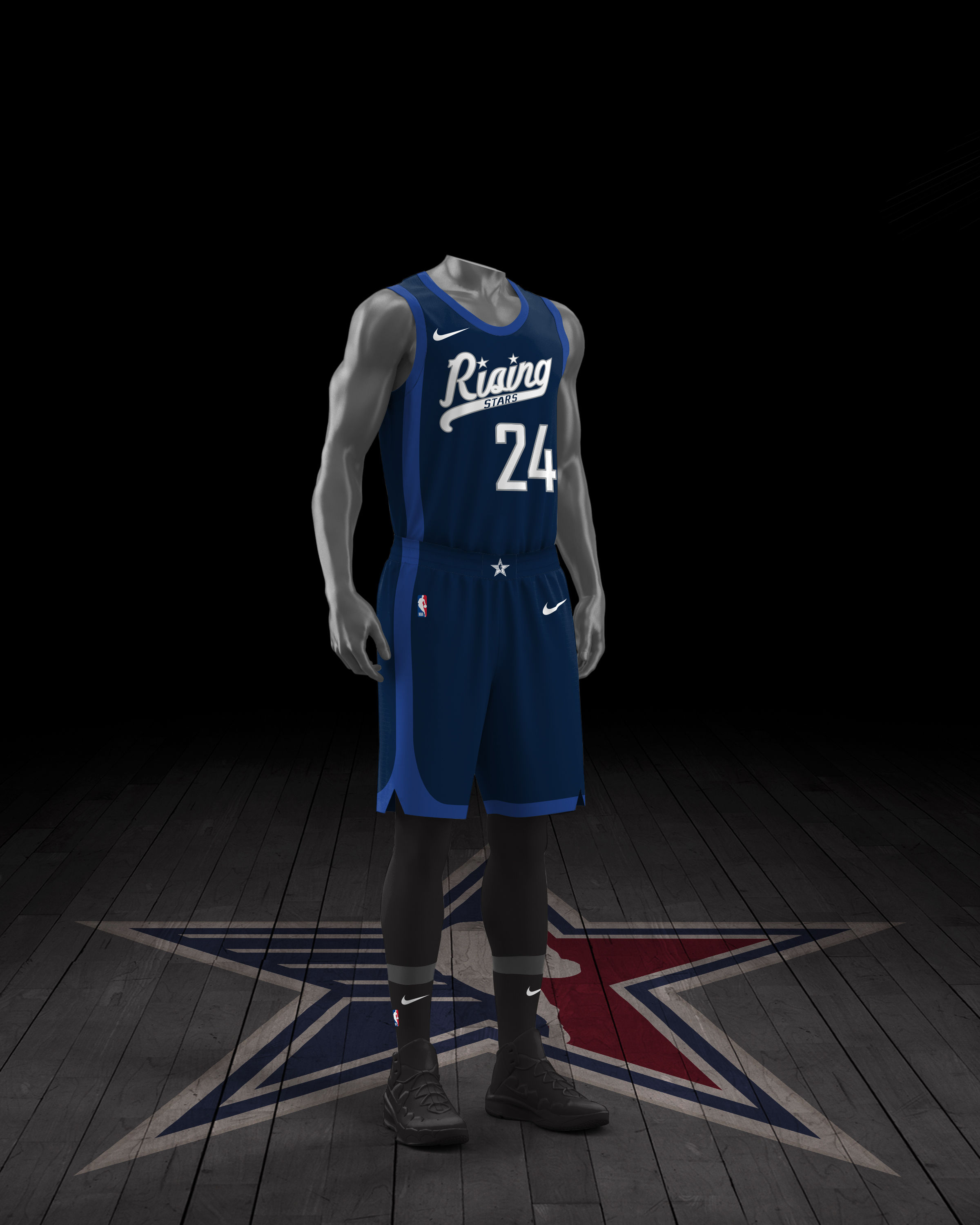
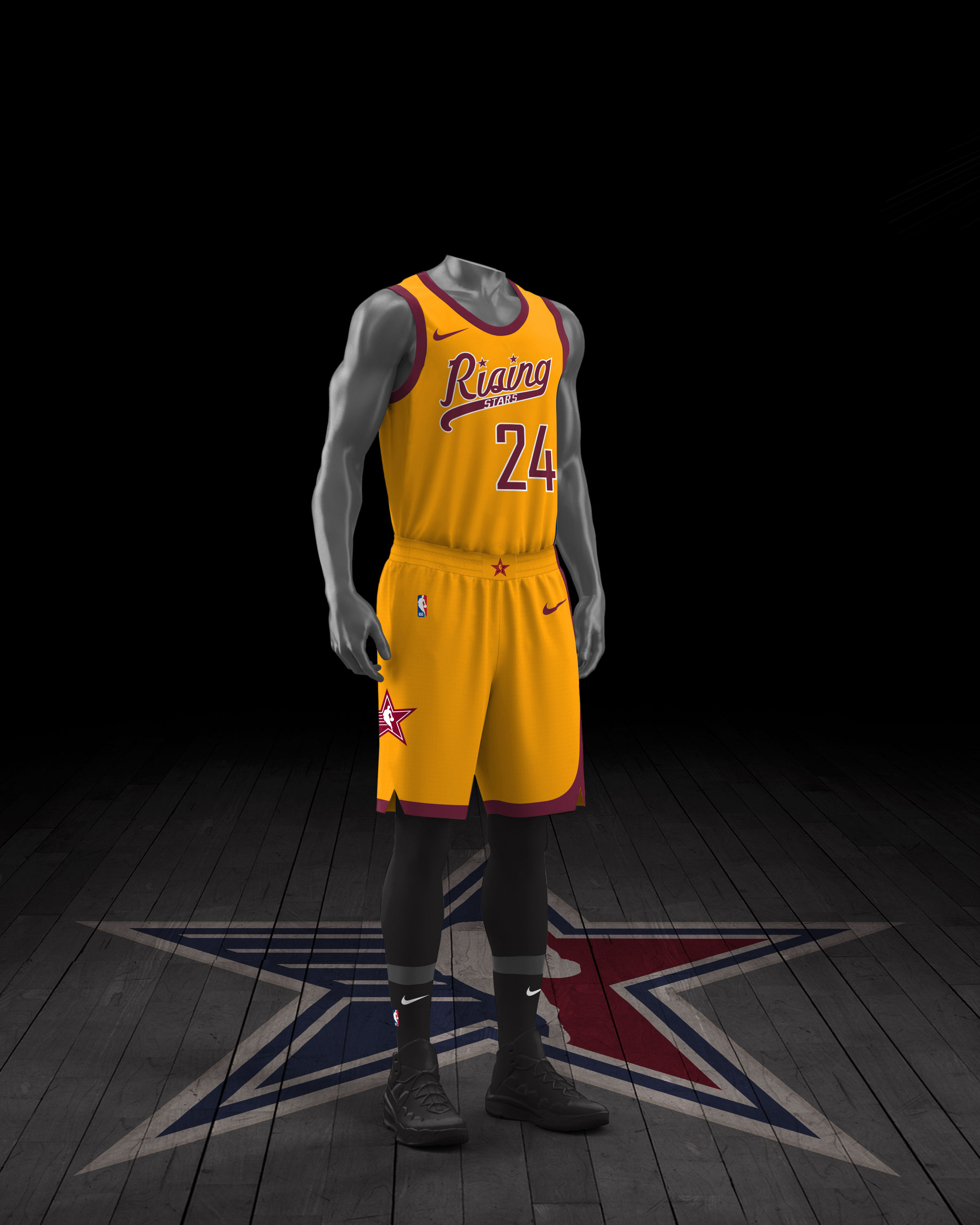
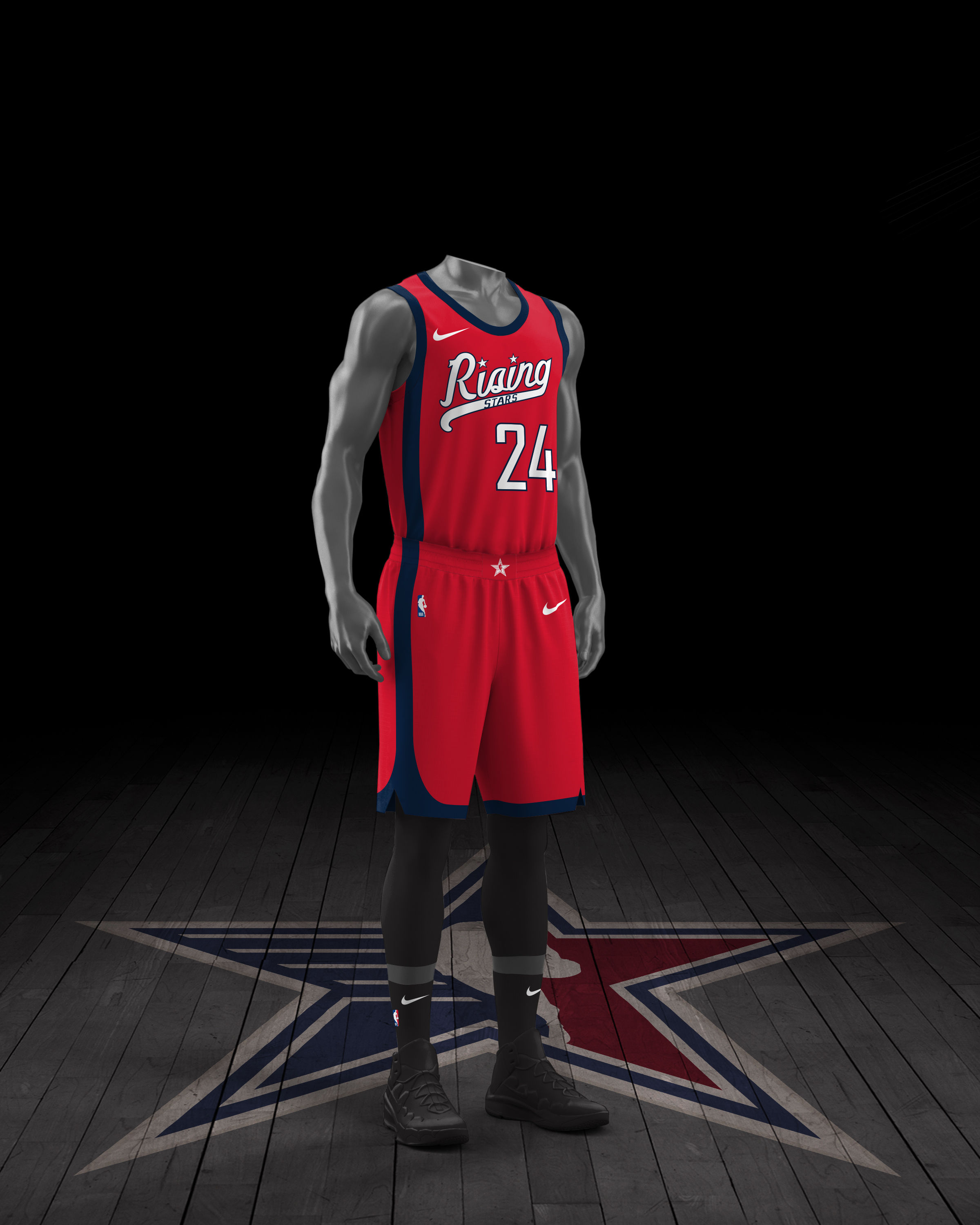
All Star court:
and Rising Stars uniforms:
-
4
-
1
-
 1
1
-
-
On 1/30/2024 at 11:21 PM, Digby said:
Whatever happened to that event where they'd make 3-person teams with an NBA player, a WNBA player and an old head? Bring that back, give me something to actually root for.
Shooting Stars was gone after 2015. Now you've got this extended Skills Challenge which I really hate, because it is a total chaos and mess.
Just bring back original Skills Challenge and Shooting Stars.
By the way, who remember 2ball?
-
10 hours ago, VampyrRabbit said:
Probably for the best.
Why? I'd like to see what Lou rejected. It always nice to see things like that.
-
6 hours ago, Morgan33 said:
We still didn't see an unused sweater for this logo, right?
-
17 hours ago, MCM0313 said:
There’s no unanimous opinion on Jets’ best uniform.
And this is what make discussion great. NYSE is ok and has one huge advantage over Namath look that I think everyone agree with that, it's simple and fit to basically every template. Take batwing, add stripes and voilla. Namath era has problem with that, but is more unique compare to NYSE. I hope nike somehow find a way to make nice shoulder stripes which help Jets went back to Broadway Joe look and with two helmets rule they could make NYSE their 3rd and 4th uniforms.
-
1
-
-
2 hours ago, truepg said:
Are both teams gonna have same warmups?Yes, but that's a norm since 2014.
-
20 hours ago, simtek34 said:
The creator really knows their stuff like us, and even mentions Uni-Watch and The GUD too.
But he didn't mention CCSLC which is a humongous blunder.
By the way I don't agree with him that New York Sack Exchange uniforms is the best one for Jets. I like Brodway Joe era much better.
-
3
-
-
Sharks - Just like Rangers alternate, they've should decide if they go with standard stripes or with gradient stripes. In Sharks case both things together looks a little bit too much.
Rangers - huge stripes, but I know this is a Stadium Series thing. I like it, better than their alternate
Flyers - great idea with nameplate that went into sleeves. Add black outline on numbers
Devils - I think I would like it more if it's black-red with some white instead of red and black.
Islanders - Younger Lou would never approved this design.


2024 Formula 1 World Championship Liveries
in Sports Logo News
Posted
Ferrari suits, no black compare to last two seasons: