


MiK
-
Posts
550 -
Joined
-
Last visited
Posts posted by MiK
-
-
14 minutes ago, Brave-Bird 08 said:
These are the worst pant stripes in the NFL. They look like they're wearing flag football flags around their waste
Their what now?
 14 minutes ago, Brave-Bird 08 said:
These are the worst pant stripes in the NFL. They look like they're wearing flag football flags around their waist
The NFL is sending messages via Denver Broncos uniforms that flag-football is the future!! First kickoffs, now this!! /s

-
 3
3
-
-
Not to mention the state bird is the California Gull. California being famously not Utah.
-
2 hours ago, Morgan33 said:
Until they made the gaudy gold jersey their primary.
Gaudy
 Vegas. Is it ugly? Yes. Does it scream "Vegas"? Yes.
-
2
-
 1
1
-
-
On 4/13/2024 at 6:46 PM, MDGP said:
first the stupid arrow cutout thing that the team uses is removed.
This made me lol. Maybe it's known or not but that arrow cutout is symbolic of the state motto "Forward" - a gimmick delivered by Under Armor. You can find it on just about any jersey a UW team wears - I get why people don't like it; I've since grown to appreciate it.
Really phenomenal job on this series, great work!
-
22 hours ago, DCarp1231 said:
All of Detroits uniform combinations via GUD
The Blue/Black/Blue/Black isn't awful. It's gimmicky for the Lions, sure but not as garish as some of the other alternates out there. Hopefully they go this route more often than the full black suit look.
The blue pants in the silver sets do badly need the w/s/w/s/w striping. If they are planning to actually use blue pants with the black alternate, I'm guessing they decided to leave the striping off so it wouldn't clash with the s/b/s/b/s striping on the black jerseys?

-
1
-
-
On 4/20/2024 at 9:27 AM, Cujo said:
Alt logo to incorporate Colorado's UNIQUE shape?
-
1
-
4
-
-
Needs a grey facemask
*ducks*
-
5
-
-
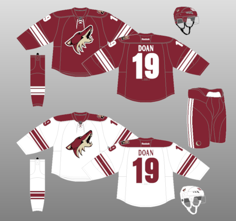
12 minutes ago, TBGKon said:
Theres always these....
Bettman would insist they keep the Arizona state shaped shoulder patch too - It's a dream market you guys
-
 1
1
-
-
5 hours ago, M4One said:
Utah Coyotes. Or is that name associated with failure too much?
What, Utah?

-
Utah Saints - games on Saturday's can be called "Ladder Day" and you get a bobble-head of a saint-ly Joseph Smith wearing a jersey and climbing a ladder made of hockey sticks.
-
1
-
1
-
-
Interesting that its orientation is horizontal rather than vertical. Looks less... official, somehow?
Any other teams do that?
-
Fantastic work - the Lake Superior State and Merrimack redesigned logos are particularly good. The execution on each of these is top notch, well done.
The CCornell looks and reads better - without the 'double C' it catches the eye as ORNELL.
I wonder if the Mercyhurst home sweaters logo may benefit from a white space between the green text and the blue outline? There's not much contrast between those colors so it kind of bleeds together - you don't get that pop like you do in the away sweaters with the white logo.
-
17 hours ago, aawagner011 said:
the Dutch always look best with black or white trim. I don’t care for the accent colors. The side panels are weird.
Agree. But I am glad to see Oranje back to a more classic orange compared to that yellow-orange they were rocking at the last WC:
-
Noticed today that the Illinois orange and blue seemed brighter than I remembered. I saw on the main site that the logos and word marks had been updated in 2022 with brighter colors. Curiousity on what rub/hex changes made were, I ventured over to @TruColor's site to find out. Here, the colors remain from the 2014 update. Curious I thought. So I then went straight to the source at fightingillini.com and found something confounding. Their own website conflicts:
Clearly the Orange and Blue on the banner of the website are much brighter from the Orange & Blue Colors depicted below. What gives? Has there not been an "official" color change or are they just unsure themselves of what the true colors are. The majority of the website is in the brighter orange and blue but then there's this page, talking specifically about Orange & Blue showing the darker colors from 2014. There were also no RGB, HEX, anything to be found on the website. Irritating!
-
The league and demographic must sure love gradient

I see your point and it's good perspective. To further counter my own point - XFL2.0 went too simple and gave us clip art logos. At least these are thoughtful in their design.
Still too many colors for Columbus (-Grey), Omaha (-purple), Orlando (-Grey again!). And seriously, cool it with the gradient.
-
What is on the right side of the Vamos Gatos logo? A juicer? Those little bathroom dixie cups?
-
Not wild about any of the franchise looks. New leagues always go too far, too busy, too many colors. Simplify it down - look to the successful pro leagues to create strong brands. No more than two prominent colors, have supporting accent colors if needed to differentiate.
Will be interesting to see how LOVB brands compare once those are fully released.
-
 2
2
-
-
On 2/3/2024 at 11:42 PM, Sykotyk said:
And--as I was a novice to this sport before the PVF--I believe the libero cannot score a point, either. Has to be another player to get the ball across the net to score. If I understood it right.
They definitely can score a point. @TalktoChuck was correct that they cannot play front row or block. They can attack but they cannot be above the net when they do so. At high levels of vb, this usually means they don't score points when attacking but it is possible.
-
2
-
-
3 minutes ago, DCarp1231 said:
Stencil font looks like the Steelers: when the Steelers use it.
Stencil font looks like the Packers: when the Packers use it.
Stencil numbers looks like
 : when the Commanders use it.
There we go.
-
4 minutes ago, tBBP said:
Different strokes for different folks, then. (Because it's easy to see where this line of discourse could go.)
I know I've already discussed all my VGK gold sweater critique a page or two back in this thread somewhere, but the gold sweaters would be much more tolerable if it didn't contain so much white. Somewhere within the several pages preceding this one I posted someone's mockup that basically swapped the current gold-sweater sleeves with the ones from the gray sweaters, with gray in place of the gold and a red stripe around the hem. I actually think that would make all that gold more tolerable. (Again, if you haven't seen it in person, its far more shimmery than what pictures show...a bit too much for my taste. But the local fans—and I'm sure a good amount of outsiders—absolutely love it simply because it's so shimmery.)
Yes on the shimmer. It's just so Vegas, and that's why it works. The dark is the better look aesthetically, but the gold fits their environment so much better.
-
1
-
-
Welp, Nevada legislative session ends with no vote on the A's stadium. Gov can still call for a special session - have to imagine that would only happen if there's confidence the vote would pass.
-
13 hours ago, habsfan1 said:
It makes sense for the Golden Knights to have a gold jersey.
No further argument needed.
-
1
-
-
26 minutes ago, Sec19Row53 said:
No for Milwaukee. Fiserv Forum had an ice unit installed as an afterthought. I'd say there's no financial backing, either owner or fans, for an NHL team.
I wish this weren't true but it is.
Hockey in Wisconsin is just not as popular as you would think. Madison and the Northwest part of the state I would say have a solid foundation of hockey fans. But northeast Wisconsin and Milwaukee metro, I just don't see it. Would that change with an NHL team presence, maybe. But it would take some time to build up that fan base. Would likely need committed partnership with the Packers, Brewers, and Bucks to make it work longterm.
Also, Chicago will block it just like they did in the early 90s and denied us the Lightning.
-
15 minutes ago, TBGKon said:
As for SLC, is the Vivint Arena made for a proper hockey setup? All pics I have seen of the venues ice setup is like this.
Barclays 2.0
-
1
-


.jpg)


2024 NFL Changes
in Sports Logo News
Posted
Yes. Can you turn on the game and know instantly who is playing based on the uniforms? If not, your brand has failed.