


altosax29b
-
Posts
500 -
Joined
-
Last visited
Posts posted by altosax29b
-
-
Anyone want to discuss the design of the rings from Super Bowl XXII?
Generally, I withhold criticism of championship rings, but the Redskins ring is awful!

This is the first Super Bowl ring Tiffany and Company designed and produced for an NFL championship team.
Here's why I dislike this ring: Small diamonds make up the two Lombardi trophies and the result is very sloppy. The two Lombardi trophies represent the Redskins two Super Bowl titles.
Adding to the yuck factor, the red stones on the top of the ring are surrounded by large gold prongs that are too large. The visual combination of red and yellow giant prongs creates too much mish mosh and ruins the elegance and beauty of the championship ring.
The shanks (sides of the rings) are unusual in their design. I like the style and think they are great, but perhaps other championship ring enthusiasts and collectors have a different opinion about the shanks.
The ring was made in 10K solid yellow gold and weighs 50 grams.
Tiffany made very few Super Bowl rings in the 80s and 90s, but started to become much more involved in making Championship rings in the last 15 years. The quality of their designs have improved dramatically since the debut of this ring.
Anyone want to add their thoughts?
It's the Stewie Griffin ring!
-
http://news.sportslogos.net/2015/05/22/sand-gnats-moving-to-columbia-for-2016/
Sand Gnats moving to Columbia, makes sense.
I'm hoping for another insect related name.
-
Would hating the Orioles new black and white hats be an unpopular opinion?
-
My biggest suggestion would be a better way to get new logos added to this site. I've sent numerous emails over the last few years trying to get you guys to update the logos for Nicholls State University with no luck and absolutely zero response from my correspondence. Is there a better way that process can be managed? I'd love to see my alma mater rightly represented on this site with its full logo package.
This. There's so many logos that are outdated or missing, and so many people on here willing to help find them.
This is sorely needed. The NCAA section is really lackluster.
-
Same thing with the Mets. It's not just one team that does it.
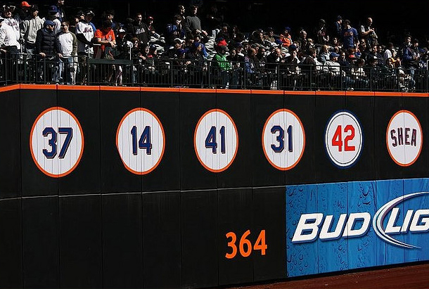
With their newest uniform update, did the Mets remove the drop shawdow from the retired numbers on the wall?
looks like the shadow is still there for some reason
This photo is also from one of the first 3 years at Citi and not 2012, so this would've been before they dropped the black dropshadow.
I think he was referring to the other picture I posted, in which there still seems to be a drop shadow even with the new fence.
-
The 31 retired number at Citi Field is a photoshop job.
I would imagine they will retire it if and when Piazza gets elected to the Hall.
The Mets have it is the way I think most teams should have it. A Hall of Fame/ring of honor type of situation and then retired numbers. To me the only one that should be retired is Seaver. Piazza I would consider borderline for that type of honor. I would say no but I get the arguments in favor of it and wouldn't have an issue with it if they did.
Yeah, the Mets are very stubborn with retiring numbers, which is a good thing. They probably have the one of the highest standards for retired numbers in MLB.
-
So, I'm confused... Did the Mets retire then unretire #31? Was it for a John Franco or Mike Piazza event, that they just wanted the number on the wall, but it wasn't official?
I'm not sure what you're referring to.
-
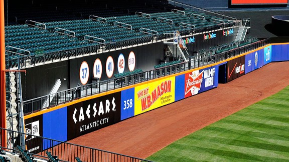
Same thing with the Mets. It's not just one team that does it.
With their newest uniform update, did the Mets remove the drop shawdow from the retired numbers on the wall?
Couldn't find a clear picture, but this photo suggests no. I haven't really noticed while watching the games. Maybe someone else can confirm.
-
Same thing with the Mets. It's not just one team that does it.
-
Now who's got a Space Jam picture?

That is NOT a "wrong" uniform!

Players in the "wrong" uniforms
in Sports Logo General Discussion
Posted
I don't know, IMO Notre Dame and CHC are currently the only two right uniforms for Samardzija.