


buckeye
-
Posts
917 -
Joined
-
Last visited
-
Days Won
1
Posts posted by buckeye
-
-
Pretty much the school anticipated are the ones we expected most to be considered. Schools like Boise and ECU are out of the running. The process is likely being completed in October.
http://sports.yahoo.com/news/report-big-12-narrows-expansion-list-to-6-to-8-schools-141118723.html
-
1 minute ago, mcj882000 said:
(Not sure how unpopular this actually is, but I've never actually seen this opinion here before, so...)
This should've been what the Indians replaced Chief Wahoo with, not the block-C they presently use: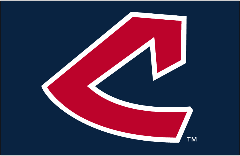
Too piggyback off this, I'm a huge fan of basically the entire look of that era. This font is great imo.

-
 2
2
-
-
Really sad to hear, he was one of the good guys in sports media left in the world!
-
19 hours ago, Brave-Bird 08 said:
I think that Southern Miss' current uniforms are far inferior to the ones they had prior, even with the two-toned pants.
Current:
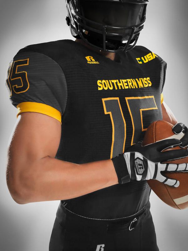
Previous:

My retinas...
-
1
-
-
ESPN loses another reporter in Shannon Spake. She's headed off to Fox Sports to be involved with college football and NASCAR among things.
-
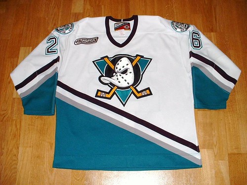
5 hours ago, DG_Now said:
And obligatory:

Varejao played 12 seasons with the Cavs, this is in no way the wrong uniform for him...
-
3
-
-
Or you have ideas like in this article being thrown around...
http://sportsday.dallasnews.com/college-sports/collegesports/2016/05/10/national-reaction-big-12-expansion-texas-hold-whole-thing-many-teams-add"He also pitched another unique idea for the Big 12 once it expanded to 24 teams (an admittedly unlikely scenario): The Big 12 should create the first two-tiered power conference. I love the idea of college football promotion and relegation, and it could be applied to one conference. Let's illustrate how it would work. Houston and Navy earn initial promotion into the Big 12's 12-team top tier, based on their 2015 seasons. The other 12 go to the Little 12 (we could call it Big 12 Tier II or whatever sounds better than "Little 12," of course). This immediately adds two Sagarin top-40 teams to the conference lineup."
-
When did they wear those?
Back around 1970
-
I think this is the best Bulls look to date.


-
For some reason I like the Bills old uniforms. Don't get me wrong, I actually like their current uniforms. I just really like these for some strange reason:

(I know that nobody agrees with me.)
What they were thinking when they came up with that set, we'll never know.
-
I honestly haven't seen this posted anywhere and found no searches, so forgive me if it has already, but found this article on the newest proposed arena in the Seattle area. Renderings were put out around 2 weeks ago. http://www.king5.com/story/news/local/seattle/2015/06/02/tukwila-arena-architects-arena-nba-nhl/28387973/
-
So who gets the CCSLC vote of support? The Coyotes or Glendale?
Or do we just watch this burn down?
BURN, BABY BURN!
(Disco Inferno!)
BURN, BABY BURN.
-
Build a new Suns arena? Isn't theirs barely 20 years old?
Opened in '92. Sadly, in today's world that's too long a tenure as technology and amenities in arena's are ever changing. I'm sure it's still a nice arena, but having a franchise or a city ask for a new one after 20+ years in their current one doesn't surprise me.
-
With the news of Glendale possibly ending the lease with the Coyotes and the arena, and the Coyotes set to show off new uni's at the draft, could we possibly see an instance similar to when the Nordiques updated their look, only to move to Colorado?
-
Nick Foligno is offically the new "Captain" of the Blue Jackets. Couldn't of picked a better guy in my opinion. Can't wait for next season!
-
The ducks should return to the mighty ducks look as the basis for everything they do
This is so much better than anything they've done post 2006. Ditch the new stuff, go back to classic ducks.
"Mighty Ducks" just sounds too 90's and childish to me. The Ducks moniker works fine, and honestly, these jerseys are overrated.
-
1
-
-
Roundel logos are great.
-
This Warrior set (including the uniforms), were imo, the best look the franchise had. Don't get me wrong, the current look is a beautiful set, but it fails to match this look. Sure this set had it's flaws, like the 90's-tastic wordmark that accompanied it. But it had more highs than it did lows, like this beautiful logo and color scheme.
Those unis were the best

Disagree.
These are one of, if not the best uniforms in the NBA
Gotta ditch the Copperplate to even be considered the best.
-
Funny that those could work for the Thunder right now...
-
These Pacers' jerseys are overrated.

-
1
-
-
I don't see what others see in Sam Hornish Jr. as a NASCAR Sprint Cup driver and how he still has potential.
I think he's an absolute terrible driver and shouldn't be racing in the Sprint Cup series. He's missing something to really compete.
Indy 500 champ carries weight...
-
The Corvalis Knights just released a rebrand
http://ballparkdigest.com/2015/02/12/corvallis-knights-unveil-new-logos-colors/
By Brandiose...

It's nice. And no wheat-stock-swinging, armor-clad crow (or some other animal) in sight.
Am I the only one whose OCD kicked in when noticing the right side of the logo isn't enclosed like the left side... One of my pet peeves in a logo.
-
Sorry if this one's been mentioned...

-
First Foligno, now Bobrovsky. Things looking up for the CBJ!
http://bluejackets.nhl.com/club/news.htm?id=747811&navid=DL|CBJ|home

NHL Anti-Thread: Bad Business Decision Aggregator
in Sports In General
Posted
The LULZ