


buckeye
-
Posts
917 -
Joined
-
Last visited
-
Days Won
1
Posts posted by buckeye
-
-
Umm...
I like it better than the skating penguin, but I don't think it should be a shoulder patch on a skating penguin jersey. Mixing logos from different eras almost always looks weird.
I prefer this logo for the Penguins.
Seconded. I have no idea why they didn't at least keep it as a shoulder patch. Worked well on the Pre-Edge set
Thirded.
Agree with the shoulder patch thing too.

They had it as a shoulder patch on the skating penguin jerseys for 7 years and it looked fine.
It doesn't look bad, but I don't like the way the styles of the penguins mismatch. Like putting a square peg in a rectangular hole... it might fit, but it's not quite right.
I don't love the idea because, yeah, one logo is quite modern and the other quite old-school.
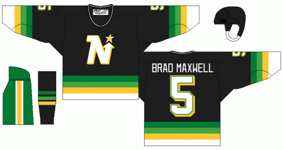
However, I will admit that after 90-91 when the North Stars went to the "Stars" logo, I wanted them to keep the "N-Star" around on the shoulders...much like the 1987 Twins kept the "TC" on the home sleeve.
If only these beauties still existed...

and this happened...
-

This one is impressive. Nice find.
Here's something more: the Vikings have worn a different uniform the last three times they've played the Bengals.
That's 2005 above. Here's 2009

Man that's a horrible uniform matchup...
-
 1
1
-
-
I prefer this logo for the Penguins.
-
A major flaw I have with the Braves' set that most people don't seem to care about...


Sorry, but that triple placket piping looks atrocious. Along with the outlined, cursive script and the tomahawk, it clutters the front of the jersey way too much.
I agree, it's so cluttered! They need to do what the Indians did with theirs and eliminate it.
-
Looks like age is catching up to me.Everyone but me seems to have a rock-hard boner for these uniforms.
 ]
]I think you need new material, so i'll just leave this here
I for one took those jerseys for granted, and I was happy for a moment when they tried to do something different. Now, not so much... BRING THEM BACK!!!
-
These are really good uniforms.

-
Baseball uniforms suck.
-
Who? I have no idea what you're talking about.
Who is that? I'll guess and say Wade Redden?
It's Brandon Dubinsky, who played 5 full seasons with the Rangers. In no way is that his "wrong" jersey.
I'm a homer but to me it is, Obviously watching him as a Blue Jacket, seeing him as a Ranger just isn't right.
-
-
Maryland's 2012 uniforms were amazing (not counting wacky alternates). It took a few tries but Under Armour hit a home run with these.

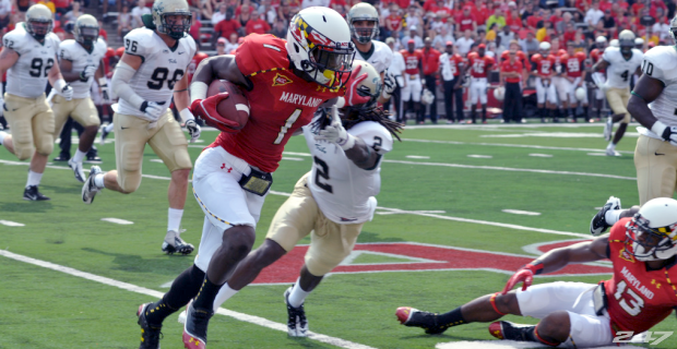
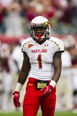
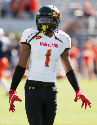
Agreed! I'm anxious to see Ohio State vs Maryland (being a homer I know)
-
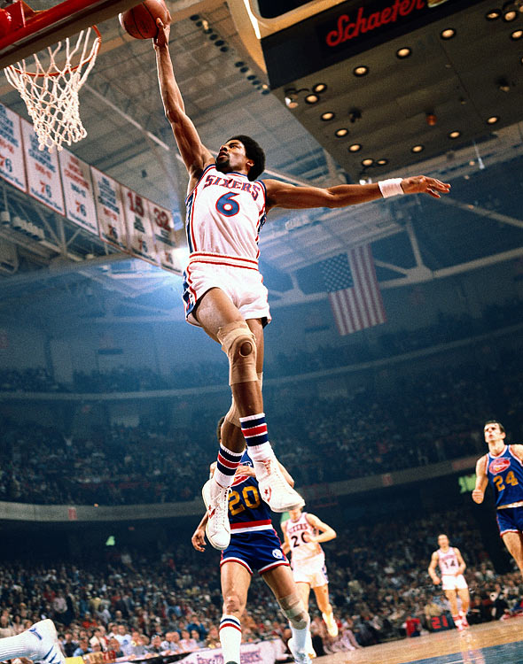
These are the best jerseys in Sixers history

I don't hate phantom yokes in hockey as long as the white jersey has a yoke of the same color.
I'm not a Sixers fan by any means, but everytime I see those Dr.J era unis, I want them back in the NBA badly. I rank them in the top 5 in league history in my book.
-
The Miami Heat have one of the most dated looking sets as an entire package in sports.
-
1
-
-
 is better than
-
1
-
-

If you live in or live near Ohio, you've heard of this grocery store.
I work at it's "replacement"
-
This is beyond hideous:
Every single one of those hats should be burned from existence. If this becomes their rumoured new alt cap next year, it will be the worst cap in the majors - and it's no contest.
I don't think that's an unpopular opinion. I think those are awful as well.
It's probably more unpopular when I say I love those!
-
1
-
-
I don't like pinstripes on sports uniforms and the Yankees pinstripes I absolutely despise. Yes, I know people will say it's just because I'm a hater and yes I hate the Yankees, but I never understand the love affair with those things...
-
There was nothing wrong with this uniform:
Agree 100%
-
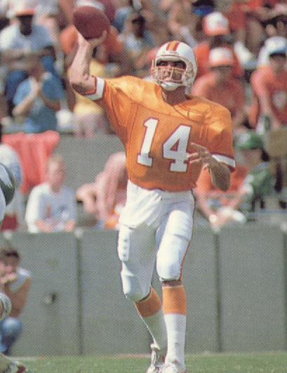
I don't know why so many people think going the "throwback" route for the Saints is a good thing, I think it's the worst the team has looked in it's history...
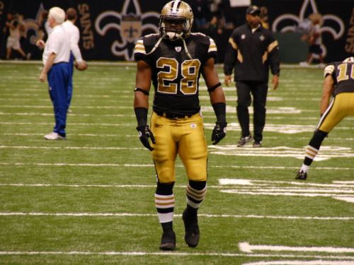
The current sets might need a little tweaking, but the "retro" set, (yes I know the helmet doesn't match the uniform), looks bad...
And On an NBA note, I agree with the Golden State set, though I think it should lose the white striping as well. It seems to me, at least on the boards, that the Pacer's current uniform set is disliked compared to the former sets, but I think it might be one of the sharpest looks in the Association.
 is better than
-

One of the best pro combats nike has done to date IMO.
YES
I disagree. It wasn't a terrible uniform, but I think it's one of the weaker Pro Combat uniforms, especially in comparison to their 2009 uniform.
I just think this version is the best mainly because of the "technical" parts in the uniform going with the Tech in the University. They took a strange design element and made it look great in a uniform. The version prior for VT was good I think as a main uniform for every game use with a change to the pant stripe, but I respect your opinion.
-
One of the best pro combats nike has done to date IMO.
-
In my opinion, I don't think Texas would ever revert back to a conference of that stature. They are to big to be playing teams like that in a conference. I think they would rather go independent first, or join the Pac-16. Not that they might consider it, but I just don't see that happening. And I think the Big-10(12) would rather go for different teams than Duke, Carolina, Virginia and Maryland.
-
Doug Gotlieb reported a source confirmed aTm is joining SEC and that Mizzou, Clemson and Florida State likely to join. Breaking news on bottom line and I'm on my iPhone so I can't link but just check out espn.com.
Just got that text on my phone and was gonna jump on here and post it, looks like the first bomb is about to be dropped...
-
Just from some of the people on the boards here, I thought that jersey wasn't all that liked for the Ducks, but I just think it's one of the best looking jerseys in the league.
-
I love this jersey!


Unpopular Opinions
in Sports Logo General Discussion
Posted
I guess I'm a sucker for the rainbow designs. I think done right it could be a good fit, hence why I mentioned it, but I do see what you're pointing out and didn't notice it until you said something. I do hate when one element is not consistent on a jersey.