


Bmac
-
Posts
4,306 -
Joined
-
Last visited
Posts posted by Bmac
-
-
Interesting BP cap for Tacoma.
-
30 minutes ago, Bill0813 said:
Seattle could be using the Space Needle in their design
Here is the brightness adjusted image:

-
 2
2
-
-
Looks fine, but pretty underwhelming. It looks like they might be using light gray pants, but it's hard to tell from the photos/video. This identity is the perfect place for a Pittsburgh team to use steel gray as a signature color. Use black and yellow to fit into the city sports scene, but lean into steel gray. Gray helmets and pants would've been great.
I agree that yellow helmets with these uniforms would be an improvement. I've long wanted the Steelers to revert to yellow helmets, but that's for another discussion. The yellow stripe on the black helmet is ridiculously thick. The collars of the jerseys are rough. Not great, but could be worse. I'm glad they kept the shoulder/sleeve color block design.
-
3
-
-
1 hour ago, gosioux76 said:
This is a fantastic point. Couldn't agree more. The NHL very clearly works well as a niche sport in markets, like Winnipeg, that will fill every seat.
It's just an unfortunate circumstance that the league has yet to see it for what it is.
Bingo.
The NHL is closer to MLS than MLB/NFL/NBA in regards to niche status and ideal market size. They've tried too hard for too long to be the NFL when they should look to MLS. Put your niche sport in markets where it will be appreciated. Grow the game, but stop trying to force it in markets where it isn't working.
Nashville and Tampa Bay have that sort of MLS market vibe (Rowdies should be MLS, but that's for another thread) and while not traditional hockey markets, have ended up working out well. That wasn't always looking to be the case, but both franchises found varying levels of on-ice success and developed some game day atmosphere and connection to the community.
Arizona has had plenty of time, but there isn't the slightest indication of that ever working out regardless of where they play in the state. Atlanta didn't show legitimate signs of things working out with the Thrashers. Winnipeg and Quebec are sure-thing smaller market answers, the same way Portland and Columbus are in MLS.
Stop looking at Atlanta and Houston, start looking at Quebec and Kansas City.
-
6
-
-
On 3/12/2023 at 11:17 PM, DTConcepts said:
An alleged prototype of an unused Minnesota Wild alternate jersey found its way to Twitter yesterday.
And this one:
-
1
-
-
On 3/12/2023 at 11:18 PM, DTConcepts said:
An alleged prototype of an unused Minnesota Wild alternate jersey found its way to Twitter yesterday.
I hope the rumor mill is right and the Wild are dredging up the North Stars' brand, because this jersey is just not good. Except for the captain patch.
There was also this one:
-
 2
2
-
 1
1
-
 1
1
-
-
-
Really digging that Japan set!
-
 1
1
-
-
These are so fun! I adore the Minnesota set.
-
1
-
-
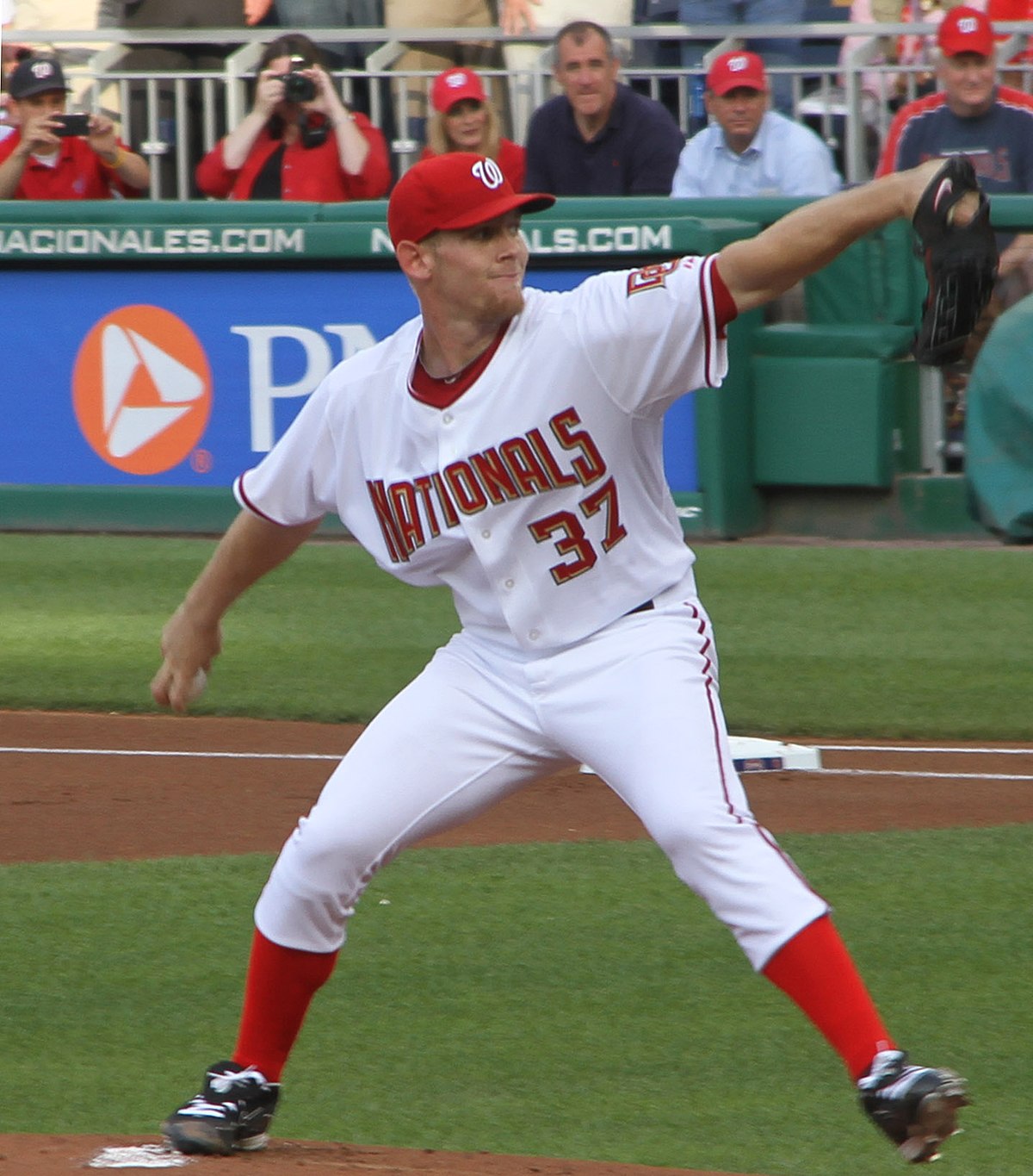
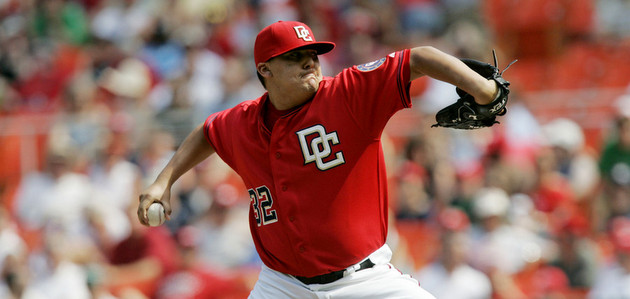
Speaking of navy+red teams who should do something unique with their identity...
The Nationals have some of the worst uniforms in MLB.
Washington should've been the navy+red team with gold, not Minnesota. It could easily be added back into the identity. Plus they have the unique monument-inspired lettering to revisit, a welcome deviation from the standard script or arched block lettering everyone seems to have. Personally I'd love to see red lettering with beveling, outlined in navy with gold trim. I also always loved the uniqueness of the red at home + navy on the road setup.
-
14
-
1
-
-
53 minutes ago, MNtwins3 said:
Is the number and NOB also stupidly small?
I will say if the lettering and number were bigger, those greys would look very nice
-
2
-
 1
1
-
-
Also worth mentioning that any changes for the upcoming season may have already been in progress before the news of adidas moving on from the NHL deal was finalized.
-
3
-
-
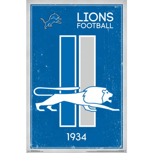
41 minutes ago, BBTV said:
My idea for the lions is to borrow from one of their old logos. Nix the TV numbers and put two vertical stripes that match this old logo on the shoulders/sleeves. They could put the current lion there, or just have the stripes and leave it alone. If they're absolutely hell bent on having a wordmark on the sleeves, I guess it goes in front of the stripes - but ideally, the sleeve wordmark experiment is over.
Then just slap a varsity block font like the Sanders set and call it a day. The stripe pattern works on both the blue and the white jersey. For the pants, there's no need for blue pants at all. Just have the silver (now grey, unfortunately) with the same striping pattern as the sleeves. The gray stripe can have a thin blue border to make it more visible.
The helmet striping would stay symmetrical, just be simplified. The Sanders era would work, as would a reversal (w-b-w).
I found this version that someone made that shows what it could look like on the white jersey with a modern lion:
(not sure who to credit, but image source is this: https://www.pinterest.com/pin/412572015837635252/ which states that it's pulled from a site called OffficialPSDs. I assume it's stolen from a forum like this, so if it's yours please say so.)
Some vertical stripes mimicking the logo could be fun.
Some inspiration:
-
11
-
-
Rumors on Twitter saying New Era is pushing for the NHL jersey contract. That would give them CFL and NHL.
-
Union Omaha switching from Nike to Hummel this year. Two new kits!
Primary:
Secondary:
-
2
-
-
I'd guess Nike isn't offering to produce new ST/BP jerseys, but any team wanting to use what they have is welcome to. Still seems odd considering the trend lately has been to produce every possible additional piece of on-field merchandise to get fans to purchase. I'm sure ST/BP jerseys weren't a super popular seller, but, like the caps, it's just one extra option to sell to fans.
-
1
-
-
Some of you may recall that this past season, several teams weren't able to get their alternate jerseys from Nike (or Majestic or whoever is actually producing them) until several weeks into the season. Certainly those production/supply chain issues contributed to this situation in which Nike is looking to limit the workload. Also keep in mind that baseball teams usually go through a handful of jerseys per player throughout the season. From a retail position, this move might not make the most sense or line up with traditional Nike strategy, but from a production standpoint it makes sense to limit the workload.
-
2
-
-
Put the Titans in navy and yellow (Predators colors, fits the market, unique to NFL, solid football color scheme) and let the Texans go with light blue, red, and navy.
-
2
-
1
-
2
-
-
5 hours ago, fortunat1 said:
Giving each team a white panel is fine I guess... certainly not the worst thing that could happen. My main issue is the white logo for each team. Taking away the color from each logo confuses me, as it leaves each one looking a little incomplete and less identifiable than their standard caps. Not to mention they'll be illegible from afar, with some being barely legible up close.
Also, is this the first season that the league has separate caps for spring training and batting practice? I thought that spring training caps have served as the teams' BP caps for the last few seasons.
Agreed. The white front panels are fine (not great, but tolerable) but the white logos on top of that are awful. There's barely anything to see here. So bland.
-
1
-
-
Yeah, I love the new Arizona alternate uniform as well. It's not perfect, but it's really damn good. The striping pattern is fantastic, especially given the inspiration and background. I'd probably prefer a logo crest instead of the wordmark, but I'm okay with the wordmark. The extra details like the C/A patches and cactus on the pants are fantastic. I wish more teams would expand their identity with details like that. The block numerals are the only thing I dislike, bad choice there.
Also, it's great to see that shade of red on the ice again, especially since it's not weighed down with black.
-
1
-
-
I find the simplified kachina pattern to be excellent. The original design is certainly better, but this is just an alternate jersey and does a great job of utilizing the signature design element in a minimalist aesthetic. The wordmark is trash, however.
-
Loving the database!
I was very surprised to learn that this jersey design with the color block sleeve inserts, which I've always associated with BC, was actually worn by half the league in 1964. I wonder if it was because of the jersey supplier at the time or something?
-
1
-
 1
1
-
-
A dark red and yellow look for the Angels could work really well. Maybe it's the USC influence, but that color combo gives off a southern Cal vibe.
-
6
-
-
I've longed for a navy cap with a red bill for the Angels (literally since 2002), but at this point they are cemented as a red team. The navy/red cap would be a fun Sunday alternate option.
-
2
-


MLB 2023 Uniform/Logo Changes
in Sports Logo News
Posted
Yeah, each team has something similar. They're not based on City Connect, but some do seem to carry on the same visual language of certain City Connect uniforms. (White Sox, Astros)
Here's the rest of them.