


Bmac
-
Posts
4,304 -
Joined
-
Last visited
Posts posted by Bmac
-
-
Seems like Dallas (Arlington) and Houston should've swapped colors.
-
 3
3
-
-
In college football, are conference championship games:
good, because they require the best teams to prove they belong and really earn it? It does help narrow the pool a bit.
or
bad, because one extra game can ruin someone's season? Like, you can have have an undefeated regular season and be in line for a top 4 spot, but lose in the conference championship and drop a few spots. Whereas a one-loss team who didn't make the conference championship because of conference divisions isn't required to play that extra game, and can move into a top spot.
Right now, for example, USC is going to drop out of the top 4 and Ohio State, who isn't in the B1G championship game because of the divisional setup, will move up.
-
4
-
-
I adore that yellow helmet.
-
4
-
 1
1
-
 1
1
-
-
3 hours ago, SilverBullet1929 said:
That makes sense but did they darken the caps too? I just don't want to look at the Twins now and see the caps nearly black as the Tigers and Yankees often do appear.
No, New Era offers two shades of navy, and the Twins already used the darker one. They continue to use the darker one. Jerseys have been darkened to match.
-
2
-
 1
1
-
-
12 hours ago, BBTV said:
Sublimation basically just means that the fabric is dyed rather than a design being woven in, printed on, stitched on, etc. Has nothing at all to do with colors. It's a process.
Yeah, this thread is revealing that many people don't seem to understand what sublimated means. I think within the sports uniform world we have here, it's become synonymous with a design that utilizes a color slightly darker or lighter than the base color to add subtlety to a design element. But in actuality, it's just a printing process that is extremely common.
-
2
-
-
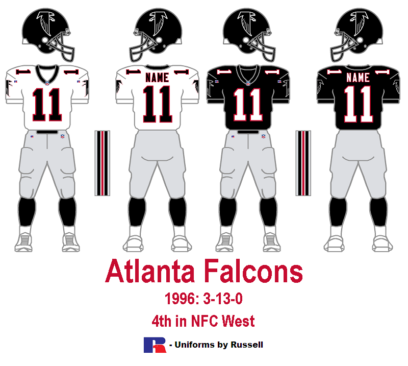
Whoa, I'd never paid much attention to the Atlanta Falcons pre-1998 visual identity before. For starters I never knew they modified the pants striping to swap the colors. Interesting.
I was much more surprised to find out there existed a different white jersey prior to the red-numbered one introduced in 1997. The black numbers and socks probably match the home uniform better, but I prefer the red numbers and socks they switched to just in time for their national attention.

But while looking all this up on the Gridiron Uniform Database, I was VERY surprised to learn that the red-numbered version existed first! Apparently it was worn (with black socks, not red) for one preseason game and the first two road games of the 1990 season, and then they switched to the black-numbered version! How odd.
-
5
-
-
Royal blue and kelly green is not a color combo that screams "San Antonio" or "Gunslingers" to me. I'd love to see more green used in the league, but I'd rather see this team rebranded in more fitting colors (brown would be cool) if they return.
-
4 hours ago, MGoBlue98 said:
I apologize if this is the wrong place for this post, but does anyone happen to know if the Fanatics (non-Adidas) Golden Knights RR apparel also feature the reflective elements? Trying to save some money and not spend $200+ for the Adidas one. Thanks in advance!
I think there was an article from right after the RR jerseys were unveiled about how only the authentic Adidas option has the glow in the dark reflective elements.
-
Based on that teaser image from this morning:
-
8
-
-
I wonder if we'll see something like this for the new Twins road cap:
-
5
-
-
Yeah, the purple and yellow needs to stay. It's so beautiful. Black and silver can remain as an alternate set, but purple and yellow is too beautiful not to use full time.
And no, I don't care what terrible uniforms the Kings wore when they hoisted the Cup.
-
4
-
-
4 hours ago, McCall said:
I know, but these don't look like anything other than fashion caps. Very basic. One's even khaki. You'd probably see slouch versions of game caps grouped together. None of these look like they'd be one.
We've already heard from multiple sources that there's supposed to be a new on field cap featuring an M with a star above it, as seen in the leaked photo. The on field cap is probably a different colorway, but that's definitely the logo.
-
37 minutes ago, AFirestormToPurify said:
Couldn't find answers on google, how come White Sox players can get away with wearing red gear? Is it because they were a RWB team at some point?
Yes, they have red gear to go with the throwback uniforms, and therefore are allowed to use it.
I'd love for the White Sox to go with a black + minimal red trim theme as a nod to the past (1950's look is my favorite, plus it connects several other eras of White Sox visual history), but that's another conversation.
-
2
-
1
-
 1
1
-
-
3 hours ago, dont care said:
I think the bottom pic is the swoosh
I hope so, because the TC logo on the chest would be underwhelming. The red alternate jersey has proven that the TC logo is better as a cap logo, but not strong enough as a chest logo. That red jersey has always felt unbalanced and bland. Hoping for red + white lettering on the navy jersey(s).
-
3
-
-
1 hour ago, seasaltvanilla said:
From the fabric texture and stitching I think this is the left corner of the C on the cap; TC stays and no mustard.
Possibly the corner of a name? Doubt they would go solid navy logo or numbers. Pinstripe-less white jersey.
White jersey sleeve piping.
Initially thought this was a navy script with red outlines, but the texture makes me think it's a navy alternate (also matches what Buxton is wearing in the video).
Still a question of what scripts they use and in which colors, ditto with the numbers.
The bottom image makes me wonder if they're going with the TC logo on the chest of a navy alternate jersey.
-
I think the RR version of Johnny Canuck just seems elongated because the modernized alternate logo version we've become accustomed to seeing is more squished. It's just a matter of untraining our eyes to see it a certain way.
-
1
-
-
I see the "BASEBALL UNIFORMS AREN'T ALLOWED TO BE FUN" crowd is here.
-
7
-
-
I'm a big fan of the Knights adding blue as well. But those logos are not working. The knight rendering is odd, and the C is generic and uninspired. I'm curious to see how the blue is utilized in the uniforms.
-
2 hours ago, the admiral said:
The consensus around the Panthers having the best design is weird to me. It's fine, I guess, but it's not as good as every publication is making it out to be. I feel like this is just a consequence of the Panthers being a very internet-friendly team right now (I have my theories).
I've felt the same way. I have no qualms with the jersey, it's perfectly fine. But I don't understand why everyone is obsessed with it. People I know who aren't even into hockey love it. I've seen it ranked #1 on many lists. I really don't understand why people think it's the best one.
-
I REALLY wish they carried over the striping layout from the teal jersey, because it would look amazing on the white jersey. Otherwise, these are just about perfect.
-
1
-
-
Just a reminder that there's a big difference between logos that are "out of date" and logos that are "of their time." The Flyers logo is certainly of its time, but I don't think it could be considered out of date (although there is some minor line work that could be done to perfect the classic logo).
-
5
-
-
This is a fun series! That Brewers business is incredible. Keep up the creativity!
-
2
-
-
This graphic really gives us a great look at the difference between the Avs blue gear and black gear. Kind of odd to include both.
-
1
-
-
Would the Phoenix market have benefited from having less teams? Rather than three new teams entering the market from 1988-1998, say only one or two did. Would support be spread better between two or three teams rather than four, or is the market just not a good fit for pro sports in general?


XFL 2023 Logos, Names and Uniforms
in Sports Logo News
Posted
What's the deal with the little bull icon above the player names on all jerseys?
The San Antonio graphic posted above appears to read "PROJECT BOOK PATCH" but I'm not sure what that means.