


Bmac
-
Posts
4,305 -
Joined
-
Last visited
Posts posted by Bmac
-
-
This is only my second year following MLS and I'm genuinely curious how teams decide which kit to wear. For example, tonight the Timbers are wearing their pink + burgundy kit in Colorado. While it isn't a direct clash, why wear the oppose team's primary color instead of your own colors? They couldn't save the rose kit for another matchup?
-
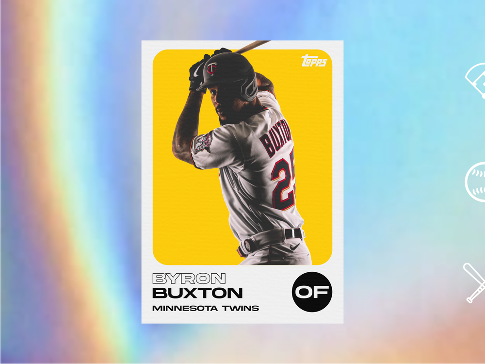
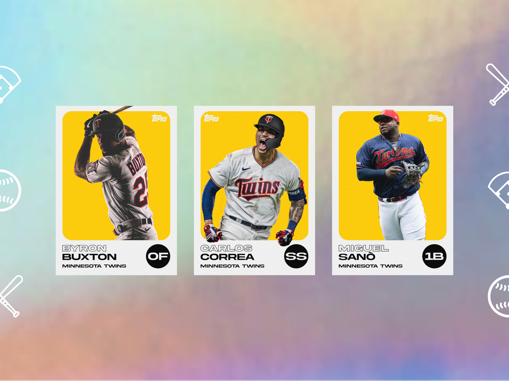
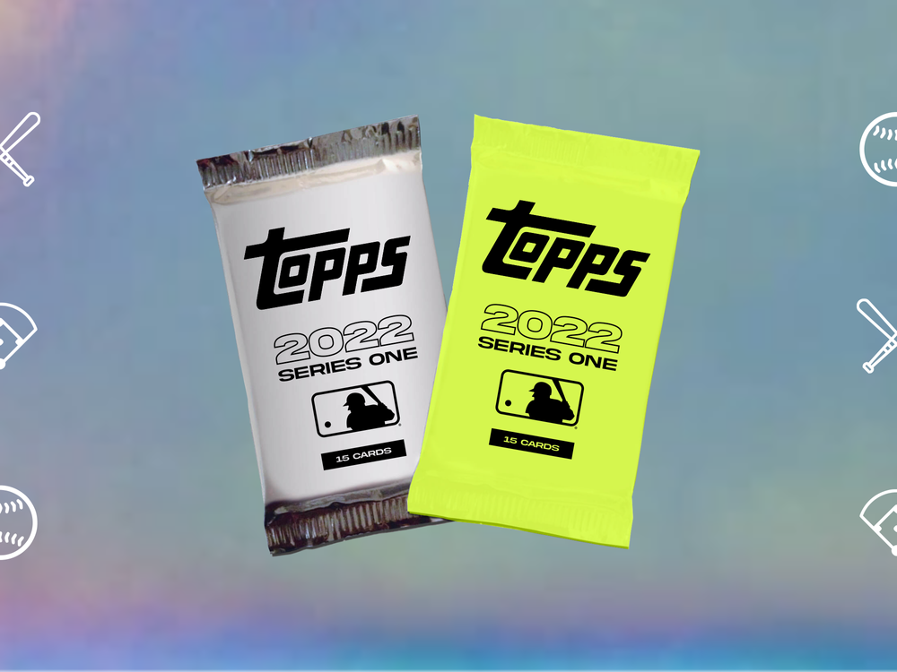
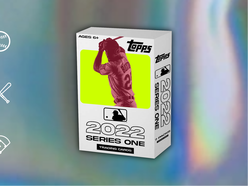
I'm trying to get better about sharing conceptual work, so here we go...
Baseball cards these days are typically over-designed, including the packaging. I wanted to design something simple and modern with a retro vibe. Blocks of color, cropped player photos, clean typeface and layout, keep it simple.
This concept presents fictional Topps 2022 Series One MLB trading cards and packaging.

-
 8
8
-
-
A few notes from around the league:
-Most teams (not just the Phillies) are missing their alternate jerseys due to production delays. It'll be interesting to see who gets theirs first. San Diego has theirs, who else?
-Giants got permission to add the City Connect uniforms as a full time alternate. (can't imagine the league having any problem with that)
-Many promotional pieces from MLB feature the winged G logo on caps for Cleveland, rather than the new C. I'll try to get a screenshot.
-
Diamondbacks have worn their new caps in the first two games of the season. I wonder if they're intended to take over as the primary home cap.
-
3
-
-
Or maybe the hat could be the thing that blocks the sun from one's head...?
-
8
-
 1
1
-
-
Most of the BP caps are pretty predictable, but the Twins randomly use the M logo, not seen in several years.
-
5
-
-
I'm legitimately curious here, would y'all still be ranking Michigan as the best uniforms if they didn't bring back the iconic Panther helmet?
-
-
https://twitter.com/jbosack/status/1494339940838039553?s=20&t=UHJ6npI6dDhLV7MWsrE4lw
Joe Bosak says the Michigan helmet is a work of art, so I think we're safe.
-
1
-
-
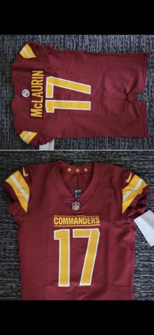
This whole franchise is like a decade behind the times. The previous name should've been dropped long ago and the new uniforms are something straight out of the Nike Pro Combat series from ten years ago. Combine that with the inappropriate behavior within the organization and overall negative workplace environment, it's obvious Snyder operates in another reality.
-
9
-
-
I don't even care that each jersey is so different from each other. Each jersey is so poorly designed on its own.
The burgundy is obviously the best one, but is still awful. Color balance must be a foreign concept with these uniforms. Numbers should either be solid yellow to match the rest of the new branding or white with yellow trim to maintain the visual language of the franchise's brand. The striping either needs to balance white and yellow if they're going to touch, or separate them with burgundy in between. This just looks like :censored:.
The white and black jerseys aren't even worthy of critique. There's nothing of value.
What a mess.
-
9
-
-
Their uniforms went from WFT to WTF.
-
28
-
-
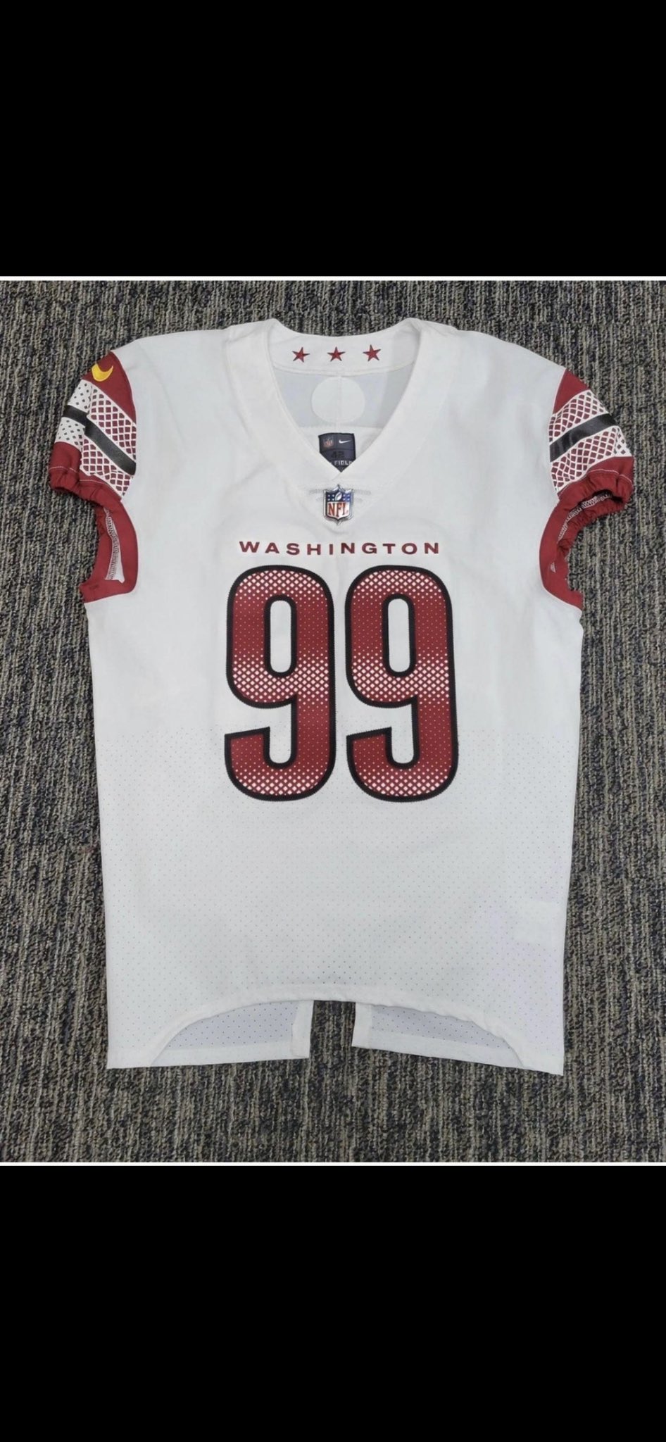
3 minutes ago, Cujo said:
Here they are...
v
Honestly the stars on the inside collar are the ONLY good part of these. Gross.
-
3
-
-
5 hours ago, SFGiants58 said:
Inside Pitch by Rick Allen shows off a better angle of the previously-known Seattle Pilots prototype.
I like it more than the finalized design.
I like it more than the final design as well. The jersey looks great, and the cap logo is better than what they went with. I wonder why the opted for the generic block 'S' instead? The one in this photo represents the pilot theme perfectly.
-
4 hours ago, IceCap said:
I played on my high school's hockey team. Our colours were red, white, and grey. One of my friends on the team once said "we should have neon green and black alternates." I asked why and he said, I'm not joking, "they'd be sick."
I can't help but think of that when I see the neon green and black Stars sweaters.
I completely understand where you're going with this, but I think it's a swing and miss simply because the design inspiration is obviously the Dallas skyline. The neon green skyline concept has been on the table forever, and the team finally went forward with it. Can't see it having anything to do with embracing meme culture.
And for what it's worth, I still maintain the Stars used too bright of a neon green and should've gone with thin piping as opposed to the thick stripes. I'm baffled by many of the striping design choices on most of the recent Adidas alternates.
-
4
-
-
3 hours ago, Digby said:
Has the team acknowledged the Hatch Show Print influence formally? That's the kind of obscure local reference detail to make the NBA City Edition proud. Can't blame Nike for this one! Should've screenprinted the jersey then, the effect is lost with the medium.
From the press release:
"According to adidas, the primary crest of the Predators jersey pays tribute to the fans with the SMASHVILLE mark, and the look was inspired by letterpress music posters which are part of Nashville's rich history. The "NP" in Nashville's guitar pick and lace collar gets a modern tonal color treatment with navy-on-navy details."
-
The Lightning jersey is fantastic.
The Hatch Show Print inspiration behind the Nashville jersey is a fun idea, but poorly executed with the Smashville mark.
-
So the New Jersey Devils' new jersey is going to have a new Jersey script on the front?
-
7
-
-
Bowling Green has some new uniforms this season:
Including this interesting throwback option:
-
2
-
-
9 hours ago, Mingjai said:
Does this mean no more grey? Good. I like the maroon set and the gold breezers. But the white jerseys need some more gold.
The gray sweaters are still around as an alternate, worn this past weekend:
-
North Dakota wore special uniforms Saturday night for the Hall of Fame Game in Nashville:
-
1
-
-
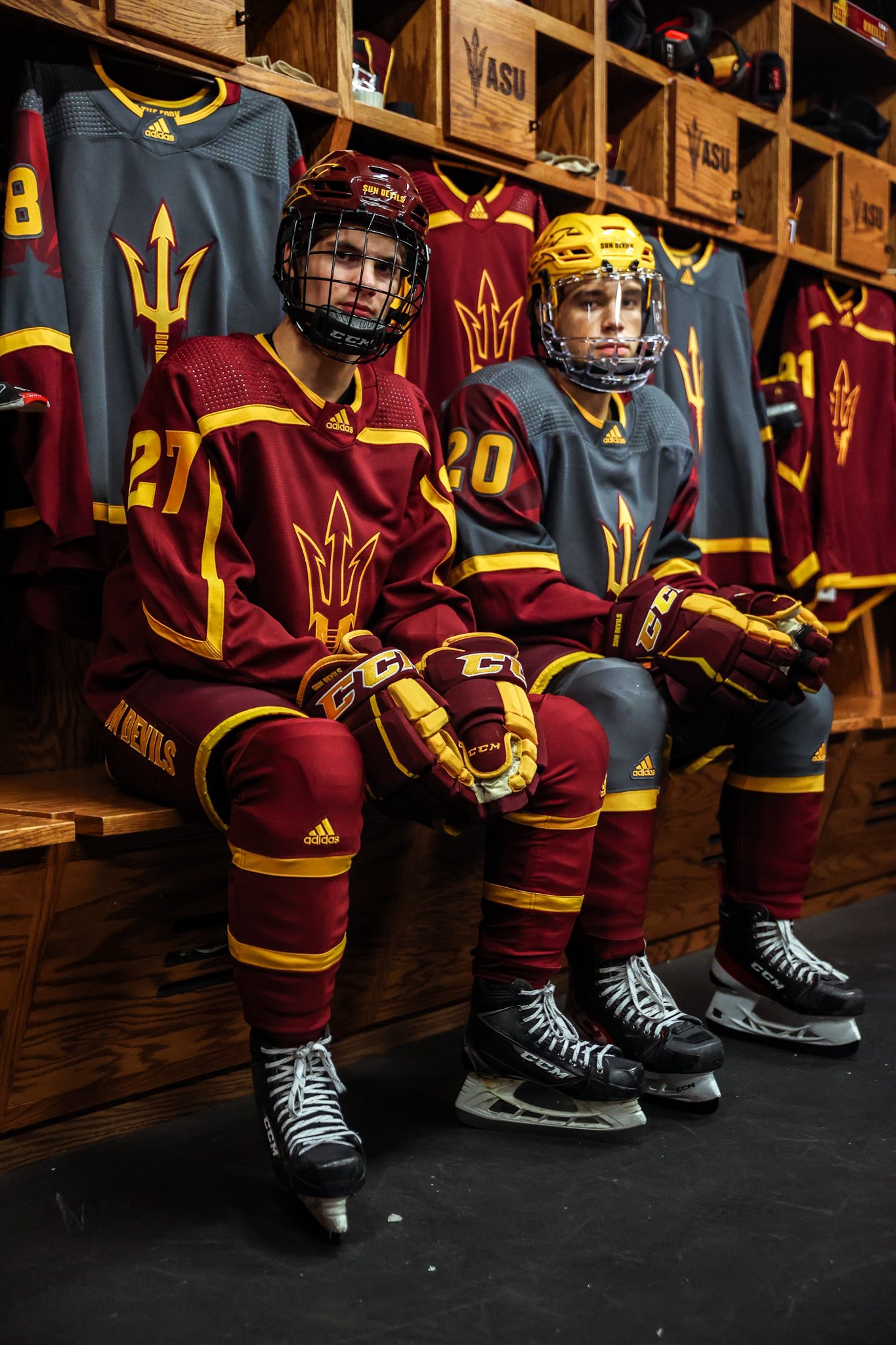
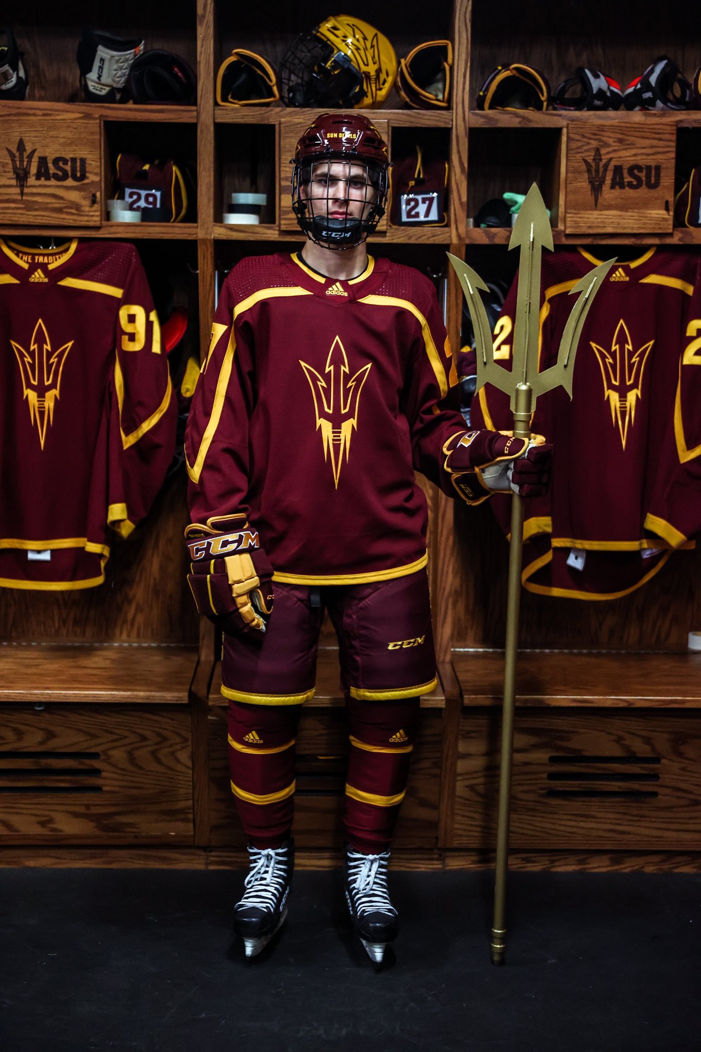
There's a college hockey uniform changes thread every few years, and I figured instead of making new ones every so often we could just use this thread yearly.
*****
A few changes for the 2021-22 season:
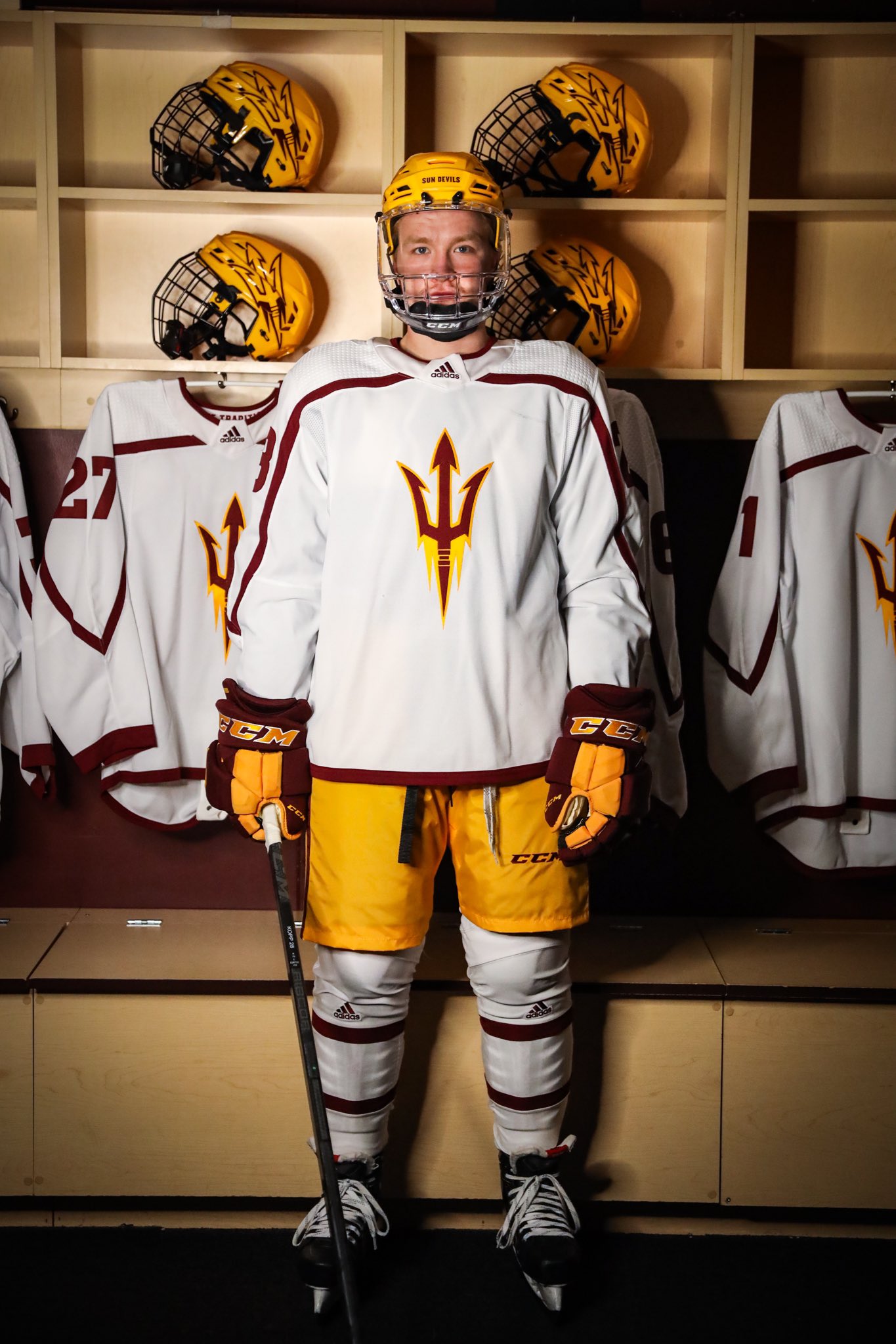
Arizona State with new home & road sweaters, paired with a variety of helmet+breezer combos:
Omaha has a new alternate jersey for the first time since 2014 and is rocking a 25th anniversary patch:
-
1
-
-
On 9/11/2021 at 2:08 PM, Bmac said:
Not sure if we ever got confirmation of the new jersey material name from Adidas, but my supplier says:
"New for the 2021/2022 season: Adidas Primegreen jerseys. AEROREADY keeps you cool and dry. A mesh underarm insert adds extra breathability.
This product is made with Primegreen, a series of high-performance recycled materials. Loose fit, 100% recycled polyester piqué with mesh underarm inserts."
Also adding that these new jerseys are showing up to retailers over the next two weeks, and should be available to purchase shortly.
-
1
-
-
Not sure if we ever got confirmation of the new jersey material name from Adidas, but my supplier says:
"New for the 2021/2022 season: Adidas Primegreen jerseys. AEROREADY keeps you cool and dry. A mesh underarm insert adds extra breathability.
This product is made with Primegreen, a series of high-performance recycled materials. Loose fit, 100% recycled polyester piqué with mesh underarm inserts."


MLB 2022 Uniform/Logo Changes
in Sports Logo News
Posted
Would the Phoenix market have benefited from having less teams? Rather than three new teams entering the market from 1988-1998, say only one or two did. Would support be spread better between two or three teams rather than four, or is the market just not a good fit for pro sports in general?