


29texan
-
Posts
2,921 -
Joined
-
Last visited
-
Days Won
5
Posts posted by 29texan
-
-
2 minutes ago, DCarp1231 said:
Yeah and that uniform is cool as f***. What about it?
Read the whole thing . . .-
 1
1
-
-
2 minutes ago, tigerslionspistonshabs said:

"Nice" is subjective.
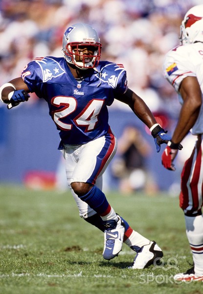
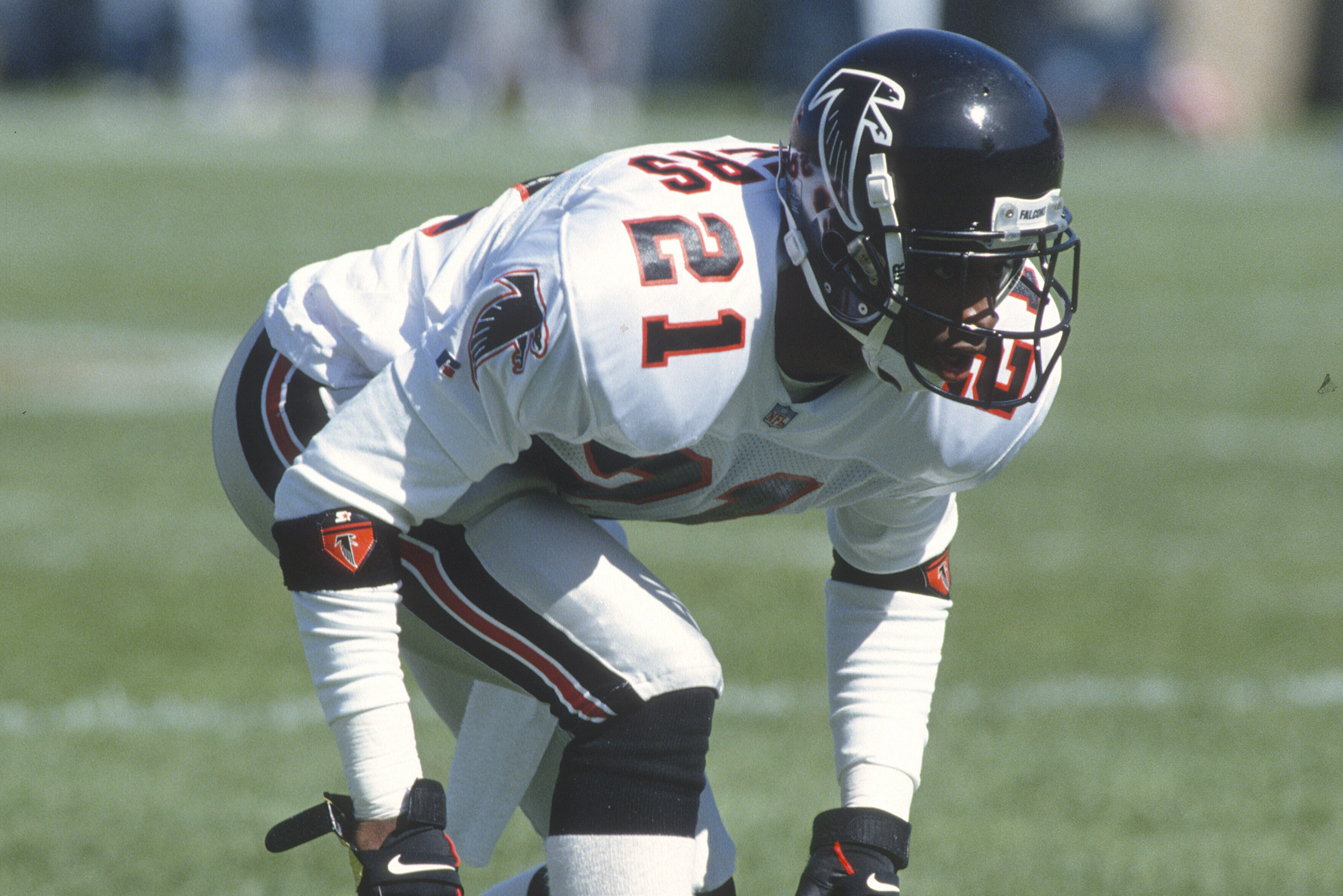
This was in 1996, btw:
-
 7
7
-
2
-
-
33 minutes ago, PurpleHayes said:
Ice?? In Houston??
"Ice"
-
1
-
 1
1
-
6
-
-
1 hour ago, infrared41 said:
Who had Denver being the clear loser in this year's new uniform Olympics?
Disagree.-
1
-
-
I started this thread back in 2013.
The Texans were the first on the list... and I stand by it.
Downgrade.-
12
-
2
-
-
18 minutes ago, ruttep said:
This is a lateral move, at best.
Exactly.
Honestly, the jerseys were the best part of the change. -
1 hour ago, chriscj1983 said:
Not every uniform has to be a throwback, but it's not too much to ask for them to not look like trash.
It is possible to design a new uniform that looks classic, yet modern. It has happened before.
Not in Denver, unfortunately.
-
1
-
1
-
 1
1
-
 1
1
-
-
2 minutes ago, nuordr said:
To balance things out, of course. -
1 minute ago, ruttep said:
The socks!
The socks should be the least of their worries.
-
Thoughts:
Helmet - D | The Seahawks helmet stripe doesn't work here.
Jerseys - A- | I like the mountain sleeve motif. But the random triangles on the side? Why?
Pants - C- | The stripe, again, is kinda knocking it down.
Overall: C+-
4
-
-
32 minutes ago, Brave-Bird 08 said:
Everyone give this baby one last good look (always loved it and will never apologize for it, just didn't mold well onto modern templates)
Honestly, I gotta give them credit. They managed to make that look somewhat "timeless".
I may miss this... but that depends on what happens within the next 30 mins.-
2
-
-
35 minutes ago, HOOVER said:
I want to agree, but that last gradient helmet has me giving you side eye.
I'll long be a proponent of the Falcons wearing these uniforms:
But with this helmet:
The Gradient helmet is just an alternate.
If they HAD to do gradients, it should have just been for the helmet and not full time. + -
29 minutes ago, PaleVermilion81 said:
I only see 1
The Cowboys don't need to be "modernized"... just fixed.
ONE Blue. ONE Silver. ONE cohesive design between the two.
Just be as consistent in the uniforms as you arewith disappointing the fanbase every season.
-
1
-
1
-
-
14 minutes ago, Cujo said:
Not sure I totally agree with you there (49ers, Colts) -- but the Browns can't be like "let's do vibrant orange helmets!" and then tack on a gray facemask. It's like what the Bills did throughout the 10s.
GFMFGFMS.
I think the Niners and Colts look better with their color facemasks... but those could go either way, to be fair.-
2
-
1
-
-
On 3/26/2024 at 4:19 PM, DCarp1231 said:
Not using these as a base was a huge mistake
Just sayin'...
-
5
-
1
-
-
18 hours ago, oldschoolvikings said:
Only mask the Browns need...
NO!
Gray facemasks should only be reserved for throwbacks and teams with silver helmets.
-
5
-
1
-
 1
1
-
-
12 minutes ago, mmejia said:
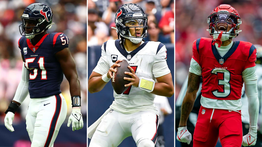
The Texans are owning the leak and just posted this pic. Thick red stripe with white outline visible in the reflection on the right
I've said the Texans were one of the few teams that got their look right the FIRST time... and I stand by that.-
13
-
1
-
-
11 hours ago, Survival79 said:
This is interesting...
"The Athletic Frog and the arched TCU logo can only appear together on football helmets."
Yeah, TCU is kind of "loose" with some of its branding...-
1
-
-
What took so long...?
-
 1
1
-
-
Hmm...
-
On 4/4/2023 at 7:28 PM, GrayJ12 said:
The font for this new logo feels like a combination between the 1950 and the 1987 logo, in my opinion. I don't think it works, it feels clunky and too loud.
Yeah, that's an accurate discription.
-
On 3/28/2023 at 10:35 AM, Pharos04 said:
Just happened to catch this. Looks like the weird smile is retiring in this year and Pepsi is reverting to the familiar wave logo again
https://www.cnn.com/2023/03/28/business/pepsi-new-logo/index.html
They could have gone with a better font... but it's an improvement for sure.
-
3
-
-
On 2/13/2023 at 7:36 PM, UncleJunior said:
Not bad at all
I appreciate that they're actually trying again... and I don't mind the template idea.
It's just still so poorly executed.
The last three logos have been better, but "better" in the same way that a low-scoring, championship game with no offense is better than a blowout in a championship game, where one team doesn't show up.-
2
-
1
-
-
Updating it, based on current rumors and what the NFL would do...
MLB with 32
(*Montréal & Nashville expansion / Astros and Padres switch Leagues / **A's move)
American:
North
- Chicago
- Cleveland
- Detroit
- Minnesota
East
- Baltimore
- Boston
- New York
- Toronto
South
- Kansas City
- *Nashville
- Tampa Bay
- Texas
West
- L.A.
- **Las Vegas
- San Diego
- Seattle
------------------------------------------
National:
North
- Chicago
- Cincinnati
- Milwaukee
- Pittsburgh
East
- *Montréal
- New York
- Philadelphia
- Washington
South
- Atlanta
- Houston
- Miami
- St. Louis
West
- Arizona
- Colorado
- L.A.
- San Francisco
And since they all play each other, now, I'd think there'd be "Protected Rivals", so that you'd still see Cubs/Cardinals, Rangers/Astros, etc.
-
1
-


:format(jpeg)/cdn.vox-cdn.com/uploads/chorus_image/image/48650395/GettyImages-1497208.0.jpg)


2024 NFL Changes
in Sports Logo News
Posted
The more I see these, the more I think these: