-
Posts
5,995 -
Joined
-
Last visited
Posts posted by LEWJ
-
-
15 minutes ago, Ferdinand Cesarano said:
Agree 100%
I quite literally had this discussion last week after reading the Uni Watch column regarding their 2019 throwbacks.
(Also I was born in Cincy and as a kid my little sister had a toddler version of that cap!)
-
 3
3
-
 1
1
-
-
1 hour ago, CC97 said:
Yeah, it sucks, but the site is literally gasping for air -- the traffic has remained steady, but we're getting destroyed by scrapers, and the like, which has sent our server fees soaring; while that's happening, what we take in from ads has tanked. So, costs have tripled, and revenue has gone down while maintaining steady traffic.
I pay a lot of money to keep this free site up for everyone; the ads allow that to continue. If you don't like the ads, you can sign up for an ad-free experience for $7 US per month (which is less than a quarter a day!). This helps pay the bills and gives you the ad-free experience you desire.
Ad-Free experience available here: https://www.patreon.com/sportslogos
If anyone needed a push off the fence, I highly recommend the ad-free experience. It’s been quite some time now and I’ve had zero complaints. It’s truly a small price to pay, for me. But I know not everyone has been here for 2 decades

All understandable obstacles though, Chris. As someone with very minimal knowledge on servers and site-building, I’m sure I’m not the only one who just doesn’t fully understand everything that goes into it.
-
 4
4
-
-
5 minutes ago, MJWalker45 said:
I'm betting their financials are on par with the XFL and USFL before their merger. Good enough to limp along separately, but better for both to streamline operations and continue on as one school for a much longer time frame.
Yea, I’m guessing that’s probably the best way to put it. I guess it’s smart on them for having the analysis done regarding a possible merger. Curious if it was their reaction to Urbana, NDC, and others closing their doors.
-
@MJWalker45 I can’t say I’m too surprised either, now that I’ve learned a little bit more about the universities. I had also seen that about Urbana, and soon ND College.
I knew Bluffton was a private Christian school, but i just learned Findlay is too. It says both schools are coming from a good place financially, so I guess we’ll see how it goes. I’m assuming this is not much different than other similar mergers and “joint campuses”. But right now it just feels like sharing bills

-
Oh good find @burgundy, i should have perused a little longer! I had noticed that about Bluffton name change being mentioned, but not Findlay.
One of my good buddies was recruited by Findlay football(15 yrs ago), so we’re curious to see if it has any substantial impact on the level of play and recruiting landscape in the future.
But obviously excited to see the “joint brand” unveiled later on.
-
 1
1
-
-
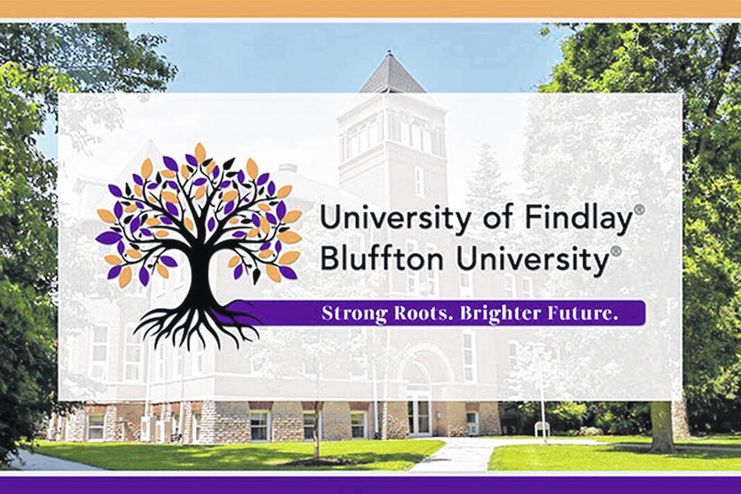
Not sure if this belongs here (or if it belongs at all)… But Bluffton University and the University of Findlay are merging. They are schools in Northwest Ohio, about 20 miles apart.
Bluffton participates athletically at the D3 level (NCAA). Findlay is D2.
QuoteFindlay and Bluffton would become one higher education community on two campuses. Pending all regulatory approvals, we anticipate the merger would be completed by Fall 2025
…
We see a brighter future ahead — one where University of Findlay and Bluffton University would establish an even stronger premier institution of higher education in Northwest Ohio.
https://www.findlayblufftonfuture.com
I’m curious to see what kind of brand changes take place, it sounds like they will be standing pat until 2025ish. A lot more info to be announced, but very curious to see if they (continue to) combine their colors (Bluffton is purple, Findlay is bright orange).
This is the only graphic they’ve revealed in regards to the merger, as far as I know:

-
 1
1
-
-
54 minutes ago, MNtwins3 said:
As far as I know, the Nats were the only team to do this
There’s been a few! (Although this one had no front number the first season worn)

-
4 minutes ago, Pigskin12 said:
That was from two years ago.
you are correct
 as you were. lol
We'll call that subpar search terms combined with lazy skimming

-
1 hour ago, ruttep said:Spoiler
Indianapolis Colts Unveil 1956 Throwback Uniforms – SportsLogos.Net News
They'll be wearing throwbacks, actually. I thought they'd be white... but no
-__-
-
-
2 hours ago, BBTV said:
If the streaks on the left are "speed trails", does that imply that it's a "shooting" star, which is actually a meteor and not a sun?
I guess if we’re getting technical the sun is classified as a star… meteors are not


edit: I’m realizing i basically paraphrased what you said. For emphasis.. er something
-
Ohio State Baseball as of today:
Spoiler-
 1
1
-
-
Sharing post from UniSwag for visual reference
-
Did they mean 30 million years? I’m no geologist, but…
I’ll see myself out.
The Marlins one seems like a memorial for someone who wore #30 and won two ‘ships. Or something..?
-
 2
2
-
-
On 12/1/2022 at 11:05 PM, riccirulesall said:
not afraid to admit the felt treatment on vintage/WC/fauxback crests and numbers gets me hot and bothered
Quoting for emphasis.

-
1 hour ago, heavybass said:
Moving onto a team that has some close distance to an NFL team.... right before that said team became
rape enablers
BOWLING GREEN FALCONS
So Bowling Green got permission from the Browns to use their classic look and this was before they said Deshaun Watson... now the team is essentially stuck with said look as the allegations get worse and worse each day
Oddly enough, it was the other way around in real life. Regarding the colors.
Browns practiced at BGSU in 40s and adopted their scheme. The more you know!
https://sanduskyregister.com/news/297349/bgsu-inspired-browns-colors/
-
My real issue is with the “M” cap. As everyone and their brother has noted, it is much too similar to the former Marlins cap. Especially at a distance. Not to be dramatic, but they need to address that.
Fwiw, I don’t really buy the idea that it was a necessity for the fans either. If they wanted to further embrace fans from outside of the twin cities, that home alternate was certainly a choice. But I get it, caps sell. (But i don’t think this one will.)
Only other gripe is the Twin Cities set. Byeeee. It adds nothing to the set. I see what they’re doing, but it’s nothing anyone wants to see more than once a year. And quite honestly looks like something they’d put on an unlicensed shirt or jersey.
Edit for additional thoughts:
i really do love the “cleanliness” Of the set and identity as a whole, I think minus the above this could be an instant classic.
Also, I don’t find it necessary for the home script to match the road wordmark/new font, as some suggest. I get what people are saying, but to me it’s just personal preference. It’s a font now, and it *does* compliment the home script, just not how everyone wants it to. In my opinion, of course haha
-
 3
3
-
-
33 minutes ago, 4_tattoos said:
Somebody send this to Jets headquarters ASAP. Put a white facemask on the helmet it's even better.
Dare I say it meshes with the uniform striping BETTER this way? Sign me up.
Spoiler

-
 5
5
-
-
-
South Carolina looking mighty fine tonight. Wow

-
 5
5
-
-
Here’s a look at the Cavaliers new uniforms in game action.


https://www.nba.com/cavaliers/photos/photogallery-clephi-221005
-
 2
2
-
 2
2
-
 2
2
-
 2
2
-
 2
2
-
-


edit: 1892 national champs. Whatever that means, they claim 27 of them

-
 1
1
-
-
Yea, one or two VTs was probably enough

edit: I’ve already looked at it too many times. Now it just looks like an odd mathematical symbol.
-
1 hour ago, TrueYankee26 said:
I agree @LEWJ. Very well designed. Very Seattle. Very Mariners.
Definitely! I just watched the video posted too. Great execution on the motion graphics, what a cool idea.
-
 4
4
-


/cdn.vox-cdn.com/uploads/chorus_image/image/71762213/1447730748.0.jpg)


College Basketball 2023-2024
in Sports Logo News
Posted
South Carolina Women just won wearing these:
Is this a championship game thing? Seems a lot of people are bewildered by the choice but mainly because Iowa is known for similar color gold (and black).
edit: technically it is the color of the gamecock’s beak and legs, I’d think