

mafiaman
-
Posts
1,406 -
Joined
-
Last visited
-
Days Won
1
Posts posted by mafiaman
-
-
2 hours ago, SSmith48 said:
The Seahawks wearing Action Green tonight reminds me that I don't hate the color, it's just better if it's used marginally as an accent color. Dressing a team head to toe in it is just straight-up nauseating.
And players think that’s a GOOD look?
-
3 hours ago, MrAstrodome said:
And the Texans are wearing white socks.

Totally predictable.
-
17 hours ago, habsfan1 said:
Old goathead:

New goathead:
Lipstick on a pig.
-
 2
2
-
 1
1
-
 3
3
-
-
On 8/26/2022 at 5:33 PM, WSU151 said:
The Rockies lasted 7 seasons.
I apologize, it’s my first day working here.
Uff dah.
-
1
-
-
1 hour ago, CreamSoda said:
I get that, but why do the Colorado Avalanche, with an already mountain themed name and 3 Stanley Cups, have to pay homage to a prior franchise that relocated? A franchise that lasted 7 years with no success? It's not the same.
7 years with no success? They were in Quebec from 1972 to 1995 and were the #1 seed in the 1995 playoffs only to lose to the #8 seed Rangers in the first round of that season’s playoffs.
-
3 hours ago, NFLfan10 said:
And hats off to whoever within Atlanta’s organization got them consistently wearing black pants on the road.
I hate the black socks with black pants. Looks ridiculous.
-
4
-
-
On 7/2/2022 at 8:20 AM, Ted Cunningham said:
For sake of visual aid, because no one had posted yet (via UNISWAG):
When did CAL become a “big game” jersey day?
Oh how the mighty Irish have fallen…
-
 1
1
-
-
2 hours ago, DarthBrett said:
Yep. They also wore them on the road last year as well for 1 game against the Giants in early September. Maybe they plan on wearing them against division rivals only on the road...?
NFL Color Rush meets Major League Baseball Latino Pandering Night.
-
On 6/6/2022 at 11:16 AM, Ferdinand Cesarano said:
Looks like Turn Ahead the Clock and Throwback Thursdays got together and had a baby. All of these are hideous.
-
19 hours ago, LA Fakers+ LA Snippers said:
The battle flag logo was lowkey underrated, IMO. I thought this was the best logo of the set, and it was the most underused. You only saw it on Fox Sports Ohio broadcasts or on second-rate sports sites like Fansided.
Go Cleveland Buccaneers!
-
1
-
-
1 hour ago, SSmith48 said:
Class D USSSA softball - Nike is ruining MLB uniforms one team at a time.
-
11
-
 1
1
-
-
23 hours ago, dont care said:
Coming from the guy who posts “VICE COLORS!!!” Any time an intramural team in Bismarck North Dakota wears it.
Hey, what’s wrong with Bismarck?
-
8 hours ago, logo-maker said:
"jersey partner" = jersey ad (most likely).
-
1
-
-
On 1/22/2022 at 10:42 AM, CaliforniaGlowin said:
LIU Sharks camo jerseys!
This is supposed to be D-1 hockey, LIU…not the Long Island Mite Jamboree.
-
1
-
-
1 hour ago, Wings2 said:
I would love to see a modern take on the Oakland Invaders if this league sticks around.
Add the Arizona Wranglers and Memphis Showboats to that list too.
-
1
-
-
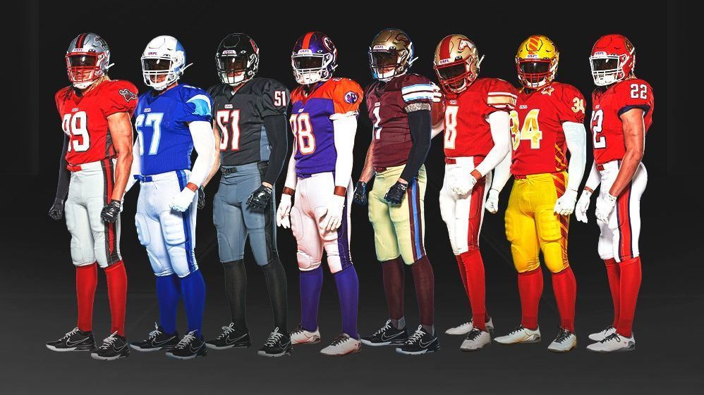
On 2/18/2022 at 1:20 PM, oldschoolvikings said:
Bravo, USFL! While the NFL trots out garbage like the Commanders new set, you hit a home run. THIS is how pants and socks sets should look,
-
7
-
1
-
-
7 hours ago, DCarp1231 said:
Not sure how many of you are familiar with Washington players, but…
Those three dudes are definitely not Jonathan Allen, Terry McLaurin, or Chase Young
The unitard fad can go away any season now. Especially on the white and black.
-
4
-
-
8 hours ago, Giantsgustav said:
USA has a new blue jersey for the juniors.
Hopefully with better socks!
-
1
-
-
3 hours ago, gosioux76 said:
I was watching the Bucks/Lakers last night and my impressions of the Bucks' City Edition unis really took a plunge. I thought they looked terrible. Just way too much going on there.
I've always liked the Irish rainbow look of the Bucks, but forcing purple and one tiny little royal blue panel into the mix is overkill. I also hate how the pattern repeats on the shorts. I'd rather they lose the purple from the jersey and let the green continue seamlessly onto the shorts. Instead, it goes green-purple-green-purple. Looks disjointed.
Also, while I recognize that the wishbone collar is an homage to their prior uniforms, it really looks terrible on this jersey. When these were released, I didn't mind them. But watching them in action, they were a real eyesore.
Mashing up 17 eras into 1 jersey doesn’t work. Most of these concepts are brutal - the Rockets, Bucks, and Nets being among the worst.
-
1
-
-
Just put the Lakers in kelly green & white and the Celtics in purple & gold and be done with it already. The NBA is a parody of itself these days.
-
5
-
-
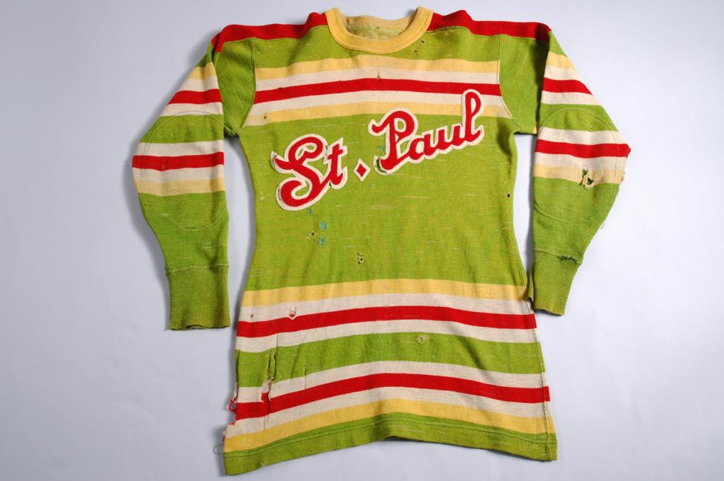
2 hours ago, andrewharrington said:
Why would adidas be forcing teams to add a stripe to the top of their jerseys? This stuff is straight from Twin Cities history books…
Wait, so Adidas has been doing this for almost 100 years now?
I cannot believe they’re still trotting out the toilet seat collars though…
-
1
-
-
9 hours ago, panthers_2012 said:
It's not Indiana, it's a boot!
It’s pronounced “about” (uh-bout).
Silly Canadian accents...-
4
-
-
8 hours ago, Volt said:
Are you saying this new logo is worse than the previous?
Yup, that’s exactly what he’s saying. I’ll second his motion.
-
1
-
-
4 hours ago, CDunn said:
These are the same unis they've been wearing all season just with the new logos. Here's what they looked like before.
You mean other than the Gemini Athletics logo in place of the Bauer logo and yellow COLORADO COLLEGE in place of white lettering on the front?


/cdn.vox-cdn.com/uploads/chorus_image/image/66423885/Screenshot_at_Mar_03_11_11_12.0.png)


2022-2023 NHL Jersey Changes
in Sports Logo News
Posted
Sorry, that’s WAY too much teal for my taste.