


rxmc89
-
Posts
823 -
Joined
-
Last visited
Posts posted by rxmc89
-
-
-
-
-
Matt Hasselbeck as Brian Urlacher for Halloween

-
 7
7
-
-
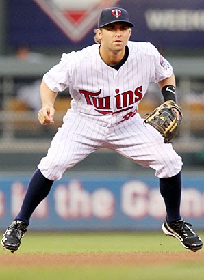
Peyton wearing a Payton jersey
-
2
-
-
Manny Machado in a uniform he’ll only wear for one year
-
-
-
11 minutes ago, ZipperClub said:

Who the hell knows? Maybe some publicity stunt? Maybe just for fun? Maybe just to get a cool picture?
-
1
-
-
1 hour ago, MCM0313 said:
So, I'll be the one to ask: what exactly is going on in this photo?
He’s dropping a bat that’s on fire.
-
1
-
-
2 hours ago, 4Mizzou said:
I haven't commented here in a while so:
1. I think hockey should go back to white home uniforms and color roadies.
2. I liked some of the 90's - era NBA uniforms - the Suns, for instance.
I think most people like the Suns ‘90s uniforms. They’re one of the exceptions of the ‘90s.
-
2
-
-
15 hours ago, insert name said:
Black on the jerseys were used during what is arguably the worst period in Jets history (they’ve had many embarrassing moments but the 90s were the most brain dumb era ever). The current set ties in to their only shinning moment in history. This is the uniform the Jets need to hold on to for eternity.
They don’t need black, they don’t need a logo change, and they don’t need Nike getting their dirty hands involved in an entirely new set. All they need to do is lighten the green.
It’s one simple job, a damn color change. Is that too much to ask?

-
7
-
-
15 hours ago, daveindc said:
The Padres also use a brighter shade of navy than the Yankees and Tigers, and their letters are completely different. You'll never mistake them for any other team. Nice, distinct look.
I was about to say the same thing. Great point except for the last sentence.
-
7 hours ago, -Akronite- said:
It's really nice but you gotta especially respect it because it prevents the slippery slope of over-wearing the alt as many teams do.
Heck, they already do that with their “alternate” road jerseys.
-
10 hours ago, ProfessorBigShots said:
In Honor Of Opening Day (a little late)
Brian Dozier
Torii Hunter

You want this thread:
-
4
-
-
5 hours ago, Quillz said:
I agree. Pat Patriot is fine as a secondary logo for merchandise, but doesn't work well as an actual sports logo. However, I also think the brighter colors the Patriots used, circa 1993-1999, were better. Seems they, along with several other teams, used darker colors with the onset of the new millennium. But with some teams starting to go back to brighter colors (such as Kelly green), I wouldn't mind the Patriots do the same.


Granted, was not a fan of that era's jersey, especially with the fake pinstripes.
Navy makes more sense for the Patriots, plus I like it better anyway.
-
3
-
-
On 10/17/2017 at 3:32 PM, Ben in LA said:
This is the EXACT case with me when it comes to the Dodgers and Angels. I follow both teams ( and want success with both; a Dodgers/Angels WS would be a dream)...but I’m a Dodgers fan more.

It's hard to tell whether the Angels logo is desecrating the Dodgers logo, or if the Dodgers logo is impaling the Angels logo.
-
1
-
-
On 12/1/2017 at 3:08 PM, M4One said:
With Daniel Sedin (right) joining his brother, Henrik, in the 1000th point club, I would say that their biggest success has come in the current set.

They wore those uniforms for like 8 years. Nothing wrong about those.
-
On August 17, 2017 at 11:24 AM, njdevs7 said:
Saw this pic today and thought it was really weird to the Islanders dynasty players and the cup with the navy-era jerseys.
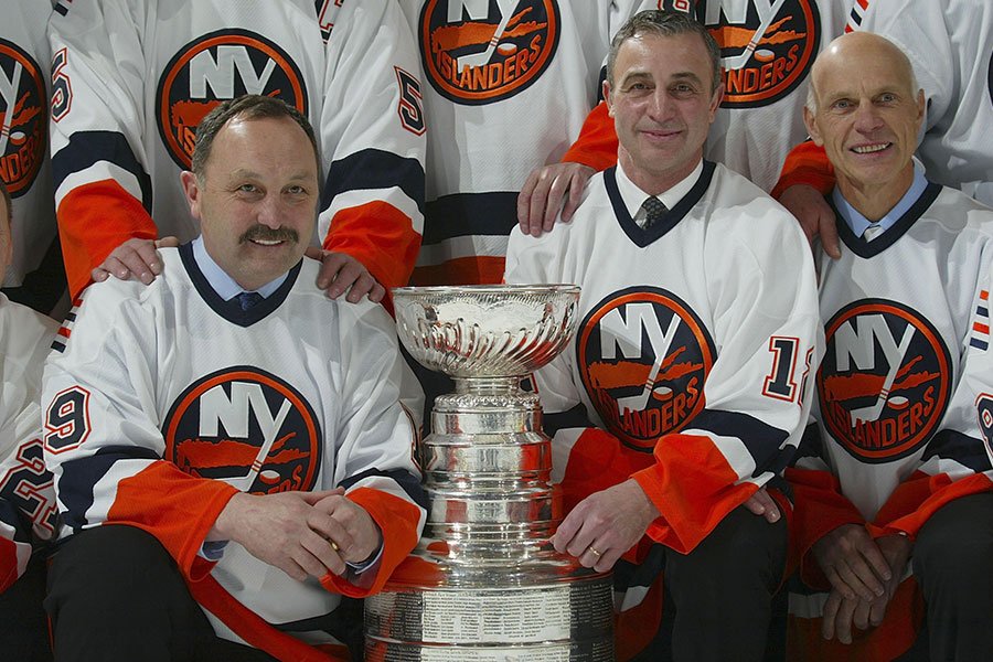
It's not really weird. It's just a darkened version of the dynasty uniforms. Heck in some pictures the dynasty and current sometimes look navy.
-
7 hours ago, KittSmith_95 said:
I never liked these jerseys nor understood why people love them:

1. The colours are very drab and the green bleeds into the black.
2. The logo doesn't even line up with the star pattern the jersey is using
3. The CCM cut was always baggy. These though make the cut look even baggier do the bottom and the pants blending into one another.
4. The template isn't even original.... it was used for All-Star jerseys 1st. Copying a ASG template? Why?
5. The number on the back actually bleeds into the striping. That's a huge no-no, IMO. It even happened with single digits.
Need I go on? This whole jersey was a failure. Even the shoulder patch looks out of place with it having no gold in it unlike everything else with white also having a little gold. I was more than happy to see these go.
Hmm, I don't know, maybe because they're called the Stars?
-
1
-
-
On September 3, 2016 at 8:28 AM, Griffinmarlins said:
You do realize many non-HOF players have had their numbers retired throughout sports, right?
Yes, but I think retired numbers should be reserved for hall of famers. Have a team hall of fame if you want to honor great players who didn't make it to the actual hall of fame.
-
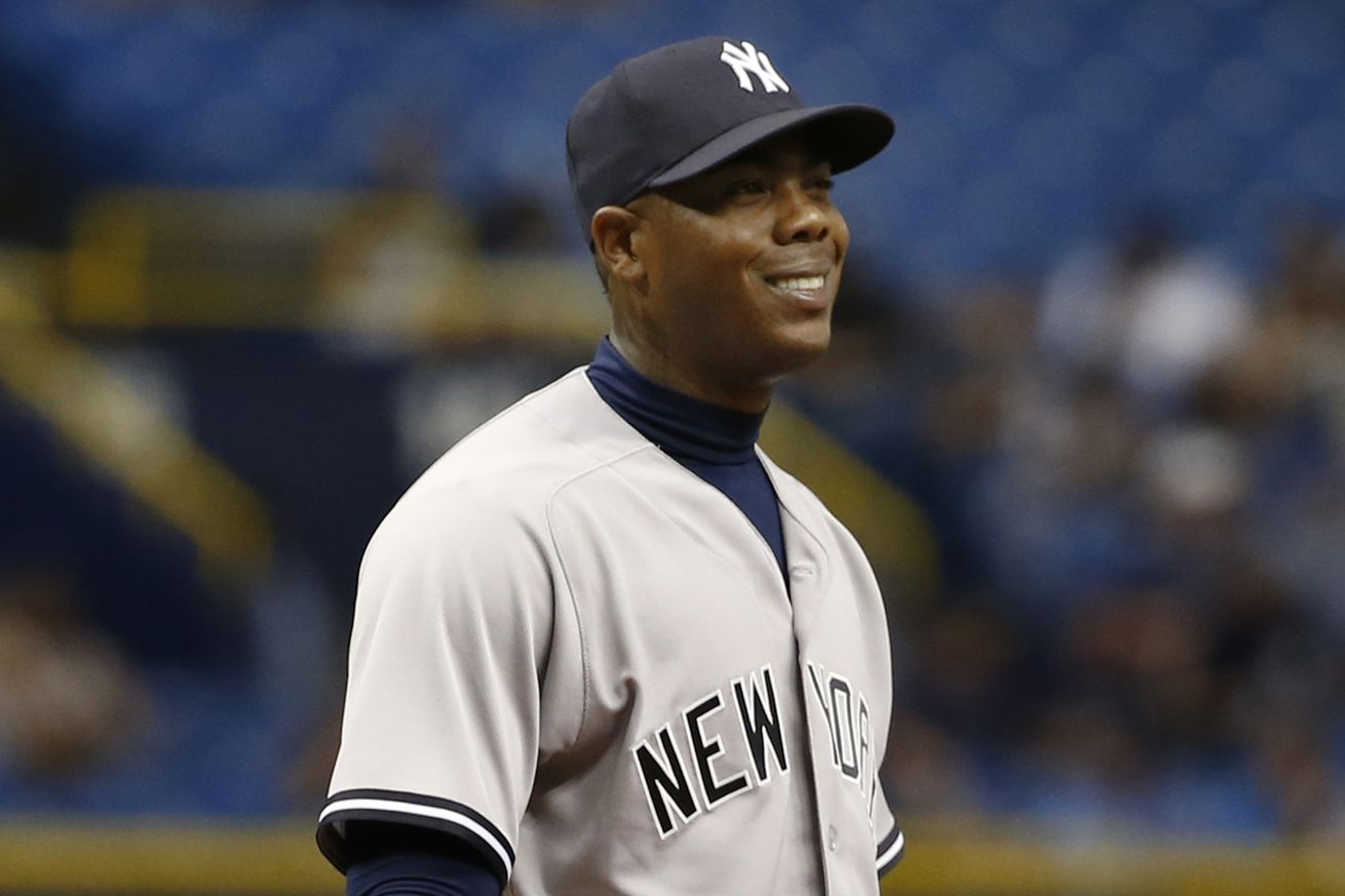
Aroldis Chapman
-
4 hours ago, buckeye said:
Varejao played 12 seasons with the Cavs, this is in no way the wrong uniform for him...
Yeah, seriously. If 12 years with one team doesn't cement that as his right uniform then I don't know what does. That's longer than a lot of guys' entire careers.
-
9 hours ago, SabresRule7361 said:
Philip Rivers' first season with the Chargers was the last season of their 1990s era unis

His first season as the starter. He was the backup for two years before that.


:format(jpeg)/cdn.vox-cdn.com/uploads/chorus_image/image/51618413/CwIpDeTUAAAkIqF.0.jpg)


College Football 2020
in Sports Logo News
Posted
Thank God they got rid of those uniforms because those were the absolute low point of Cal football. The only good things were the colors and number font. They look fantastic now.