


rxmc89
-
Posts
823 -
Joined
-
Last visited
Posts posted by rxmc89
-
-
I find it odd that when people mention the color issues on the Cowboys' home uniforms, they almost all leave out the black outlines on the sleeve stripes:
I know that this is how the stripes have been outlined since 1966, but they really should have changed it when they returned to this style of home uniform in 1995.
They probably either don't notice it or think it's navy.
-
David Freese

-
Gordon Beckham

-
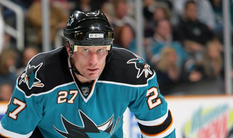
Huston Street


Meh, the Angels is the only one that looks strange to me.
-
Um no...
Well it is the "unpopular opinions" thread.
-
 1
1
-
-
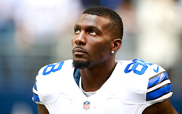
DeSean Jackson

-
Huston Street
-
You guys have to start identifying the hockey players.
Absolutely...been a problem throughout the thread. Hockey is not as popular as the three major sports. Soccer players...forget it.
Hockey is a major sport.
-
Right team, wrong uniform:

I disagree. That's his "right" uniform. It was an incredible uniform that was won by a burgeoning superstar QB with a loaded team on the rise. Then they changed to their current awful uniforms and coincidentally had huge collapses, failed greatly, got old and injured, and in the case of Rivers, became run-of-the-mill. Even if those unis weren't light years better than the current set, they'd be right for him because they represented something.
Well he only wore it for 3 years, only one of which he was the starter, that's why I consider it his "wrong" uniform. Plus they had a huge collapse in that one year too, so it's not like they did anything really special during that time either.
-
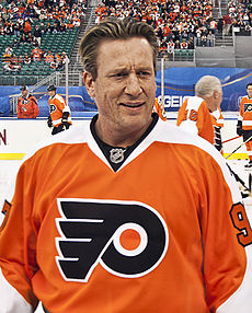
Jeremy Roenick

Right team, wrong uniform:

-
Shaun Alexander

and in the current Seahawks jersey

-
Right team, wrong uniform:
-
That's not an unpopular opinion at all, everyone hates the Jags' helmet.The Jaguars helmet needs to be just one color.
GOLD is that color.

I think the unpopular opinion is that the helmet should be gold, instead of black.
-
I believe that should actually be posted in "Players in the right uniform".David Price:


Yeah 10 years from now that could end up being his right uniform.
-
1
-
-
I actually like that MLB coaches and managers wear the full uniforms. I know it's not necessary but I like the tradition in baseball. I wish more would wear them (since I don't think too many managers actually show their jersey any more.
I think it would look kinda odd for a base coach to wear street clothes so I hope they at least continue to wear the pants and some kind of team jacket type clothing.
Is that really unpopular?
-
Alexander Frolov

-
When I did my road trip through New England, I put a Bills frame on my license plate to let the people know I wasn't from the part of New York that they hated.I don't see why you couldn't leave the orange in the stick but use silver as the third color everywhere else.
Unpopular logo opinion: I hate team-specific license plates. I generally dislike all specialty plates, but I really don't like the ones for sports teams. To me, it almost says that you're a fan of a sports team first and a resident of your state second. Ironically, the time when this might be appropriate would be a Yankees fan in Boca, or a Bears fan in Kenosha, but that obviously can't happen. Also, why invite cops who like a rival team to pull you over?
They don't hate Buffalo too?
-

Right team, wrong number:
-
I am probably the only person who likes this logo, therefor making my liking of it a very unpopular opinion.

I liked it at the time, but later realized how bad it is. That logo/uniform set would've been perfectly fine if the Angels were a '90s expansion team, but it didn't fit a team that's been around since the early '60s.
-
1
-
-
Because this:
How is this any different than what Nike always gets criticized for?
Who would've thought this look would be lightyears better than what they have now. That switch to nike really cost the Seahawks. I'd love to see a remake of these uniforms, and they'd sell like hot-cakes.This is my favorite Seahawks look from the 2002-2011 set:

Neon "volt" color? Check.
No real design other than contrasting sleeves? Check.
Yet because it's not Nike, it gets a pass?

Looks 10 million times better
Than this:

What have you been smoking?
-
I do not like all the flag desecration uniforms and hats MLB and MiLB are using today and the rest of the weekend.
I don't think that's an unpopular opinion at all.
-
I love the Astros' rainbow jerseys and don't find them ugly. When you are a team based in the city of space launches, having colors of red, orange, and yellow are especially fitting. The gold/blue look just didn't cut it 20 years ago, and it still doesn't now.
The Astros don't play in Cape Canaveral.
-
1
-
-
Yes! I don't think that's that unpopular an opinion, at least it shouldn't be. One reflects the locale well and actually looks like a baseball uniform, the other looks like something fast food employees would wear.This
is miles ahead of this

Sure the colors are unique, and there are so many navy baseball teams, but at least it actually looks good
-
"New" LA kings jerseys suck the big one, i am a fan of black and silver, like the Gretzky era unis, but the new ones with the strange piping are no good, and the logo is terrible, a homeplate with "LA" on it ?.Come on, some of the worst jerseys in the NHL
Totally agree and I'm a Kings fan, and I don't think that opinion is all that unpopular.

Rare team matchups
in Sports Logo General Discussion
Posted
Actually 2001-2002 was the last year of those Flyers uniforms.