


Pharos04
-
Posts
1,306 -
Joined
-
Last visited
-
Days Won
1
Posts posted by Pharos04
-
-
Jets look really good. They should never have to change again. I even don’t mind the black as there’s a good amount of green mixed in.
solid upgrade all around
-
 4
4
-
-
-
This is a great rebrand! I’ll echo the same sentiments as been voiced where powder blue and orange could’ve been a better alternative to help the Clippers stand out. I saw the N-North and also think it’s genius. I also love the new LA logo on the belt.
the ship I can make out the sails but the comparison to a cruise ship is very valid and should’ve been refined more to emphasize the Clipper aspect rather than just “boat”.
this is a solid improvement all around. After the last rebrand leaned heavily into the black it was worrisome where they would go. But this was an amazing surprise and think overall it’s a solid package.
-
1
-
-

BMO should’ve gone with no logo here. The crest and the logo are both off center from the stripe and looks like neither could be aligned.
i hate this
-
8 hours ago, GDAWG said:
Shanahan wants a ring to erase 28-3 from his ledger.
I want the Lions to make it to the Super Bowl and win it so that we can have all of the champions of the Big 4 Major Sports leagues as first time champions in the last 6-8 months.
I hate to be the one to point out that the NFL had Champions prior to the Super Bowl, but the Lions were the NFL Champions for the 1935, 1952, 1953, and 1957 seasons.
-
4
-
-
Of all ways to miss a Field Goal for Buffalo…
Lets go Lions?
-
6 minutes ago, tBBP said:
That name sounds familiar...wasn't he a linebacker up there for the Patriots for a good little bit? Or am I thinking of someone else?
He was
-
2
-
-
That was fast. Clearly they had this in mind
-
Knew it was coming but still pretty surreal
-
 1
1
-
-
-
2
-
 1
1
-
-
Glad to see the Cannons back in proper fashion
-
1
-
-
maybe if we all mass report them for constantly disrupting the topic at hand with their opinion-as-fact posts something will be done?
It’s quite problematic that every page has them complaining about the matchups. At this point they’re in such a repeating loop of the same lines of thought that maybe they’re actually a sports forum AI?
-
1
-
-
If a low seed makes the championship, it’s a travesty against all that is holy.
if the #1 seeds make it, it’s all scripted and a waste of everyone’s time.
some people just can’t have fun I suppose. Maybe watching sports isn’t for everyone.
Congrats to the Rangers and Diamondbacks. Could be a fun Series! I hope the Rangers win their first but could go either way for me. Hopefully a fun and entertaining matchup!
-
4
-
-
If I were playing a drinking game called “Take a shot every time the announcers said ‘Connor Bedard’” I’d already be dead and it’s just the First Period.
The way they’re talking it seems like he’s the next coming of Gretzky. They even showed a graphic saying they have a camera following him whenever he’s on the ice.
-
 1
1
-
-
I don’t have any words at this time. Wakefield was one of my favorite pitchers to watch due to that crazy knuckleball.
this one hurts…
-
4
-
-
Wow these are horribly underwhelming to me. I was expecting something traditional but not…bland. I had recently seen a hoodie that put the anniversary crest in the center with the Spoked-B on the shoulders and thought they were gonna lean into the full bear.
Disappointing to me for sure
-
4
-
-
I wish the Bears would introduce a decent cleaned up Bear head rather than a digitized tracing of a copy of a copy of a drawing from before digital media even existed. It has that frazzled, odd-shaped aspect that shows up on so many older logos adapted for the modern era. The Ditka Bear certain isn’t an improvement. I can never figure out what is happening there with the weird blob of shadow on the right and lord knows what on the left.
Surely they could modernize the older bear and still invoke all of its elements without it looking so jagged? (And don’t call me Shirley)
-
3
-
 1
1
-
-
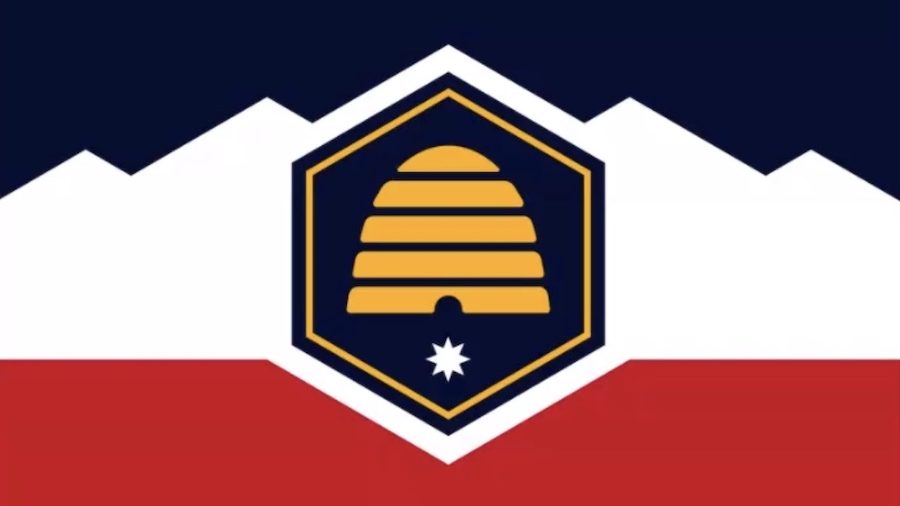
On 11/10/2022 at 5:43 PM, Foxxtrot44 said:
New flag for the state of Utah to be voted on during the next legislative session
picked from these options
https://ksltv.com/510923/new-utah-state-flag-options-narrowed-to-top-5/
Guess we all missed the follow up on this. Looks like this new design was approved by voters and will go into effect March 9, 2024
-
4
-
-
One thing I find interesting is there is a Black-B version of the same logo floating out there, but they’re highlighting the Yellow-B more
-
It would be great if the Lakers could reincorporate the water droplets that have been lost to bad tracings and time
(sorry Conrad, using your tweet)
-
11
-
 3
3
-
-
Irish colors for Boston? Kinda surprised not a RWB scheme.These are all awful
-
3
-
-
No one to blame but themselves. Bruins looked tired, slow, out of sync, and completely in their own heads. What a disgusting end to the season
-
Very disappointing. The colors meshed with some Arizona flair could’ve been incredible.
we get Ohio State but large reminders that it’s not with ARIZONA and slapping “CARDINALS” on 2/3 of the jersey stripes.
So about on par with the Nike refresh
-
3
-
-


:no_upscale()/cdn.vox-cdn.com/uploads/chorus_image/image/63313280/121165759.jpg.0.jpg)


2024 NFL Changes
in Sports Logo News
Posted
so if they continue to do typical Jets stuff, can we refer to them as the ZT3Ls?