


Krona
-
Posts
1,530 -
Joined
-
Last visited
Posts posted by Krona
-
-

The Mets really blew the opportunity to use the old windowpane plaid the Dodgers had. Ties in with the city's history and gives the perfect backdrop to a subway tile mosaic treatment. This doesn't have to be that hard.
-
4 hours ago, M59 said:
Nothing quite like being kitted out in a uniform that says "ah, the urine sample is here"!
You might want to see a urologist

-
 1
1
-
 1
1
-
-
12 minutes ago, Chromatic said:
Apparently this graphic was sent out to Broncos season ticket holders this morning
If that is the updated D horse logo, it’s really well done.Incredible. Start the countdown to that replacing the robohorse in 5 years
-
 2
2
-
-
1 hour ago, LMU said:
Los Angeles Kings/Kansas City; Kansas City-Omaha; Sacramento Kings
New York Rangers/Texas Rangers
New York Jets/Winnipeg Jets
Carolina Panthers/Florida Panthers
New York Giants/San Francisco Giants
St. Louis Cardinals/Arizona Cardinals
Kansas City Royals/Cincinnati Royals (defunct)
Edmonton Oilers/Houston Oilers (defunct)
There's enough precedent.
The most recent of those was the Panthers in the 90s, most of the others 50 years+. Notice the pattern? Trademarks and lawsuits have all but made this trend a non-starter.
-
2
-
-
34 minutes ago, KouPilot said:
I've been away from the board for a long time but it does feel a little bit more negative. I think it's just a sign of the times. It does feel like 50% of nike era redesigns get redesigned in pretty quick order.
Putting on my tin foil hat for a moment, Nike seems to have a knack at putting out sets that garner 40-60% approval, leaving 40-60% wanting more. City Edition/Connection is another lane of the highway. A large majority of their clientele is living in the petri dish. There's a vibe of planned obsolescence in what they produce. Capital Rules Everything Around Me.
-
1
-
-
29 minutes ago, MCM0313 said:
I’m more intrigued by the space in (Travis?) McNeil’s surname.
Which reminds me of old footage I saw of Super Bowl XX, where the Patriots’ Larry McGrew had a similar gap after the Mc.
MC Neal's first three albums were stellar
-
1
-
1
-
-
On 4/6/2024 at 1:15 PM, The_Admiral said:
I'm going to echo what tons of people here have already said (and mocked up), which is that if the old-timey Browns are going to commit to a helmet as a logo, they should go so far back that no one could confuse the helmet with recent history: an old one-bar facemask, for instance. Lean into the concept of predating a logo rather than using the stock helmet art across the league and calling it a primary--especially when that stock helmet art is a relic of the recent, not distant, past.
Personally, I think the =B= football was halfway to the right idea, it just should have been a =C= instead.
Make this weirdo helmet happen. I was endlessly intrigued by these coaches jackets when I was a kid.
-
6
-
-
I submitted Oxen, Unique, region appropriate, a variety of ways to go thematically (pioneers, tough aggro, stoic, single or a team). Utah Oxen rolls off the tongue in a pleasant, sing-songy way. "the Ox" is a nice sub-nickname, too. And lets get a primarily brown colored hockey team!
-
1 hour ago, Chromatic said:
Maybe top 25. It’s still just a gold shield on a blue field like many other states. I definitely wouldn’t put it top 5 just because there’s an easter egg.
Hey. Don't gloss over that the easter egg is a beaver. And there's some nice, uniquely arched type om there too.
-
2
-
-
27 minutes ago, tBBP said:
Alright, so...
1) Arizona
2.) Maryland
3.) New Mexico
4.) Ohio (only because it's the only swallowtail...)
Everything else after that is up for debate, but none of them are cracking the top 4.
This is my word...and as such is beyond contestation.*
*in my Prince Edward of Wales voice*
Oregon has a unique design on either side of our flag. I think that gets us in the top 5.
-
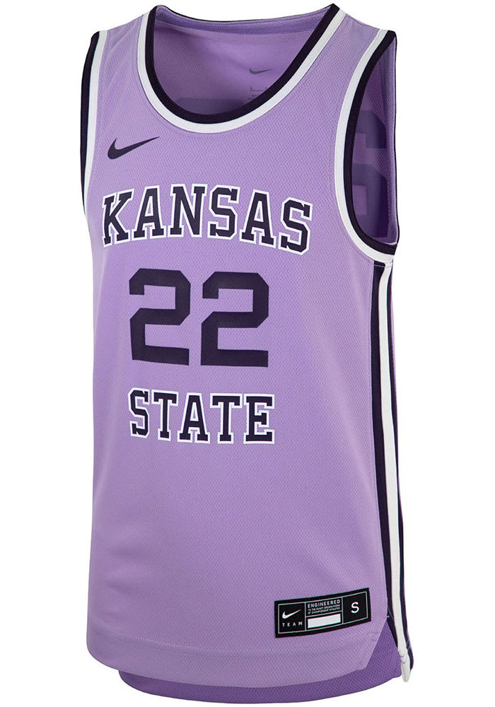
On 3/28/2024 at 7:20 AM, PK22 said:
Loved the Kansas State lavender uniforms from a few years back. Would really love a team to own lavender as a color.
The Lakers should be the first team to jump on this. The perfect bridge from the two tone blue hardwood classics and a modern city edition, which have often been real stinkers. I'd much rather see a rotation of Yellow/Forum Blue/White/ LAvender (sorry) and occasionally Black
-
3
-
-
1 minute ago, Bomba Tomba said:
Like the Saints wore, and should continue to
It's bad enough that they have this very dull shade right now, even worse when they don't even show it prominently and instead emphasize the boring ass black
They really are missing the boat. They could even do a modern, non-traditional look emphasizing wrought iron and tarnished brass with a lot of ornamental frippery and it'd be miles ahead. And that's coming from a instinct to just go back to the expansion look.
-
1
-
-
10 hours ago, Old School Fool said:
It's funny you say this because the uniforms in The Show look way better than they do in real life at this point.
I'm old and probably thinking of 2K14

-
1
-
-
4 minutes ago, CaliforniaGlowin said:
See that make sense for them because their name represents gold.
Counterpoint: That's polished gold brick gold. The current color is more representative of the gold being pulled from the earth as the name refers. Better yet a dirtier old gold like the Saints wore would be more fitting than the champagne adjacent color now.
-
4
-
 1
1
-
-
It finally hit me as to what these nike uniforms look like: it's video game renderings. Always something that bothered me about them. even the best games, is that the unis have an uncanny valley vibe. Numbers too small, trim too weird, player names always "off". What if Nike's team is full of people that spent more hours playing 2K or The Show than they did watching baseball. It could explain a lot.
-
3
-
-
2 hours ago, oldschoolvikings said:
Only mask the Browns need...
The hill I'll die on is the should swap grey, white and brown facemasks depending on combos. Grey with brown jersey/white pants, white with brown/orange & white/orange, brown with white throwbacks & any time the insist on brown pants.
-
6
-
1
-
-
52 minutes ago, CaliforniaGlowin said:
The absurd logos and brands were made to sell merchandise, not look good. They know what they're doing.
Spot on. They invented a market to sell more design work under the guise of more merch sales. Smart business move, but the quality couldn't keep up. On the positive side, I'm seeing a ton of new names of designers and studios popping up on some of these jobs. That's great news for the industry.
-
On 2/16/2024 at 6:57 AM, McCall said:
These two logos look like they were done by the same artist; the top one, as an experienced, top-of-the-industry branding and identity artist, and he bottom one, when he was 5 and just beginning to show signs of his future talents.
The simplest explainer on the difference in finished product between Studio Simon and Brandiose. Dan Simon has such a sophisticated touch with even the most playful brands. Rarely misses and illustrates the quality vs quantity debate. Now that business has seemingly slowed down for Brandiose (unless City Name/Alleged Regional Food fad somehow continues), I look forward to seeing how/if they can step up their game with a little more time for craft.
-
5
-
-
I'm not sure why shabby unis weren't excpected. It's Nike's MO. Doesn't anybody remember the NBA rollout?
Nike's new NBA jerseys cannot stop falling apart.
https://www.sbnation.com/nba/2017/11/6/16612728/nike-nba-jerseys-ripping-tearing-lebron-jamesAlso, I'm tired of everyone parroting their line about "xx% lighter/engineered/etc". It's simple: every millimeter of fabric saved, every patch printed, every fabric swapped is multiplied by millions. It's not bad enough they pay slave wages, More for the bottom line. We complain for a few weeks and then just eat the slop.
-
1
-
-
2 hours ago, DCarp1231 said:
Looks like a Kenny Washington tribute. Likely timed with black history month.
Kind of a weird thing to be a merch drop although they do quite a few capsule collections. It'd be a nice move to announce a throwback in this manner. Fingers crossed.
-
7
-
-
I could see the Titans at least bringing back the white helmet. It's already there with the Oilers throwback and could be worn as an alternate a couple of times.
-
2
-
-
-
https://www.milb.com/oklahoma-city/news/okc-brand-identity-transition
OKC retiring the Dodgers identity, doing the "baseball club" thing while working on a new one.-
 1
1
-
-
4 hours ago, Green27 said:
It's so weird to see schools now moving to one logo for everything. I know the multiple schools I have worked with/for have had very strict brand guides and standards of 'this logo is for athletics only, and this one is for academics only'.
Being in Eugene, I'm sure you're well aware how athletics have supplanted academics as the primary function of the institution. It was only a matter of time, In a way, it's understandable as brand recognition goes, but it's still pretty gross.
-
1
-


:no_upscale()/cdn.vox-cdn.com/uploads/chorus_asset/file/20014042/80812464.jpg.jpg)


MLB 2024 Uniform/Logo Changes
in Sports Logo News
Posted
Not saying they wear Dodgers throwbacks, just use the pattern, which 99% of fans wouldn't connect to the Dodgers unless it was pointed out. As for the being about the city, that's the point. Use a subway tile inspired design with the windowpane as the architecture. And also, half of these teams are misunderstanding the assignment of "CITY". It's a dumb program that could be marginally better if they lifted a dumb name that doesn't mean anything.