


officeglenn
-
Posts
13,489 -
Joined
-
Last visited
-
Days Won
1
Posts posted by officeglenn
-
-
35 minutes ago, clonewars2008 said:
Alouettes using 70’s Delta logo this year.
Remember what day it is.
-
 1
1
-
-
Forge FC unveiled their 2024 kits last night:
-
1
-
-
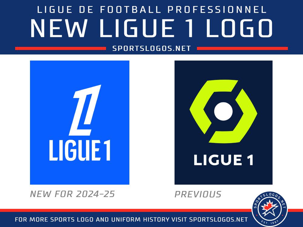
New logo for Ligue 1 in 2024-25:

-
1
-
-
2 hours ago, GrayJ12 said:
I feel like the incorporation of the Edmonton skyline crowds the logo. However, I do like the incorporation of the original EE wordmark.
At the very least, the skyline needs a little dimension/depth to it, and the white outline on the skyline needs to be at least as thick as the white keyline on the shield that it meets up with. It feels like it's going to be a pain to embroider and/or deal with at small sizes.
-
 1
1
-
-
Edmonton Elks 75th anniversary logo:
They're also bringing back their "In the Game" program where, for $270 each, 90 people can have their names printed in the borders of the anniversary logo decals that will go on the team's helmets for the home opener vs. Saskatchewan on June 8.
-
2
-
-
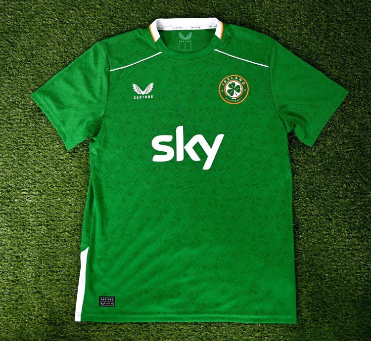
New home kits for Ireland's men's team with a "heritage shield knot print symbolic of protection, kinship, and unity":
The women's team will wear the previous home kit until early 2025, when they'll get a new one in time for Euro 2025.
Sky's sponsorship now extends to the men's team. They were previously only sponsoring the women's teams. All men's and women's retail jerseys will now have the Sky logo on the front.
-
2
-
 1
1
-
-
Aaaaaand that's why we don't talk about Indigenous naming/logo controversies.
-
1
-
 2
2
-
 2
2
-
-
Apologies if this has been brought up before ...
Are there any jerseys you own just because they look nice? And you have no other connection to or affinity for the team?
I recently bought a Portland Timbers home jersey from last season with Alaska Airlines still as the sponsor pretty much just because I love the look of it and I got a good deal on it. But I don't follow the Timbers at all and wouldn't consider myself a fan.
Turns out I'm just a sucker for a tonal plaid/diamond pattern. I also have a Bayern Munich home jersey from 2018-19 in my closet that I bought for pretty much the same reason. I rationalized it because Alphonso Davies joined Bayern that year, but I never got his name/number on the back.
Anyone else?
-
1
-
-
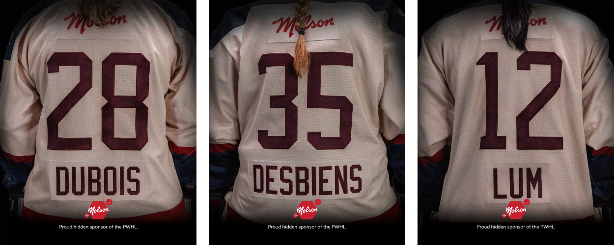
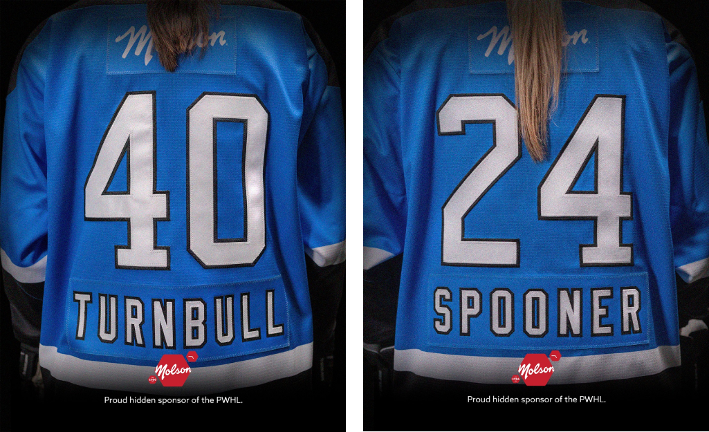
Here's some relatively good sponsorship news for a change: The PWHL is piloting a program in which Molson's logo will appear on jerseys, on the back above the numbers. This means nameplates move below the numbers, where they're unobstructed by players' long hair.
Toronto and Montréal will be wearing these jerseys in their game tonight. And it may go league-wide soon enough.
-
3
-
-
WHL's Portland Winterhawks will wear these throwbacks on March 9 to honor the 1925-26 Portland Rosebuds:
-
3
-
 1
1
-
1
-
-
1 minute ago, Danny the Sheeb said:
By "use the direct image URL", do you mean copying the hyperlink from the browser, or are you talking about something else? Because just grabbing the link from the browser hasn't been working.
Right-click on the image and select "Copy image address". Paste that directly into the compose/reply box and it should automatically embed. Make sure the address ends in a raster file format (e.g., .jpg or .png).
-
Atlético Ottawa have unveiled their new primary kit . For each one sold, club sponsor Maple Lodge Farms will donate a case of frozen chicken to community food centre partners — enough to provide a meal to 30 people, or six families.
-
8
-
-
FC Cincinnati secondary kit, with a unique orange and blue design in the side panels, sleeve cuffs, etc., and a paintbrush on the back collar leaving an orange streak with the words "MAKE YOUR MARK" inside:
-
3
-
-
Vancouver Whitecaps 50th anniversary secondary kit:
-
2
-
3
-
 1
1
-
-
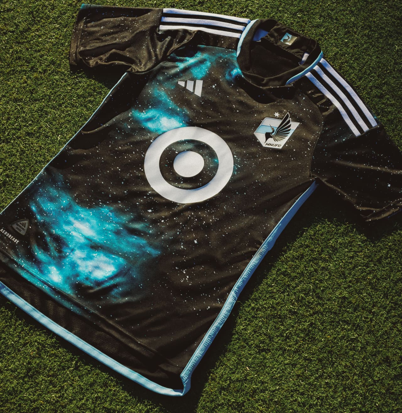
Minnesota United "Starry Night" primary kit:
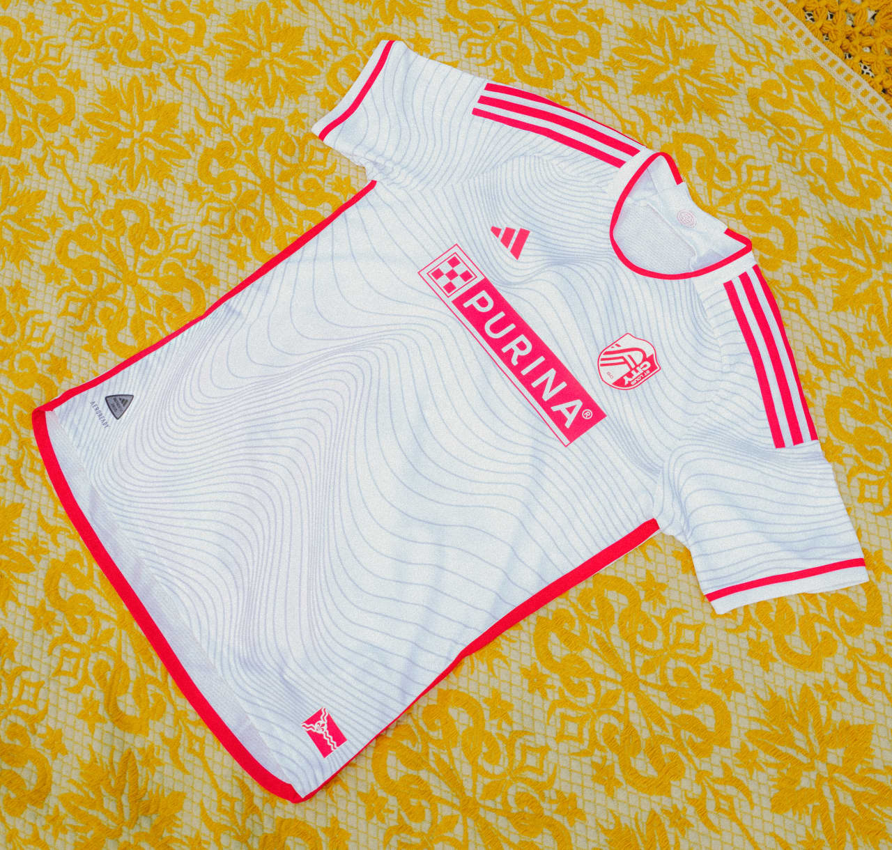
St. Louis CITY SC "Confluence" secondary kit:
-
5
-
1
-
1
-
-
-
Chicago Fire primary kit:
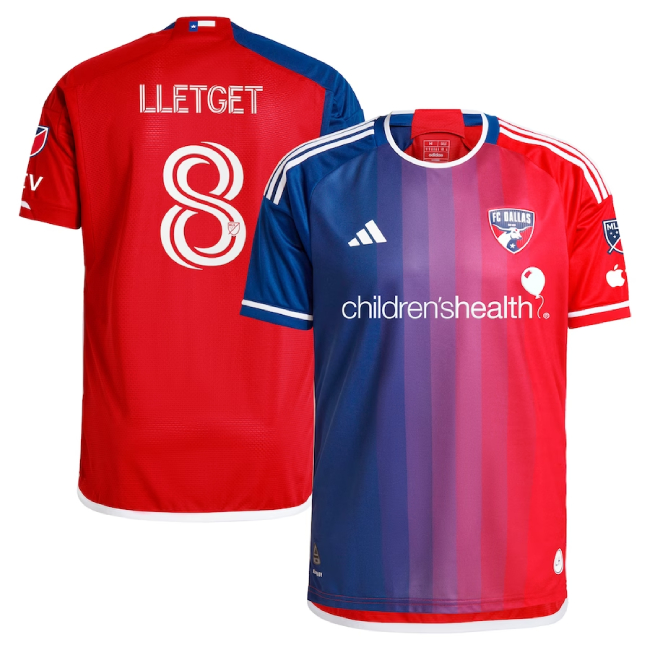
FC Dallas going out to left field for their new primary kit:
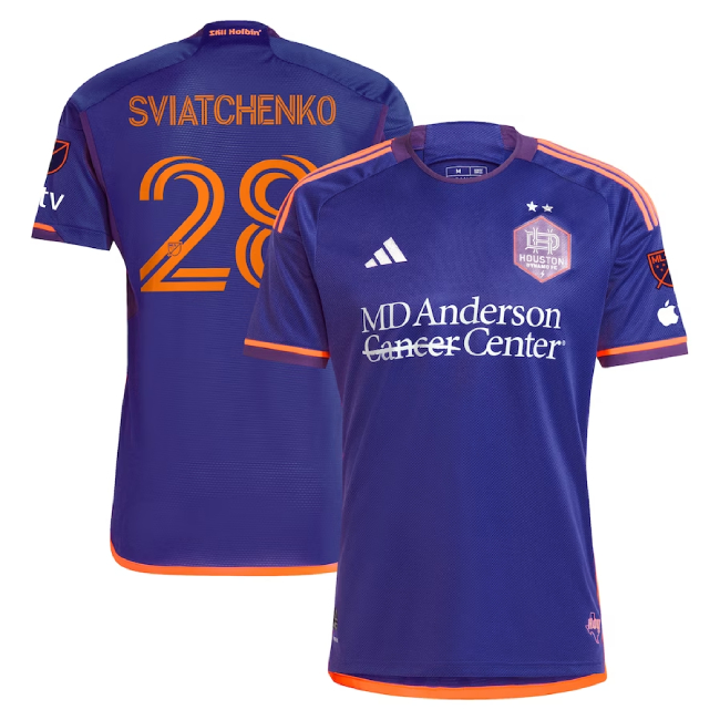
Officially official Houston Dynamo secondary kit:
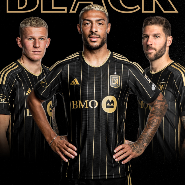
Officially official LAFC home kit, which they unveiled earlier this morning despite tweeting earlier this week that it would be launched on Saturday:
-
4
-
1
-
-
Officially Official Seattle Sounders primary kit:
-
2
-
1
-
 1
1
-
1
-
1
-
-
Officially official Real Salt Lake "Peak Utah" primary kit:
And CF Montréal's "La Main" secondary kit -- the stripe symbolizes Boulevard St-Laurent, “Montréal’s central artery where east and west ends meet, a street that runs at the heart of the city, which has historically reunited its diverse communities":
-
1
-
-
Officially official New York City FC "24/7" secondary kit:
-
4
-
1
-
-
Not exactly a database, but this thread has some scorebugs dating back to 2013. Quite a few broken image links in earlier posts, though.
-
Philadelphia Union "XV" primary kit:
-
7
-
1
-
2
-
-
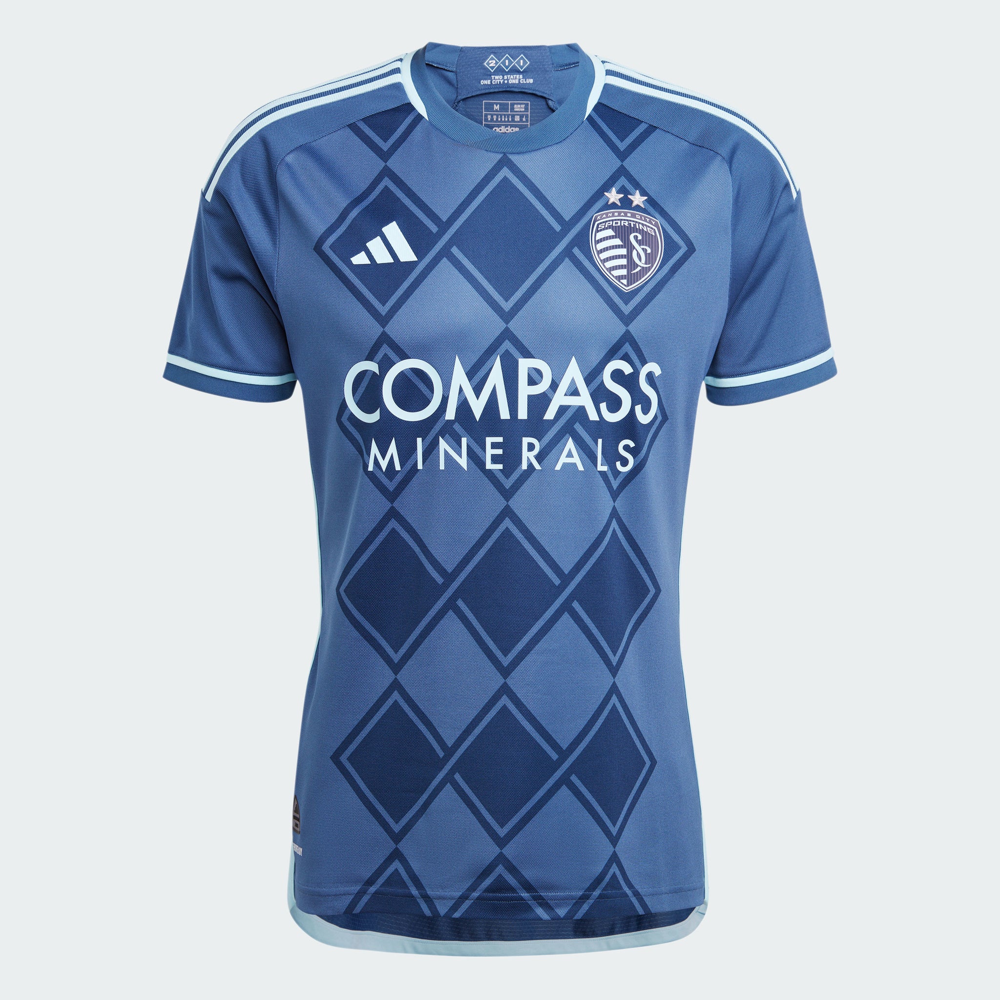
Sporting Kansas City "Diamonds Our Forever" secondary kit:
-
10
-
1
-
1
-
-
Just now, Digby said:
I like red sleeves as a change of pace for the Revolution, though it seems that AND the dotted pinstripes are too many design elements. One or the other would've been nice on their totally plain previous home kit. Also, what does any of this have to do with the Boston Tea Party?
Agreed on the sleeves. Revs were sort of falling into a pit of drabness with navy blue-heavy kits; the sleeves are an injection of color and a nice change of pace.
But your guess is as good as mine on the Tea Party connection. Checked their website to see if there was an explainer, but only a video of players wearing the new kits in front of exploding ships.


Fowler
in Forum Policies and Announcements
Posted
Member Fowler2 — fka BottomlessPitt prior to today — has been banned after admitting to being a dupe account of Fowler.