wysinwyg
-
Posts
57 -
Joined
-
Last visited
Posts posted by wysinwyg
-
-
Is there an easy way to do this?

I want to fill in the background only in areas behind my drawing...
I guess it requires a masking technique but I am not sure how to do that..
For illustration purposes I drew in the black lines manually but on a large piece of artwork that would become very tiresome.

Any help would be great. Thanks.
-
Can someone help me identify this font? Thanks!
Shhh... listen closely... do you hear my heart breaking?

-
Check out the tutorials at The Web Machine. Under illustrator, there is one for fake 3d effects.
Thanks alot quantumfreak! I took the tutorial and soon after was able to create this rendering of my intended subject:
 compare with
Not too bad for a first effort. Obviously I need to increase the angle of the 3d portion. I will keep practicing. This was a little different in the tutorial in the fact that it uses 3 colors instead of the tutorials 2 colors.
-
Nobody here knows how to do this?
I've seen the work of some of you guys and it is really impressive. I thought this would be a pretty simple request with the talent level on this board.
If I am asking for some trade secret that must never be shared then I apologize...

-
It looks vaguely like Playbill but as done by machine-tooled printing press pieces, giving a rougher, uneven look.
Thanks for your post.. I originally thought Playbill as well but there are some notable differences...
For the A N and V all have additional slab type serifs on them that Playbill does not.
The K in my sample has the angular lines meeting in the middle of the vertical line whereas the Playbill K the lower angled line connects to the upper angled line.
I can't imagine this being a custom font but for the life of me can't figure this one out.
-
Can someone help me identify this font? Thanks!

-
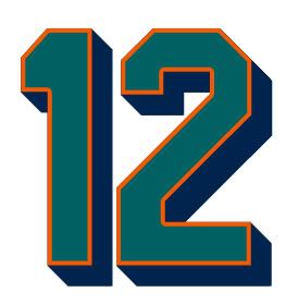
OK so I see this question was asked for Photoshop...
http://boards.sportslogos.net/index.php?showtopic=25581
But how do I create this shadow effect in Illustrator (I am using version 10)?

My novice self has spent all day trying to recreate this but it was all for naught.
Thanks.

Illustrator Help
in General Design
Posted
You... You're good.