


Legend
-
Posts
1,132 -
Joined
-
Last visited
Posts posted by Legend
-
-
Just realized apparently this wasn't a popular opinion:
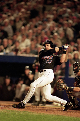
EAD Lukas, the Mets black looks awesome.
Love the Bears orange:

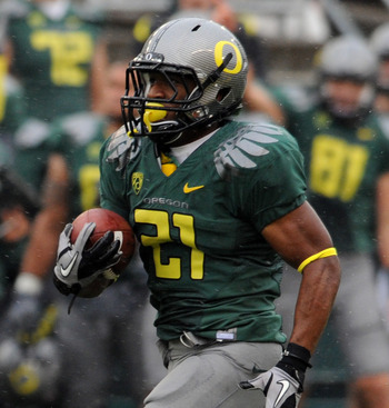
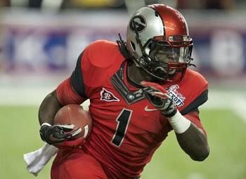
I have loved all of the Ducks looks over the years, some I prefer more than others, but I like them all:
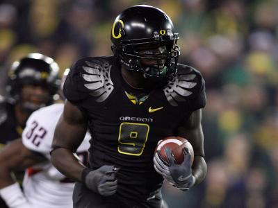
.jpg)
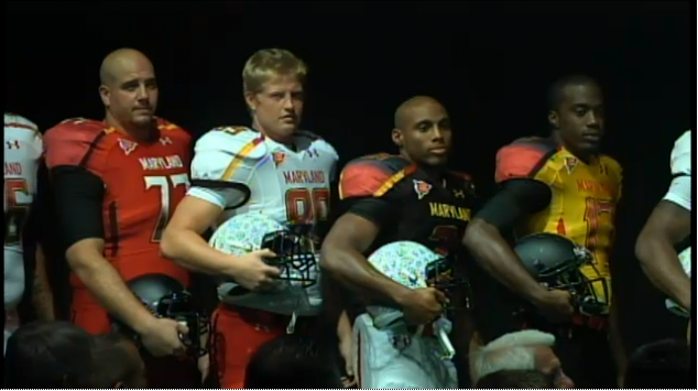
I dig the new Maryland unis:

I enjoyed the all red and crazy helmet:
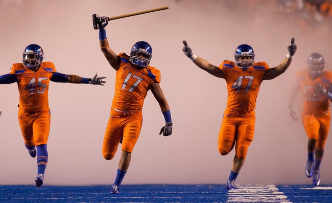
I like all of Boise State's unis, the orange are my favorites:

-
I don't like the Rays plaid bills.
This should be a popular opinion. Those things suck lol.
I also like the Connecticut Whale. I think it's a cool logo.
-
Since the death of the Buffaslug has been one of today's hot topics, I'm gonna go ahead and say that I don't think it was that bad.
Sure, it's not the most appealing thing around since it... well, looks like a slug. For some reason it kind of grew on me. Not to say that it's one of the greatest hockey logos ever - because it's not - but I think there are worse things out there. And hey, at least their primary logo wasn't made into a wordmark.

I like it better than their lackluster wordmark third they are using this year.
Oh my, how creative! You guys have a wordmark with a tiny logo! That's freaking amazing!
Sigh.
-
^^^Not really. That one is so 90s it's ridiculous. Lemieux hates that set any way.
Unpopular opinion, now is the best the Pens have ever looked.
Ouch!
How I and many other Pens fans miss the traditional gold and black, not this stupid vegas gold.
I love the skaing Penguin logo, and really like the triangle Pen as well. If they use that jersey from a few years back with the real gold, I'd be all over it.
Also I like the triangle with the lines across, I own one of those lol.
-
I will not be happy until they go back to the gold and black from before.
Yellow, gold, vegas gold, whatever you wanna call it, it isn't as good now as it was. I don't care what logos/unis, use the old colors!
No blue please, I hate the blue.
-
I don't think there is enough room to list the unis I love that everyone hates. It seems the common opinion is plain is good, and no one likes bright or odd colors, or crazy and creative designs. Just a taste per sport.
NHL- Penguins gold jersey, Bruins yellow jersey, Isles orange jersey, Seals/Golden Series jerseys, Flames horse head jersey, Isles fisherman jersey, current and old Coyotes third jersey, Stars bullhead jersey, Preds mustard jersey.
NFL- Bengals orange, Seahawks bright green, Giants red, Browns orange, Texans all red, and most monochrome looks that everyone hates.
MLB- all D-Backs jerseys, Pirates pillbox hat, stars and stripes hats, Pirates red, Rockies purple.
NBA- original Grizzlies and Raptors unis.
AS for what everyone seems to love and I don't, pretty much alot of classics that are just plain or hyped just because they're old. Leafs, Canadiens, Packers, Bears, most NBA unis now, and hate the Rays unis most. The permanant throwback trend I loathe. A throwback here and there, but just reverting back for a big "change," is stupid and lacks creativity.
-


There are some of the Bucs concepts before their current uniforms, this link has some more.

Unpopular Opinions
in Sports Logo General Discussion
Posted
I loved the Blue Jays look with black, blue, and gray.
Uniqueness no longer gets you anything apparently.