


Yac12
-
Posts
786 -
Joined
-
Last visited
Posts posted by Yac12
-
-
Watching the Cubs opening Spring Training game and this year the walking cub patch is not on the same sleeve for every player. Usually a sign an ad patch is coming.
-
 1
1
-
 1
1
-
-
The more I look at the BP hats, the more I am torn on the Angels. While I do like the retro blue brim with red bill, I might like it more with an old logo. Possibly the lower case a with the halo above it. So many choices. I was even thinking of the CA logo, now that they have the state of California logo on the clubhouse caps.
-
1
-
-
If I remember correctly, when the clubhouse caps were introduced they were to be worn by players post game. I don't have any recollection of ever seeing a player wearing them.
-
What is next for Nike and MLB when they don't do the CC jerseys? Will they go the mix tape route like they did with the NBA. Or Reverse Retro like hockey did.
-
1
-
-
13 hours ago, BJ Sands said:
Perhaps, but last year when Dansby Swanson was introduced he got a jersey with the walking bear patch. I made sure to check that.
Picture in this article shows Swanson was given an authentic jersey.
-
I also noticed the no walking cub patch during the press conference. From what I can tell it was a replica jersey and I don't think the replicas have the patch.
-
1
-
-
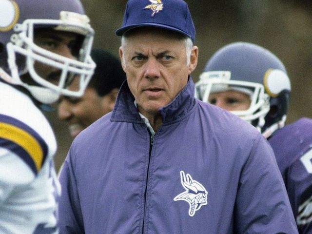
I think the midfield logo for the Vikings was done in memory of the style of logo Bud Grant would wear on his jackets and shirts.

-
3
-
-
Cubs are wearing their CC uniforms today for the first time. Don’t know if they are going to be wearing these every Friday home game like past seasons or a one time thing since they stated they are celebrating the neighborhoods of Chicago this weekend.
-
http://www.uniformlineup.com/Lineups/bal-lineups.html#bar17
Looks like they wore an all black cap with the cartoon bird with the black jersey back on May 26, 2017.
-
As of the last homestand, the Cubs have only worn the pinstripe uniform at home. Last year the CC was worn on Friday home games.
-
2
-
 1
1
-
-
-
Proposal made to look at designing a new flag for the city of Nashville, TN.
https://www.newschannel5.com/news/metro-councilman-calls-for-revision-of-nashville-flag
Information from Wikipedia on the current flag.
-
9 minutes ago, SFCOM1 said:
Yea those Candlestick fields where classic. I doubt they will go as far as painting the numbers and adding the extra fun stuff!
Just like I would like the Chiefs to go this route for the AFC Championship game, but I doubt they will go this far. At minimum I would love to see the arrowheads marking the kickoff location.
-
As much as I like the end zones from the 49ers game this weekend, I'd like to see San Francisco in one of the end zones like they did in 1981.
-
Put an LED board on that column like the other one and it would be easy to change with each event. Plus, it will be brighter and easier to see during the games.
-
2
-
-
15 hours ago, insert name said:
So the Rangers just retired Vic Hadfield’s number, officially reuniting The GAG Line. This is the 2nd time the number 11 has been retired (Mark Messier). Now, what makes this unique is that it’s not the first time the Rangers retired the same number twice.

They retired 9 twice.

I’ve seen the Yankees retire 8 twice but is there any other team anywhere that retired 2 different numbers twice?
The Chicago Cubs both have 31 retired for Fergie Jenkins and Greg Maddux.
The Chicago Blackhawks have 3 retired for Keith Magnuson and Pierre Pilote.
I'm sure there are many teams with a number retired for more than one person.
-
2 hours ago, pitt6pack said:
I still think they'd completely replace the turf for the game, so my guess is they'd use the format from the past two years. But let's hope that of the Vikings do make it, they'll change the endzone.
I can speak for this year, but 10 of the 32 teams have had location in one endzone, and just team name in the other. I'm not entirely sure how those numbers have been throughout history, or just in recent years, since I'm missing a large number of fields not re-created yet.
It will be interesting to see what you find. IICR growing up, most teams had location in one and team name in the other. It might be more of a college thing than NFL, but when I was a kid I'd make endzones for my Monday Night Football game and would have one and one thinking that was what teams had.
Again, great work.
-
I just noticed that 3 of the 4 games last week have the same design in each endzone and the same for this weekends games. Is this the new trend in the NFL or is it just the teams we are seeing in the playoffs? I personally like when team name is in one endzone and location name is in the other.
-
54 minutes ago, pitt6pack said:
They could have went with their 2015 endzone design, which I'm not sure why they don't just stick with full time, but they should at least do this for the playoffs.

Given the teams left, The Steelers will probably be the only team that makes field changes for the playoffs. In the past at Heinze field they have always added an AFC logo to the enzone:
2007

2008

2016

The Eagles might possibly add something to there endzones, but I doubt it given that the wordmark takes up much more space this year. I'd expect this field from them:

2010 was the only season in their current stadium where they added logos to the endzones for the playoffs

They have the endzone space to add logos if they want, but I doubt they will. But who knows, we may get a pleasant surprise.
That Chiefs 2015 endzone looks sharp. I've always wished for them to have a larger arrowhead logo at midfield.
Great work Pitt6Pack.
-
The Chiefs end zones need something besides the word mark. Maybe the AFC logo and the logo they use at midfield. Or the AFC logo and the Lamar Hunt Memorial logo that is on the jersey.
I do like the use of the helmet instead of the logo for the Rams. -
Even more rare about the shot of the MECCA is that it doesn't have the more well known M floor.
-
3
-
-
13 hours ago, Jimmy's Brother said:
Remember the old Jacksonville midfield logo in December used to have the santa hat?
Bears also did this. I will try to look for it when I have more time.
-
Not that I like the change of colors, but I do give them credit for at least keeping the era appropriate logos on the title banners and look on the retired jersey banners.
-
1
-
-
On 11/5/2016 at 2:51 PM, Pizzaman7294 said:
Any thoughts on where the Cubs could put a new "banner"?
Think theyll honestly put up another flag on the roof that no one can see?
There are already 3 retired number flags on each foul pole, so no room on one of those. The center field score board flag space is already taken up by the standings flags. If they don't add it to the roof flags, I could see them adding a flag pole by one of the new video boards.
-
3
-


2024 NFL Changes
in Sports Logo News
Posted
The 3 reminds me of the Big West Conference logo.