


TornadoGTS
-
Posts
1,287 -
Joined
-
Last visited
Posts posted by TornadoGTS
-
-
Does anyone know of good substitutes for either NFL official font (Endzone and Orbit)?
Link to NFL Style Guide. Page 22 and 23.
I can send you the Endzone fonts...
-
It looks very close to Eurostile Black
http://www.myfonts.com/fonts/urw/eurostile/t-black-italic/
EDIT: I think Slapshot got it, does look like Forza Black Italic
-
This thread seems like an appropriate place to put this:
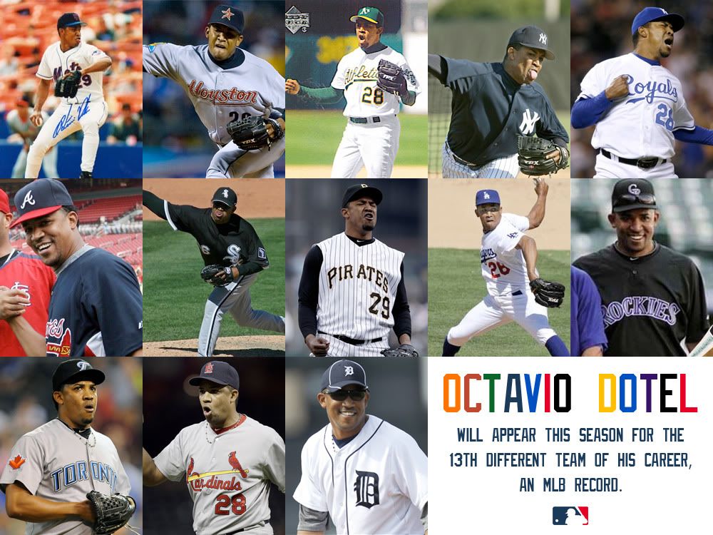
what's the right uniform for him?
I suppose the Astros, he spent four-and-a-half seasons with them.
That's the first team I think of whenever I hear his name.
-
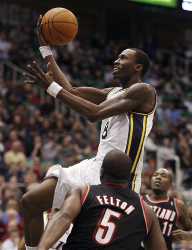
Josh Howard, sans headband; Ty Corbin following after Jerry Sloan in enforcing the policy.
That whole pic is weird to me, not just Howard, but had no idea Felton and Crawford were with Portland.
-
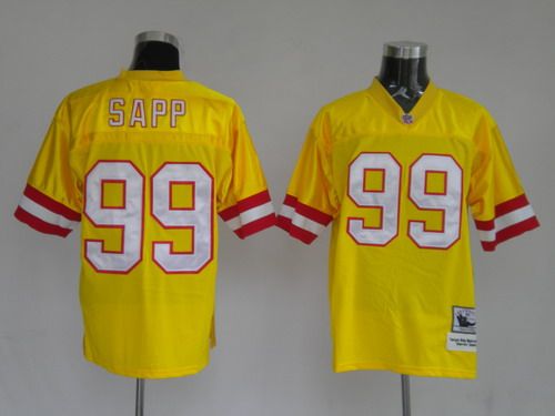
Keyshawn Johnson

What in your opinion is his right jersey?
-
Here's the font for "NFLEndzoneSansCondMed". Just had to dig through some code to find the file:
was gonna post the same...i went through and downloaded all 4 different faces they use there on NFL.com.
I got a total of 10 font files, Im guessing you got the same?
-
Anyone know what font is in the NBA logo? I know its basic, but I can't find a match. If its custom and super secret, a free alternative would be much appreciated

Its a custom form of Grotesque
-
The scary part is that he's the starting quarterback for the team. Wow.
He played QB in the NFL, why would he change that up for some no name league?
-
Can someone identify this one? Thanks

-
What's the name of the font where it says "BUFFALO"?

That has to be a Phoenix job on that logo...
-
Can anyone tell me the font of "Electronic Arts Sports Network"? Thanks.

-
Endzone is the font with the serifs ("Read" "Discuss") and Orbit "Greatness on the Road" Endzone is a NFL font while Orbit can be found on the web but it is not free.
Here's a free version of Endzone:
-


Seeing that will always seem odd to me too. Copied my avatar idea too I see......LOL jk
Nah it's actually yours. I saw it in the thread in Concepts. Hope you don't mind.
I could care less, thats why they were made, to be used.
-
Seeing that will always seem odd to me too. Copied my avatar idea too I see......LOL jk
-
Why didn't anyone mention this yet?
LOL the URL even says yellow! Also, the Packers' tab says Green pay
Yeah thats up there with the guy that was selling counterfeits at the Super Bowl the other year in Tampa, had ones with upside down names and a whole bunch of stuff that was just unbelievable, I remember seeing it on the local news, and just laughing my ass off.
-
So, I have a whole lotta jerseys. But, I wanted to show three here. One is authentic; one is fake; the other I'm not really sure given the price paid for it. I'm curious, just from these pictures, who can tell the difference...


From a distance, I think it's rather hard to tell. Get up close (or enlarge the photo) and the fake is obvious. Two of these jerseys cost $40, the other $85 (on sale). But, can you tell me which is which...?
Yeah the Pats is the biggest fake of them all. Someone mentioned about the tail on the Twins script, but the shirt looks folded over on that part, so might wanna re-examine that.
Huh.. well shows you what I know. The Twins one is fake. And, apparently the Patriots one is too, but I was never sure; the fact that it had actual patches that were sewn on and not a graphic that was actually "embroidered" onto the jersey made me optimistic (see what happens when you go shopping at yard sales). The Indians is authentic.
Thanks for playing...
It was the faded and bubbled up 12 that gave it away on the Brady jersey.
Plus the thick stitching on it, and Ive seen that bad sleeve logo many a times.
-
So, I have a whole lotta jerseys. But, I wanted to show three here. One is authentic; one is fake; the other I'm not really sure given the price paid for it. I'm curious, just from these pictures, who can tell the difference...
From a distance, I think it's rather hard to tell. Get up close (or enlarge the photo) and the fake is obvious. Two of these jerseys cost $40, the other $85 (on sale). But, can you tell me which is which...?
Yeah the Pats is the biggest fake of them all. Someone mentioned about the tail on the Twins script, but the shirt looks folded over on that part, so might wanna re-examine that.
-
You should see the front of his, the Titans wordmark is horrible, dead giveaway.
-
I have a Darrelle Revis jersey I got off a site called styleJerseys.com, and I'm pretty sure it's authentic. It
has high quality material and I got it for less than $20 (the shipping cost a fortune, though).
They're counterfeit, plus considering its also your username, looks like spam to me.
-
For anybody who wants to really learn how to spot one, check out this site, they got videos, forums, and everything on how to spot one, you can even post one and they'll tell ya easily if its legit or not.
-
The Pats fonts look right, to me. The sizing of the numbers seems way off, and the colors seem off on the white ones, but the fonts don't appear to be an issue.
I wasnt talking about the ones in that gallery, I was talking about the ones I see a lot of people wearing around.
-
Besides, most casual observers won't even notice the flaws.
Some of those are pretty bad, where even a casual fan would notice, like those Pats jerseys with regular block numbers.
-
This might be the wrong uniform for Yankee fans, but it sure looks right for C.C.

-
Looks like a stretched version of PF Din Text Pro Medium.
Thanks, looks like it for sure.


Name That Font!
in General Design
Posted
Nvm