

TheRealPepman
-
Posts
1,365 -
Joined
-
Last visited
Posts posted by TheRealPepman
-
-
-
On 3/17/2024 at 1:09 PM, projectjohn said:
The Pistons are using horizonal NOB today for the 20th anniversary celebration of their 2004 championship, proving it is possible on the Nike template. I wish they'd go back to it full-time.

I wish they flipped the red and blue side panels on the uniform. I have no idea why Nike flipped the order in 2017 in the first place.
-
 3
3
-
-
(all photos are credited to the original owner)
St. Louis Blues' 1994 Jersey Prototype
Ottawa Senators' 2020 Jersey Prototype (black version exists too)
Toronto Maple Leafs' 2016 Jersey Prototype (those texts in the end corners are something else for sure)
Florida Panthers' 2011 Jersey Prototype
Colorado Avalanche's 2008 Jersey Prototype
-
1
-
 1
1
-
-
On 2/28/2024 at 1:03 PM, Lights Out said:
Just a quick idea I had trying to combine the San Diego colors and the unused '90s colors with the new logo:
I liked the one on the left better first, but now I'm starting to prefer the sublety of how the seafoam green and light blue almost blend into each other in the one on the right.
I would have made the C logo in the middle black on a white background. It'll look like the Nets but at least there are more colors on that roundel.
-
1
-
-
Ryan Smyth wearing the Oilers' copper-red Edge-era sweater in 2011:
Same thing for Ryan Nugent-Hopkins:
-
-
The Los Angeles Clippers' new branding isn't bad, but I wasn't sure on how good or bad the actual floor looks so I decided to put my own spin on the soon-to-be-default court.
-
2
-
-
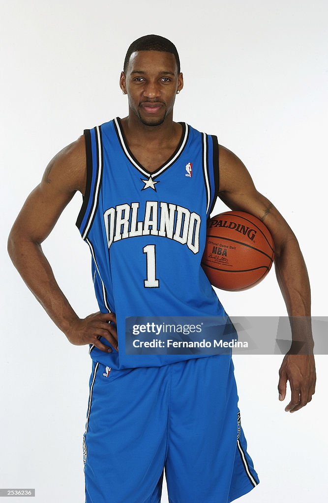
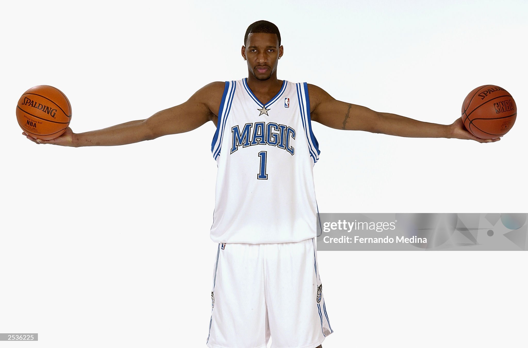
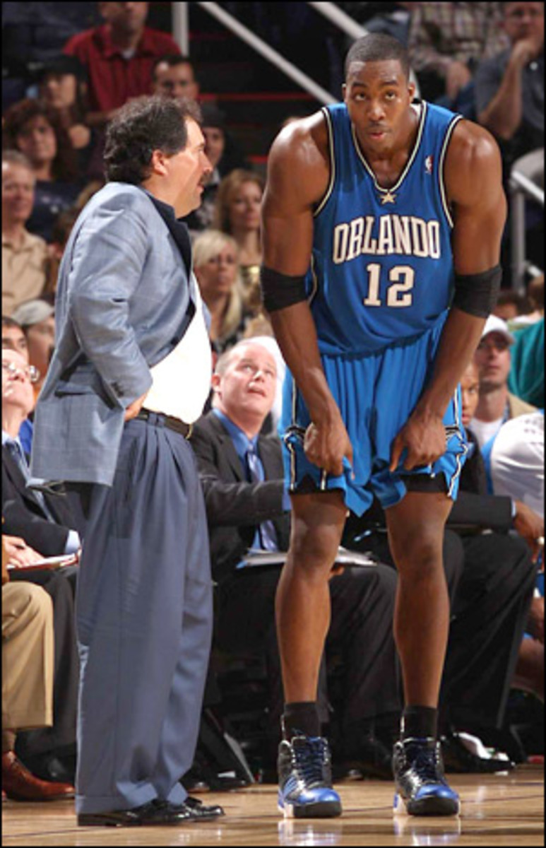
When the Orlando Magic unveiled their 2003-08 uniforms, the jerseys originally looked slightly different:
-
2
-
1
-
-
New Orleans Pelicans' 2024 Association Court Tweaked (made it a little more conservative/not as busy than the actual court)
-
New Orleans Pelicans' 2024 Statement Court
-
1992-93: Milawukee Bucks (last season w/ that green set) vs. Phoenix Suns (first season w/ the new threads)
-
 2
2
-
-
The Milwaukee Bucks, in the 1993-94 season, wearing their new uniforms versus:
The Philadelphia 76ers
The Sacramento Kings:
The Cleveland Cavaliers:
All of these teams would change their uniforms the following season.
-
2
-
-
For the NBA, bring back the jersey number on the shorts. Like these:
-
1
-
-
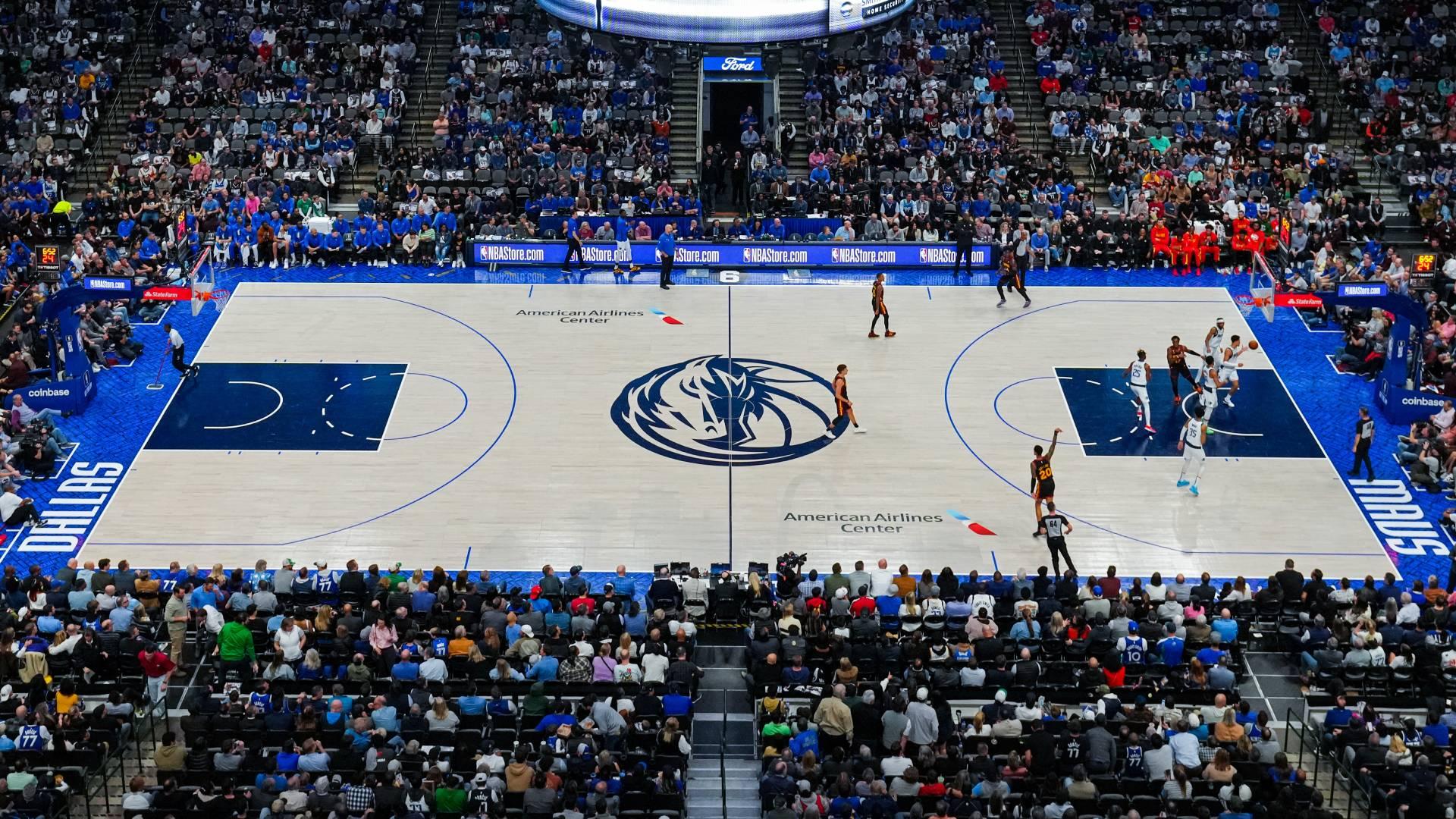
Was watching a Mavs game the other day and realized their current go-to floor isn't my cup of tea. So I tweaked it...
-
1
-
-
-
On 12/18/2023 at 2:30 PM, monkeypower said:
The Iowa Wild do (did? some photos have them wearing white helmets with these jerseys) have a wheat coloured helmet for their wheat jerseys. which is essentially cream.
and it looks much different in different lighting.
It just doesn't look good and that's with only CCM making all the helmets so at least the colour is consistent. Imagine how much variation we could see in the cream helmet colour across different brands.
I wish those WHITE accents on the jersey and helmet were RED instead.
-
4
-
-
On 12/4/2023 at 12:43 PM, Wackyriderfan14 said:
2019 they were road for all their playoff games
2021 they were the road team
2022 they won the previous two in white
2023 they were the road team
I thought it was because the white jersey brought luck?
-
On 12/4/2023 at 12:33 AM, mcj882000 said:
Apologies for the late reply, but I remember this! The story about why it's unused is hilarious: sometime in the late-00s, I wanna say 2008 or 2009, they were planning on bringing these back for the playoffs when they made it... but then, of course, they missed the playoffs (as they did every year between the last two lockouts) and couldn't use them. Oops.
They kinda wore that in 2013. Only, the white was now purely white instead of cream.
-
-
The "We Believe" Warriors era
-
1
-
-
Inconsistent lining on jersey numbers. See Wild's and Golden Knights' (2024 WC) sweaters.
-
5
-
-
What was the font used on this SIXERS text above?
-
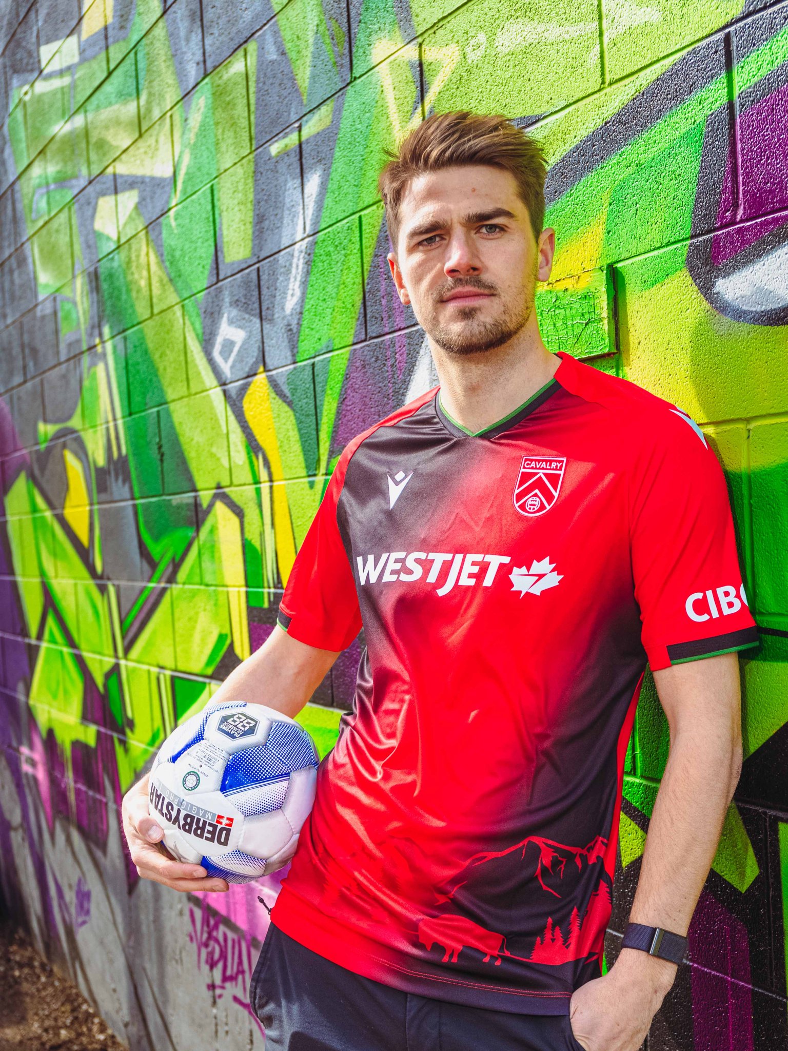
Cavalry FC
2021 kit
2022 kit
2023 kits
-
12 hours ago, Cujo said:
NBA courts have reached an all-time low. Really. Who thinks this stuff is nice?
They're not bad, but yeah it's sad to see NBA teams run out of ideas on how to design courts for sure.
I think I'll blame myself and few others for figuring out their best practices and making designs in the process. In my case, I have been designing NBA courts for almost a decade. When I started creating them, court designs used to look much better. Now? There are more courts (now divided into main, alternate, and City-themed) but less appealing approaches on how to design one. I guess I'll take credit for (almost) every NBA team having multiple court designs because of the requests I'm getting like this and this?
Just kidding on both. God I sound so cocky lol.
But yeah, I'm a little disappointed to see NBA courts evolve like that since I started making NBA courts.


Arena Rafters & Banners
in Sports Logo General Discussion
Posted
At least this one looks much better than Zach Randolph's old banner.
And I said old because they changed the banner design for Zach's as well. It's shown above Marc himself.