

raysox
-
Posts
7,588 -
Joined
-
Last visited
-
Days Won
22
Posts posted by raysox
-
-
I completely forgot about this concept thread, it's one of the best in the history of the boards. Just superb stuff since page 1, looking forward to the Italian league!
Someone make this world on Football Manager! -
I'll preface this essay by saying that I live in the Tampa Bay area, a region not exactly blessed by pro lacrosse and that I have a little bias. I am a sport management major so I guess that kind of negates it out.
Paul Rabil is a smart business man, and has a lot more data than I could imagine ever having. He's said that the goal is to do a city based model and I get it. It's so enticing to play what if and hand pick cities to place teams down in. But like... why do we need to?
Lacrosse is regional and not a major sport, that's just a fact. The current touring model ensures that you can tease different markets, but also your footprint is just a little bit larger than having 8 teams with a home town. Including the plans for 2020 that never got realized, I have 21 markets that the PLL have/will have played in. Not saying that every city deserves a team, but you're kind of limiting yourself. Hell there's cities that aren't included in that 21 markets that could reasonably host games too. The MLL attendance in 2018 was pretty dog :censored: outside of Denver. The MLL wasn't the best run league in it's later life, but to me on the surface it seems like 7 games were too much to market for - especially in non traditional areas for the sport. The crowd in Charlotte a few weeks ago was much bigger than the 1,364 average the Hounds had in their last season.
The PLL has been one of the most refreshing social presence i've ever seen. They have well exceeded the max for MLL in terms of follower count. They are doing some great stuff across all channels. Splitting the league into 8 different cities will just make creating content that much harder because there's so much to focus on. One vlog with one personality filming over 4 games is a lot more easier to pull off than having 4 on air talents. The league feels SO accessible because they're filming and shooting everything that happens over the weekend.
I really want to see this league succeed because I think the touring model should be used for fringe sports. I think a sport like softball could pull this off - something way better than the Athletes Unlimited thing that's mostly player forward. There's a lot of thoughts I have about this (obviously) and not everything is laid out in this argument. I don't know if there has ever been a time other than now that this could have worked. There's streaming services, and a craving for something different if you haven't noticed all the new leagues starting. The PLL will definitely continue to exist past when they decide to plop teams down. The salaries will begin to justify the means and become the sole income for players. That's the goal in the end-
 1
1
-
-
.........is this thing on? I have some unfinished business I feel!
Oregon StateThe Beavs have a really solid football look with a striping pattern down the sleeves. I mimicked that on the road, but gave them an asymmetrical stripping pattern on the orange They have a sexy Beavers script too. The Orange and Black look are extremely bold and I wanted it to do the talking on here. I think the other biggest thing is the use of numbers on the helmet, somewhat inspired by the Pro Combat design Nike came out with a decade ago.

Washington Huskies
The Huskies have one of the cleanest brands in the NCAA I feel. Then I saw theyre an adidas team now and had to make it stupid complicated and sublimate stripes. The gold helmet matches the football team and the gloves would pop as well. This concept's most unique look is the fauxback road white uniforms because I found a vector of the husky head UW logo. I felt like it could definitely work and stand out as a look straight out of the early 90sArizona Wildcats
I really didn't know what to do with the Cats. I do kind of like their football uniforms, but they stand alone in the brand. I ended up taking inspiration from that, but introducing two old logos into the uniforms. The homes have sublimated cactus/mountain logo and the roads have the big wildcat head.
So that' ll be it for the Pac-12! With some recent news, I feel like it's only right I transition from the Pac-12 back to the Big Ten. I really don't like the Michigan State and Wisconsin look anymore and want to take a stab at updating. Might do Illinois too.
Then i'll probably do a handful of teams in the SEC and Big XII that I feel could have a team. Not all though, because imagine Kansas State and Ole Miss having one. It's impossible!-
3
-
-
I havent been able to place the feelings I have for this but "jumping the shark" is absolutely the right term.
-
3
-
-
That’s a great point about training camp. I guess they could hypothetically play at the old Minnesota United stadium north of town, but thinking about how the Star in Frisco wouldn’t be able to be used.
I’m still of the opinion that they shouldn’t go to a city model, but that’s a long post for another day and I still need to organize my argument lmao.
One thing about the PLL this year is that there might not be any bad teams. In the last couple years there’s been a team that’s clearly worse than the rest. Atlas a few times and Chrome last year come to mind. There’s three 1-4 teams right now. I think Redwoods need some help offensively but overall they’re pretty loaded. Chaos relies on box players, and they had some players missing training camp and three game weeks.
The Cannons are probably fit the mold the best but they have the consensus best player on earth in Lyle Thompson. I could see them getting help next year from the draft and rocketing up the standings.
-
With the Chrome loss last night, the Whipsnakes become the last undefeated PLL team for the 3rd time in 4 seasons. The outlier they were second to last team. They play the Waterdogs tonight. One thing the PLL is great at is parody, but it's really fun that there's a Golden State Warriors-esque team right out of the gate.
Maybe the Chrome shouldn't have worn matte lids-
1
-
-
I liked this game more than game 2
-
Absolutely thriving seeing the Whipsnakes continuing being the benchmark for PLL teams. Pretty crazy how the #1 picks in the college draft dragged their teams from last to a very good year. Logan Wisnauskas seems to be the real deal.
If you're familiar with the videos of Jon Bois, there's a series being made on the history of Syracuse Lacrosse and it's absolutely phenomenal. It's truly one of the best series I've ever seen. I couldn't recommend it more. There's a single part left that should come out this week, but here's the first 5.
-
1
-
-
glad someone is getting use out of that lacrosse template I made! My favorite so far is the Woods. Can't wait for the Whipsnakes!
-
1
-
-
What a wild ride, you guys. The Lightning blew out Toronto and Florida near the end of the regular season, one which was "just fine" by my now astronomical standards, and I kind of convinced myself "okay they may be able to make a run here". I was out on them after game 5 against Toronto, and again after Game 2 against New York. But there's just another gear to this core. Stamkos, Vasilevskiy, Kucherov are earning their massive salaries year after year. Each of these Cup runs have been extremely different from each other, and i think they haven't even faced their toughest opponent yet. The Avs full on scare me, but I think this is the Cup Final for the neutral fan.
Obviously i'm extremely biased. I'm not going to tell people to enjoy it because I too root for parody, but what they've been doing is very special. Good luck to Colorado and their fans, this should be a fun one.-
1
-
-
Just thumbed through this for the first time, and holy boats is it solid. Everything is clean, well manicured, and true to what a college football identity package should be. Excellent work my friend, looking forward to the evolution of these ACC concepts!
-
5
-
-
I think all the ingredients were there but they made it unnecessarily cluttered. I tweeted a few times about how much the years overlapping the stripes just barely is killing me. I never do this but I just wanted to see how it looked with some minor tweaks.
-
4
-
 1
1
-
-
This is essentially going to be a regurgitation of my twitter thread last night but it belongs here! Also follow me, it's fun.
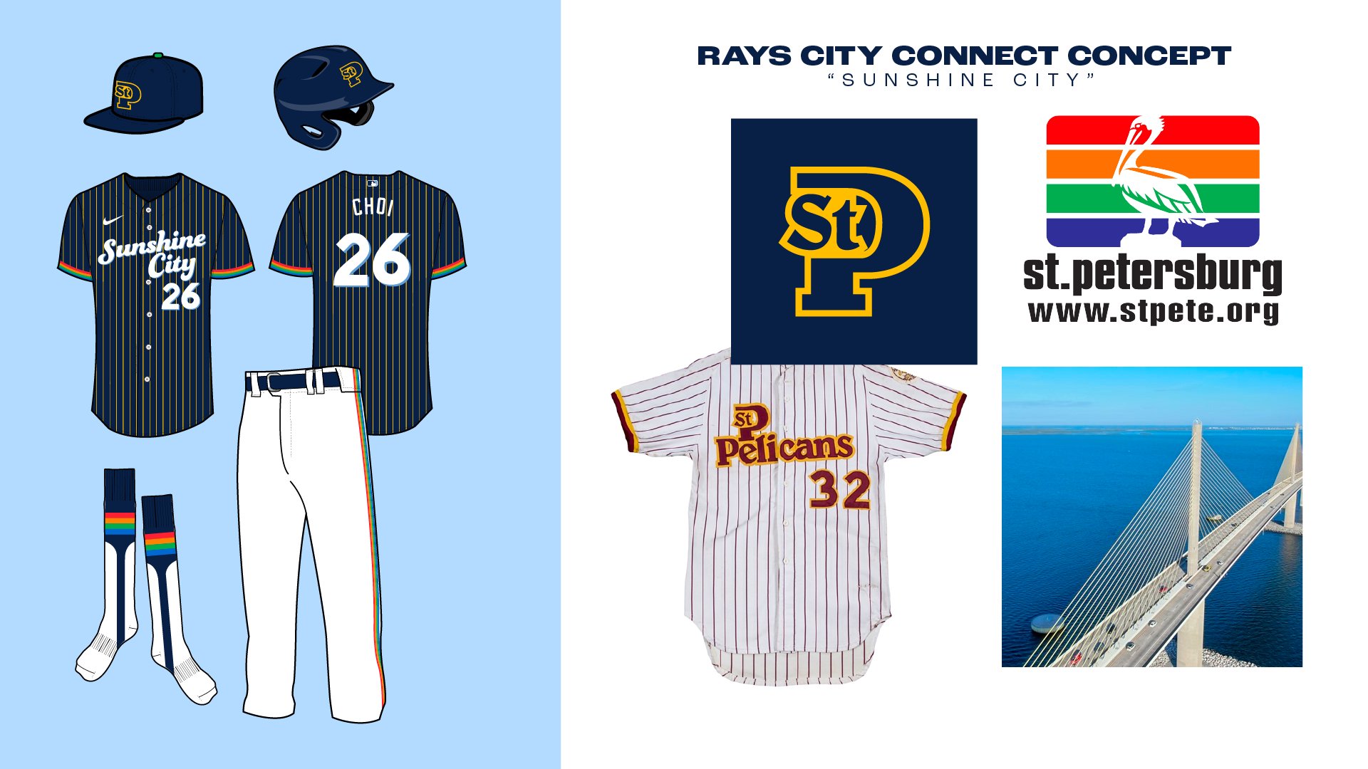
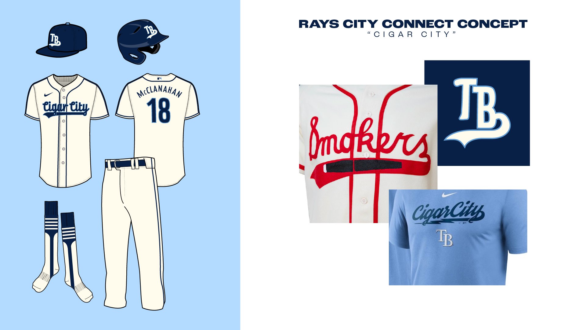
Since Nike started releasing City Connect alternate jerseys for a handful of MLB teams, I hadn't really had a clue about what America's team - the Tampa Bay Rays, would look like. Well I thought on it this week, and came up with a few concepts.FIRST: for any out of towners, Tampa and St. Pete are two very different places. SECOND: Tampa Bay has a lot of history with minor league/independent teams in the past. So each one of these concepts is a reference to at least one of them, like what the Marlins' CC jerseys look like.
1. "Sunshine City" is a nickname for St. Pete, the actual city the Rays play in. I used pinstripes & cap logo from the old SPBA Pelicans. The yellow pinstripes are a reference to the Skyway Bridge, and the cuffs are a reference to the city's flag. After the fact I think I would instead do an SC cap logo to better fit this. But the Pelicans logo is just so good.
2. "Tampa Bay" is obvious beach scene. I thought "the rays never can decide if their brand is the SUN rays, or STING rays. So I referenced the place you'd find both. The script is a trace of the old Tarpons script + Bay
3. "Cigar City" is weird because that's TAMPA's nickname. However they apparently sell shirts with a Cigar City script. I mimic'd the Tampa Smokers, a team the Rays have thrown back to before, with the logo and jersey with piping down the sleeve.
Would love to hear what you guys think! I may do more, I may do revisions to my favorite - sunshine city.-
11
-
5
-
-
I'd probably do a white kit with a new pattern if I was really leaning into a concept, but I needed to see how this looked. Also hey! New jersey cut and collar!
-
2
-
-
On 4/27/2022 at 2:11 PM, vtgco said:
Definitely prefer the composition of the "Whitecaps" version of the logo, and the dashed lines are a nice touch that make it feel more argyle-y than the other version...
That said, I imagine the first one would be improved if the G & O were centered to the left & right diamonds. I also wonder if a two-diamond version is possible.
So I had the G&O centered but they're scooted over so it meets right where the green diamond connects. When they're centered there's a lot of green space I don't really love. Which is kind of a flaw with the design I had to cope with! I'm still going to play around but that specifically was a turnoff when I was playing with it
9 hours ago, nielsoncp said:I think I like the logo on the left the most. I think it fits the traditional argyle shape, and I do think the one on the right looks too whitecapish.
This was also a factor because the Whitecaps logo isn't really argyle! Just more condensed and smarter than the one left one
9 hours ago, MDTrey4 said:Definitely like the right logo more. And that typeface is beautiful. What's the name of the font or is that custom?
48 minutes ago, Friedrich Stuart Macbeth said:Is this template available in MS Paint form? I was trying to make concepts with yours, but it keeps giving me some kind of pixelated ugliness.
It's not finalized but it's a pretty big size. Once I post an all white version you would be able to take that and convert it to MS Paint
I've been goofing with two other teams that you'll see here soon!
-
Yep and it took watching the 2021 Cup presentation to figure it out. A close up shot of a player you could see the Canadian team row next to the Pacific row. Just a goof on the stadium management team.
-
8 minutes ago, mcrosby said:
Is there a reason for your spelling of Argile?
Yes, because i'm an idiot lmao. I got my wires crossed with Textile I guess. Updated!
-
 1
1
-
-
Some of you may remember a soccer concept series from 2014 where I re-imagined what the US Soccer Pyramid looked like in 2030.
I did three tiers of 24 teams each. What everyone doesn't know is I started to do a fourth! I think it was mostly due to not knowing what to do with my hands after such an undertaking. One of the clubs was based in Greensboro, NC. I have a connection to the city, so I wanted it to be special. The concept is here if you're interested. Something about the name stuck in my head.
Fast-forward to 2022, I was kicking around the idea again. Immediately the name Greensboro Argyle FC popped into my head. Now argyle is the pattern, but it's also a specific shade of green. GREENSboro, you get it. I almost named it Greensboro Textile FC for the industry there, but I couldn't get Argyle out of my head. What I did was create two concepts. It's a simple look in the style of something you'd see in the Bundesliga. One is more of a true argyle with GSO woven into the pattern. The other is probably cleaner, but I feel like is too close to the Whitecaps. Would love to hear what you think!But what may have caught your attention is that me, Raysox, am working on a new soccer template! You're surely familiar with my previous one - it's been the standard for concepts for like 6 years. I've been trying to make this an extremely smart template with a collar library, pre-placed patches, and clip groups for patterns. I've only done nike before but here's what Greensboro Argyle could look like!
-
5
-
4
-
-
I came through to bring up how much I love Hawaii, I didn't even notice the flowers highlighting the island they represent.
The last two have been stellar, waaaaaay better than what they have now. Kentucky's is so generic i'm glad you gave them a nice facelift. -
the Rangers ones rip. Maybe my favorite so far.
-
1
-
-
On 4/2/2022 at 2:41 PM, TrueNorth13 said:
I must ask, is this something Tampa fans would want? I'm not sure what to make of this lol, but it would present a creative challenge to take this on for a city uniform for the Lightning. Definitely something I could try to work into the uniform set for Tampa Bay

Hah, I think our very colorful flags are more tongue and cheek. I've done a concept for the Rowdies using the St. Pete flag that looked super cool with the rainbow hoops. But if you want to be steered in any direction by someone who's a local, the Gasparilla jerseys they wore for warmups in January was really well received!
Really good work on the last two!-
1
-
-
I think this entire series is a pretty solid one. I think you may be trending in the right direction with the last few, but my biggest gripe had been that for the most part, not every city has a recognizable flag to be represented as a jersey. I think Edmonton, Carolina, and Dallas were the biggest offenders. Chicago's works because people outside the city know what the flag looks like. I think concepts and ideas are, for better or worse, more in line with the NBA launch. I think you're on the right path with ones like Minnesota, Florida, and Arizona
Once again, you've done great so far and that's just a personal gripe to push this to the next level. I will be expecting a Tampa flag alternate for the Lightning however.-
1
-
-
Thank you for doing a project i've always wanted to do Lysander. Love all of these so far, i'm glad you're content with making changes instead of relying what already exists.
-
It's such a shame the best branded league top to bottom was the one that imploded half way through season 1 smh
-
4
-


D1 College Lacrosse Concepts - Big Ten Redos + Illinois
in Concepts
Posted
Wisconsin Badgers Road redo
I stopped liking the striping pattern and redid it to look more like a Under Armour team.
Michigan State Spartans Home
I did have this looking like an old Football uniform, but instead went for a new design that ran a spike up the sleeve to try and get back into the swing of concepts.
Illinois Fighting Illini
Not sure why I decided in the first phase not to do the Illini. There's some lacrosse history closer to Chicago, but Illinois would probably be a better candidate than most other B1G schools. Their team doesn't have much of a striping pattern so I created one that looks the same across the board. So the pattern has a white stripe separating navy and orange. You'll see what I mean below!
So while we're in between conferences, would you guys rather see some SEC teams or Big XII teams? Only a handful of each but I think I have some good candidates.