


dakotapalm
-
Posts
578 -
Joined
-
Last visited
Posts posted by dakotapalm
-
-
Thanks for the feedback. I know there's still stuff to do (teeth?), but wondering if this is trending in the right direction.

-
I need some constructive criticism on a Chinook Salmon logo that I made for a fictional university logo in the northwest.
The "C" shape is important, and the three colors and the university's colors. Otherwise, trying to make it more like a good logo.
-
I really like how Nashville's colors look on the court. Enjoying this whole series.
-
I like these teams' identities (color schemes, logos, nicknames). The Flyers' side trim is nicely reflected in the third jersey. I feel like the Kings' crown trim is a little too forced; perhaps a smaller, repeated pattern?
-
 1
1
-
-
Little help with this one from Nike?
-
Haven't really commented, but I really like the work on this. Enjoying watching the detail you put in to all these fields. Keep it up!
-
Thanks for doing this; very valuable!
-
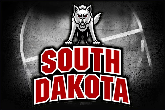
I really enjoyed seeing your work on the South Dakota logo. Had not seen that in a long while, and it looks very fresh with how you sharpened it up! Thanks!
-
Does anyone know what font or free font would be close to this? I'm assuming it is a custom font, but... given USD's athletic budget, maybe not.
-
I know this isn't an actual font, but does someone have a suggestion about what may be a font that would be similar or imitating some of these letters?
Thanks.

-
Arizona Wildcats numeral font (basketball):

Thank you!


Salmon/ Chinook logo needing C&C
in Concepts
Posted
Thank you, that's good advice. I'd shied away from looking at the logos of fish vs. actual fish, but it might be time for that. I didn't want to "borrow" either accidentally or otherwise, but I think I've arrived too much at too complex of a logo as you said. Back to the drawing board.