


Ray Lankford
-
Posts
982 -
Joined
-
Last visited
-
Days Won
1
Posts posted by Ray Lankford
-
-
1 hour ago, Ark said:
If they Twins are the best looking navy/red team now what were they before?


Maybe the pinstripe home jersey was better (but not really) but the new road is a thousand times better. The new wordmark alone is way better.
Personally, I think pinstripes only really work with chest logos and on top of that, a well designed wordmark like the Twins' shouldn't have lines running through it.
-
 1
1
-
-
The gold is unnecessary but more than that it's inconsequential. It doesn't move the needle in either direction considering that you can't really make it out in action.
And I love the red look.
-
The Twins are the best looking navy/red team in baseball:


-
1
-
-
Not only is the White Sox's home set better than the Yankees' but their road set is way better and they have a very good alt. The White Sox could very well have the best overall look in baseball.
-
2
-
-

Jaime Garcia without his bright red glove.
-
On 4/20/2017 at 2:52 AM, Ark said:
Most of the 2002 World Series Angels team was around for the Disney uniforms
Troy Glaus

Darin Erstad

Tim Salmon

Don't forget:

And speaking of the Angels and Tim Salmon in particular, I'll add:

-
On 4/7/2017 at 4:30 PM, WSU151 said:
The Mets logo is better than Mr. Met. Mascot patches seem ill-placed in MLB (though it might be kinda cool if the Pirates had a non-mascot green parrot as a sleeve patch on an alternate).
It doesn't help that Mr. Met is a subpar mascot. The Swinging Friar works as a patch, in part because he's not a baseball with a body.
-
I hope that the Dbacks add more red when they finally change their home jerseys. Maybe down the shoulders to the sleeves like the ASG jerseys.
-
-
-

Bonus point for the black bat.
-
16 minutes ago, ImmortalChef said:
1.01 ERA
They won the Central by 17 games. I don't think Chapman was worth that much.
-
1 hour ago, ImmortalChef said:
Well, he did help the Cubs win the World Series. I would even argue that if it weren't for him, the Cubs would not have won
How's that?
-
On 3/22/2017 at 11:10 PM, bwburke94 said:
He could become dual Reds/Yankees in the future, or possibly dual Reds/Cubs depending on how well his Cubs stint is remembered.
Won't the memory of his Cubs stint be almost blowing it?
-
I always liked the way Vlad tucked his pant legs into his shoes:

-
1
-
-
On 3/22/2017 at 0:39 AM, Ark said:
On this board I'm surprised this isn't a popular opinion but stirrups should be required in MLB
I would only be on board with this if players were also required to wear low top cleats.
I really hate the look of high socks with big sneaker cleats.
-
One thing about the Giants' cream look is that the pants look terrible when paired with the orange jerseys.
-
18 hours ago, McCarthy said:
This was during his brief comeback with the Reds in 2001 also the same time when they inexplicably wore red hats with black sleeves. Looked awful. Amazing he was such an athlete that he could dabble in Major League Baseball.
I don't mind the red hat and black sleeves (besides the BFBSness of it all) but the black sleeves with red socks is inexcusable.
-
9 hours ago, Cujo said:
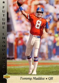

If Maddox on the Steelers is wrong, what's right?
-
1
-
-
I'll actually go so far as to say that Arizona's A logo is the best cap logo in baseball.
-
2
-
-
27 minutes ago, SilverBullet1929 said:
Cracks me up how "new uniform" automatically means "wrong uniform" for so many of you.
And while Boggs in a Devil Rays jersey isn't his "right uniform" I can't say it was a "wrong uniform" because when I think of the 98 Devil Rays I think of Wade Boggs.
I think it's legit for Phillips and Weaver.
-
1
-
-
This one works on many levels:

-
1
-
-
18 hours ago, Dolphins Dynasty said:
The Dolphins could use a tad more orange I suppose, but the main issue isn't the amount they're using. I think the issue is that both the aqua and orange were brightened in the update, so now they don't contrast as well as they use to, making it difficult to see the orange outlines from afar. Despite that, I love the brighten colors; it's very tropical-y. The previous logo and uniforms will always hold a special place in my heart, but the update overall was nice. I love the consistency with the striping and number font (they literally match) and I'm a sucker for custom fonts (though I would've preferred a different kind of custom font). While I do think the logo is a bit of a downgrade, it's not that bad. I think it's pretty tolerable.
And whether this is an unpopular opinion or not (it probably is), the Dolphins won the 2013 rebrands.
This is the correct answer.
The aqua looks particularly poor on anything but a bright sunny day.
-
38 minutes ago, hawk36 said:
Wait, I fixed it
")

I like where your head's at but I'm not crazy about that jersey. Too much yellow, maybe?


Unpopular Opinions
in Sports Logo General Discussion
Posted
I personally like when teams have home and road looks. I don't know if they still do this but the Dolphins used to wear white over white at home but white over teal on the road and I can get behind something like that with the Redskins. Burgundy over yellow at home but burgundy over white on the road (or at least in Dallas).
It'd be nice if they could get all their striping on the same page though.