


Ray Lankford
-
Posts
982 -
Joined
-
Last visited
-
Days Won
1
Posts posted by Ray Lankford
-
-
On 5 de febrero de 2017 at 4:23 AM, ImmortalChef said:
One of the most famous unused logos
The letters looks very intimate colored this way.
-
 3
3
-
-
On 1 de febrero de 2017 at 5:32 PM, FinsUp1214 said:
Two random ones:
1) Of all the Flying Elvis uniforms, this one looks best to me (even with the mismatched number color):

P.S. on that one: Flying Elvis is better in royal blue than navy to me.
The jerseys themselves are pretty plain but I love the Flying Elvis tail as the pant leg striping.
-
1
-
-
The Chargers' true color is dark (or at least darker) blue. They've won it for more than 40 years, they wore it in their only Super Bowl appearance and it's what Fouts, Joiner, Winslow, Seau, LT, Gates and Rivers have worn.
-
Speaking of the Steelers, I love the rounded numbers and think they look immensely better than the old block ones.
-
5
-
-
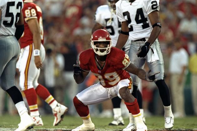
16 hours ago, SabresRule7361 said:
Jim Everett with the San Diego Chargers in his final year as a QB- 1997. The only time he played for a team outside the NFC West (11 years with the Rams/Saints)

Double points for the white-on-white Chargers look
-
1
-
-
7 hours ago, njdevs7 said:
I actually like these Bucs uniforms
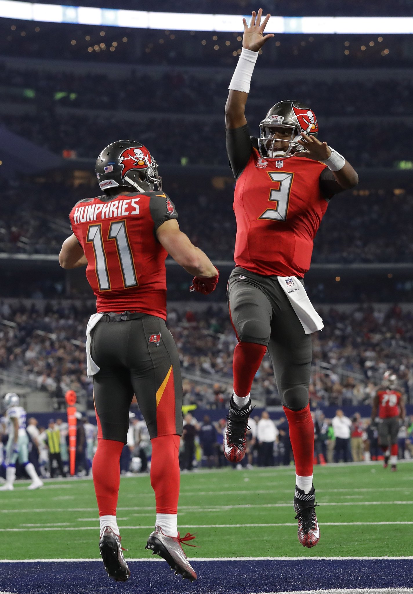
I'm not entirely clear on what the issue is. Yes, the alarm clock numbers are silly and the pewter seems excessive but those are hardly dealbreakers.
-
1
-
-
12 hours ago, Rj0498 said:
in case you couldn't tell, I really like following themes. Here is good ole Andre Rison. sure, he went to a pro bowl his first year there but imo, I think he belongs more in a glanville era Falcons uni
Also, he's a Falcon because that's where he was when Left Eye burned down his house.
-
2
-
-
Teams should change uniforms every ~15 years or so.
Not every team can be the Yankees or Packers and styles change so teams should be open to it. They should keep the same basic design elements but also change with the times. Ideally, this means different era of teams will have their own looks. One example is the Chargers, who have been blue and yellow and have had lightning bolts on the sleeves forever but their jerseys can be broken down into the Alworth era, the Fouts era, the Seau era and the Rivers era. And every jersey doesn't have to be perfect, as nostalgia will do the perfecting for them a decade or so later.
-
1
-
-
11 hours ago, the admiral said:
Yeah, if you had that width of yellow outline on the Agency numbers and a yellow facemask, it'd be a perfect update for today.
I could live with those jerseys with the Seau-era numbers. I just really hate when yellow and white touch on jerseys. The colors bleed together.
-
On 17 de noviembre de 2016 at 1:44 AM, the admiral said:
More yellow, no navy, and I'll agree.
The navy blue provides some much needed contrast. Powder blue, yellow and white are all too soft together.
-
3
-
-
Maddon's as much a Ray as Bochy is a Padre.
-
1
-
-
4 hours ago, jp1409 said:
I'm sincerely happy for the Cubs but Lester (and even Lackey)? It might be the right uniform for Cubs fans but Cubs fans only...
This is true. Lackey will always be an Angel.
-
4
-
-
It's not a perfect analogy but since Maddon will probably always be remembered as a Cub, it's probably like Torre in St. Louis or Cox in Toronto.
-
2
-
-
30 minutes ago, OnWis97 said:
There was some talk of this around here for a while (semi-legit rumors?) That is about the only thing the Padres have left to do to make themselves forgettable.
I am OK with the number of navy/red teams given how long most of them have used the scheme. But I don't want to see any teams change to it or any expansion/relocated teams adopt it.
That was the old owner.
-
Green and gold then. You could even throw in dark blue as an accent color, kind of like what the Brewers had in the mid-90s.
-
1
-
-
31 minutes ago, SFGiants58 said:
The history of the American Association Brewers with blue would make me defend blue/yellow for the Brewers. Besides, the A's should be the only green/yellow team.
You could argue for the Padres to switch to navy and red using that logic.
-
3 minutes ago, SFGiants58 said:
I wish more baseball teams had followed Charlie O. Finley's example and diversified their color schemes in the 1960's. These color changes wouldn't be nearly as drastic as the A's, but would be enough to prevent the navy/red or royal/red overdose we have today. Some examples of this would be:
Red Sox: Forest Green (to tie in with the Fenway deco)/Red
Twins: Navy Blue/Kelly Green, Royal Blue/Kelly Green, or Forest Green/Powder Blue
Indians: Red/Brown
Braves: Black/Red/Yellow-Gold (for accents)
Royals: Purple/Yellow
Rangers: Blue/Silver or Blue/Bronze
I wouldn't want any of these teams changing their colors now, but I still think it would have been interesting and visually refreshing to see more teams take advantage of color TV in the same way Finley did with the A's and other teams did with their initial color schemes (Pilots/Brewers, Padres, etc.).
I'm a big fan of regional colors so I think the Brewers should switch to green.
-
On 3 de noviembre de 2016 at 10:37 PM, joekono said:
As far as MLB goes, other than the Brewers .Dbacks(horrible) and Padres, the league seems OK. No more BFFBS,except the Reds but if you go down the list, the league isn't that bad. I just want the Mets to never ever ever ever change uniforms.
I really hate the Rockies' look. If it weren't for the Dbacks (who would look pretty good without the red splotches), they'd be the worst in the league to me.
-
1
-
-
Paul Konerko on the Dodgers and Reds
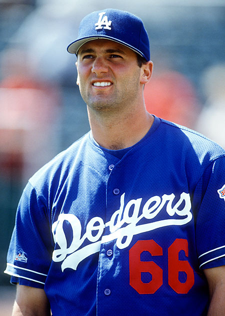

Also...

I think Konerko without the goatee qualifies.
-
The new Twins uniform looks great in action.
-
I love Cleveland's blue jersey, which kind of feels like an unpopular opinion now.
-
I don't think players look necessarily better with high socks, especially since everyone wears them with big sneaker cleats now.
-
I don't care for Johnny Canuck at all.
Its an alright logo, but anything's better than the stupid stick-in-rink (yes, even the orca is better).
Agreed. I actually like the orca logo.
I'm going to take you one further and say that I LOVE the orca logo.
-
I think the St. Louis Cardinals' uniforms are incredibly boring. No red alternate, no piping, nothing. Just a white or grey jersey with the logo and some numbers slapped onto it. They honestly look unfinished.
I agree with the Cardinals uniforms being overrated but not because they are boring. There is something off putting about them to me. Maybe the cardinals on the bat make them a little too busy for my liking.
For me, the issue is that there's too much negative space on the jersey. The St. Louis alt with the piping looks a thousand times better than the regular home and road jerseys.
-
1
-


Unpopular Opinions
in Sports Logo General Discussion
Posted