


Telemundo219
-
Posts
1,209 -
Joined
-
Last visited
-
Days Won
2
Posts posted by Telemundo219
-
-
10 hours ago, CLEstones said:
Please please please tell me there is a .PSD version of this template. Please.
Or an .AI version and I'm not talking Allen Iverson.
-
1 hour ago, MCM0313 said:
Rather…cavalier of you.
Hahaha....I did the Cavaliers as well. This is too red for them.
-
18 hours ago, tscuzzy said:
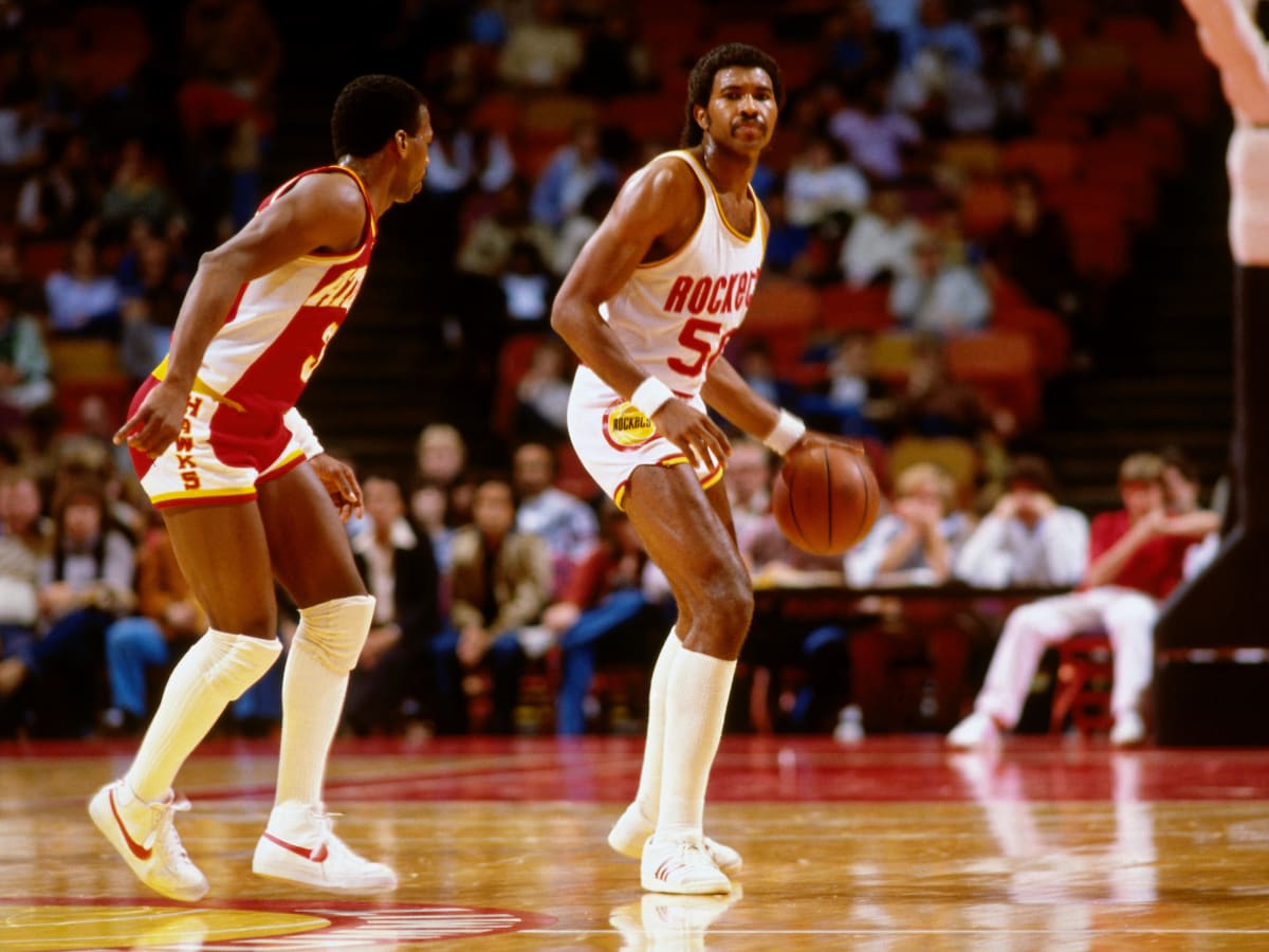
I was so upset that the Hawks beat the Rockets to the retro re-brand... it's a fair point, but they did share colors for about 30 years
 11 hours ago, truepg said:
It's just that the Rockets shouldn't be using black to begin with. They jumped on the black bandwagon only during the last ten years and similarly to several other teams eventually dragged it all over their identity. Eliminate black, and all of a sudden there is one red & black team less.
I never liked the yellow for the Rockets, and the 00s' color scheme felt just right. At the end of the day, just throwing thoughts around, the red & blue color scheme and style seen on the City(?) uni could work equally well with powder blue instead, if they ever wanted to take that route, now that the Clippers failed to capitalize on it.
I always the Hawks should go with Red and Yellow (i.e. Chiefs) and the Rockets should go with Red and Gold (or Double Red and Gold) (i.e. 49ers). Something like this for the Rockets (plug included).
-
 5
5
-
 2
2
-
-
Fan of the logo. Not a fan of anything else. For a logo that's still a bit more modern and dynamic, the uniforms are too plain. I believe there's a way to have modern jerseys w/o going overboard (for example you could make great usage of the wong pattern) and the font used too complex. A more simplified version of that font could work
-
1
-
-
-
1
-
-
Surprised not by the rebrand but even the early reveal.....the early random reveal.
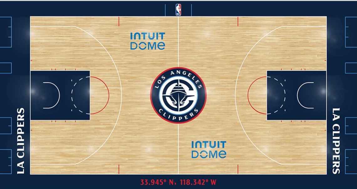
Overall I'd give this an 8/10. Most of the logos (the alt ones) are great. As mentioned above, the main logo looks like a cruise ship. Maybe if they were in San Diego, it'd be ok.
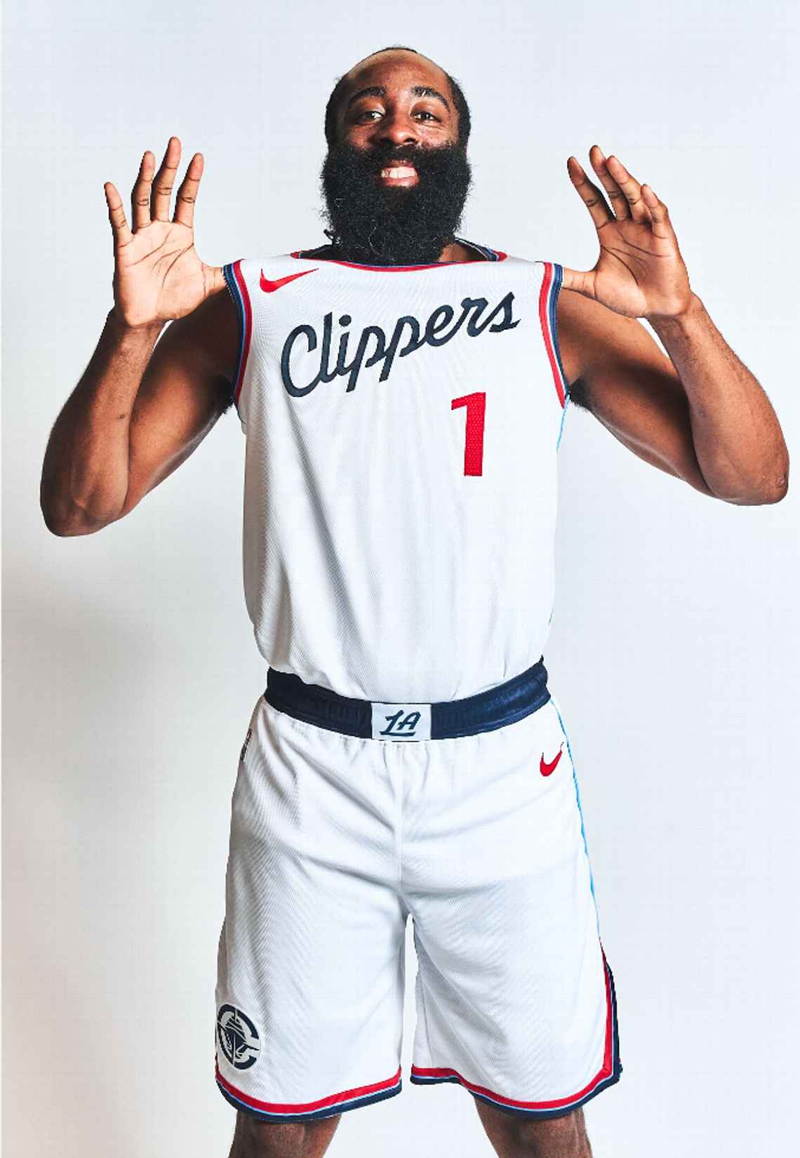
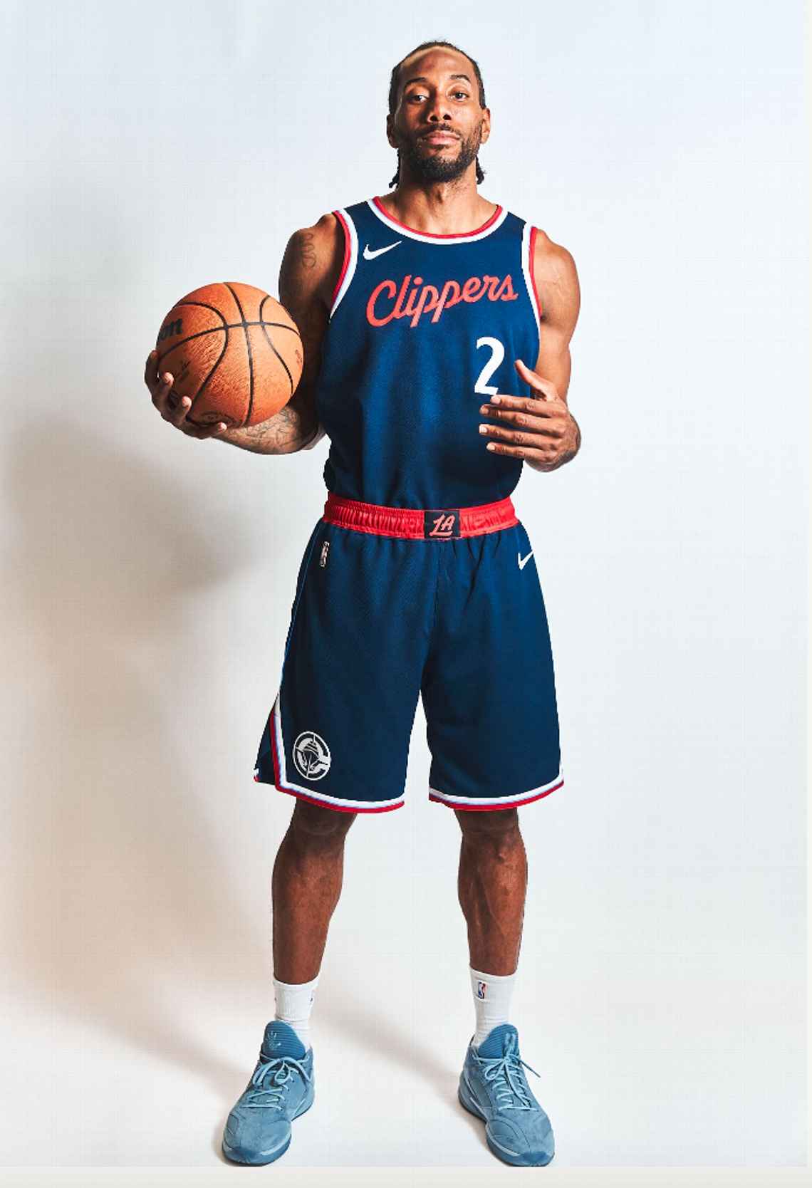
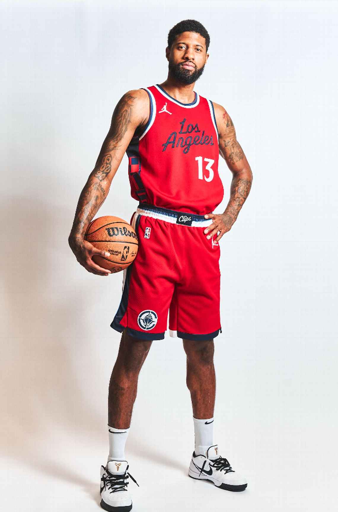
As for the uniforms, the white one is the best of the bunch. I think with both the red and navy jerseys, the wordmark and number colors should be switch (i.e. white clippers on navy and red numbers, white clippers on red navy numbers). Love the use of the nautical flags on the jerseys as well.-
13
-
-
-
15
-
 3
3
-
4
-
 1
1
-
-
-
15
-
6
-
6
-
 1
1
-
-
Q. Why is St. Louis in the East and Tampa in the South when Orlando is in the East and teams in cities closer to St. Louis are in the South?
Orlando's purple should be darker.
Also is the uniform template available? -
-
On 4/27/2023 at 1:45 PM, Telemundo219 said:
Does anyone have recent NBA Jersey Templates (svg or ai format)?
-
Does anyone have recent NBA Jersey Templates (svg or ai format)?
-
3 minutes ago, Telemundo219 said:
Like someone mentioned in I believe the Jazz uniform topic, they should just rip the colors from the New Orleans Hornets before the change to the Pelicans.
Just switch out the purple here with the normal Jazz purple. The creole blue and gold is close to Salt Lake's flag colors and the light blue can just replace green being similar to the 90's teal.
Someone should throw these colors on their last uniforms to see how they look.
Something like Salt Lake Blue, Beehive Gold, Palace Purple (Palace i.e Salt Place)
-
2
-
-
Like someone mentioned in I believe the Jazz uniform topic, they should just rip the colors from the New Orleans Hornets before the change to the Pelicans.
Just switch out the purple here with the normal Jazz purple. The creole blue and gold is close to Salt Lake's flag colors and the light blue can just replace green being similar to the 90's teal.
-
2
-
-
This is cool. Would love a shot at this if you decide to do this again.
-
2
-
-
1 hour ago, RO_ said:
This isn't my template, but I did make a few changes to it. I probably still have the original PSD file if you wanted it
That'd be great. Great job with the current updates as well. Loving the Saints
-
Hey good job for the most part. Is the uniform template yours/available?
-
1
-
-
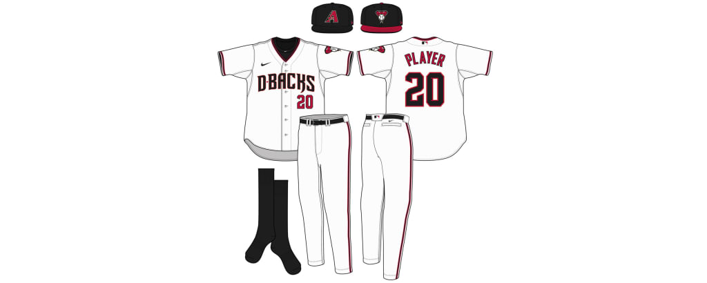
Anybody have a hand on this baseball template. From MLB.com:
-
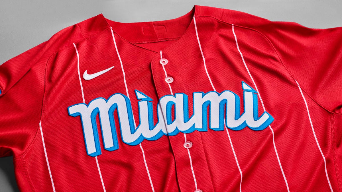
Does anyone know the font used in the Marlins City Connect uniform?
-
Jerami Grant (Blazers, #9)
-
1
-
-
Gary Payton II (Blazers, #00)
-
2
-
-
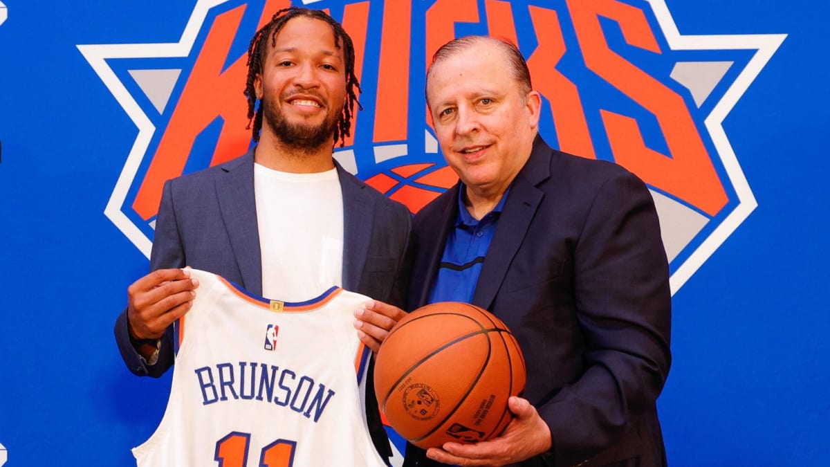
Jalen Brunson (Knicks, #11)
-
3
-
-
5 hours ago, PERRIN said:
Thanks for the tip. I've seen MPLS before, completely slipped my mind. I should've double-checked before using an unofficial abbreviation. I'll update that.
It's custom-made, with some downloadable templates used as a reference. I haven't looked into making it downloadable so I'm not entirely sure if it would work on other drawing apps, but I could try it in the future. If I end up sharing it as a PSD or SVG template, I'll be sure to let you know.
Thanla for that info and responding. Great job overall (on the template and the uniforms)
-
Hey @PERRIN great updates. Definitely like the color palettes and identities of some, if not most, of the teams.
Q: Is the uniform template you're using yours or is something that you get somewhere? Been tryimg to find one myself that is good and usable.


 ️
️


ARZ, ATL, CAR, LAR, SEA added 4/9 | Perrin Redesigns the NFL
in Concepts
Posted
Concepts are all good. Only critique is the numbers of a bit big. Suggestion to make them slightly smaller.