


LogoFan
-
Posts
670 -
Joined
-
Last visited
Posts posted by LogoFan
-
-
2 hours ago, shaydre1019 said:
LEAK:
When I shared the comments from the Texans on the new unis a few months back, I said it was going to be a show. Doesn't appear to be disappointing.
Hell, let's throw it all together: a single uniform with piping, gradients, alarm clock numbers, swoosh striping, side panels, toilet seat collar and let's do it all in bright magenta pink just because it's different. If you're going to fail, might as well be epic with it.-
 2
2
-
-
4 hours ago, GFB said:
no wordmark on home jerseys:

They finally did it right. Bravo.
-
5
-
-
26 minutes ago, ruttep said:
No. I just don't like the "electric lime" color. I think of it more as "puke green".
The lime green like Orlando used and Seattle uses are great colors for me. Green is one of those tricky colors, however, that depending on lighting, medium, etc. than can go from nice looking to awful in a hurry. What I consider to be "puke green" is duller than the Thunder's unis, but in reality it's not far off.-
2
-
 1
1
-
-
17 hours ago, ruttep said:
Hate to say it, but designing a good uniform and designing a uniform that the players like are becoming two very different things. From what I understand about current players' uniform opinions, they'd be estatic about every game being all-black
 vs all-white
All you need to know about giving any weight to what the players like is to look at them getting off the bus in their street clothes. Some know how to look sharp, others look like they walked through a tornado of clothes and are wearing whatever landed on them. -
8 hours ago, ruttep said:
Not sold on this in the slightest.
It was perfect for the time it came out. While I never cared for the logo itself, I loved the uniforms as they we very unique and well executed.-
3
-
-
On 3/25/2024 at 2:40 PM, See Red said:
That’s not good.
Scary thought: please do NOT try to convey snow coverage using gradients. Gradients are worse than piping.
-
4
-
-
The Texas took a cool modern logo, put it on a bland uniform. Instead of going with an upgrade (even just going to the red helmet would have helped!), they chose to go even more bland.
-
1
-
-
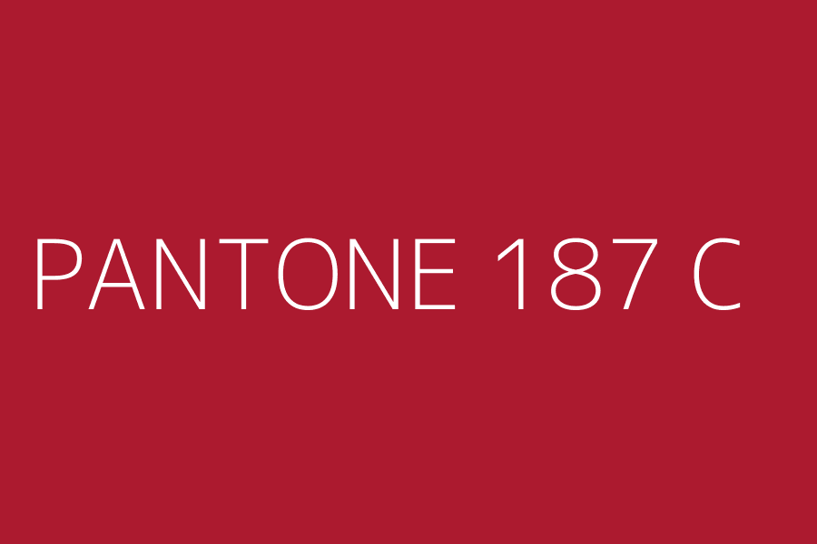
On 3/12/2024 at 10:33 AM, burgundy said:
I think we can all agree that calling 187C "maroon" is absolutely ridiculous.
What they've done to the Panthers is just sad.-
1
-
-
On 1/5/2024 at 9:46 AM, heavybass said:
No. I'm saying he personally funded the morons that designed the XFL uniforms.I.E. Dani and her assistants, probably.


-
On 2/23/2024 at 10:51 AM, sluggish_edgeboy said:
I feel as if a lot of Falcons concepts that try to combine the old and current logos fall a little flat, but this one actually works pretty well. I do prefer black helmets for the team (red looks a little UGA-esque IMO), and the 2 looks a little odd.
Yeah, I plan on modifying the 2 and using the modification on a more modernized version. I also realize now I only posted the "deluxe" version of the wordmark and will post the basic version. Thanks to you and everyone for the feedback so far!
-
5 hours ago, burgundy said:
Those pants are awful and don't match the traditional style jersey at all. I think they were trying to mimic the panther logo, but it just does not work. They look like a high school team that ordered mismatched styles out of the catalog.
Agreed. It's a bit jarring looking at the sleeve stripes and then the pants. Once again, Dani and Dwayne broke what was working well.
I am reeeeaaallly hoping they drop all the silly gradient stuff.
-
1
-
-
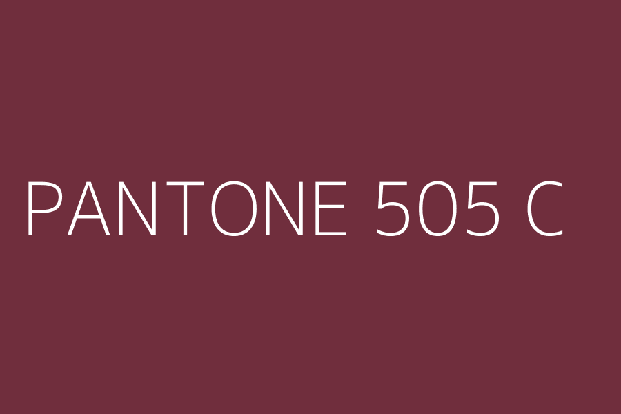
On 3/6/2024 at 3:47 PM, GFB said:
That Under Armour shade of plum makes me very sad
Agreed. It was more maroon before, now more like a medium burgundy.
-
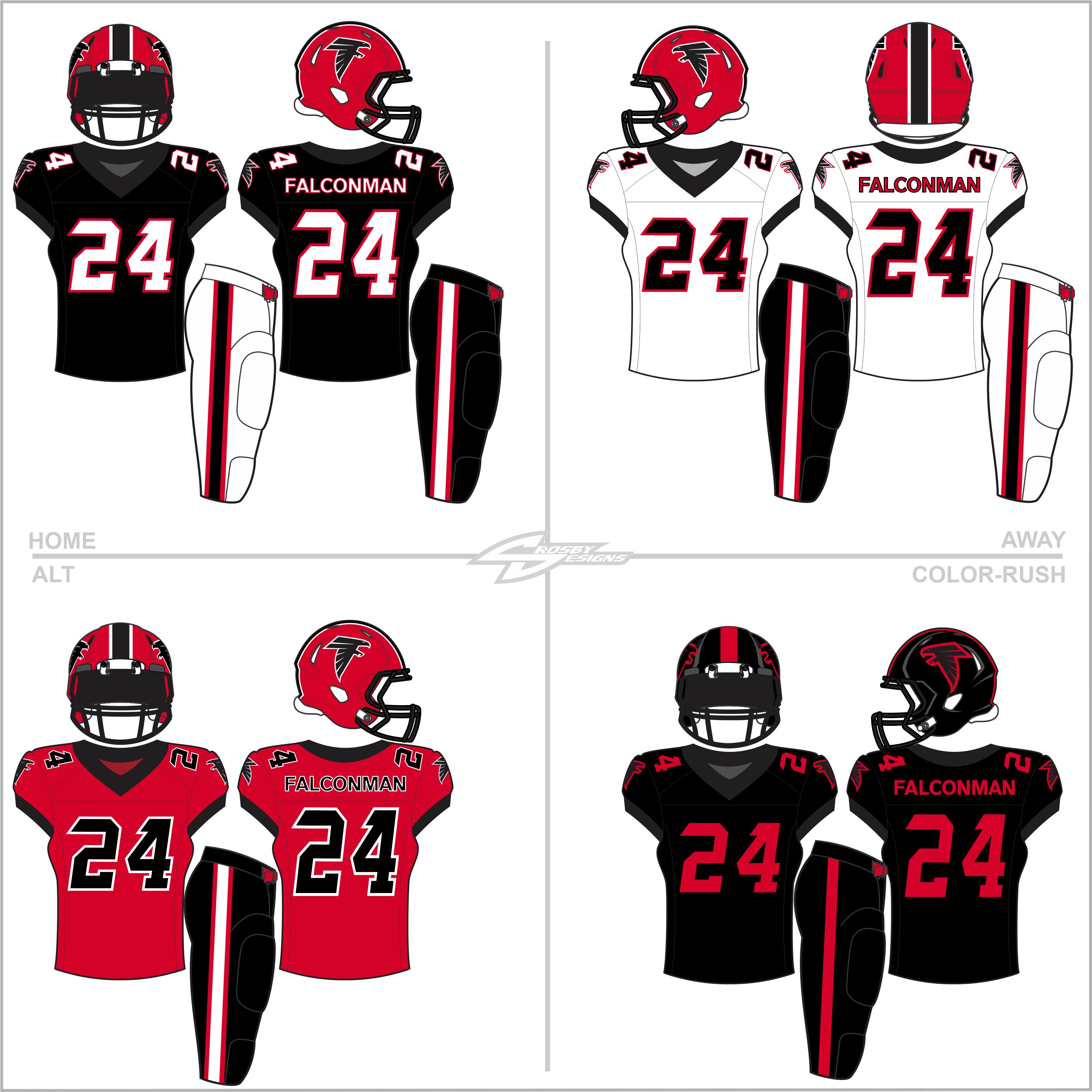
Wow. I posted a Falcons concept that was an attempt to bring together the elements of the old logos and the current a while ago and just realized it's been 7 years since then!
Not going to re-post that one but my 2024 redo of the Falcons to try to better blend the old and new into something more conservative and traditional. While I did try to go with a more classic look (heavily influenced by their great throwbacks) I did go radical with the ColorRush. Any, here it is...c&c welcome as always!
-
11
-
 1
1
-
-
15 hours ago, MJD7 said:
I’m surprised the Jets are in fact just straight-up going back to the Legacy uniforms, & a bit underwhelmed. Honestly, I think this outgoing set was a bit over-hated:
Much more 2017 Lions or 2023 Cardinals than 2014 Bucs or 2015 Browns. The shoehorning in of black onto the green & white jerseys was a bit unnecessary, as was the black helmet. Otherwise, it’s a fine modernization of the Jets’ look to me, even if the helmet logo is a bit boring. I didn’t even mind the black uniform on its own for a couple games a year, as long as it was paired with the green helmet with the gorgeous finish.
I agree. I thought the current unis were tastefully done, modernizing the look without all the usual Nike OTT junk. It was a vast improvement over the Namath era unis, which were ruined IMHO by a horribly drab green and shoulder stripes that, while they looked great in the 60s, did NOT transition well at all onto the current template. I think the current uniforms address a host of issues and make them unique while still being simple. I love the current helmet finish.
-
2
-
-
On 2/5/2024 at 10:17 AM, PurpleHayes said:
Some new concepts today over on Uniwatch...the Commanders one is so good that it will never happen, because we can't have nice things as long as Nike is in charge...
https://uni-watch.com/2024/02/04/uni-concepts-jets-cardinals-and-commanders/
I like the Jets' Concept 1 very, very much!
Concept 2 looks like the long-lost brother of the Saskatchewan Roughriders.-
1
-
-
On 1/29/2024 at 12:37 PM, DCarp1231 said:
Check this out- Just copped the complete Jaguars set
 probably gonna end up wearing the black and white ones an annoying amount of times. The teal ones are so legendary I’ll probably never ever wear them for no reason at all! Just like the Jags! #DUVALLLL
Hmm. Are they going to wear hoodies with them, too?
-
2
-
-
Blown away by the update. Loving it!!!
-
1
-
-
36 minutes ago, BadSeed84 said:
I see boomerangs along with the most generic "modern football" font. (I still would say a improvement over rock's XFL logo, but not much, USFL was better than both)
I wonder who they've used for their logos and workmarks. I've never been able to locate anything on the XFL.-
1
-
-
32 minutes ago, Brave-Bird 08 said:
Every layer of that post re: Broncos is not credible. I wouldn't read into it at all.
Bummer. Other than the white shell, I liked it. -
On 12/31/2023 at 1:34 PM, BadSeed84 said:
Yea, The Rock & his ex-wife are still involved it would seem. Also the Black & white color scheme would be what carries over from the XFL.
I know it's supposed to be "UFL" bracketed by an abstract football, but as executed is see it as <UFL> every time, like it's in parenthesis. Is the "UFL" silent?
-
 1
1
-
-
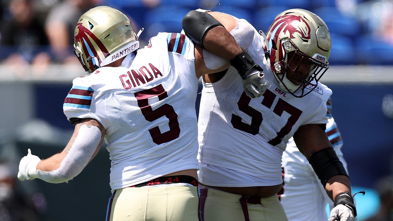
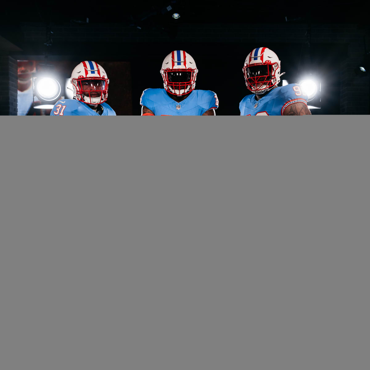
Still More Info on Houston Texans’ Upcoming Uniforms Emerges
UniWatch reported:"Last week I wrote about how we were starting to learn more about the Texans’ upcoming 2024 uni redesign. The main things in that first wave of info were the following:
- The team will have four new uniforms.
- “H-Town Blue” — i.e., the Oilers’ old shade of Columbia blue — will be an accent color, not a main color.
- The team’s primary logo will not be changing.
- The new uniforms will be unveiled during the lead-up to the draft in late April."
Also:
"Vosik added the four versions of the uniform will be completely different from each other and not simply a repeat in various colors. That would be a way to make sure everyone gets what they want. Before drawing up designs, the team set up a fan council, which provided feedback that varied from fans who wanted to keep the uniforms traditional to others who wanted a drastic change. Players also gave their input on what they’d like to wear starting next season."
This already sounds like a trainwreck.

-
8
-
 1
1
-
 1
1
-
On 1/3/2024 at 10:38 PM, HOOVER said:
As you said, this is the only thing they need to do; go back to the Cowboy as the primary and the original helmet, where the helmet stripe perfectly matches the jersey numbers from last year's uniforms:
Which would give them this:
And then they could fix their away uniforms to these:
YES! The away unis desperately cry for help. To me, the all-whites with the pale blue look like pajamas. The red stripe in the light blue numbers is horrible. What you propose is far superior and delivers a more cohesive/consistent look. One the home sets, I'd add some more black...they looked sharper that way.-
1
-
-
On 1/5/2024 at 12:17 PM, gosioux76 said:
The league was under new ownership that also brought on a new apparel partner. They were never going to just roll out the looks from a prior regime.
Based on the popularity and the recentness of the 2.0 version, I would've expected them to have kept the close to the originals for at least brand recognition's sake.
Everything they touched was a downgrade IMHO.-
1
-
-
On 8/1/2023 at 1:02 PM, PlayGloria said:
It's sort of funny... after seeing all of these throwbacks with striped socks, sleeve stripes, etc, somehow it has made the new AZ Cards set look dated already and they haven't even stepped foot on the field
I mean, you tell me which one looks out of date. To me, it isn't the throwbacks:
Well,. it doesn't help that the Cards rolled out an epic failure of what appears to be the laziest effort at a redesign ever. It looks more like pajamas...or a pee wee league that couldn't afford more than just the bare basic templates.
The whole solid color sock thing is just a horrible idea...it's already dated just like all the piping crap that was so popular for about 20 years.
I've always liked flashy uniforms and don't mind new looks at all. The problem is, Nike pushes the envelope until they tear it into a million pieces...like a drunk who just doesn't know when to quit.
The throwbacks you show are all great looking. One of the best not included is the Falcons.-
3
-
2
-
 show. Doesn't appear to be disappointing.


2024 NFL Changes
in Sports Logo News
Posted
Anyone not liking block numbers, take heed. It could be worse. SEE: Texans, Houston