


KCScout76
-
Posts
6,120 -
Joined
-
Last visited
Posts posted by KCScout76
-
-
Really nice job on the KC logos and unis !!
-
 1
1
-
-
You did a wonderful job on these jerseys!!
-
 1
1
-
-
Kevin W - these are wonderful !! Well done sir!!
-
1
-
-

New Jersey Devils, tweeked Adidas Reverse Retro Logo. I added yellow/gold as both KC & Colorado had the color as part of their logos & jerseys.
-
5
-
-
As a Cowboys fan, I love beating the Washington Football Team.
With that said, I really like the simplicity and clean look. The simple "military" W is nice.
You know they are going to build off these logos and change them up over the years.
I like the name, unique. It is similar to the Cleveland Guardians, in that is reflects the city and is a name
not in common use. For now,
-
 1
1
-
-
Dispite the name trouble, pretty good looking logo. I like the font they went with. The doesn't look new/created for them, still well done Fort Worth.
-
7 hours ago, bkknight95 said:
The NHL needs more green.
How about....
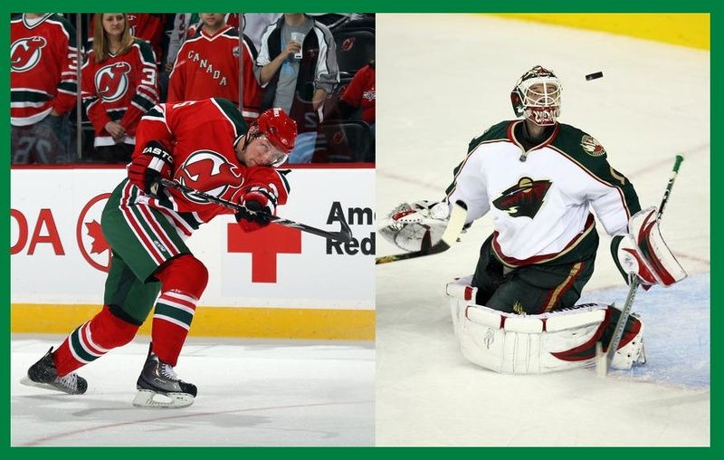
Devils in their throwbacks vs the Wild
-
Here are the uniform tops that were posted


-
Believe it or not, Catchers & Pitchers report to camp in about a month (as of this writing).
Minor League teams are also gearing up. In Detroit, they have set up three Independent teams for the 2016 season.
The logos (an artist from around the CC boards) style looks familiar. Well here you go;


I'm liking the Unicorns logo.
-
ren69 - really quality work on the KC Scouts logo. Thank you so much! You are very talented!!!!!!!
Go Scouts - Kansas City Hockey coming back.
-
1
-
-
These are so good, I mean GREAT! Wonder work!
-
1
-
-
Maybe not PHX but how about KC, I present the Kansas City Panthers.

-
All of them - AMAZING!!!
-
BINGO - that did it pcgd. Thanks. I did what you said, played around with some 'formats' and came up with a simple ARC text with the trim.
To me it's a classic look, as well as looks nice on white t-shirts.
This shows a drop shadow, which I changed to an outline on the text.

-
Thanks for the answer - but I still don't know how to 'create' the outline.
What do I do to create it - the rest of the advice make sense.
Thanks -

-
OK- I am not a Graphic Artist, but I play one on TV.
I have AI 10.0, and I am totally learning this whole thing from the start.
My problem: I am trying to do a semi-simple wordmark for my t-shirts.
I have Raytown South in red, but I need to arch it and put black trim around each letter. I can't get the program to create an outline to put around the red font.
This is what I'm trying to do- The green R is a sample of what I need to do, then I want to arch it. I've done it on bitmap, but it's too grainy.
HELP


Reimagining Superheroes as Hockey Teams #15 - New Jersey Devils (Daredevil)
in Concepts
Posted
These are really nice - great concepts!