


projectjohn
-
Posts
461 -
Joined
-
Last visited
Posts posted by projectjohn
-
-
The only thing that stopped it from being perfect for me is the lack of stripes on the blue and white pants. I wish the black pants didn't exist but I guess that's a color rush requirement. I'm also a little afraid they'll go with monochrome combos in 90% of the games which will hinder the set.
-
2 minutes ago, rfraser85 said:
The Lions missed a good opportunity with the pants if they want multiple options. Making all the pants interchangeable was overkill. I would suggest something like this (primary only)
Silver pants: remain the same, use with both jerseys
Blue pants: add silver stripes, restrict to the blue jerseys
White pants: match the stripes of the silver pants, use with both jerseys
Teams are starting to return to classic jersey designs, so hopefully the pants designs and options will follow suit at some point. I'm not asking teams to only use one pair of pants, but too many options can kill a good jersey.
I missed a number of pages here, but I'd agree with this take, with the exception of also using the blue pants with the white jerseys (it's actually one of the better looks in the NFL, IMO.) Also wish they didn't have black pants but I guess they have to under the Color Rush rules.
Overall, I like the Lions update a lot but I wish the blue and white pants had stripes, and I'm somewhat afraid monochrome combos will be used 90% of the time, which will hinder the set overall.
-
1 minute ago, timjameskohler said:
I just want a Honolulu Blue facemask. Is that too much to ask?
That, pants stripes, and no black pants and this is an A+ update.
-
 1
1
-
 1
1
-
-
10 minutes ago, TBGKon said:
Quite good and I'm breathing a big sigh of relief. Just need to make sure all the pants have stripes, please. And hopefully no black pants.
-
1
-
-
3 hours ago, simtek34 said:
Possible Lions leak. Looks to be the old logo and...
Black?
Oh no...
I mean, I don’t want black but I’d rather have a reasonable black alternate top than the all gray.
-
5
-
-
1 hour ago, DCarp1231 said:

They'll be hampered by the overuse of mono-black and mono-green but when the right combos are used, these will be quite good.
-
2
-
-
13 hours ago, TaylorMade said:
City Edition?
That or a classic edition would be my guess. It would be nice for the Raptors to bring back the Vince Carter era branding, it's a lot better than the Drake/OVO stuff they use now - even the Chris Bosh era red/black version.
-
4
-
-
12 hours ago, Cujo said:
US STATE FLAG POWER RANKINGS
1) New Mexico
2-50) The rest.
End of thread.
-
 1
1
-
-
25 minutes ago, Conrad. said:
Sadly, they are not.
Figured as much. The organization has been going out of their way to minimize red in their color scheme - even eliminating the classic red and blue court design they'd been using since the Bad Boys days.
I'll take this as a confirmation they are changing the Statement jerseys at least. I'll hold out some hope that the new ones are an improvement, and at least somewhat congruent to the team branding this time.
-
A Pistons uniform tracker account on Twitter is claiming their Statement editions are being retired. I haven't heard that from anywhere else, so I'm not sure if it's just wishful thinking since they are eligible to be changed after two years, or the account has inside information. Certainly hoping it's accurate since I find the current Statement jerseys abysmal. Hopefully they might finally bring back either the 2000s or 90s red jerseys, which for some unknown reason they continually refuse to do.
-
2
-
 1
1
-
-
17 hours ago, GFB said:
good 90s Tigers CC inspiration:
Something like this would be pretty decent, as long as it's paired with regular gray or white pants. Maybe I'm scarred by some of the atrocities Nike has put out in the NBA's City Edition program, but I'm a little afraid of what the Tigers are going to do. But they have been pretty adamant about maintaining a fairly traditional look over the years. Having said that, I'm also the guy who has hoped at times they'd add a road-only navy alternate top, something akin to an inverse of the regular home jersey.
4 hours ago, coco1997 said:
I also always kinda liked the orange bill on the road hat for the Tigers.
-
3
-
-
Tigers City Connect is debuting May 10, with merch available May 6.
Most I've seen are believing it will be navy/orange and feature the '90s Tiger face logo.
-
5
-
 1
1
-
-
15 hours ago, GFB said:
Lions details starting to trickle out.
The confirmed things that we already knew/assumed are that the Lions pants will be more compatible with mixing-and-matching looks (Lions currently have 5 pairs of pants, but only two can be paired with the home-blue jerseys) and the numbers will be easier to read (return of white numbers or white outlines).
Among the new details:
WCF Patch
Alternate Helmet
Here's to hoping that the William Clay Ford tribute is reduced to a "hanger effect" inner collar styling or something far less noticeable; as for the blue helmet, my best guess is the blue finish sticks around with a new facemask color (since the dark grey uniforms are gone) and helmet decal (no longer team's 90th anniversary).
While the jersey may not be accurate, check out the black Nike swooshes... it may speak to the return of the black alternate jersey.
Please at least add blue striping to white pants. No mono-color pants, please.
I'm a little less afraid for the Lions new set than I was previously (going off a quote from the team president a year or two ago about the new set being a more significant change than the 2017 set, which he referred to as a tweaking.)
Overall, if there's no mono-color pants and the all gray set is gone, I guess I'll consider it a win, even though I rather liked the 2017 set overall as long as the right combos were used. Oh, and it'd be nice if we get true silver back, rather than dull gray.
-
2
-
-
Official Lions unveiling happening on April 18.
-
2 hours ago, oldschoolvikings said:
It’s gonna be hard to top the time Nike matched the airport carpet for some basketball team.
That spawned some heated debate in one of the NBA threads.
-
1
-
-
12 hours ago, TheRealPepman said:
I wish they flipped the red and blue side panels on the uniform. I have no idea why Nike flipped the order in 2017 in the first place.
That is indeed the classic historical look but for some reason the change never bothered me too much. It improved the color balance on the front side of the jersey IMO.
-
2
-
 1
1
-
-
28 minutes ago, kimball said:
20 years? Oy. I feel old. That feels like yesterday.
Don't remind me, especially in light of the disaster the Pistons have been for the last 15 years..
-
2
-
 1
1
-
-
The Pistons are using horizonal NOB today for the 20th anniversary celebration of their 2004 championship, proving it is possible on the Nike template. I wish they'd go back to it full-time.
-
9
-
1
-
-
Sounds like the Bally Sports branding is going away at the end of MLB season. Hopefully a new graphics package will be something more akin to what Fox had at the end of their ownership of the RSNs.
https://awfulannouncing.com/bally/diamond-sports-group-branding-rsns.html
-
7 minutes ago, CitizenTino said:
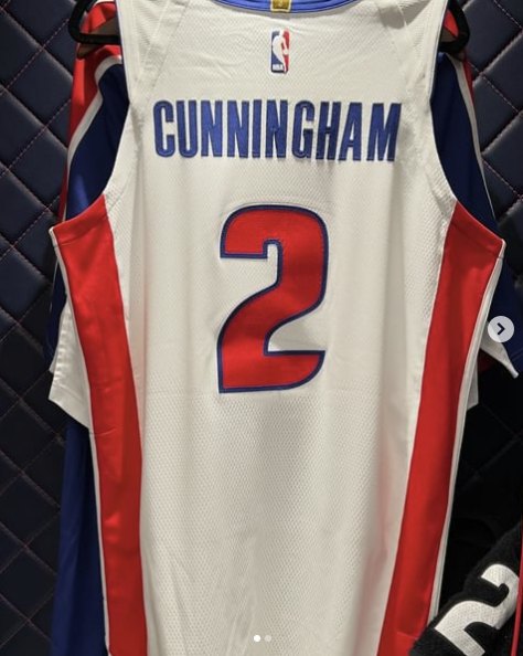
https://www.espn.com/nba/story/_/id/39586633/nba-story-clippers-new-uniforms-logos
These are pretty nice!
Not bad - a lot better than the black and white NWA look we all thought they would be going with.
-
1
-
-
14 hours ago, SSmith48 said:
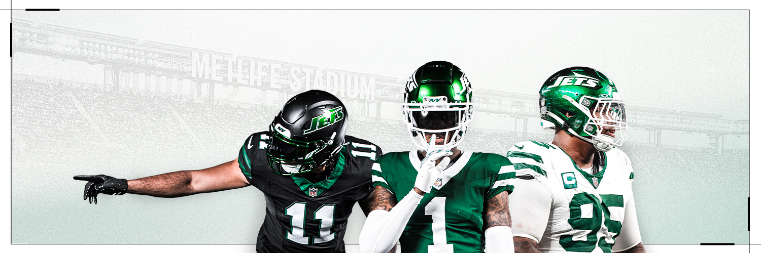
I'm gonna go off on a tangent here that will make me seem like a conspiracy theorist, but what if the NFL/Nike's prerogative is to design bad/mediocre uniforms on purpose so that they can turn around, pull them 5 years later, and milk more money from fans with a new, more popular set? It's happening with the Jets and Lions where they introduced generally mixed or unpopular uniforms, only to scrap them relatively early on in their lifespan in favor of more fan-favorite looks (i.e. Jets' modern "collegiate" look to the "Sack Exchange" throwback uniforms). The last couple of redesigns from the Cardinals and Commanders seem like they may be set up for the same fate. There have been rumors swirling around the Titans too, although its for sure not gonna happen this year.
Was the Lions current set unpopular? While not perfect, I thought it was a huge improvement over the two sets that came before it. The all-gray was the worst part, and then the blank white pants being introduced late in its life cycle also weren't great, but other than that it was their best look since the Barry Sanders era set. It was definitely good enough IMO that I'm dreading the new set, fearing that there's a reasonable chance it will be downgrade.
-
11
-
-
42 minutes ago, PurpleHayes said:
That's true, but I have a feeling that teams just defer to Nike..."you guys are the experts, looks good to me." I wonder if there's ever been a time since Nike took over that a team flat out refused to wear a uniform they designed...it almost seems that teams don't have a choice.
In the NBA, Zach Lowe had an article a few years back about the Heat refusing Nike's City Edition concept, and instead designing the well-received Vice jerseys in-house.
-
1
-
-
I don't subscribe to "The Athletic," although there are ways to get around the paywall that I presume are verboten to discuss.
-
6
-
1
-
-
Just now, burgundy said:
That would not surprise me at all, unfortunately.
Nike has pushed chrome/gray pretty hard for Detroit teams the last 5 years or so.


2024 NFL Changes
in Sports Logo News
Posted
100% agree. The new ones aren't bad, certainly better than I was afraid they were going to be, but I'm not sure they're better than the old ones, which had built up a fair amount of equity with 25+ years of continuous use and 3 Super Bowls.