


Mitch B
-
Posts
985 -
Joined
-
Last visited
Posts posted by Mitch B
-
-
On 10/25/2016 at 0:59 PM, Rj0498 said:
I kind of agree with you I love their logo but I think their uniforms leave a little to be desired
I think the Texans should wear red jerseys at home full time to add some needed "pop" to their look.
-
 1
1
-
-
On 10/11/2016 at 2:29 PM, WSU151 said:
There's something awesome about playoff day games, especially in the fall when the weather is usually great.
Yep, watching playoff baseball on a fall afternoon is awesome.
-
1
-
-
2 minutes ago, Rj0498 said:
You are not alone I just think they would look better separated gold pants with roads and gold jersey with white pants I think it would make for a solid look
How about black pants with gold stripes?
-
I don't hate this look for The Jaguars. I think it works well with the helmet.

-
1
-
-
27 minutes ago, Harmening said:
Wasn't he nothing more than an assistant coach with the Browns?
Doubt he would have the power to have any say on uniforms.
Gregg was their head coach in the mid '70s.
-
1
-
-
2 hours ago, Morgo said:
Black. Hard to go darker than navy.
Actually, traditional Navy blue looks like black with a blue tint.
-
On June 23, 2016 at 11:44 AM, DC in Da House w/o a Doubt said:
Possibly unpopular opinion:
This uniform is better than what they currently wear.
I don't think that is an unpopular opinion, but I have wondered if that Chargers uniform would have looked just a little better if the bolts were all predominantly yellow.
-
44 minutes ago, Silver_Star said:
What team was this and what football association?
World Football League, Southern California Sun?
-
3
-
-
16 hours ago, Justin7218 said:
Jets-Rams in 1998

Wow, the Jets colors and stripes match nicely in this pic.
-
2
-
-
16 hours ago, Justin7218 said:
Pats-Bucs in 1997

Best looks ever for both teams
-
4
-
-
On January 8, 2016 at 3:22 PM, frosty06306 said:
Good idea to never let these see the light of day by UNC - those aren't good.
Worse than black
-
Miami Dolphins:. As a young boy, I played for a rec league team named the Dolphins. I was just learning the game of football and I just started following the Miami Dolphins who were becoming pretty darn good In the early 70's. I have been a loyal fan ever since.
New York Mets:. I always loved their colors and my then hometown hosted a Single A Mets team for a number of years. The Lynchburg Mets with players like Doc Gooden, Darryl Strawberry, Wally Backman, and Lenny Dykstra were labeled "America's Best" as they had the hghest winning percentage in professional baseball in the early 80's.
Kansas Jayhawks Basketball: KU gave me full tuition while earning one of my degrees there and I love college basketball.
FC Barcelona:. I love the colors and the history
D.C. United: the one regional pro team I adopted as it presented no conflicts with other loyalties
Liverpool FC: influenced by my love of The Beatles
All Boston teams except New England: My Dad is a Massachusettes native and a Boston sports fan who permanently relocated to Virginia in the late 50's (pre-Pats).
Interesting Note: Now living 90 miles from D.C., I gave brief consideration to following the Washington Nationals as a second team, but my life-long affection to The Mets just made that impossible.
As someone who has never permanently resided in a major league area, my loyalty typically lies with a franchise and not to the home city (no offense intended to those cities). Despite my love of NYC (the greatest city on Earth), I am a Mets fan, not a New Yorker.
-
On March 23, 2016 at 8:51 PM, JosiahWVU said:
I love the Bucs over sized helmet logo.

The only positive about the current uniforms.
-
I didn't think the Kings' mid-2000s gold alts were as awful as everybody else thought (full disclosure: I like shiny things):
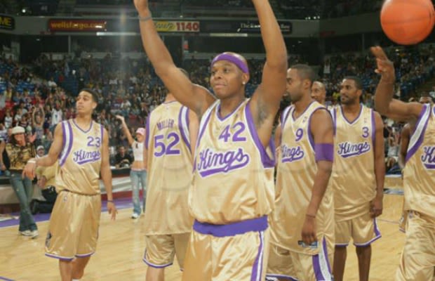
I kinda dig those.
-
1
-
-
Nah, maroon and white looked grat for the Phils. They should have used the new park as a reason to go from bright red back to maroon.Is it an unpopular opinion to think the Phillies looked best during the 70s-80s in their maroon and white jerseys? I especially liked the "P" logo, and maroon isn't a color seen anywhere else in the MLB right now.
I'd like to see Pittsburgh wear yellow pants with black jerseys but other than that I don't think I want to see pants in anything but white or grey.Colored pants look good in baseball. For alternates.
I loved the Philliies in maroon. It was unique.
IMO, the Pittsburgh Pirates are a team that can get away with wearing just about anything, probably because they essential have throughout their history.
-
They've won two titles as Golden State.
And that doesn't change how stupid it is as a name.
I forgot about '75.
To each his own ?
-
I dislike it. Again, we've got the LA Lakers, LA Clippers, and Sacramento Kings. And let's be honest, the Lakers are probably the ones that could best claim the California crown. (But none of them should). There was nothing wrong with "San Francisco Warriors," and even their time in Oakland could still make sense if you expand it to imply the San Francisco Bay Area. (This is how I now justify the 49ers being in Santa Clara).
I could care less how a team chooses to label their locality, but then again, I've never lived in a major league market. I don't think the use of a regional name is any real threat to other teams in the same state. Some combinations of localities and team names do sound better to the ears than others. I remember when the Warriors rebranded to Golden State. I've always liked the uniqueness and the sound of it personally. Now that they've won a title as Golden State, I don't see why they'd ever change it.
-
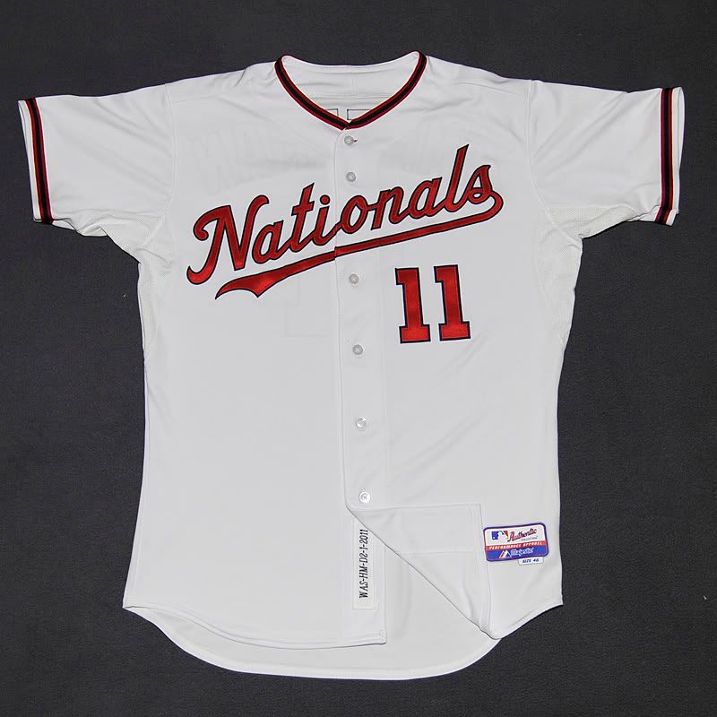
That does look good. That's the same script used on their current away jerseys right?
I don't mind the curly w at all, but the nationals have such a nice script it is a shame they don't even use it on an alt jersey.
I like the Washington Nats' current uniforms. I thought the original wordmark the Nats used at home was horrible. Many are critical that the current "W" resembles the Walgreens logo, but I see it as a nice tribute to the Washington Senators 2.0 of my childhood.
This looks too awesome to be relegated to T-Shirts and Jackets:
What cap did they wear with those?
-
I like the Washington Nats' current uniforms. I thought the original wordmark the Nats used at home was horrible. Many are critical that the current "W" resembles the Walgreens logo, but I see it as a nice tribute to the Washington Senators 2.0 of my childhood.
-
I like Cleveland's new uniforms.
Change the number colors and I too think they are fine.
As much as I like the Orioles' cartoon bird, I don't like it as a cap logo. I much prefer the ornithologically correct bird (or even the O's logo) as a cap logo.
I couldn't agree more.
-
My problem with the Eagles' midnight green uniforms is the inclusion of additional dark colors (black & charcoal grey). If they were just midnight green & white (or even silver) they'd be a lot more tolerable for me.
I think you are spot on there. Get rid of the black and charcoal.
-
Would never want those to see the light of day. Not even as an alternate. If I'm paying to see the Yankees play in Yankees Stadium they better be wearing the classic navy pinstripes on white. It's part of the experience. It would suck if the team decided to dress in a clown suit the one time I get to see the Yankees play on their home turf in person.
That's how I feel when I manage to see the Mets and they are not wearing pinstripes or their greys.
-
As I understand it, something like this --

Yep. With pants to match.
I kind of like that and don't think it would be that bad with matching pants. I've always maintained it is only a matter of time before colored pants make a comeback in mlb.
I kinda dig those for an away uni.
-
I dont know if this is unpopular but
this

is waaaaaaaaaaaaaaaaaaaaaayyyyyyyyyyyyy better than this, even if it was BFBS

This Mets fan likes neither of those uniforms. Give me pinstripes at home and greys on the road any day.


Players in the "wrong" uniforms
in Sports Logo General Discussion
Posted
That uniform is definitely superior to their current look. It's much brighter.