


Mitch B
-
Posts
985 -
Joined
-
Last visited
Posts posted by Mitch B
-
-
I love the Brooklyn Nets uniforms and logos. Less is really more with the Nets.
-
More Vikings prototypes:
http://espn.go.com/nfl/story/_/id/11384090/minnesota-vikings-rejected-uniform-designs-uni-watch
Those Vikings ideas were horrible.
-
The Oakland Raiders' logo could use an upgrade. I've always liked the Raiders' look, both home and away, but the logo could use some tweaking.
-
I don't want to see the St. Louis Rams return to royal blue and yellow uniforms. It looked good in the 70's, but hey that was the seventies.
The navy and gold uniforms look good in the absence of khaki pants, side panels on the jerseys, toilet bowl collars and bad trim.
-
Below is my favorite college football jersey ever. I think the block font is way better than the loopy font everyone loves so much. That font just does not say "football" to me.
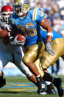
I love the true blue and gold. I hate seeing UCLA moving away from that look.
-
No clue if this in unpopular or not, but I think the Houston Oilers looked much better than both the Titans and the Texans.
Not unpopular with me, the NFL needs a team that uses light blue.
-
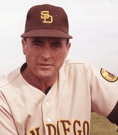
Agreed...a classic design, the brown ties to the friar...the uniforms don't look like those of their rivals from the BayUnpopular? I don't know. But these is not only the padres best look, its in the top 25 best uniforms in MLB history.

-
Two more excellent updates ren. Any chance you could try the Kansas logo I posted a few pages back?
I was looking online for logo possibly showing a little more detail than the one you posted & came across this one done by CHIEF on these boards back in 2011.

Rock Chalk Jayhawk !!!
-
 1
1
-
-

I wish the Fins would use this. Good work.
-
Best Bruins B" logo, ever.Best Bruins black jersey ever. Hands down.

Agreed, the sweaters look great w/o the yolk.
-
The team now wears gold pants so I guess it is a step in the right direction.
I dig those just like they are. I have nothing against their current color scheme, but the old colors are pretty sweet. I agree that these would be good for the transition to a different name.This is my favorite Redskins look:
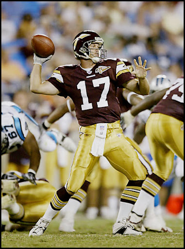
If it used the current colors, it'd be perfect (and ease any potential name change).
 I also kind of liked those uniforms. The spear logo does not bother me. It is different than Florida State's. Plus, the Seminoles sport gold helmets.
That color scheme is very unique for the NFL.
-
You guys are talking about this as if they've never worn theseAs good as the Boston Celtics uniforms look, I wouldn't mind it if they used gold as an accent color. Not only would it work with the Irish motif, but it would be a nice tribute to their championship legacy.
Gold would be better than the black they use in their alts.
No doubt. Heck, they have gold in their logo. Either use that shade or lighten it up a bit and use it.
I have seen those and I wish they'd wear them more often. I'd ditch the green and black personally.
-
1
-
-
I dig those just like they are. I have nothing against their current color scheme, but the old colors are pretty sweet. I agree that these would be good for the transition to a different name.This is my favorite Redskins look:
If it used the current colors, it'd be perfect (and ease any potential name change).
-
As good as the Boston Celtics uniforms look, I wouldn't mind it if they used gold as an accent color. Not only would it work with the Irish motif, but it would be a nice tribute to their championship legacy.
Gold would be better than the black they use in their alts.
-

A lot of people are critical of the Baltimore Ravens current logo, but I think their original was horrible. Local sportscasters here in RVA called them the "Flying Bs" and the "Water Buffaloes".
-
1. I like Pinstripes on road uniforms and wish the Twins and Rockies would bring them back

I agree, but I am a fan of pinstripes in general. I wish my favorite team, The Mets, would wear nothing but pinstripes.
-
I maintain that these are the best jerseys either team has ever worn.


There's probably more examples of bad drop-shadowing than good, but that's because most teams do/did it to be "kewl" and didn't take the time to execute it correctly.
I like collegiate numbers with drop shadows.
-
I've never liked the NY Yankees away uniforms.
I don't like the font they use to spell out New York. I'd replace New York with the interlocking NY they wear on their caps and on their home uniforms.
I'm just not a fan of city/state names on uniforms. I prefer stylish initials or team names on jerseys.
-
I like the navy pants with the columbia blue jerseys (with the navy shoulders).

 I also kind of liked those uniforms. The spear logo does not bother me. It is different than Florida State's. Plus, the Seminoles sport gold helmets.
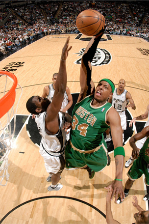

Unused Logos and Uniforms
in Sports Logo General Discussion
Posted