


Mitch B
-
Posts
985 -
Joined
-
Last visited
Posts posted by Mitch B
-
-
I like the Boston Celtics black jerseys with green highlights.
https://www.celticsblog.com/2020/8/17/21372888/boston-celtics-philadelphia-76ers-game-1-nba-playoffs
-
 2
2
-
-
If Nike would do something with the socks to break up the leotard look, I would give them high marks on the uniforms they've introduced for 2020. They made some choices that I wouldn't have made, but I've kept my traditional mind open and I think each offering is an upgrade to last season's uniforms.
-
On 7/18/2014 at 4:25 PM, Jungle Jim said:

I've been saying this since 1999, but that "T" logo looks so much better on the Titans' helmet than the flaming ball thing, that it's not even funny.
We can only dream.
-
5 hours ago, Lights Out said:
I wasn't a huge fan, but the BFBS did look pretty good in some contexts:
They really just screwed up by forcing the black drop-shadows into the normal home and road instead of leaving it for the alternates.
YES, that and the fact they are didn't wear the pinstripes enough killed it for me. The black jerseys on their own weren't bad.
-
2
-
-
On 6/2/2019 at 1:06 PM, Ferdinand Cesarano said:
Before the addition of the white outline, the Yankees looked like they were wearing wet paper bags.
The white outline and the sleeve stripes made that uniform appear much sharper.
And the same goes for the Dodgers.
We'll have to agree to disagree.
-
6
-
-
16 hours ago, CaliforniaGlowin said:
Dodgers not having the white outline on their road uniforms like they used to
I’ll never understand the love for these white outlines. I wish the Yankees would ditch theirs as well. To each his own.
-
11
-
-
On 10/21/2018 at 11:28 AM, San Diego said:
I hate everything about the Chicago Bears look and I hate that they have a cool name but don't use any actual bears.
I love it when the Bears wear white jerseys over the dark pants. It's a classic old school look with a great color distribution.

It's sort of like the Yankees home uniforms. They're such a classic that they don't need any imagery or a lot of color. They have one uniform that's so good you can overlook their other less appealing looks. Every league needs a couple of teams like the Bears and Yankees.
-
1
-
-
On 10/20/2018 at 1:42 AM, SFGiants58 said:
I must admit that some teams pulled off the look pretty well.

I love pinstripes. Change that it orange to athletic gold and that's a sweet uniform.
-
1
-
-
Oops, I forgot my #1 pet peeve regarding football uniforms:
Teams wearing colors that aren’t in their traditional color schemes. I hate switching the channel to a college game and not immediately knowing who is playing.
P.S. I am also one on those guys who walked miles in the snow to and from school (uphill both ways) back in the day.
-
5
-
-
I find American Football uniforms to be the least asthetically pleasing of any major sport. Perhaps I am becoming a grumpy old man, but I dislike most of the uniform trends in football:
lack of stripes on pants and socks,
names and letters replacing stripes,
non-traditional striping patterns,
monochrome uniforms (this would work better with traditional striping on the pants and socks,
side panels and piping on jerseys, and
decreasing use of materials that provide a more glossy metallic look to jerseys and particularly pants.
Football looks ugly to me these days.
-
1
-
-
I'd like to see my favorite NFL team, the Miami Dolphins, adopt the blaze alternate helmet. It would give me something to look forward to on Autumn Sundays.
-
1
-
-
On 2/10/2018 at 9:50 PM, fgoodwin said:
This isn't the best photo, but #40 is longtime NYG Ron Johnson, in his one partial season with the Dallas Cowboys. This comes from the Aug 7, 1976, preseason game which the Rams won, 26-14:

There's no glaring mismatching of colors in this pic. Even if the Rams dark helmet blends in.
-
11 hours ago, Zeus89725 said:
Don't know if this is unpopular or not, but...
this:

is better than this:

That's a slam dunk. You are right.
-
1
-
-
6 hours ago, WSU151 said:
This road uni is far better than what the Cubs wear today, and probably the best (or maybe Top 3) the Cubs have worn all time. I think my only critique is it only needed one sleeve patch, and though the Cubs patch looks nice, the 80s/90s bear patch was probably a better choice and synced with the home jersey:
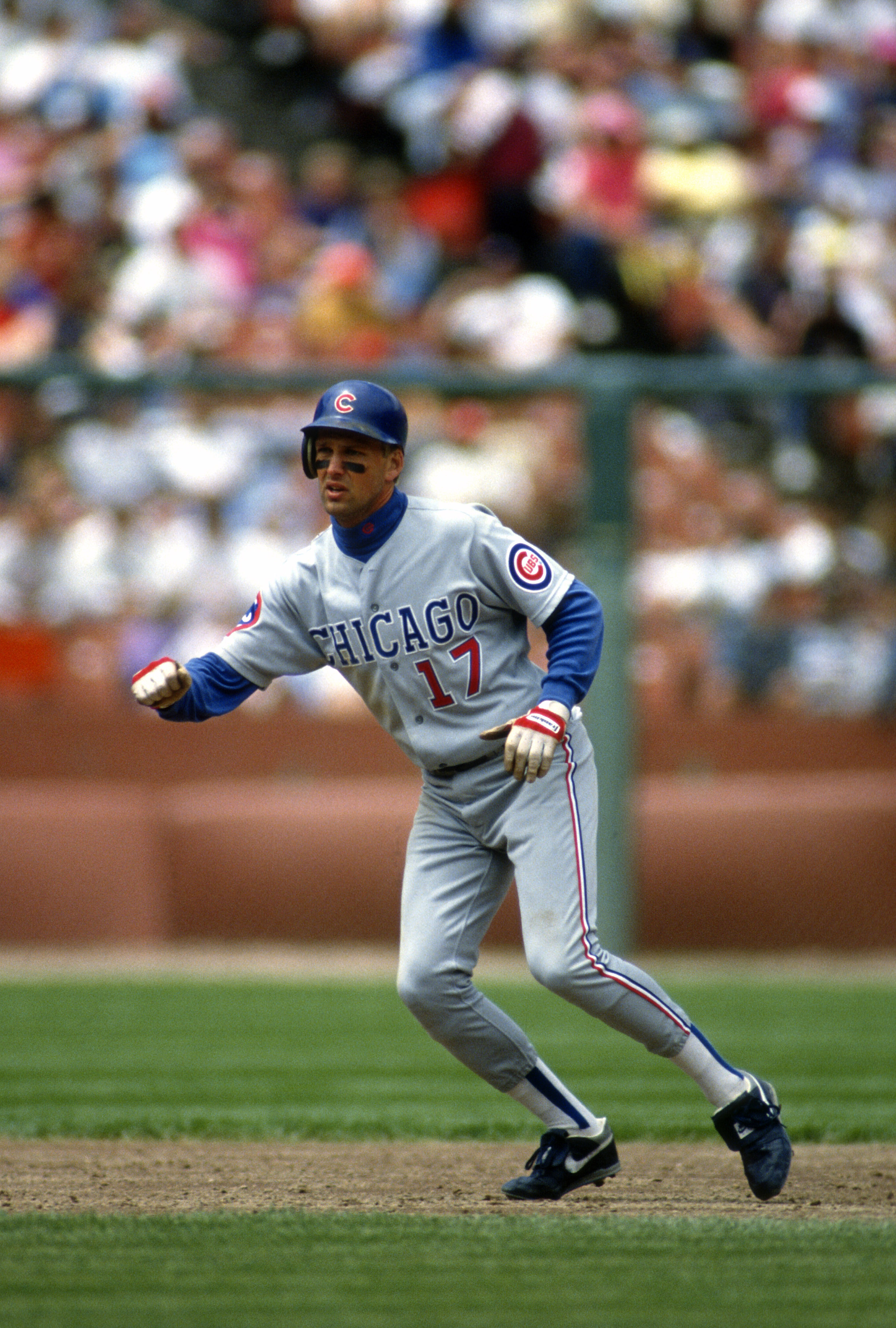 :
:
That uniform looks better than I remembered. Didn't they have a different patch on each sleeve.
-
1
-
-
On 2/27/2018 at 1:10 AM, rxmc89 said:
Navy makes more sense for the Patriots, plus I like it better anyway.
I understand your point, but I'm not convinced that the Patriots have to match these colors. The original blue and silver uniforms were nice and bright, and looked good.
Navy is bettered paired with white and red with no silver IMO. There's a great faux back concept out there somewhere that combines the style of the old red jerseys with UCLA stripes. It replaces the red with navy and Pat Patriot is replaced by Elvis. It's very clean and sharp.
Navy needs help from the right use of supporting colors to make for a good uniform. IMO, neither The Patriots nor The Chargers have found that right use with their current uniforms.
-
2
-
-
Monochrome football uniforms are not bad, they are just frequently executed poorly by bad striping and poor sock selection.
-
4
-
-
On 9/7/2017 at 0:48 PM, Rj0498 said:
I really like this jersey

I'm a Celtics fan and I am surprised how much I like this. ☘️??☘️
-
I support any action that gets the Mets triple-A affiliate out of Vegas and back to the east coast.
-
1
-
-
On 7/21/2017 at 10:45 PM, FinsUp1214 said:
I completely agree. I felt the same way about the Sonics, too.
The darker green provides a better contrast to the brIght althletic gold. Teams like the NYJets and the Philadelphia Eagles lack such a bright color and I believe look better with a lighter shade of green.
-
2
-
-
While I like the color Kelly Green, I think the Oakland A's are one of the few sports teams that looks better with a darker shade of Green.
-
11
-
-
9 hours ago, DNAsports said:
On baseball uniforms, I cannot stand when jerseys have numbers on one side and a logo on the other side on the front.
I agree. I can't stand the Reds home jerseys.
-
1 hour ago, chrispw12 said:
Ron Jaworski in Eagles Kelly green

Didn't Jaworski lead the Eagles to the Super Bowl in 1981 wearing kelly green?
-
1
-
-
On 3/8/2017 at 11:35 AM, kimball said:
Going with the ABA theme a bit, here are a few things I found ...
The caption notes that this is Doug Moe playing for the Carolina Cougars. Not sure why he's wearing a blank jersey -- or if it's the lighting? Doesn't look like a lighting washout to me.
This was noted as Moses Malone's first professional basketball game (pre-season albeit). I'm not sure of the arena? Scope? Richmond? I'll have to dig. I am assuming it's in or near Virginia, the caption gave no clues to it. But, it is color vs. color!

These are the Utah Stars' last jerseys before they folded that same season. I've seen the front of the jerseys, I had no idea they had the names under the number. Kinda cool find.
That's the Richmond Coliseum. I watched many a game there back in the day.
-
1
-
-
19 hours ago, ~Bear said:

The Raiders logo is cool in a retro way, but it's outdated. The facial lines reminds me of the 1940s in design. Fix the face and the helmet, maybe add a thin silver outline around the shield.
The character in the Raiders logo is based upon Randolph Scott, the western movie star of the mid 20th century.

-
1
-


Unpopular Opinions
in Sports Logo General Discussion
Posted
The ChiSox had lost their identity until they adopted their current set back in the 90's. I hope they never deviate from those except for some occasional throwback games.