


j'villejags
-
Posts
1,240 -
Joined
-
Last visited
-
Days Won
4
Posts posted by j'villejags
-
-
20 hours ago, kimball said:
The stripe running down the center of the court is supposed to represent the airport runway in Las Vegas, which will host the semifinals and finals at T-Mobile Arena on Dec. 7 and 9.
This is the DUMBEST reason for a design element I've heard in quite a while.
The trash talking before tip off:
-
 5
5
-
-
On 10/10/2023 at 1:28 AM, sayahh said:
Looks like a guy fell asleep or passed out on a bike with a huge spoiler.
I don't know if I should say what I'm seeing. Let's just say it involves three people and a wheelchair.

-
17 hours ago, ruttep said:
Come at me all you want-- these uniforms should have either been given to the Texans or left to the sands of time. The Titans don't deserve to wear Oilers uniforms after Bud Adams screwed the city of Houston over and withheld everything about the Oilers identity out of spite. Now they want to gloat that over Houston with these throwbacks and even wear them against the Texans?
 that. Give the Oilers identity back to Houston, or don't bring these back. I doubt many fans in Tennessee have much of a connection to these uniforms, either.
Imo should have been a Browns/Ravens situation (or more directly comparable, a Hornets/Pelicans situation). The old name/colors can go back to the original city for the new expansion team, while the moving team has to rebrand.
All the more puzzling after the Titans went heavy on navy for their new uniforms. I thought that might be indicative of possibly letting Houston reclaim Columbia down the road, but now they are doubling down on this. It’s only going to get more difficult now with merchandise sales factoring in to the decision.
Tennessee wearing navy/red is the cherry on top for me. If you’re going to insist on keeping Luv Ya Blue, at least let them have their navy/red.
-
 2
2
-
-
22 hours ago, jerrylawless3 said:
First in-action look at the throwback Oilers helmets for the Titans. Initial thoughts – the stripes look extra large and modern helmets cause some awkward logo placements.
Agree on the awkward logo placement. It’s too far back. Seeing #31 on the video thumbnail, it would make sense for the decal to be tilted slightly forward to use more of that empty space. It would ultimately look best if they took the time to work the lower leg of it inside the chinstrap snaps.Those helmet stripes might have more weight to them than the numbers on their practice jerseys.
-
2 hours ago, upperV03 said:
Utah is going all-black with their “Ute Proud” helmet decals vs. Cal:
As has been customary in recent years, Oregon State will be wearing Retro Benny decals for homecoming:
Love the Ute decals. A black facemask would rightfully make the decals the focal point on that helmet. As is, I think they are fighting the red facemask for attention.-
1
-
-
On 8/15/2023 at 10:04 PM, FiddySicks said:
Yeah that’s nice in a vacuum, but it gives off real strong Oklahoma State vibes. Pass.
Now Pete is crying. Thanks a lot.
-
1
-
7
-
 1
1
-
-
5 hours ago, MDGP said:
Can’t unsee. It’s even shaped like Kyler.-
3
-
-
Any BC Lions fans? Nathan Rourke is the real deal.
-
2
-
 2
2
-
 1
1
-
-
1 hour ago, henburg said:
I don't necessarily think that the Bears should completely phase out the wishbone C, but I do think this looks pretty awesome in a vacuum. At the very least, it could work pretty well on a new alternate helmet.
Nice mock-up. I think it’d look better on a white helmet. That said, I’m not sure it works for me considering how well the C fits on the helmet. Gotta think the bear looks blobby from any sort of distance.-
4
-
-
1 hour ago, cajunaggie08 said:
Especially when you havent had a football uniform since just after WW2. Its not like Centenary will ever be on TV and Shreveport residents will see the jerseys and think, "Hey, this is my hometown team."
Shreveport residents:-
1
-
-
7 hours ago, tBBP said:
Somewhere in or near Beaverton OR there's a think-tank group conferencing around a campfire right now drawing up the next Spurs Statement edition...inspired by this right here. BOOK IT.
I’d like it. Calling them ‘icy’ may be underselling how cold they’d be.
-
1 hour ago, tBBP said:
Granted, I'm sure this is a coincidence, but...given this and the new Michigan State sets, might we about to see a new mini-trend of pattern-stripes in place of traditional sleeve stripes?
I hope so — I’ve loved both. It looks great if it’s done right. It’s probably easy to make it look bad though, so hopefully they don’t start forcing it. Tasteful choices only. Lol -
1 hour ago, aawagner011 said:
Nike does have a better solution. It’s a horizontal seam across the upper chest instead of the deep V seam. However, I’ve only seen it used on a couple teams, mostly teams with UCLA stripes.
Wonder why it's not used more if all else is equal. Seems like Nike should insist on it for teams with chest wordmarks. It would look a bit better.
It was the issue I had with my Cowboys' uniforms -- just wishing they were able to scooch the wordmark and numbers up a smidge. Lol-
2
-
-
16 hours ago, aawagner011 said:
Couple template updates:
Alabama - we saw the retail jersey but here’s a gamer
UNC - the argyle stops a bit higher due to the collar
Oklahoma - the template pushes the wordmark and number down, making the gap between the Jumpman and conference logos very noticeable
In other news:
I wish Nike had a better solution for the wordmark across the chest. Pushing it and the numbers further down makes it look like an afterthought.
-
1
-
-
1 hour ago, stumpygremlin said:
Pertinent to this site, this is the logo that Union has put out with the nickname. I actually like the nickname.
What’s in a name? Union explores a new nickname and mascot | Union College This article explains why they changed it from Dutchmen in the first place. Basically, it seems like people just didn't connect with the nickname, which seems to have never been formally adopted in the first place.
I love when people find ways to use negative space for logos but this needs refinement. -
12 minutes ago, solvetica said:
They did it long ago, but wouldn't hurt to update this idea:
That's awesome. He looks sleepy. -
1 hour ago, solvetica said:
Individually, the elements are great and that standalone owl head is awesome.. The owl in a badge or the T in a badge would be fine, but combining them seems very off and the feel of the elements is too contradictory (hard angled T vs sweeping round angles for the owl). I also don't like that the decenders on the T don't align with the inner tips of the wings, but I'm OCD.
6.2/10
You make some good points here. It gets a little weird for me when I start thinking how the owl is flying underneath a floating T. Now I can't unsee it. Almost wish they would've tried to have the owl perched on top.
Love the owl logo though, and think Owls are underused as mascots. -
5 minutes ago, JTernup said:
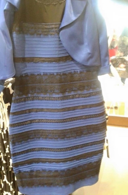
It’s black, the lighting in the bookstore was terrible and I couldn’t get a more accurate picture.
Ah, whoops. Thanks for clarifying. Reminds me of the dress where nobody could decide on the color due to the lighting.-
1
-
1
-
-
It may just be the lighting, but the Florida jersey looks anthracite / charcoal to me -- not quite black. (Not that dark gray is any better.)
-
I kinda miss the black from the original set and would prefer black over white as the trim color. I think it brings out the orange a bit more.
-
3
-
-
Is a 'shadow' uniform just another way to say a black uniform?

-
1
-
 1
1
-
1
-
 1
1
-
 2
2
-
-
2 hours ago, Chawls said:
Unfortunately, the Oilers throwback game against the Texans is not in Houston.
You really want Tennessee turning full heel, eh?
(I do too.)-
5
-
1
-
-
1 hour ago, jalpz9 said:
Why does that man look like a wax sculpture?-
1
-
22
-
-
Never understood Minnesota's recent use of the white collar on their home jerseys, or even the white numbers. My favorite uniforms they have worn did not have any white. They are one of the programs that would benefit from embracing their rich history and sticking to a more traditional look. Their colors work so well for it.
-
17
-
1
-
 2
2
-


/cdn.vox-cdn.com/uploads/chorus_image/image/50775839/usa-today-9531316.0.jpg)


2024 NFL Changes
in Sports Logo News
Posted
Jags throwbacks.