


BrandMooreArt
-
Posts
5,363 -
Joined
-
Last visited
-
Days Won
8
Posts posted by BrandMooreArt
-
-
I honestly have no idea why everyone hates this set so much:

I'd even go as far as saying they are a top five or top ten look in the league.
my #1 favorite. a beautiful modern design that is unique, appropriate, and works perfectly with their logos. it's not over done either, i think this has a lot of "life" left. and if it starts to get a bit stale, they can bring back the black jersey as a primary. but it's also different enough (with the red jersey) from the throwback for it to be worth doing. (why have a throwback if it's all the same color as the current uni?) all the lines in this uniform screams "speed and athleticism". the way they curve on the edges of the pads or flow up the leg is very well done. and theres a consistant design/application across all player body types.
yes the throwback is beautiful too, but it dosent work with the new identity/logos. part of what makes it special is that we only see it twice a year.
-
 3
3
-
-
im not sure if anyone dislikes the CBJ's identity but i think its the best in the NHL. the logo, the jerseys, the alt, the whole package is just beautiful and full of Ohio spirit

The CCM version was better.

i dont know what that means, but im not feeling the black (or navy?) LOL
-
im not sure if anyone dislikes the CBJ's identity but i think its the best in the NHL. the logo, the jerseys, the alt, the whole package is just beautiful and full of Ohio spirit
You've been in Columbus for a few weeks and you're already an Ohio slappy? How long until you start Cleve'jacking threads...

(CBJ's look is definitely underrated... Top in the league is a little nuts, but Top 10 isn't out of the question. It's that awful alternate jersey that brings it down... And bumping up the piping off the hem like on the original version would help as well IMO.)
LOL, man its different seeing the stuff in real life. the jerseys hanging in the windows of Nationwide Arena and the logos all over town. the identity just works great everywhere. and since im not really a hockey fan at all, im allowed to say its best in the league, so there!
oh, and true story about the alt logo. it went to reebok/adidas (from the team) as a concept. the circle wasnt even a perfect circle, the font was copperplate, and the cannon was probably a clip art piece. they had other ideas, but the team said "thanks but we like what we have" so it left there as a "cleaned up" version.
-
im not sure if anyone dislikes the CBJ's identity but i think its the best in the NHL. the logo, the jerseys, the alt, the whole package is just beautiful and full of Ohio spirit
-
Would some one who is experienced in Photoshop give me a simple tutorial of how to get a gradient effect like these 2 images below have...
ex...


As you see, it has a gradient effect but I can't figure out how to do this. Your help would be greatly appreciated.
theres more than one way to do this, but heres how i would do it in PS

1. in the top left i circled the type of gradient you need to use for this
2. on the image, the measurement is where i started with the gradient and where i dragged it to. depending on how your swatches are set up (reverse them by pressing X) you will either need to drag from middle down, or bottom to the middle. make sure your gradient/swatch is black and white
3. the far right is how i achieved that affect you see. SCREEN and 43%. as you can see, theres some banding on the image, it's pretty poor quality, but thats the gist of it. stay away from 100% black/white on your background. also, the OVERLAY and SOFT LIGHT setting may work best depending on colors you're using
-
i like the Bengals uniforms and hate the Panthers
-
1
-
-
How is the Astro's new logo not the epitome of Lazy? It's the Padres logo with orange and a generic star in place of generic interlocking letters. I'm sure many long days and sleepless nights were put into that peice of artistic genious. If they wanted to look like every other team in the MLB, why not go all the way and replace orange with red? Personally I think every MLB team should be required to use those colours with a roundel as a primary logo.
its a well executed idea with an aesthetic that fits traditional baseball and includes some of their past visual equity. its appropriate, timeless, well built, will look great and be consistent across all applications and gives them a modern identity that replaces a sloppy, overly complex, turn of the century identity. the new colors help separate them from almost every other MLB team giving them something that is really unique and memorable.
You're good with spin, no doubt.
I'm failing to see that star as "well-executed".
LOL its a star dude, how can you screw it up?
-
How is the Astro's new logo not the epitome of Lazy? It's the Padres logo with orange and a generic star in place of generic interlocking letters. I'm sure many long days and sleepless nights were put into that peice of artistic genious. If they wanted to look like every other team in the MLB, why not go all the way and replace orange with red? Personally I think every MLB team should be required to use those colours with a roundel as a primary logo.
its a well executed idea with an aesthetic that fits traditional baseball and includes some of their past visual equity. its appropriate, timeless, well built, will look great and be consistent across all applications and gives them a modern identity that replaces a sloppy, overly complex, turn of the century identity. the new colors help separate them from almost every other MLB team giving them something that is really unique and memorable.
-
1
-
-
Roundels are universally :censored:ing terrible.
blasphemy!
that 80s/early 90s Jets uniform . . . hate it
-
apparently im the only one who really loves Minnesota's new look. i wouldnt change a single detail (maybe the brick number pattern) and their typography is beautiful
-
Here's an opinion which I know is unpopular - I loved the last Broncos helmet. I thought that shade of blue worked perfectly with orange and always felt that the blue on the uniforms should have been changed to match the helmets.

i never liked that uniform but i agree the color palette is really nice. very sporty and energetic. probably too "retro" now for them to ever go that way full time though
-
not sure what the Inkscape solution would be but in Ai its: Object > envelope distort > make with warp > arch
-
if the mark is owned by the Bears you cannot redistribute and profit from it. the NFL is one business you dont want to F with.
-
Not sure if anyone ever looks in this thread anymore, but I thought I'd go ahead and ask a question

I've been importing .SVG files into Illustrator, and anytime i resize the logo, the stroke widths go all goofy. Anyone have this problem?
not sure if its SVG file specific but you can go to your Illustrator > preferences > general and check "scale strokes and effects". if its already turned on, im out of ideas.
-
Maryland football team is doing it right. even if what they're doing is copying Nike, which says more about UA than Maryland i think
Browns brown pants are perfect how they are
Falcons uniforms are the best in the NFL (Packers 2nd)
PEYTON WILL PLAY!!!!!

-
Just a few questions:
Let's say you're working on something symmetrical and would like to align the mirrored sides flush, how would you do it?
How do you evenly space objects?
Any help on these would really be appreciated!
the "align" palette. "horizontally/vertically distribute objects" might do the trick for you
-
DeFrank, if i undertand correctly, you need to use clipping mask.

1. lay out your stars (or stripes) in a single horizontal row. use the Align Palette to evenly distribute the space between ("horizontal distribute space" under the 'Distribute Spacing' part). copy that row and set underneath as you need. you can use "vertical distribute spacing" for each row. 'Group' all the stars together.
2. you need to copy the shape that you are setting your stars/stripes in, and set in on top. use CMD+7 (Object > clipping mask > make). now, your pattern is cut to your shape.
3. the 3rd picture is your end result, selected
-

What is the name of the font used for the word "ATLANTA"?
Gil Sans Bold would be close
-
Can anyone tell me what font this is?
edit - maybe it is a font, the lower case "S" both look the same. maybe check Billy Argel's portfolio/font collection
Thank you. I found it, it has a very creative name, the Billy Argel Font.
LOL, wow! i mentioned Billy because i know his style, hes very good, and thought you would find something close. but cool thats it actually is one of his!
-
Can anyone tell me what font this is?
edit - maybe it is a font, the lower case "S" both look the same. maybe check Billy Argel's portfolio/font collection
-
Estone, i believe thats how Von Glitschka does his Ai work. check out this tutorial: http://illustrationclass.com/2008/01/24/poster-illustration-tiger/
also, Illustrator is the industry standard for vector graphics. never tried inkscape but i wouldnt want to use anything other than Ai
-
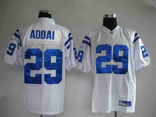
Ever think of taking advantage of an "internet deal"?
Here is their "quality"
Most of these sites have pop-up "customer service" boxes where the sales rep admitted to me that the jerseys are counterfit... his words!
Take a look at their hockey jerseys. They can't get a font type or size correct to save their lives.
Their North Star Ns are way to big, same with the Whaler logos.
Their Blackhawk 1s are in correct.
ok, so , do you buy the stuff or not ? regardless of this banter
The materials used on letters number and patches don't seem to be the high quality material.
You definately get what you pay for.
From your link, the "low quality Chinese jersey" looks better than what the Colts wear on the field. Just saying...and laughing.

You think so?
To me the poor quality of the numbers and letters just scream "cheap knockoff to me". For example do you notice the "wavyness" in the numbers? It is not the stiff tackel twill that should be there. Its kind of the same material of a logo that would be on a Starter jacket.
Absolutely, the stripes actually look like stripes as opposed to an equals sign on each shoulder and the numbers are all a suitable size.
Addai wears the TechFit jersey, where the stripes are much shorter but the "regular" jerseys are not like that. about 12 Colts players wear a TechFit jersey. the stripes may be close to correct but the number/name material does look terrible
-
I don't like the Rays plaid bills.
it seems to be pretty split. id imagine more people wouldnt like them. but i think they're awesome
-
The Colts need to bring back the blue pants:
agreed. id like to see them with the blue jersey too

Unpopular Opinions
in Sports Logo General Discussion
Posted
Agree!! Like the 90's-simple era helmet the best. I know some of it is safety related, however. I am hoping they can find a safe helmet that has a smooth surface and normal looking facemask.
this is actually one of my favorites. i like the Revolutions more than any of the other modern designs. hard to believe that helmet is a decade old. i think it first showed up in 2002. Peyton and Jerry Rice were the first 2 i remember using it