


Quillz
-
Posts
3,044 -
Joined
-
Last visited
Posts posted by Quillz
-
-
33 minutes ago, CaliforniaGlowin said:
What's Orange County or Anaheim known for? oranges? the beach? Disneyland?
Every season I hope the Marlins uniforms get fixed. More blue less black!
Very likely will be some kind of Disneyland motif. Beaches are generic and can be associated with any part of SoCal.
-
 1
1
-
-
So where are all the people who trusted the NHL and parroted the "the ads on the helmets are just for one season, it won't be extended" now? Because I think anyone with a brain knew this was going to happen. It's creeping normality. You start on the helmets, for just one season. You extend it another season. Then you allow it on the sweaters. And then it's normal. The NBA opened the door to this, it was inevitable.
For the NBA, it was merely "an experiment." NHL claimed it was to "recover pandemic losses." It's like all those fees airlines added after 9/11, then they never went away.
-
12
-
-
On 7/7/2021 at 11:34 AM, Skycast said:
Hard to have any enthusiasm for something that's a year and a half away. Not to mention it's the third try for the XFL.
And I don't see it succeeding the third time, either. Then it will have a fourth relaunch. And so on. If it succeeds, great. But I just don't ever seeing it work out. For all the faults the NFL has, it's also clear that people don't really want anything much different. If ratings of other football attempts are anything to go by.
-
2
-
-
9 hours ago, CS85 said:
Monterey is probably not going to be anything substantial, but it gets to be 12.0?
This has happened before. When Apple released macOS 8 in 1997, it was a very minor update. In fact, it was originally intended to be released as macOS 7.7. The reason it was changed was solely to shut down the Macintosh clone market, which had licenses to run System 7, but nothing newer. Under the hood, it had no new kernel, no new APIs, nothing of significance. Whereas the later macOS 8.5 actually was significant.
So it's happened before. And version numbers are always arbitrary to an extent. The first major release of Windows NT was 3.1, as opposed to a 1.0, simply to keep the versioning in place with the consumer-oriented MS-DOS versions (i.e. Windows 3.1 from 1992).
-
1
-
-
9 hours ago, CS85 said:
Which is a bit of an eye-roll.
Perhaps. Me, I don't really care. As long as they have some consistency, that's all that matters to me. If they want to do annual version updates, fine. Although makes me wonder why they still even bother with the code names anymore.
-
On 6/26/2021 at 7:54 AM, MDGP said:
Now that Mac has moved onto 11
Also they are already on macOS 12, which is coming out later this year. It will be known as "Monterey." They seem to be moving macOS to annual version updates.
-
On 6/26/2021 at 7:54 AM, MDGP said:
including skipping windows 9 entirely
This was actually due to poor programming practices by third-party developers. Instead of checking for "Windows 4" as they should have (since 9x was based on kernel versions 4.x), they instead only looked for "Windows 9." Which also failed because of Windows Me.
And Apple did have a macOS 9. I don't know why they skipped iPhone 9, they shouldn't have. The re-released SE should have been called the 9.
-
3
-
-
17 hours ago, habsfan1 said:

Not sure I agree here. An expansion franchise that made the Finals their first year, has been a contender every season since. I know you are a Habs fan, but if we look at this more critically, I'd say this has been a pretty successful logo (so far).
-
14
-
-
On 6/17/2021 at 3:19 PM, tBBP said:
Wasn't Windows 10 supposed to be the last one??
Someone at Microsoft did say that. It was a stupid thing to say in 2015 for exactly this reason. Because plans change. The quote was in reference to Windows moving to a more service model, and it was something to the effect of "Windows 10 is the last Windows and it will be a service." It's possible the speaker (who I believe was French) meant to say "latest," in which case the quote makes a lot more sense.
-
1
-
-
On 6/18/2021 at 6:07 AM, kmccarthy27 said:
OSX was supposed to be the last one for Mac as well
This isn't true, in the sense that Apple has never said anything that could be interpreted as such. The closest reference I can find is Steve Jobs referring to macOS 10 setting Apple up for the next 20 years. He said that in 2005, and macOS 11 came out last year, so it was fairly accurate.
-
1
-
-
So was last year's World Series berth more of a fluke, or do they really have something there that will keep them competitive?
-
#38 is the lowest number that has not been retired by any of the 30 MLB franchises.
-
3
-
-
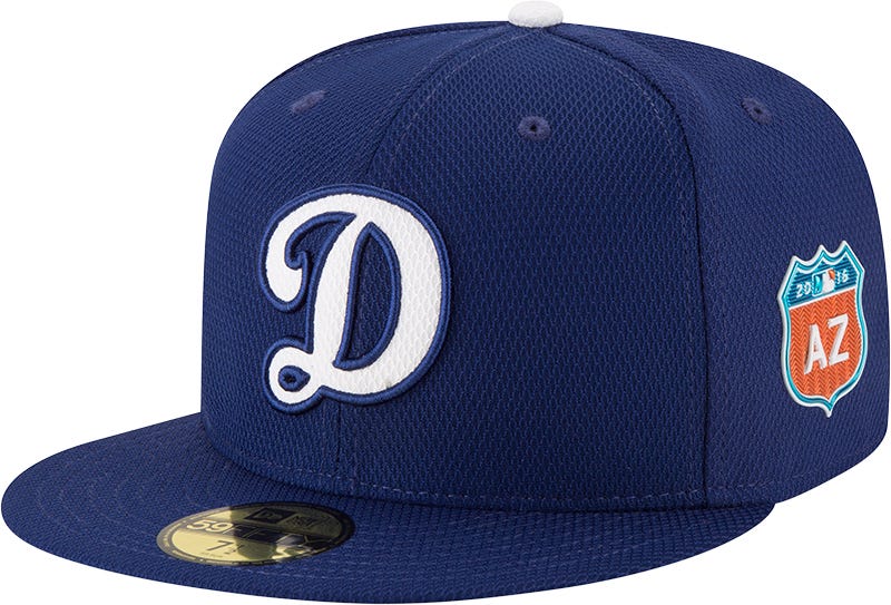
18 hours ago, DNAsports said:
This,
should be worn with this-
and definitely, at all times, this-
which itself should be upgraded to the main rotation full time
Keep the “LA” caps for the away uniforms
I'm bothered by the blue jersey using the thinner number font on the front, which is already an issue I have with the Dodgers in general. They need to be using the thicker variant, or fake it by having a color-matched outline.
-
3
-
-
On 5/1/2021 at 3:16 AM, SCalderwood said:
but I still don't think it was that bad and I don't think it deserves hate.
It's one of those "vacuum scenarios," where the identity in of itself was okay, but didn't fit the Blue Jays at all who had a great, solid identity prior. They went back to their senses from 2012 onward.
-
On 5/17/2020 at 4:10 PM, TrueYankee26 said:
Correct.
The 2020 Texas Rangers have long odds but nothing is impossible
Wow... I just came across this post. Funny how the World Series was decided at GlobeLife and won by the "home team." A proxy win for the Rangers?
-
2
-
-
15 minutes ago, gosioux76 said:
What makes you think nobody cared in 2020?
Zero coverage in most traditional media. Like the original XFL, most coverage treated it more like a special or an event than a legitimate league. We also had much bigger issues in 2020. And despite its heavy marketing about how it would be simple and not the NFL, it pretty much was. The games in of themselves weren't bad but there was nothing I found really worth watching. It didn't do anything that the (failed) Alliance of American Football did. Both just felt like early season or preseason games.
-
1
-
-
Ah, so this time around they aren't trying to cater to the "AMERICA!" crowd, I see. No press statement about how everyone will stand for the national anthem and no player will have a criminal record.
But hey, I'm sure it will finally succeed in 2022. No one cared in 2001 or 2020, but I'm sure this time will be different, somehow.
-
1
-
-
I really hope San Diego finally has their identity and sticks with brown and yellow.
-
2
-
-
On 4/4/2021 at 2:47 PM, DNAsports said:
Yes, not all water tastes the same.
I thought this was pretty common knowledge, but a lot of people either don't know this or just don't taste the difference. Spring water, distilled water, tap water, all taste different. I like Smart Water, which is basically created in a lab since it's distilled with some minerals added back in. Has a taste that I like more than spring or tap water.
-
2 hours ago, DNAsports said:
We need more teams in baseball to have sleeve numbers like the Phillies
Not something I disagree with, but I just really hate the Phillies number font. I don't know why, it just looks too "soft" for lack of a better way to put it. Also, sometimes the white keyline will intersect with itself and it just looks muddled. I liked both the maroon and number font they used prior to 1993.
-
1
-
-
As long as we are talking about colors, I've never had an issue with any setup. As long as the home team and road team colors aren't too similar to cause confusion, I don't care. I'm fine with color vs. color in baseball. If you want to wear white at home in the NFL and NHL, go right ahead.
Rather, where I draw the line is when teams like the Cavs will have something like 20 different uniforms and 20 different color combinations. If you want to do color vs. color, fine. But I think you should be limited to whatever colors are presently in your color scheme. If the Lakers wore blue in the past, fine. I don't want to see it on the court though. Unless it's a deliberate throwback game that is planned in advance. I'm again thinking of when the Cavs milked LeBron as much as possible and pretty much wore any possible uniform combo they could think of.
-
The one in the trees is good. If you go to the nearby Big Basin Redwood State Park, you'll find banana slugs everywhere. On the ground, trees, eating leaves, etc. So a logo making some kind of reference to that is a good one.
-
Maybe I've posted this already, but with all the talk of the Patriots making changes to their uniforms...I don't think "Pat Patriot" is a good logo. I think it's a great mascot, and works fine for secondary/fan merchandise. But as an actual logo on a helmet, it's terrible. Too detailed, too many small lines, all things are which completely lost at a distance on a helmet. And like most old logos, it doesn't scale well on modern websites and score bugs. "Flying Elvis" simply works better as a logo.
-
5
-
-
10 hours ago, QCS said:
Alright, I'll get it started: the new Rams logo isn't awful. In fact, I really like the idea behind it and I think with more refining it could've been great. The gradients are the biggest problem, but as soon as you realize the horn is supposed to be both a wave and a horn it starts to click a little more. They should switch the primary and secondary, however.
Both are growing on me. I really like the secondary as a modernization of the old rams head logo they were using in the 80s or so. Really want to get it on a cap. I agree I'd like to see it reversed, but it is what it is.
-
3
-


MLB 2022 Uniform/Logo Changes
in Sports Logo News
Posted
Me. I bought several Rams caps when they moved back to LA. Also have at least one cap of most of the other teams, even if I don't wear them.